Tutorial Aims:
- Learn what the Google Earth Engine is
- Find out what types of analyses you can do using the GEE
- Get familiar with the GEE layout
- Learn the basic principles of JavaScript
- Import and explore data - forest cover change as a case study
- Visualise forest cover change
- Calculate forest cover change over time in specific locations
- Export results - summary tables
- Further analysis and visualisation in R - the best of both worlds!
All the files you need to complete this tutorial will be generated and exported from the GEE during the course of the tutorial.
Follow this link to register for the Google Earth Engine - it is free.
Say what you’ll be using the GEE for - for research, education, etc. It might take a few hours or a day or so for your registration to be approved.
1. Learn what the Google Earth Engine is
The Google Earth Engine, as its developers have described it, is “the most advanced cloud-based geospatial processing platform in the world!” What this means is that, through the Google Earth Engine, you can access and efficiently analyse numerous open-source spatial databases (like Landsat and MODIS remote sensing imagery, the Global Forest Change dataset, roads, protected areas, etc.). When doing these analyses, you are using the Google servers, so you can do analyses that would take weeks, if not months, on your computer or even a fancy computer.
From the Google Earth Engine, you can export .csv files of any values you’ve calculated and geoTIFF files (georeferenced images) to your Google Drive account.
2. Find out what types of analyses you can do using the GEE
With the GEE, you can answer large-scale research questions in an efficient way that really was just not possible before, so quite exciting! You can use large geospatial datasets to address a plethora of questions and challenges facing humanity in the modern world. We will see later on how to explore what datasets are available to work with in the GEE, and it’s also possible to import your own georeferenced imagery (like photos from drone missions). You can find out how to import your own raster data from this page on the GEE developers website.
For example, you can classify different land cover types, you can calculate and extract values for landscape features such as NDVI (Normalised Difference Vegetation Index) - for the world, a particular region of interest, or many different areas around the world. Really, the possibilities are enormous, and here we are only scratching the surface by giving you an example of how you can use the GEE to calculate changes in forest cover over time.
You can check out the tutorials on the Google Earth Engine Developers website if you are keen to learn more and to practice your GEE skills!
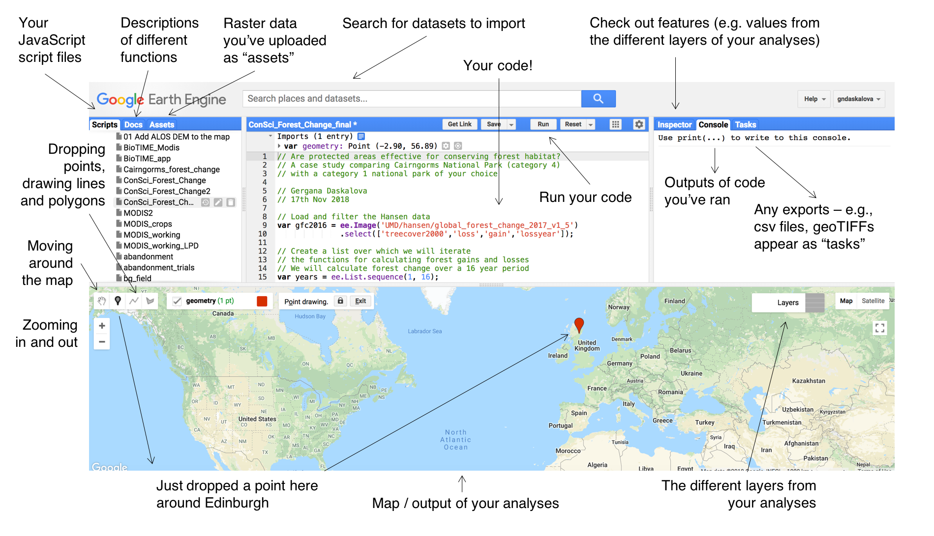
3. Get familiar with the GEE layout
Go to the Earth Engine to start your GEE journey!
Take a moment to familiarise yourself with the layout of the Earth Engine editor - like when first starting to learn a new language, it can seem like a lot to take in at once! With your blank script, have a go at exploring the different tabs. Notice how if you draw polygons or drop points, they will appear in your script. You can go to the Inspector tab, click on a place in the map, and see what information is available for it. Here is an outline of what most of the tabs do:
4. Learn the basic principles of JavaScript
The Google Earth Engine uses the programming language JavaScript.
Similarly to other programming languages, there is support online - you can google JavaScript and Earth Engine tutorials. It will all seem unfamiliar at first, but thanks to the online programming community, you very rarely start completely from scratch - i.e., don’t feel bad about yourself because you can’t just think of the correct JavaScript code from the top of your head straight away.
We’ll introduce you to more about JavaScript syntax and functions as we go along with the tutorial, but for now, here a few notes:
Lines of code in JavaScript finish with a ; - note that code for e.g. defining a variable can be spread over multiple lines, but you only need to put a ; at the end of the last line of the code chunk.
To define new variables, you use:
var new_variable = ...
You’ll see variants of this code at multiple places throughout the script we will create later. Essentially, when you import datasets, create new layers, calculate new values, all those need to be stored as varibles so that you can map them, export them, etc.
To add comments in your script, use //. For example, at the start of your blank new script (if you created any polygons or points while you were exploring, you can make a new script now to start “clean”). Like when coding in other programming languages, it’s great to leave comments to make sure your script outlines who you are, what the aim of the script is and why you are following the specific workflow. Here are a few example comments - you can write up something similar in your script:
// Calculating forest cover change in protected areas around the world
// Gergana Daskalova
// 26th Nov 2018
In JavaScript, you have to run your entire script at once - that is, you can’t, for example, select two lines of your script and run just those, you have to run the whole thing. You “run” a script by pressing the Run button. This means that throughout your tutorial, as you add more lines to your script, you have to keep pressing Run to see the results of the new code you’ve added.
5. Import and explore data - protected areas and forest cover change as a case study
Like with any analysis, it’s not so much about the data as it is about your research question, so as you start exploring the GEE, remember to keep your research questions (or science communication goals, since the GEE is pretty great for that, too) in mind!
Research question
How has forest cover changed in different national parks around the world?
Import and explore a dataset in the GEE - protected areas
To import the protected area dataset (polygons of the protected areas around the world from the World Database of Protected Areas), type protected area in the search tab and select the polygon version of the database (the other one is just points, i.e. the coordinates of one point within the protected areas, not their outline).
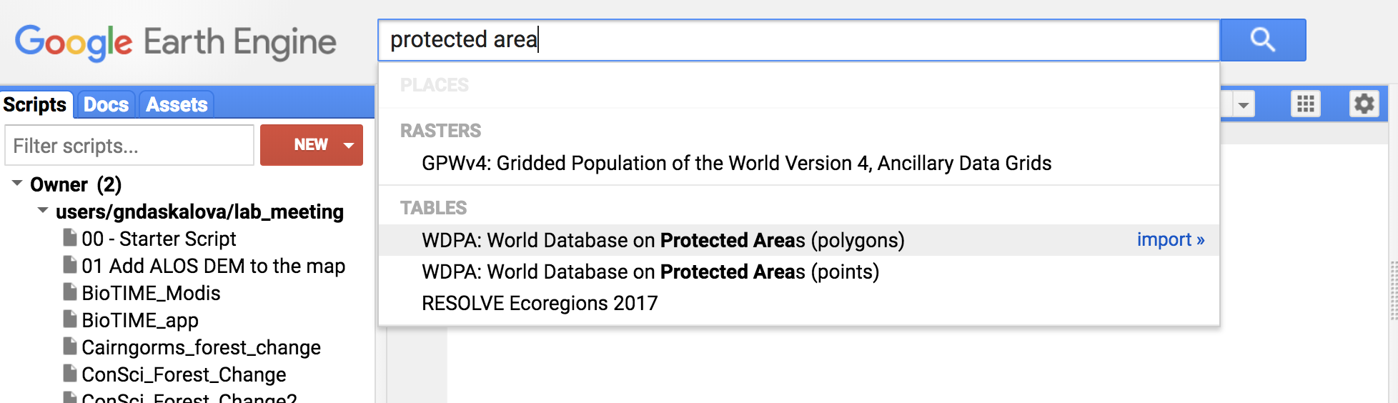
Select Import.
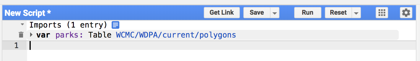
Your imported dataset appears at the top of the script - it’s currently called table which is not particularly informative, so you can rename that something else, e.g., parks.
Remember to save your script and to save it often! Once you’ve saved it, you’ll see the file appear on the left under your scripts tab.
Visualise protected areas around the world
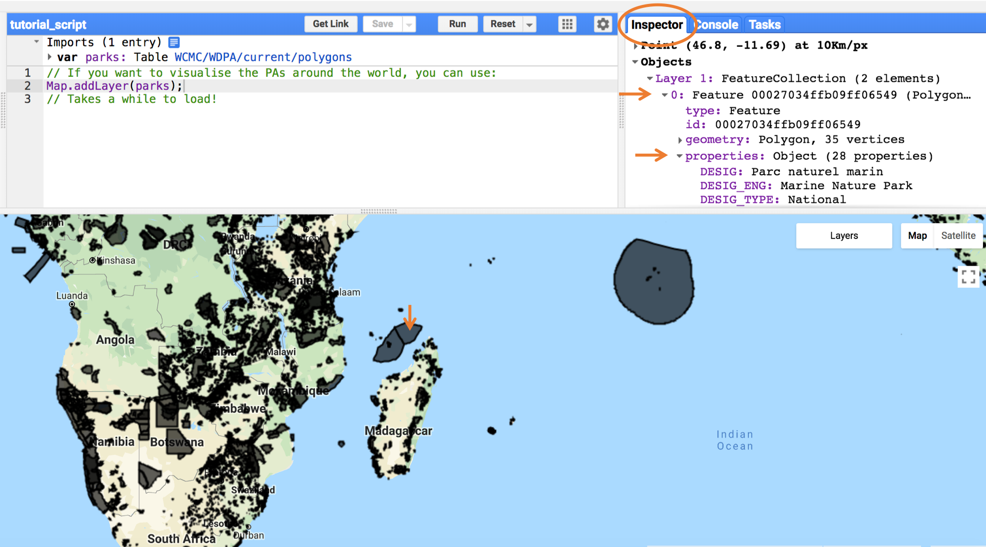
Next up, we’ll use the Map function to map the dataset and we will add a layer. You can then turn that layer on and off from the layer tab in the top right corner of the map window. You can also change the opacity.
// If you want to visualise the PAs around the world, you can use:
Map.addLayer(parks);
// Takes a while to load! Remember you need to press "Run" to see the results.
Go to the Inspector tab, click on a point somewhere on the map and check out the features of that point - the name of the protected area, its area, when it was established, etc.
Move around the world, find a national park and “inspect” it - can you find the name, area, etc. - all this information is under the Inspector tab.
Import and explore a dataset in the GEE - forest cover change
Similarly to how you imported the protected area dataset, go to the search tab, type in global forest change and select the Hansen et al. dataset.
Take a look at the different types of information held within this dataset - that will help you familiarise yourself with what to expect from our analyses later on.
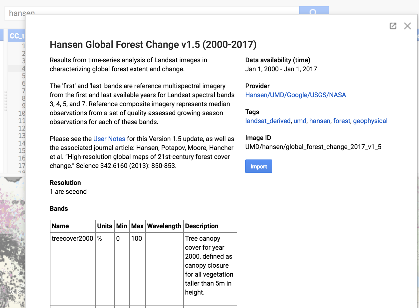
Call the object gfc, or whatever else you wish, but remember that if you call it something else, you have to change gfc to your new name in all the code coming up! Next up, we will again map our dataset.
// Add the Global Forest Change dataset
Map.addLayer(gfc);
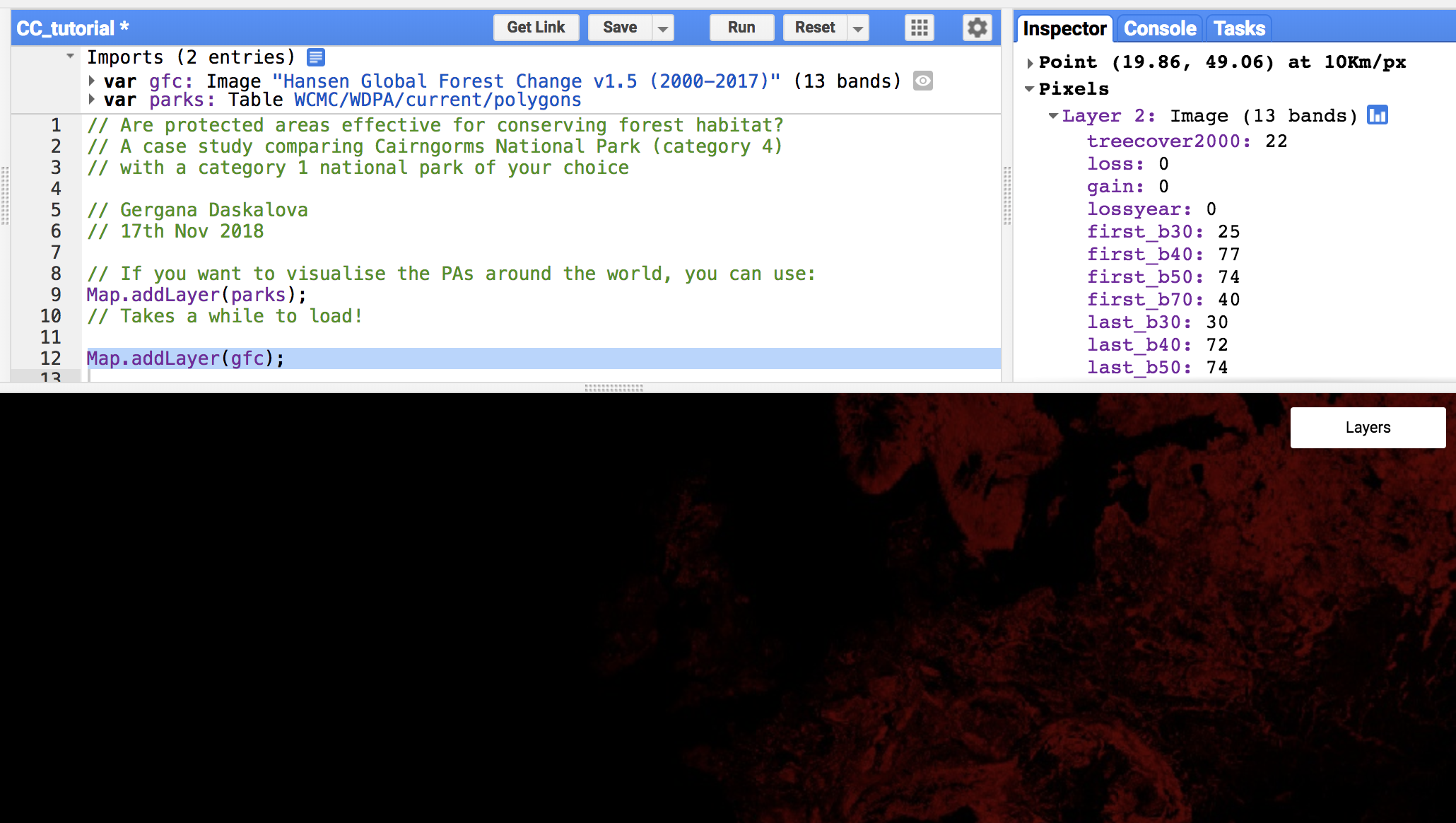
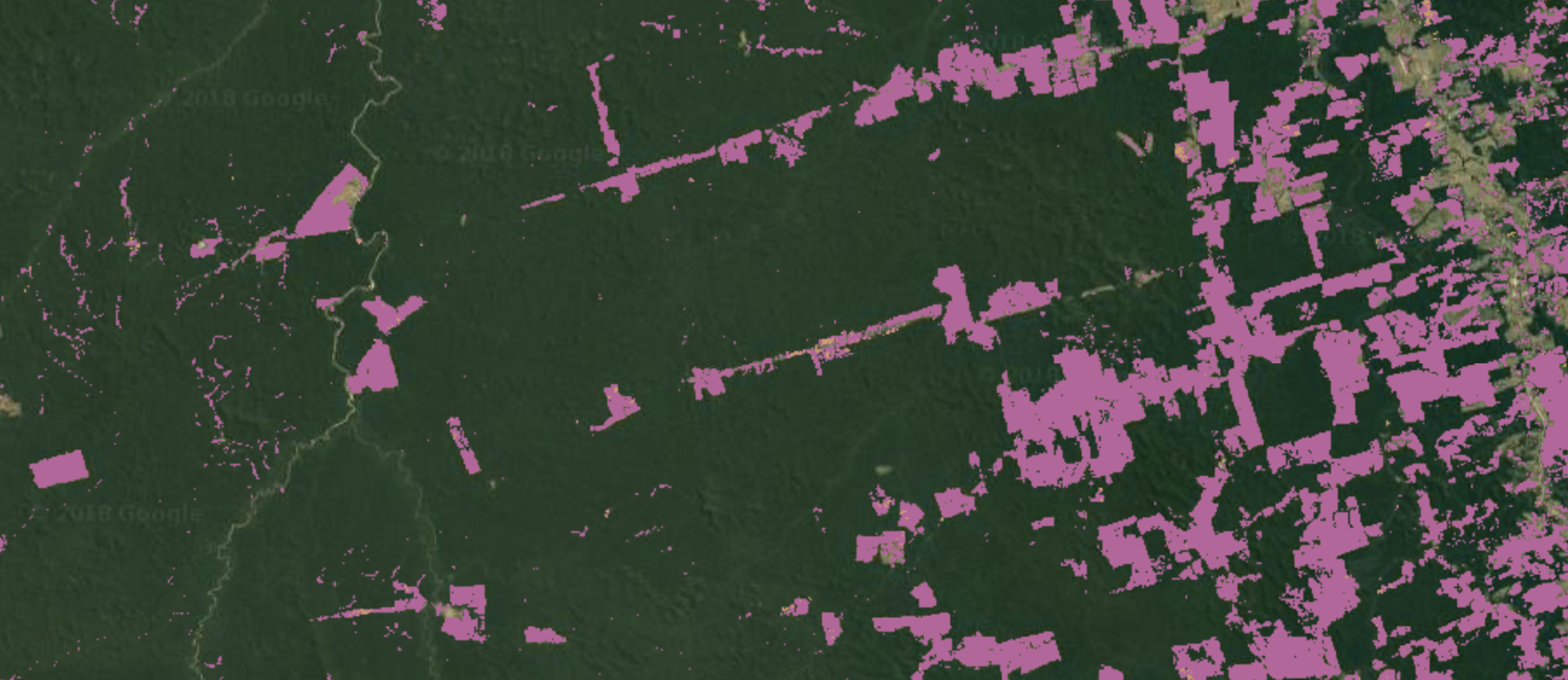
Currently, we just have a black and red map - black for the places where there are no forests, and red from the places that do have forest cover. This is not terribly informative and over the course of the tutorial we will work on making this map better!
Go to the Inspector tab again, click on a point somewhere on the red parts map and check out the features of the forest cover change layer. If it says loss: 0, gain: 0, that means that, in this specific pixel, no forest loss or gain has occurred.
You can also turn layers on and off, and you can “comment out” certain parts of the code if you don’t want that action to be performed every single time you rerun the script. For example, mapping the protected area dataset takes quite a while, so if you didn’t want to do that multiple times, you can add // in front of that line of code. You can always remove the // when you do wish to map those data again. Like this:
// If you want to visualise the PAs around the world, you can use:
// Map.addLayer(parks);
If you want to turn lots of code lines into comments or turn lots of comments back into code, you can use a keyboard shortcut Cmd + / on a Mac and Ctrl + / on a Windows computer.
We are now ready to improve our map and derive quantitative values for forest loss and gain!
6. Visualise forest cover change
First, it’s good practice to define the scale of your analyses - in our case, it’s 30 m, the resolution of the Global Forest Change dataset. If a given pixel has experienced forest loss, this means that somewhere in that 30 m x 30 m square, there were decreases in forest cover.
You can also set the scale to automatically detect the resolution of the dataset and use that as your scale.
Type up the following code in your script:
// Set the scale for our calculations to the scale of the Hansen dataset
// which is 30m
var scale = gfc.projection().nominalScale();
The next step is to create variables for the tree cover in 2000 (when the database starts), for the loss up until 2016 and the gain in forest cover, again up until 2016. In raster data, images usually have different “bands” (e.g., red, green, UV), and we can select which bands we want to work with. In this case, the different bands of the gfc object represent the forest cover, forest loss and forest gain, so we will make a variable for each.
To do this, we will use the select() function. Note that unlike other programming languages like R, in JavaScript you put the object you want to apply the function to first, and then the actual function comes second.
// Create a variable for the original tree cover in 2000
var treeCover = gfc.select(['treecover2000']);

// Convert the tree cover layer because the treeCover by default is in
// hundreds of hectares, but the loss and gain layers are just in hectares!
treeCover = treeCover.divide(100);

// Create a variable for forest loss
var loss = gfc.select(['loss']);

// Create a variable for forest gain
var gain = gfc.select(['gain']);
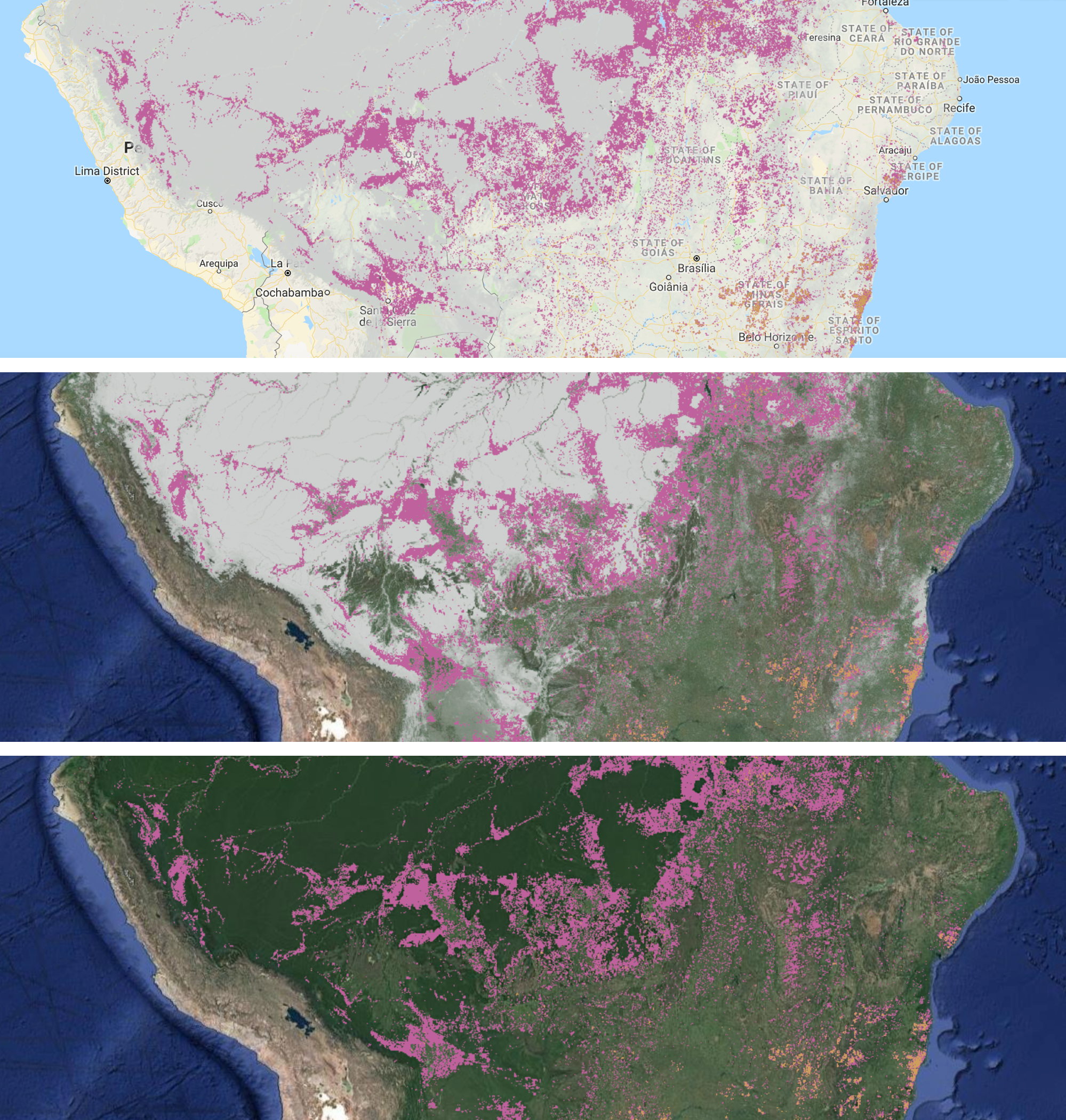
Make a global map of forest cover, forest loss and forest gain
Now that we have our three variables, we can create a layer for each of them and we can plot them using colours of our choice. We will use the same Map.addLayer function as before, but in addition to adding the object name, we will specify the colours and what we want to call the specific layers.
Note that we are also introducing a new function updateMask(). What this does is mask the areas there was no forest cover in the year 2000 - they become transparent, so instead of just blackness, we can see the seas, rivers, continent outlines, etc.
// Add the tree cover layer in light grey
Map.addLayer(treeCover.updateMask(treeCover),
    {palette: ['D0D0D0', '00FF00'], max: 100}, 'Forest Cover');

// Add the loss layer in pink
Map.addLayer(loss.updateMask(loss),
            {palette: ['#BF619D']}, 'Loss');

// Add the gain layer in yellow
Map.addLayer(gain.updateMask(gain),
            {palette: ['#CE9E5D']}, 'Gain');
Remember to click on Run so that you see your newly plotted maps. The forest layers might be easier to see if you either turn off the first two layers you plotted (the protected areas and the generic GFC layer), or you can keep the protected area layer on, but reduce the opacity by dragging the bar below that layer.
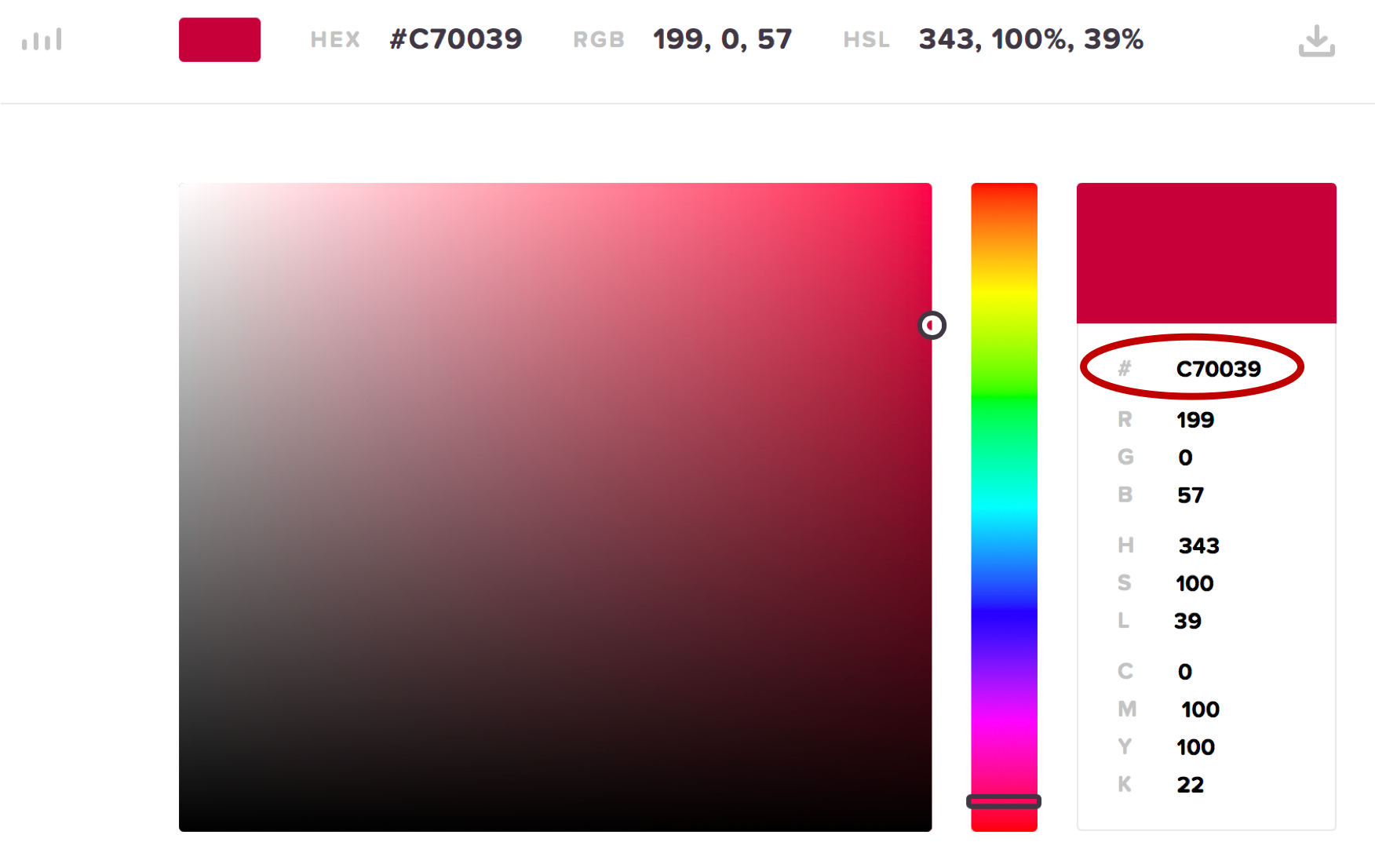
You can specify colour using hex codes, those are the number and letter combinations in the code above, e.g. #CE9E5D is yellow. You can find examples of those online, for example this website.
You can also switch between map view and satellite view. If you zoom in enough and go to satellite view, you can actually start spotting some patterns, like forest loss along roads in the Amazon.
7. Calculate total forest cover gain and loss in specific locations
So far we can see where forest loss and gain have occurred, so we know about the extent of forest change, but we don’t know about the magnitude of forest change, so our next step is to convert the number of pixels that have experienced gain or loss (remember that they are just 0 or 1 values, 0 for no, 1 for yes) into areas, e.g. square kilometers.
For each of the variables we created earlier (forest cover, forest loss and forest gain), we will now create new variables representing the areas of forest cover, loss and gain. To achieve this, we will use the ee.Image.pixelArea() function, and we have to multiply our original variables (e.g., treeCover), similar to when you convert from meters to centimeters, you would miltiply by 100. Here we want the area to be in square kilometers, so to go from square meters to square kilometers, we will also divide by 1 000 000. Finally, we select the first band from our new variables - the areas of forest cover, loss and gain, respectively.
// The units of the variables are numbers of pixels
// Here we are converting the pixels into actual area
// Dividing by 1 000 000 so that the final result is in km2
var areaCover = treeCover.multiply(ee.Image.pixelArea())
                .divide(1000000).select([0],["areacover"]);

var areaLoss = loss.gt(0).multiply(ee.Image.pixelArea()).multiply(treeCover)
              .divide(1000000).select([0],["arealoss"]);

var areaGain = gain.gt(0).multiply(ee.Image.pixelArea()).multiply(treeCover)
              .divide(1000000).select([0],["areagain"]);
Calculate forest loss and gain in specific areas
Often we are interested in extracting values from geospatial data for specific places around the world. Here, our question was about changes in forest cover in national parks, so to answer that, we need to calculate how much forest cover change has occurred in just our chosen national parks, not the whole world.
The first step is to create a filtered variable that contains our areas of interest. Here, we will filter our original parks variable that includes all the protected areas in the world, down to just four protected areas. We will use ee.Filter.or() to add multiple filtering conditions.
// Create a variable that has the polygons for just a few
// national parks and nature reserves
var parks = parks.filter(ee.Filter.or(
    ee.Filter.eq("NAME", "Yellowstone"),
    ee.Filter.eq("NAME", "Sankuru"),
    ee.Filter.eq("NAME", "Cairngorms"),
    ee.Filter.eq("NAME", "Redwood")));
Now we are ready to calculate the areas of forest loss and gain, exciting times! We will use what in GEE lingo is called a “reducer” - a summarising function. We will apply that to our parks variable and we will use the scale we defined earlier (30m, the resolution of the dataset). The results will be stored in two new variables, statsLoss and statsGain.
// Sum the values of loss pixels.
var statsLoss = areaLoss.reduceRegions({
  reducer: ee.Reducer.sum(),
  collection: parks,
  scale: scale
});

// Sum the values of gain pixels.
var statsGain = areaGain.reduceRegions({
  reducer: ee.Reducer.sum(),
  collection: parks,
  scale: scale
});
8. Export results - summary tables
At this stage, we have calculated the areas of forest loss and gain in our chosen protected areas, but we haven’t actually seen or visualised those numbers.
We can export .csv files of our results, in this case they will go to your Google Drive account. Add the code below to your script and press Run again. You will see that the Task tab lights up, go check it out. You will have two tasks and you have to press the Run button next to them (otherwise the tasks are ready for you, but you haven’t actually initiated their completion), then you’ll start seeing a timer - that reflects how much time has passed since you started the task. Depending on your task it can take seconds to hours. Should be seconds in our case!
We use the curly brackets to specify which object we want to export and what we want to call the file, e.g. NP_forest_loss.
Export.table.toDrive({
  collection: statsLoss,
  description: 'NP_forest_loss'});

Export.table.toDrive({
  collection: statsGain,
  description: 'NP_forest_gain'});
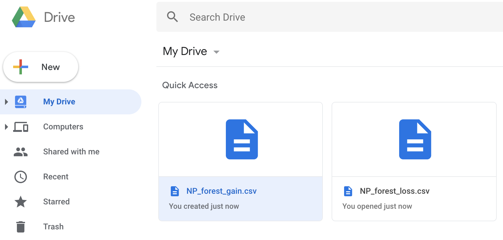
Go check out your files in your Google Drive. Scroll all the way right to see the sum column, which shows the area, in square kilometers, of forest loss or gain (depending on which file you are looking at).
9. Further visualisation in R - the best of both worlds!
We are keen to incorporate different platforms and languages in our analyses, playing to the strengths of each. R and R packages like ggplot2 offer more flexibility in how you visualise your findings, so we will now switch over to R to make a barplot of forest loss and gain in the four protected areas we studied.
Note: You can also make graphs in the Earth Engine, so this comes down to personal preferences and what works best for your own workflow. You can find tutorials on how to create graphs in the Earth Engine on the Developers website.
Open up RStudio (or just R depending on your preferences) and start a new script by going to File / New file / R Script. If you’ve never used R before, you can find our intro to R tutorial here.
# Load libraries ----
library(ggplot2)
devtools::install_github('Mikata-Project/ggthemr') # to install the ggthemr package
# if you don't have it already
library(ggthemr)  # to set a custom theme but non essential!
library(forcats)  # to reorder categorical variables
We can set a theme (changes the colours and background) for our plot using the ggthemr package. You can explore the different colour options here.
# Set theme for the plot
ggthemr('dust', type = "outer", layout = "minimal")

# This theme will now be applied to all plots you make, if you wanted to
# get rid of it, use:
# ggthemr_reset()
Next up, set your working directory to wherever you saved the data we exported to Google Drive and read in the files.
# Read in the data ----
NP_forest_gain <- read.csv("NP_forest_gain.csv")
NP_forest_loss <- read.csv("NP_forest_loss.csv")
We will combine the two objects (the one for forest loss and the one for forest gain) so that we can visualise them in the same plot. We can create an “identifier” column so that we know which values refer to gain and which ones to loss in forest cover.
# Create identifier column for gain vs loss
NP_forest_gain$type <- "Gain"
NP_forest_loss$type <- "Loss"

# Bind the objects together
forest_change <- rbind(NP_forest_gain, NP_forest_loss)
We can make a barplot to visualise the amount of forest cover lost and gained between 2000 and 2016 at our four study sites. Because a larger national park can loose more forest simply because it’s larger (i.e., there is more of it to loose), we can visualise the forest change as % of the total park area. We do this in the code below by specifying y = sum/GIS_AREA (or you can make a new column in your data frame that has those percentages calculated in it if you wish).
The ggthemr theme we chose earlier gives the graph more of an infographic feel. If you need more standard formatting, you can add + theme_bw or + theme_classic() to your barplot code.
(forest_barplot <- ggplot(forest_change, aes(x = NAME, y = sum/GIS_AREA,
                                             fill = fct_rev(type))) +
    geom_bar(stat = "identity", position = "dodge") +
    labs(x = NULL, y = "Forest change (% of park area)\n") +
    # Expanding the scale removes the emtpy space below the bars
    scale_y_continuous(expand = c(0, 0)) +
    theme(text = element_text(size = 16),  # makes font size larger
          legend.position = c(0.1, 0.85),  # changes the placement of the legend
          legend.title = element_blank(),  # gets rid of the legend title
          legend.background = element_rect(color = "black",
                                           fill = "transparent",   # removes the white background behind the legend
                                           linetype = "blank")))
Note that putting your entire ggplot code in brackets () creates the plot and then shows it in the plot viewer. If you don’t have the brackets, you’ve only created the object, but haven’t visualised it. You would then have to call the object such that it will be displayed by just typing forest_barplot after you’ve created the “forest_barplot” object.
We can use the ggsave function to save our graph. The file will be saved to wherever your working directory is, which you can check by running getwd() in the console.
ggsave(forest_barplot, filename = "forest_barplot.png",
       height = 5, width = 7)
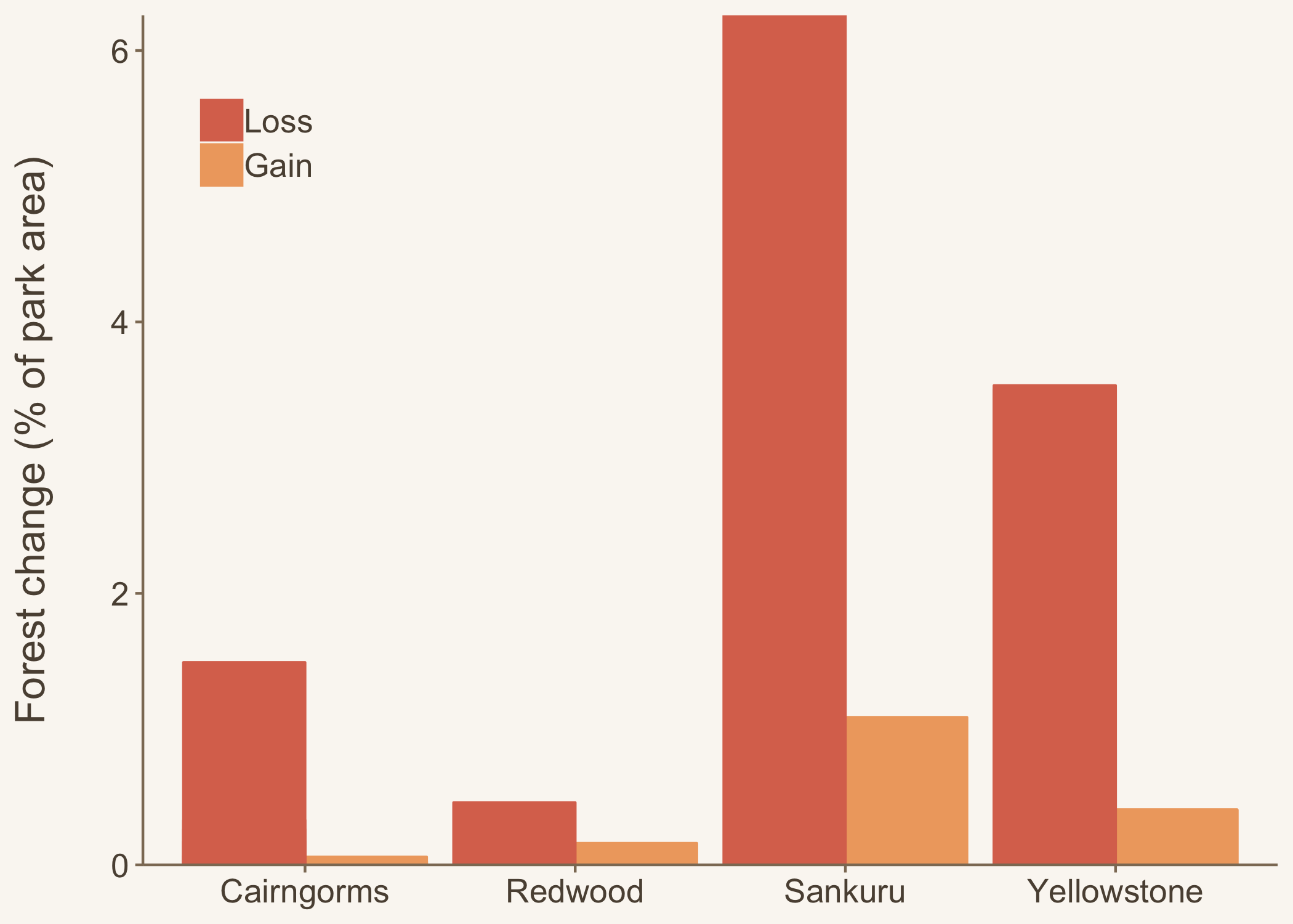
Now that we can see how much forest has been gained and lost in our protected areas of interest, we can go back to our original research question, how does forest change vary across protected areas, and we can see if we can spot any patterns - are there any types of protected areas that are more likely to loose forest?
We hope you’ve enjoyed your introduction to the Google Earth Engine! It’s a very exciting tool and if you want to learn more, go check out the tutorials on the Google Earth Engine Developers website!