Tutorial Aims:
- Create a coding tutorial and host it on GitHub
- Set up version control with GitHub and RStudio
- Analyse and visualise data using the tidyverse
- Create a reproducible report using Markdown
All the files you need to complete this tutorial can be downloaded from this repository. Click on Clone/Download/Download ZIP and unzip the folder, or clone the repository to your own GitHub account.
![]()
We started Coding Club to help people at all career stages gain statistical and programming fluency, facilitating the collective advancement of ecology across institutions and borders. We use in-person workshops and online tutorials to equip participants not only with new skills, but also with the means to communicate these new skills broadly via online tutorials.
We would love to extend Coding Club beyond the University of Edinburgh and create a supportive community of people keen to get better at coding and statistics! With that in mind, we present you with a workshop on how to write and share tutorials!
There are similar initiatives already in place, including in Ghent University, University of Aberdeen and University of St Andrews, which is very exciting!
How does a Coding Club workshop work?
There are many ways to run a coding workshop and different approaches might work better in different situations. Here is how we usually structure our workshops. The workshops take two hours and begin with a super short presentation or introductory talk about what we will be doing, what skills we will acquire and what they are useful for. We then direct workshop attendants to the link for the tutorial around which the workshop is focused. People usually open the tutorial on half of their screen and RStudio on the other half.
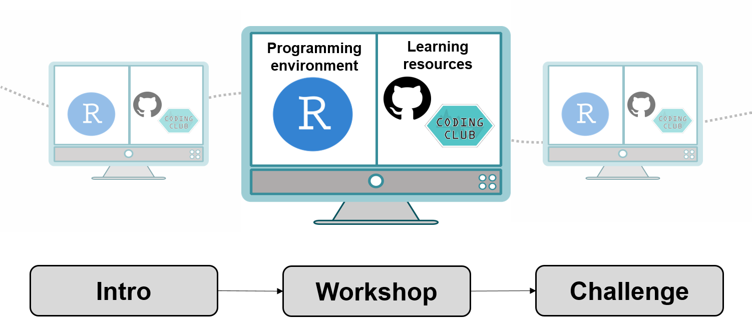
At each workshop, we have a team of demonstrators who are there to answer questions and help out. We find that it works well to let people go through the tutorial at their own pace and we usually walk around and check whether things are going fine. Most of the tutorials have challenges at the end, for which people can work individually or in small teams. We bring cookies, popcorn and other treats, occasionally make bad R jokes and try our best to make the atmosphere light and positive. We don’t require people to sign up and there are no obligations to attend all the workshops: people are free to attend whichever workshops are of interest to them. At the end of the workshops, we usually stay behind for a while in case people have any specific questions about their own coding projects.
1. Create a coding tutorial and host it on GitHub
We write our tutorials in Markdown. Markdown is a language with plain text formatting syntax. Github and Markdown work very well together and we use Markdown because we can turn a Markdown file into a website hosted on Github in a minute or so! Because of the syntax formatting, Markdown is a great way to display code: the code appears in chunks and stands out from the rest of the text. All of the Coding Club tutorials are written in Markdown.
We use the Atom text editor, which is a user-friendly text editor and easy on the eyes. You can use another text editor, like Brackets or TextEdit on a Mac and Notepad on a Windows computer if you prefer, the principle is the same. A plain text editor is a programme, which allow you to create, save and edit various types of text files, like .txt and in our case, Markdown (.md) files. So for example, Microsoft Word is a text editor, but not a plain one. In the “fancier” plain text editors, you get “syntax” highlighting: different types of text, like code and links, are colour coded so they are easier to spot.
You can download Atom here, if you wish, but it’s a fairly large file, so you can also proceed with whatever text editor you already have and you can check out Atom later.
You can also open the tutorial template in RStudio, but note that there are small differences between Markdown and GitHub-flavoured Markdown (the curly brackets):__
# Traditional Markdown
# ```{r}
# some code
# ```

# GitHub-flavoured Markdown
# ```r
# some code
# ```
Our workflow tends to go like this:
- Write the
Rcode for the tutorial inRStudio - Save any graphs you create with your code
- Open a text editor, copy and paste your
Rcode in the tutorial template - Save the file as a
.mdfile - Add text to explain the purpose of the tutorial and what the code does
- Add images and links as suitable
Don’t worry if you’ve never used a text editor or Markdown before. We have created a template you can open straight in Atom (or another plain text editor) and just insert your text, code and images.
Open the tut_template.md file in a text editor or RStudio and the tutorial_script.R file in RStudio.
The sample script in tutorial_script.R creates a few simple plots about plant trait relationships. Run through the code and save the graph. Next, transfer the code from the R script into the code chunks in the tut_template.md file.
In the tut_template.md file, we are using <a href="#section_number">text</a> to create anchors within our text. For example, when you click on section one, the page will automatically go to where you have put <a name="section_number"></a>.
To create subheadings, you can use #, e.g. # Subheading 1 creates a subheading with a large font size. The more hashtags you add, the smaller the text becomes. If you want to make text bold, you can surround it with __text__, which creates text. For italics, use only one understore around the text, e.g. _text_, text.
When you have a larger chunk of code, you can paste the whole code in the Markdown document and add three backticks on the line before the code chunks starts and on the line after the code chunks ends. After the three backticks that go before your code chunk starts, you can specify in which language the code is written, in our case R.
To find the backticks on your keyboard, look towards the top left corner on a Windows computer, perhaps just above Tab and before the number one key. On a Mac, look around the left Shift key. You can also just copy the backticks from below.
Publish your tutorial on Github
Next we can publish our tutorial on GitHub, which will turn it into a website, whose link you can share with your peers - transferring quantitative skills among ecologists in action!
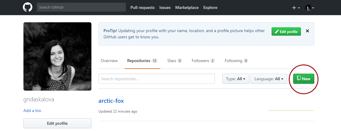
Go to the GitHub website, register if you don’t already have an account (it’s free) and click on New Repository.
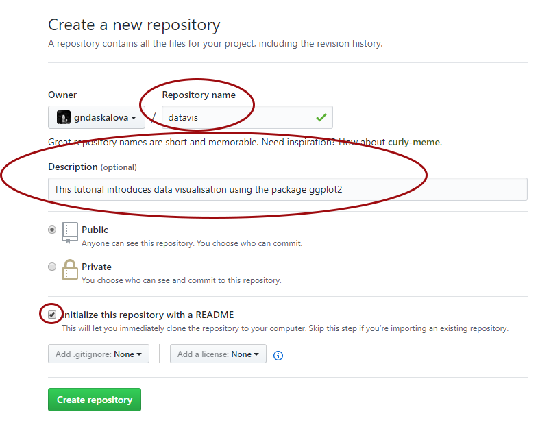
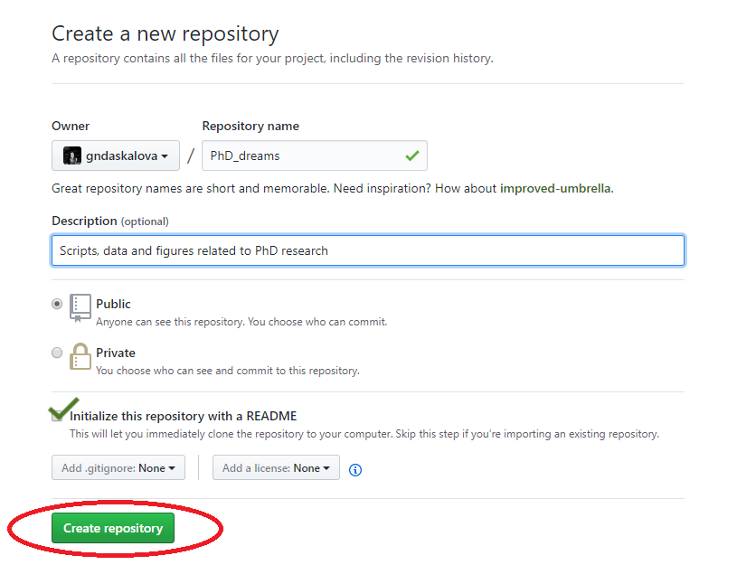
Choose a name for your repository: that will form part of the link for your online tutorial so choose something short and informative. Add a brief description, click on Initialize with a README.md and then click on Create repository.
Now you can see your new repository. Click on Upload files and upload your filled in Markdown template and the graph you saved. Make sure you save the file as index.md - that will make your tutorial the landing (home) page of the website. Upload any images you are using in your tutorial as well.
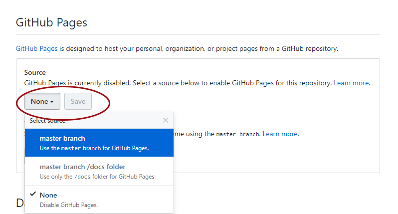
You are two clicks away from having a website with your tutorial! Now click on Settings and scroll down to the GitHub pages section. We need to enable the GitHub pages feature, which turns our index.md file into a page, i.e. website. Change Source from None to master - the master branch of our repository. Click on Save.
Your repository is now published as a website!
Scroll down to the GitHub pages section again - you can see the link for your tutorial! If you need to edit your tutorial, you can go back to your repository, select the index.md file, then click on Edit and make any necessary changes. You can also check out different themes for your website, though the default one is clean and tidy, which works well for coding and statistics tutorials in general.
2. Set up version control with GitHub and RStudio
What is version control?
Version control allows you to keep track of your work and helps you to easily explore what changes you have made, be it data, coding scripts, or manuscripts. You are probably already doing some type of version control, if you save multiple files, such as Dissertation_script_25thFeb.R, Dissertation_script_26thFeb.R, etc. This approach will leave you with tens, if not hundreds, of similar files, it makes it rather cumbersome to directly compare different versions, and is not easy to share among collaborators. What if by the time your supervisor/co-author has finished commenting on Dissertation_script_26thFeb.R, you are already on Dissertation_script_27thFeb.R? With version control software such as Git, version control is much smoother and easier to implement. Using an online platform like Github to store your files also means that you have an online back up of your work, so you won’t need to panic when your laptop dies or your files mysteriously disappear.
How does GitHub work?
__You make a repository (a folder that is under version control) and you have two copies of it - a local copy (on your computer) and a remote copy (online on GitHub). Repositories can be public or private. Github now provides free private repositories as standard with up to three collaborators.
The GitHub workflow can be summaried by commit-pull-push.
Commit
Once you’ve saved your files, you need to commit them - this means they are ready to go up on GitHub (the online copy of the repository).
Pull
Now you need to pull, i.e. make sure you are completely up to date with the online version of the files - other people could have been working on them even if you haven’t.
Push
Once you are up to date, you can push your changes - at this point in time your local copy and the online copy of the files will be the same.
When you open a fresh RStudio session and start working in a repository, especially when it’s a shared one, it’s a good idea to first pull, then you get the latest version of everything in the repo, and you can continue with the work you had planned. Pulling first can really minimise the amount of problems between users - e.g. you having to do something another person has already done, not working on the latest version, etc.
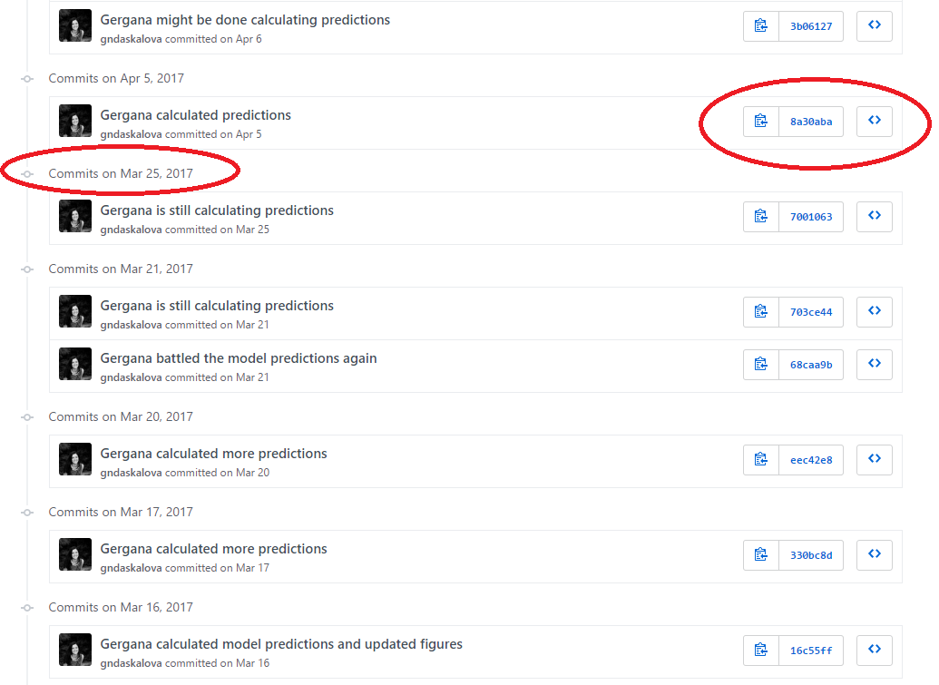
Each file on GitHub has a history, so instead of having many files like Dissertation_1st_May.R, Dissertation_2nd_May.R, you can have only one and by exploring its history, you can see what it looked at different points in time.
For example, here is the history for a script. You can see it took me a while to calculate those model predictions!
You can embed this workflow within RStudio using projects and enabling version control for them - we will be doing that shortly in the tutorial. You can use git through the command line, or through RStudio and/or GitHub desktop.
What are the benefits of using GitHub as a lab?
Having a GitHub repo for your lab makes it easy to keep track of collaborative and personal projects - all files necessary for certain analyses can be held together and people can add in their code, graphs, etc. as the projects develop. Each file on GitHub has a history, making it easy to explore the changes that occurred to it at different time points. You can review other people’s code, add comments on certain lines or the overall document, and suggest changes. For collaborative projects, GitHub allows you to assign tasks to different users, making it clear who is responsible for which part of the analysis. You can also ask certain users to review your code. Overall, GitHub presents a great opportunity to have an online back up copy of your work, whilst also doing version control, and it can also make it easier to discuss code, as well as write and edit code collaboratively.
Make a new GitHub repository and sync it with RStudio
What is a repository?
GitHub uses repositories - you can think of a repository (aka a repo) as a “master folder” - a repository can have folders within it, or be just separate files. In any case, a repository is what holds all of the files associated with a certain project that is version-controlled.
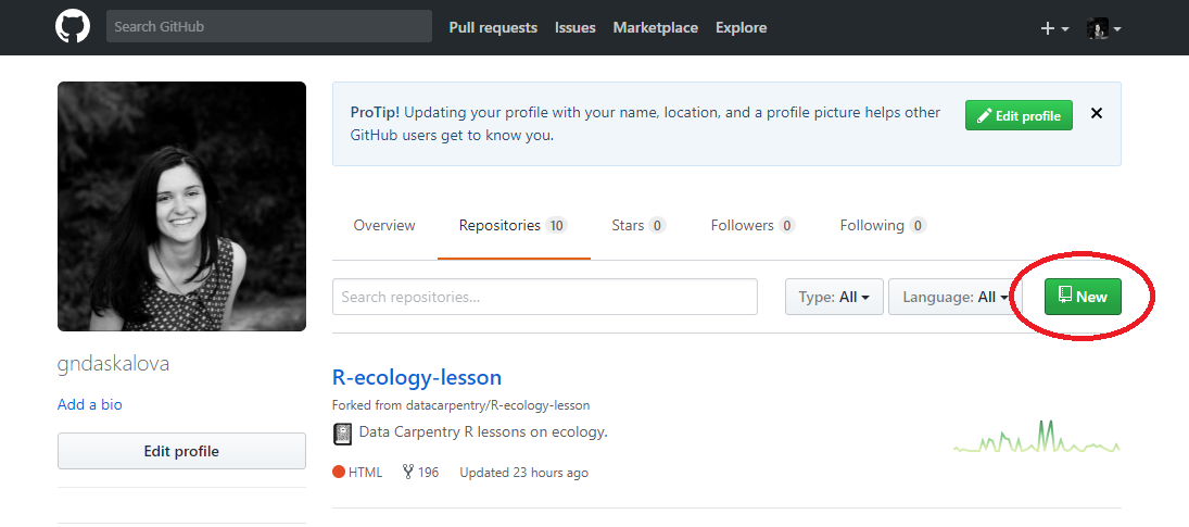
To make a repository, go to Repositories/New repository - choose a concise and informative name that has no spaces or funky characters in it. This can be your master repo that holds together past and ongoing research, data, scripts, manuscripts. Later on you might want to have more repositories - e.g. a repository associated with a particular project that you want to make public or a project where you are actively seeking feedback from a wide audience.
Click on Initialise repo with a README.md file. It’s common practice for each repository to have a README.md file, which contains information about the project/lab group, what is the purpose of the repository, as well as any comments on licensing and data sources. Github understands several text formats, among which .txt and .md. .md stands for a file written in Markdown - you might have used Markdown before from within RStudio to create reports of your code and its outputs. You can also use Markdown to write plain text files, for example the file you are reading now was written in Markdown.
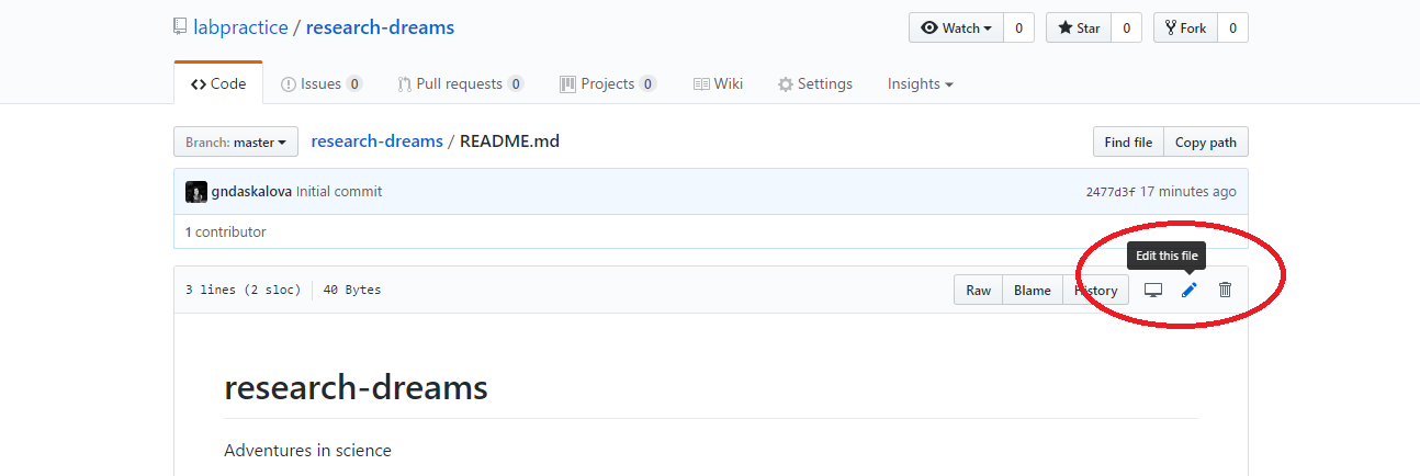
You can directly edit your README.md file on Github by clicking on the file and then selecting Edit this file.
Exercise 1: Write an informative README.md file
You can now write the README.md file for your repository. To make headings and subheadings, put hashtags before a line of text - the more hashtags, the smaller the heading will appear. You can make lists using - and numbers 1, 2, 3, etc..
Exercise 2: Writing a .gitignore file
In a file called .gitignore, you can specify which files you want git to ignore when users make changes and add files. Examples include temporary Word, Excel and Powerpoint files, .Rproj files, .Rhist files etc. You might also have gigantic files that are only stored on your local copy, e.g. if you are working in a group repository, other users might not need them and they’ll take up unnecessary space on their computers.
Go to Create new file and write a .gitignore file within the main repository (i.e. not in a subfolder). You need to call the file .gitignore and then add the types of files that Git should ignore on separate lines. You can make this specific to your needs, but as a start, you can copy over this code:
# Prevent users to commit their own RProject
.Rproj.user
.Rproj
# Prevent users to commit their own .Rhistory in mutual area
.Rhistory
.Rapp.history
# Temporary files
*~
~$*.doc*
~$*.xls*
*.xlk
~$*.ppt*
# Prevent mac users to commit .DS_Store files
*.DS_Store
# Prevent users to commit the README files created by RStudio
*README.html
*README_cache/
#*README_files/
Relative filepaths
Another reason why git is great is that you can use relative file paths - if the data are on your computer, and you have e.g. data <- read.csv("C:/user/Documents/bird_abundance.csv") in your code, only you will be able to read in that data, since that’s the filepath specific to your computer. But if you load the data from a repo using a relative filepath, every member of the repo (or you from e.g. your work computer and your laptop) can use it, e.g. data <- read.csv("data/bird_abundance.csv"), where data is a folder within the lab’s repo.
Sync your GitHub rep with RStudio
We are now ready to start using your repository - first you need to create a local (i.e. on your computer) copy of the repository and create an RStudio project for the repo.
Click Clone or download and copy the HTTPS link (that’s the one that automatically appears in the box).
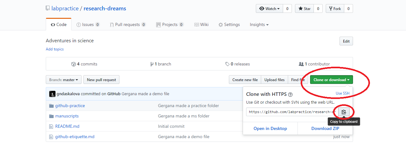
Now open RStudio, click File/ New Project/ Version control/ Git and paste the link you copied from Github. Select a directory on your computer - that is where the “local” copy of your repository will be (the online one being on Github).
On some Macs, RStudio will fail to find Git. To fix this, first make sure all your work is saved then close R Studio, open up a terminal window by going to Applications/Utilities/Terminal.app then install Homebrew by typing the following, then pressing Enter:
/usr/bin/ruby -e "$(curl -fsSL https://raw.githubusercontent.com/Homebrew/install/master/install)"
Now enter:
brew install git
and follow any instructions in the terminal window, you may need to enter your Mac’s password or agree to questions by typing yes. Now you should be able to go back to RStudio and repeat the steps above to clone the git repository. We can’t guarantee the above fix for Mac will work forever, some googling may be required.
Once the files have finished copying across, you will notice that a few things about your RStudio session have changed:
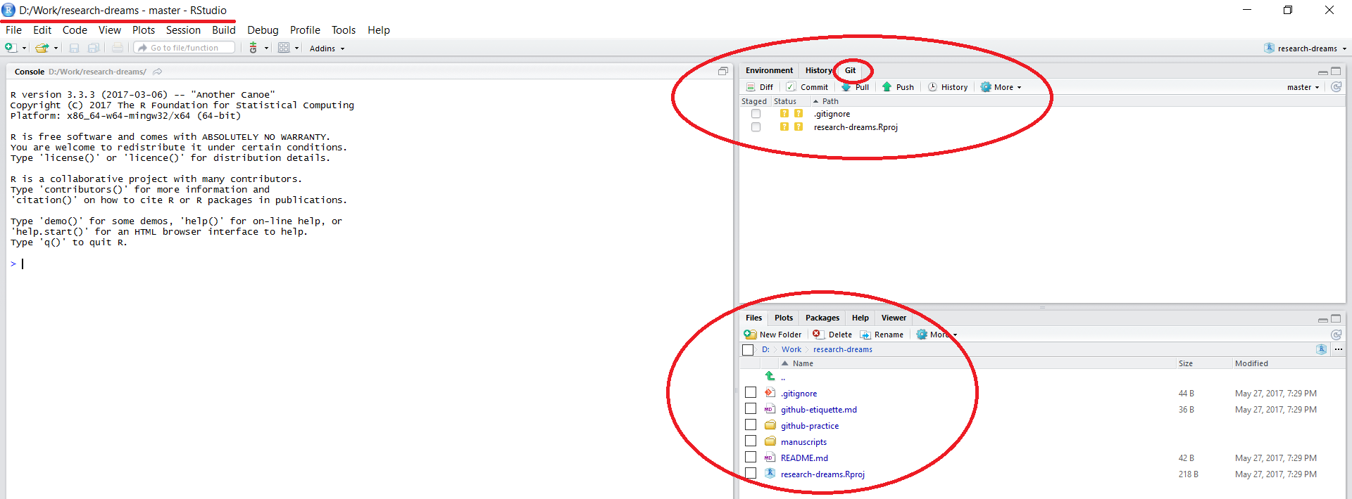
The working directory in the top left corner is set to your local copy of the repository. You can load in data using read.csv("data/your_file.csv") - this would load a .csv file in a folder called data within your lab’s repository - notice that there is no need to include the repository’s name - by setting up a RStudio project, you are already within it. Similarly, when saving files, you can specify the folder where you want them saved without the repository’s name.
There is a Git tab in the top right panel of RStudio. We will be doing our version control using the options within this tab.
All the files that were in the repository online are now on your computer as well.
Tell RStudio who you are on GitHub
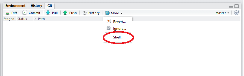
In the top right corner of the RStudio screen, click on More/Shell.
Copy the following code:
git config --global user.email your_email@example.com
# Add the email with which you registered on GitHub and click Enter

git config --global user.name "Your GitHub Username"
# Add your username and click Enter
If it worked fine, there will be no messages and you can close the shell window - you only need to do this once.
Make a new script file and go through commit - pull - push
Click on File/New file/R Script and type a one line comment like # This is a test file.. Save the file - you will see its name appear under the Git tab in the top right corner of the RStudio window. Click on the file, then on Commit, write a quick message and commit. Then click on Pull first and Push afterwards - given that you just made this repo, you’ll probably get a message saying you are all up to date when you pulled - this means that everything that is in the remote (online) copy is also on your local copy on your computer. After you’ve pushed, everything on your local copy will appear on the remote copy - if you go to your repository on GitHub, you’ll see your test file.
Potential problems
Sometimes you will see error messages as you try to commit-pull-push. Usually the error message identifies the problem and which file it’s associated with, if the message is more obscure, googling it is a good step towards solving the problem. When you google errors, you’ll often see little chunks of code you can run in the shell in RStudio or the command line/terminal - read carefully before you run them! For example, when the code includes hard reset - there is no going back - e.g. if you do a hard reset from the origin repo (the online version) this will overwrite the version on your local computer. If you haven’t pushed all your changes or recent work, they will disappear.
Code conflicts
While you were working on a certain part of a script, someone else was working on it, too. When you go through commit-pull-push, GitHub will make you decide which version you want to keep. This is called a code conflict, and you can’t proceed until you’ve resolved it. You will see arrows looking like >>>>>>>>> around the two versions of the code - delete the version of the code you don’t want to keep, as well as the arrows, and save the file. Then open the git shell, type git add path-to-your-file/your-file.R where you should replace the filepath with the one leading to the problem file. Then hit Enter and close the shell window. Now you should be able to commit again without issues.
When there are code conflicts in collaborative repositories, communication and respect are both very important - you wouldn’t want to hurt someone else’s work. If it comes to deciding which version of a file to keep, might be best to get in touch with the person who is also working on the same file before you take any drastic measures. You could save your own version as a separate file, too, which avoids another person’s work getting overwritten.
Contribute to an existing repo & get set up for the tidyverse tutorial
Log into your Github account and navigate to the repository for this workshop . You downloaded the files earlier, but they are not currently under version control or set up as a project in RStudio. We will do this now. Click Fork in the top right corner of the screen - this means you are making a copy of this repository to your own Github account - think of it as a working copy.
This is a tiny repo, so forking it will only take a few seconds, note that when working with lots of data, it can take a while. Once the forking is done, you will be automatically redirected to your forked copy of the CC-7-Github repo. Notice that now the repo is located within your own Github account - e.g. where you see “gndaskalova”, you should see your name.
Click Clone or download and copy the HTTPS link.
Now open RStudio, click File/ New Project/ Version control/ Git and paste the HTTPS link into the Repository URL:. You can have more than one RStudio project and you can have multiple RStudio windows open with a project each - e.g. if you go to File/Recent projects, you should see the project you made earlier.
What is the difference between forking and cloning?
If you had just cloned the tidyverse repository (i.e. copying the HTTPS link of the original repository that is hosted on the Coding Club account), then the repository still remains associated with the Coding Club account - then everyone reading this tutorial would have been working in the same repository. In this case, we thought it would be nice if everyone has their own space, i.e. one working copy per person, so that’s why you fork the repo first, which gives you a copy hosted on your account, and that is the copy you clone to your computer.
You are now all set up for the tidyverse tutorial!
3. Analyse and visualise data using the tidyverse
Learning Objectives
PART 1: Intro to the tidyverse
How to analyse population change of forest vertebrates
- How to write a custom
ggplot2function - How to use
gather()andspread()from thetidyrpackage - How to parse numbers using
parse_number()from thereadrpackage - How to use the
distinct()function fromdplyr - How to use the
filter()function fromdplyr - How to use the
mutate()function fromdplyr - How to use the
summarise()/summarize()function fromdplyr - How to use the
tidy()function from thebroompackage to summarise model results - How to use the
select()function fromdplyr
In this tutorial, we will focus on how to efficiently format, manipulate and visualise large datasets. We will use the tidyr and dplyr packages to clean up data frames and calculate new variables. We will use the broom and purr packages to make the modelling of thousands of population trends more efficient. We will use the ggplot2 package to make graphs, maps of occurrence records, and to visualise ppulation trends and then we will arrange all of our graphs together using the gridExtra package.
We will be working with population data from the Living Planet Database and red deer occurrence data from the Global Biodiversity Information Facility, both of which are publicly available datasets.
First, we will model population change for vertebrate forest species to see whether greater population change is found for longer duration studies.
Because we have created a version-controlled R project using the repository for the workshop, we are already in the right working directory, i.e. the folder that contains all the data and other files, thus there is no need for us to set a working directory at the start of the script, unless we explicitly want to change it for some reason.
Here are the packages we need. Note that not all tidyverse packages load automatically with library(tidyverse) - only the core ones do, so you need to load broom separately. If you don’t have some of the packages installed, you can install them using ìnstall.packages("package-name").
# Packages ----
library(tidyverse)  # Hadley Wickham's tidyverse - the theme of this tutorial
library(broom)  # To summarise model outputs
library(ggExtra)  # To make pretty graphs - addon package to ggplot2
library(maps)  # To make pretty maps - warning: maps masks map from purr!
library(RColorBrewer)  # To make pretty colours
library(gridExtra)  # To arrange multi-plot panels
If you’ve ever tried to perfect your ggplot2 graphs, you might have noticed that the lines starting with theme() quickly pile up: you adjust the font size of the axes and the labels, the position of the title, the background colour of the plot, you remove the grid lines in the background, etc. And then you have to do the same for the next plot, which really increases the amount of code you use. Here is a simple solution: create a customised theme that combines all the theme() elements you want and apply it to your graphs to make things easier and increase consistency. You can include as many elements in your theme as you want, as long as they don’t contradict one another and then when you apply your theme to a graph, only the relevant elements will be considered - e.g. for our graphs we won’t need to use legend.position, but it’s fine to keep it in the theme in case any future graphs we apply it to do have the need for legends.
# Setting a custom ggplot2 function ---
# *** Functional Programming ***
# This function makes a pretty ggplot theme
# This function takes no arguments!
theme_LPD <- function(){
  theme_bw()+
    theme(axis.text.x = element_text(size = 12, vjust = 1, hjust = 1),
          axis.text.y = element_text(size = 12),
          axis.title.x = element_text(size = 14, face = "plain"),
          axis.title.y = element_text(size = 14, face = "plain"),
          panel.grid.major.x = element_blank(),
          panel.grid.minor.x = element_blank(),
          panel.grid.minor.y = element_blank(),
          panel.grid.major.y = element_blank(),
          plot.margin = unit(c(0.5, 0.5, 0.5, 0.5), units = , "cm"),
          plot.title = element_text(size = 20, vjust = 1, hjust = 0.5),
          legend.text = element_text(size = 12, face = "italic"),
          legend.title = element_blank(),
          legend.position = c(0.5, 0.8))
}
Load population trend data
The data are in a .RData format, as those are quicker to use, since .Rdata files are more compressed. Of course, a drawback is that .RData files can only be used within R, whereas .csv files are more transferable.
# Load data ----
load("LPDdata_Feb2016.RData")

# Inspect data ----
head(LPDdata_Feb2016)
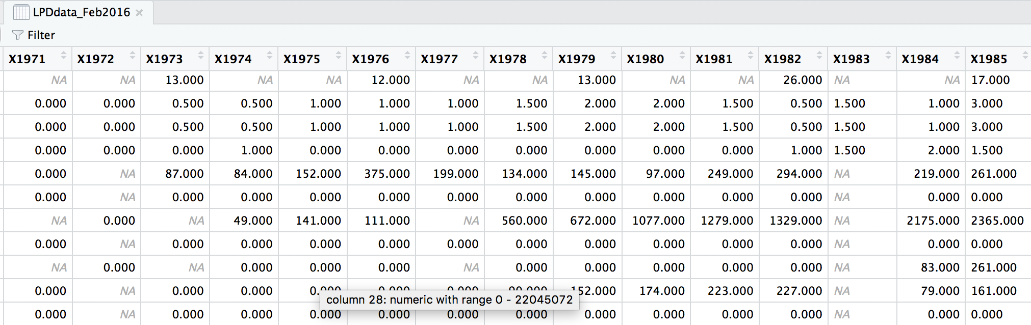
At the moment, each row contains a population that has been monitored over time and towards the right of the data frame there are lots of columns with population estimates for each year. To make this data “tidy” (one column per variable) we can use gather() to transform the data so there is a new column containing all the years for each population and an adjacent column containing all the population estimates for those years.
This takes our original dataset LPIdata_Feb2016 and creates a new column called year, fills it with column names from columns 26:70 and then uses the data from these columns to make another column called pop.
# Format data for analysis ----

# Transform from wide to long format usign gather (opposite is spread)
# *** gather() function from the dplyr package in the tidyverse ***
LPD_long <- gather(data = LPDdata_Feb2016, key = "year", value = "pop", select = 26:70)
Because column names are coded in as characters, when we turned the column names (1970, 1971, 1972, etc.) into rows, R automatically put an X in front of the numbers to force them to remain characters. We don’t want that, so to turn year into a numeric variable, use the parse_number() function from the readr package. We can also make all the column names lowercase and remove some of the funky characters in the country column - strange characters mess up things in general, e.g. when you want to save files, push them to GitHub, etc.
# Get rid of the X in front of years
# *** parse_number() from the readr package in the tidyverse ***
LPD_long$year <- parse_number(LPD_long$year)

# Rename variable names for consistency
names(LPD_long)
names(LPD_long) <- tolower(names(LPD_long))
names(LPD_long)

# Create new column with genus and species together
LPD_long$species.name <- paste(LPD_long$genus, LPD_long$species, sep = " ")

# Get rid of strange characters like " / "
LPD_long$country.list <- gsub(",", "", LPD_long$country.list, fixed = TRUE)
LPD_long$biome <- gsub("/", "", LPD_long$biome, fixed = TRUE)

# Examine the tidy data frame
head(LPD_long)
Now that our dataset is tidy we can get it ready for our analysis. We want to only use populations that have more than 5 years of data to make sure our analysis has enough data to capture population change. We should also scale the population data, because since the data come from many species, the units and magnitude of the data are very different - imagine tiny fish whose abundance is in the millions, and large carnivores whose abundance is much smaller. Scaling also normalises the data, as later on we will be using linear models assuming a normal distribution. To do all of this in one go, we can use pipes.
Pipes (%>%) are a way of streamlining data manipulation - imagine all of your data coming in one end of the pipe, while they are in there, they are manipulated, summarised, etc., then the output (e.g. your new data frame or summary statistics) comes out the other end of the pipe. At each step of the pipe processing, the pipe is using the output of the previous step.
# Data manipulation ----

# *** piping from from dplyr
LPD_long2 <- LPD_long %>%
  # Remove duplicate rows
  # *** distinct() function from dplyr
  distinct(LPD_long) %>%
  # remove NAs in the population column
  # *** filter() function from dplyr
  filter(is.finite(pop)) %>%
  # Group rows so that each group is one population
  # *** group_by() function from dplyr
  group_by(id) %>%
  # Make some calculations
  # *** mutate() function from dplyr
  mutate(maxyear = max(year), minyear = min(year),
         # Calculate duration
         duration = maxyear - minyear,
         # Scale population trend data
         scalepop = (pop - min(pop))/(max(pop) - min(pop))) %>%
  # Keep populations with >5 years worth of data and calculate length of monitoring
  filter(is.finite(scalepop),
         length(unique(year)) > 5) %>%
  # Remove any groupings you've greated in the pipe
  ungroup()
Now we can explore our data a bit. Let’s create a few basic summary statistics for each biome and store them in a new data frame:
# Calculate summary statistics for each biome
LPD_biome_sum <- LPD_long2 %>%
  # Group by biome
  group_by(biome) %>%
  # Create columns, number of populations
  #  *** summarise()/summarize() function from dplyr in the tidyverse ***
  summarise(populations = n(),
            # Calculate the mean study length
            mean_study_length_years = mean(duration),
            # Model sampling method
            dominant_sampling_method = names(which.max(table(sampling.method))),
            # Model unit type
            dominant_units = names(which.max(table(units)))) %>%
  # Remove any groupings you've greated in the pipe
  ungroup()

# Take a look at some of the records
head(LPD_biome_sum)
Next we will explore how populations from two of these biomes, temperate coniferous and temperate broadleaf forests, have changed over the monitoring duration. We will make the biome variable a factor (before it is just a character variable), so that later on we can make graphs based on the two categories (coniferous and broadleaf forests). We’ll use the filter() function from dplyr to subset the data to just the forest species.
# Subset to just temperate forest species -----
  # Notice the difference between | and & when filtering
  # | is an "or" whereas & is "and", i.e. both conditions have to be met
  # at the same time
LPD_long2$biome <- as.factor(LPD_long2$biome)
LPD.forest <- filter(LPD_long2, biome == "Temperate broadleaf and mixed forests" |
                                      biome == "Temperate coniferous forests")
Before running models, it’s a good idea to visualise our data to explore what kind of distribution we are working with.
The gg in ggplot2 stands for grammar of graphics. Writing the code for your graph is like constructing a sentence made up of different parts that logically follow from one another. In a data visualisation context, the different elements of the code represent layers - first you make an empty plot, then you add a layer with your data points, then your measure of uncertainty, the axis labels and so on.
When using ggplot2, you usually start your code with ggplot(your_data, aes(x = independent_variable, y = dependent_variable)), then you add the type of plot you want to make using + geom_boxplot(), + geom_histogram(), etc. aes stands for aesthetics, hinting to the fact that using ggplot2 you can make aesthetically pleasing graphs - there are many ggplot2 functions to help you clearly communicate your results, and we will now go through some of them.
When we want to change the colour, shape or fill of a variable based on another variable, e.g. colour-code by species, we include colour = species inside the aes() function. When we want to set a specific colour, shape or fill, e.g. colour = "black", we put that outside of the aes() function.
We will see our custom theme theme_LPD() in action as well!
# Data visualisation ----
# Data distribution - a histogram
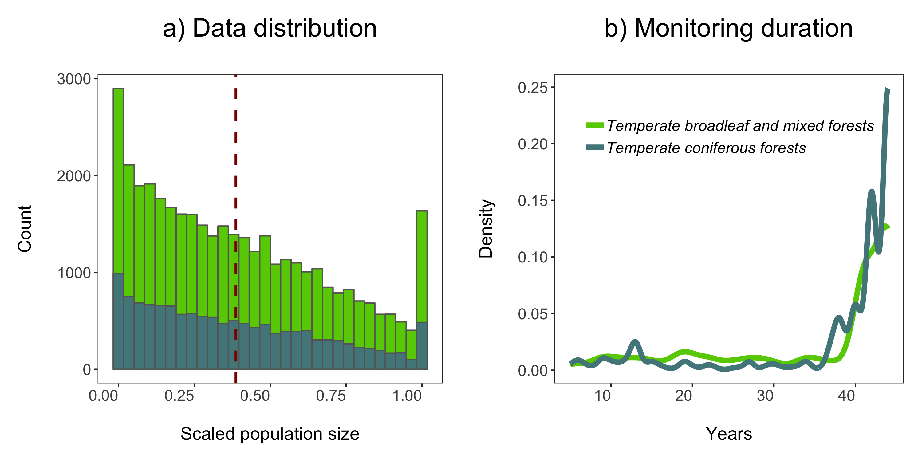
(forest.hist <- ggplot(LPD.forest, aes(x = scalepop)) +
geom_histogram(aes(fill = biome),
position = "identity", colour = "grey40") +
geom_vline(aes(xintercept = mean(scalepop)), # Adding a line for mean abundance
colour = "darkred", linetype = "dashed", size = 1) +
scale_fill_manual(values = c("#66CD00", "#53868B")) +
theme_LPD() +
labs(title = "a) Data distribution\n") +
guides(fill = F)) # Hiding the legend - this will be a two plot panel
# thus we don't need the same legend twice
Note that putting your entire ggplot code in brackets () creates the graph and then shows it in the plot viewer. If you don’t have the brackets, you’ve only created the object, but haven’t visualized it. You would then have to call the object such that it will be displayed by just typing forest.hist after you’ve created the “forest.hist” object.
Next up we can explore for how long populations have been monitored in the two biomes using a density histogram.
# Density histogram of duration of studies in the two biomes
(duration.forests <- ggplot(LPD.forest, aes(duration, colour = biome)) +
   stat_density(geom = "line", size = 2, position = "identity") +
   theme_LPD() +
   scale_colour_manual(values = c("#66CD00", "#53868B")) +
   labs(x = "\nYears", y = "Density\n", title = "b) Monitoring duration\n"))
We’ll use the grid.arrange function from the gridExtra package to combine the two plots in a panel. You can specify the number of columns using ncol = and the number of rows using nrow =.
# Arrange in a panel and save
forest.panel <- grid.arrange(forest.hist, duration.forests, ncol = 2)
ggsave(forest.panel, file = "forest_panel.png", height = 5, width = 10)
We are now ready to model how each population has changed over time. There are 1785 populations, so with this one code chunk, we will run 1785 models and tidy up their outputs. You can read through the line-by-line comments to get a feel for what each line of code is doing.
One specific thing to note is that when you add the lm() function in a pipe, you have to add data = ., which means use the outcome of the previous step in the pipe for the model.
# Calculate population change for each forest population
# 1785 models in one go!
# Using a pipe
forest.slopes <- LPD.forest %>%
  # Group by the key variables that we want to interate over
  group_by(decimal.latitude, decimal.longitude, class, species.name, id, duration, location.of.population) %>%
  # Create a linear model for each group
  do(mod = lm(scalepop ~ year, data = .)) %>%
  # Extract model coefficients using tidy() from the
  # *** tidy() function from the broom package ***
  tidy(mod) %>%
  # Filter out slopes and remove intercept values
  filter(term == "year") %>%
  # Get rid of the column term as we don't need it any more
  #  *** select() function from dplyr in the tidyverse ***
  dplyr::select(-term) %>%
  # Remove any groupings you've greated in the pipe
  ungroup()
We are ungrouping at the end of our pipe just because otherwise the object remains grouped and later on that might cause problems, if we forget about it.
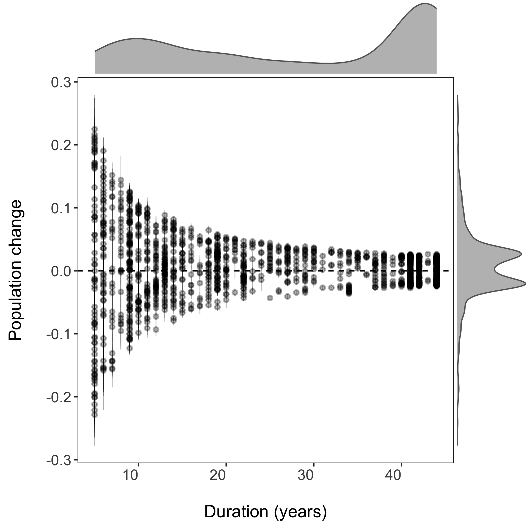
Now we can visualise the outputs of all our models and see how they vary based on study duration. We will add density histograms along the margins of the graph which makes for a more informative graph using the ggMarginal() function from the ggExtra package. Note that ggExtra is also an addin in RStudio, so for future reference, if you select some ggplot2 code, then click on Addins/ggplot2 Marginal plots (the menu is in the middle top part of the screen), you can customise marginal histograms and the code gets automatically generated.
# Visualising model outputs ----

# Plotting slope estimates and standard errors for all populations and adding histograms along the margins
(all.slopes <- ggplot(forest.slopes, aes(x = duration, y = estimate)) +
         geom_pointrange(aes(ymin = estimate - std.error,
                             ymax = estimate + std.error),
                         alpha = 0.3, size = 0.3) +
         geom_hline(yintercept = 0, linetype = "dashed") +
         theme_LPD() +
         ylab("Population change\n") +
         xlab("\nDuration (years)"))

(density.slopes <- ggExtra::ggMarginal(
  p = all.slopes,
  type = 'density',
  margins = 'both',
  size = 5,
  col = 'gray40',
  fill = 'gray'
))

# Save the plot
ggsave(density.slopes, filename = "slopes_duration.png", height = 6, width = 6)
PART 2: Using pipes to make figures with large datasets
How to print plots of population change for multiple taxa
- How to set up file paths and folders in R
- How to use a pipe to plot many plots by taxa
- How to use the purrr package and functional programming
In the next part of the tutorial, we will focus on automating iterative actions, for example when we want to create the same type of graph for different subsets of our data. In our case, we will make histograms of the population change experienced by different vertebrate taxa in forests. When making multiple graphs at once, we have to specify the folder where they will be saved first:
# PART 2: Using pipes to make figures with large datasets ----

# Make histograms of slope estimates for each taxa -----
# Set up new folder for figures
# Set path to relevant path on your computer/in your repository
path1 <- "Taxa_Forest_LPD/"
# Create new folder
dir.create(path1)
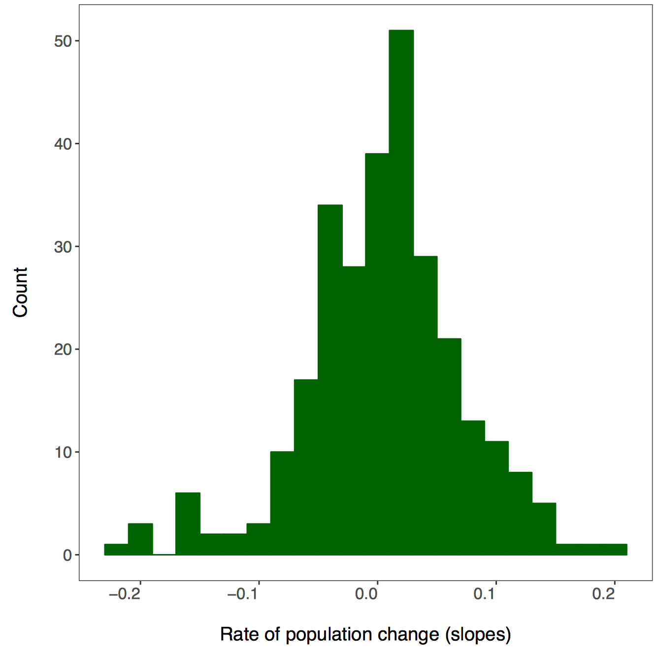
There isn’t a right answer here, there are different ways to achieve the same result and you can decide which one works best for your workflow. First we will use dplyr and pipes %>%. Since we want one graph per taxa, we are going to group by the class variable. You can add functions that are not part of the dplyr package to pipes using do - in our case, we are saying that we want R to do our requested action (making and saving the histograms) for each taxa.
# First we will do this using dplyr and a pipe

forest.slopes %>%
# Select the relevant data
dplyr::select(id, class, species.name, estimate) %>%
# Group by taxa
group_by(class) %>%
# Save all plots in new folder
do(ggsave(ggplot(., aes(x = estimate)) +
            # Add histograms
            geom_histogram(colour = "darkgreen", fill = "darkgreen", binwidth = 0.02) +
            # Use custom theme
            theme_LPD() +
            # Add axis lables
            xlab("Rate of population change (slopes)"),
            # Set up file names to print to
            filename = gsub("", "", paste0(path1, unique(as.character(.$class)),
                                          ".pdf")), device = "pdf"))
A warning message pops up: Error: Results 1, 2, 3, 4 must be data frames, not NULL - you can ignore this, it’s because the do() function expects a data frame as an output, but in our case we are making graphs, not data frames.
If you go check out your folder now, you should see four histograms, one per taxa:
Another way to make all those histograms in one go is by creating a function for it. In general, whenever you find yourself copying and pasting lots of code only to change the object name, you’re probably in a position to swap all the code with a function - you can then apply the function using the purrr package.
But what is purrr? It is a way to “map” or “apply” functions to data. Note that there are functions from other packages also called map(), which is why we are specifying we want the map() function from the purrr package. Here we will first format the data taxa.slopes and then we will map it to the mean fuction:
We have to change the format of the data, in our case we will split the data using spread() from the tidyr package.
# Here we select the relevant data
# Let's get rid of the other levels of 'class'
forest.slopes$class <- as.character(forest.slopes$class)
# Selecting the relevant data and splitting it into a list
taxa.slopes <- forest.slopes %>%
  dplyr::select(id, class, estimate) %>%
  spread(class, estimate) %>%
  dplyr::select(-id)
We can apply the mean function using purrr::map():
taxa.mean <- purrr::map(taxa.slopes, ~mean(., na.rm = TRUE))
# This plots the mean population change per taxa
taxa.mean
Now we can write our own function to make histograms and use the purrr package to apply it to each taxa.
### Intro to the purrr package ----

# First let's write a function to make the plots
# *** Functional Programming ***
# This function takes one argument x, the data vector that we want to make a histogram
plot.hist <- function(x) {
  ggplot() +
  geom_histogram(aes(x), colour = "darkgreen", fill = "darkgreen", binwidth = 0.02) +
  theme_LPD() +
  xlab("Rate of population change (slopes)")
}
Now we can use purr to “map” our figure making function. The first input is your data that you want to iterate over and the second input is the function.
taxa.plots <- purrr::map(taxa.slopes, ~plot.hist(.))
# We need to make a new folder to put these figures in
path2 <- "Taxa_Forest_LPD_purrr/"
dir.create(path2)
First we learned about map() when there is one dataset, but there are other purrr functions,too.
walk2() takes two arguments and returns nothing. In our case we just want to print the graphs, so we don’t need anything returned. The first argument is our file path, the second is our data and ggsave is our function.
# *** walk2() function in purrr from the tidyverse ***
walk2(paste0(path2, names(taxa.slopes), ".pdf"), taxa.plots, ggsave)
PART 3: Downloading and mapping data from large datasets
Map the distribution of a forest vertebrate species and the location of monitored populations
- How to download GBIF records
- How to map occurence data and populations
- How to make a custom function for plotting figures
In this part of the tutorial, we will focus on one particular species, red deer (Cervus elaphus), where it has been recorded around the world, and where it’s populations are being monitored. We will use occurrence data from the Global Biodiversity Information Facility which we will download in R using the rgbif package.
Occurrence data can be messy and when you are working with thousands of records, not all of them might be valid records. If you are keen to find out how to test the validity of geographic coordinates using the CoordinateCleaner package, check out our tutorial here.
### PART 3: Downloading and mapping data from large datasets ----
#### How to map distributions and monitoring locations for one or more taxa

# Packages ----
library(rgbif)  # To extract GBIF data
# library(CoordinateCleaner)  # To clean coordinates if you want to explore that later
library(gridExtra)  # To make pretty graphs
library(ggrepel)  # To add labels with rounded edges
library(png)  # To add icons
library(mapdata)  # To plot maps
library(ggthemes)  # To make maps extra pretty
We are limiting the number of records to 5000 for the sake of time - in the future you can ask for more records as well, there’s just a bit of waiting involved. The records come with a lot of metadata. For our purposes, we will select just the columns we need. Similar to how before we had to specify that we want the map() function from the purrr package, there are often other select() functions, so we are saying that we want the one from dplyr using dplyr::select(). Otherwise, the select() function might not work because of a conflict with another select() function from a different package, e.g. the raster packge.
# Download species occurrence records from the Global Biodiversity Information Facility
# *** rgbif package and the occ_search() function ***
# You can increase the limit to get more records - 5000 takes a couple of minutes
deer.locations <- occ_search(scientificName = "Cervus elaphus", limit = 5000,
                             hasCoordinate = TRUE, return = "data") %>%
                  # Simplify occurrence data frame
                  dplyr::select(key, name, decimalLongitude,
		                decimalLatitude, year,
				individualCount, country)
Next we will extract the red deer population data - the raw time series and the slopes of population change from the two data frames.
# Data formatting & manipulation ----

# Filter out population data for chosen species - red deer
deer.data <- LPD_long2 %>%
  filter(species.name == "Cervus elaphus") %>%
  dplyr::select(id, species.name, location.of.population, year, pop)

# Filter out population estimates for chosen species - red deer
deer.slopes <- forest.slopes %>%
  filter(species.name == "Cervus elaphus")
In addition to making histograms, scatterplots and such, you can use ggplot2 to make maps as well - the maps come from the mapdata package we loaded earlier. In this map, we want to visualise information from two separate data frames - where the species occurs (deer.locations, the GBIF data) and where it is monitored (deer.slopes, the Living Planet Database data). We can combine this information in the same ggplot2 code chunk using the geom_point() function twice - the first time it will plot the occurrences since that the data frame associated with the plot in the very first line, and the second time we’ve told the function to specifically use the deer.slopes object using data = deer.slopes.
As you start making your maps, you may get this warning message:
Warning message:
In drawGrob(x) : reached elapsed time limit
We are working with thousands of records, so depending on your computer, making the map might take a while. This message doesn’t mean something is wrong, just lets you know that generating the map took a bit longer than what RStudio expected.
# Make an occurrence map and include the locations of the populations part of the Living Planet Database
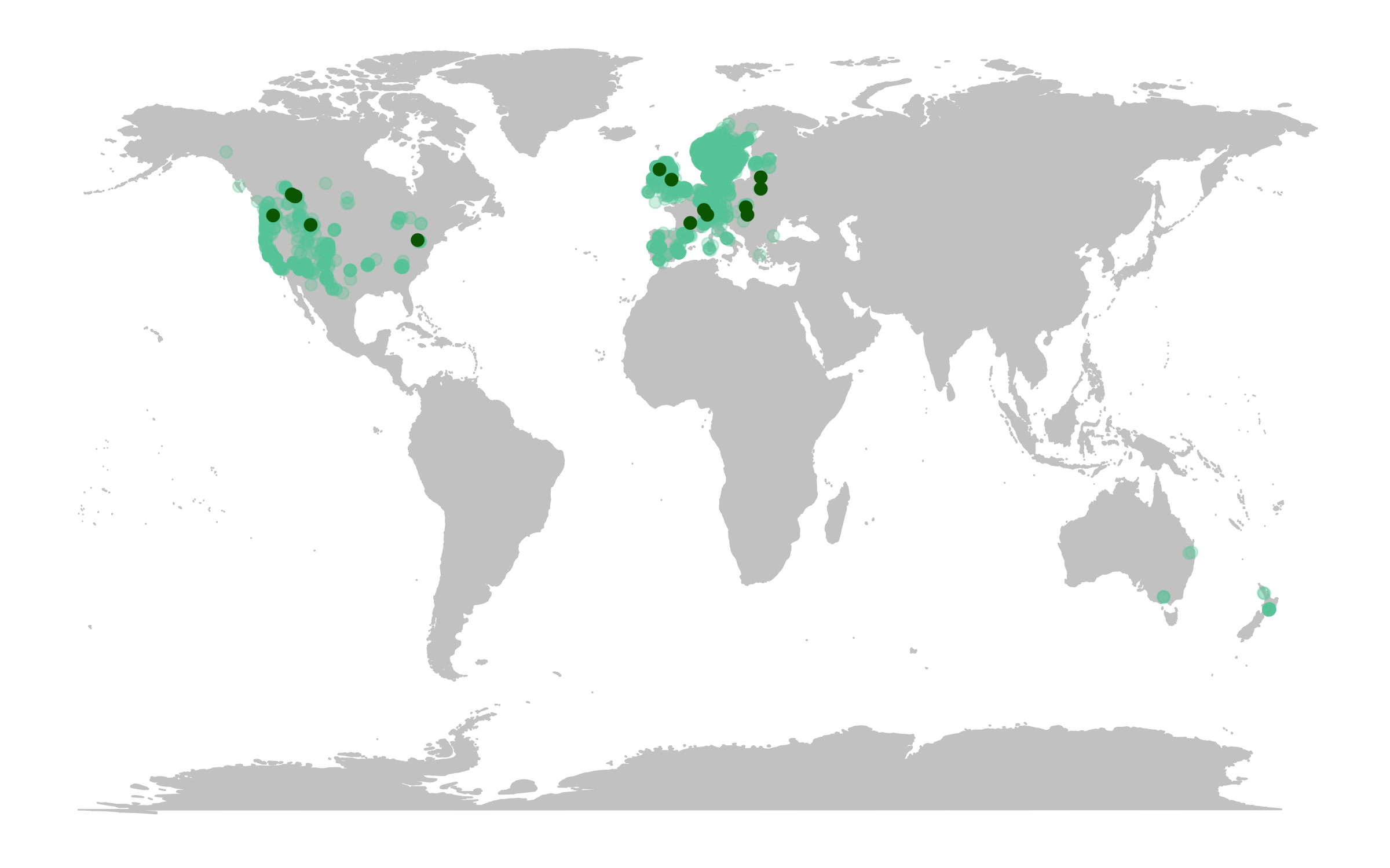
(deer.map.LPD <- ggplot(deer.locations, aes(x = decimalLongitude, y = decimalLatitude)) +
# Add map data
borders("world", colour = "gray80", fill = "gray80", size = 0.3) +
# Use custom map theme from ggthemes package
theme_map() +
# Add the points from the population change data
geom_point(alpha = 0.3, size = 2, colour = "aquamarine3") +
# Specify where the data come from when plotting from more than one data frame using data = ""
geom_point(data = deer.slopes, aes(x = decimal.longitude, y = decimal.latitude),
size = 2, colour = "darkgreen"))
The map already looks fine, but we can customise it further to add more information. For example, we can add labels for the locations of some of the monitored populations and we can add plots of population change next to our map.
First we will rename some of the populations, just so that our labels are not crazy long, using the recode() function from the dplyr package.
# Customising map to make it more beautiful ----

# Check site names
print(deer.slopes$location.of.population)

# Beautify site names
deer.slopes$location.of.population <- recode(deer.slopes$location.of.population,
                                             "Northern Yellowstone National Park"
					     = "Yellowstone National Park")
deer.slopes$location.of.population <- recode(deer.slopes$location.of.population,
                                             "Mount Rainier National Park, USA"
					     = "Mount Rainier National Park")
deer.slopes$location.of.population <- recode(deer.slopes$location.of.population,
                                             "Bow Valley - eastern zone, Banff National Park, Alberta" =
					     "Banff National Park, Alberta")
deer.slopes$location.of.population <- recode(deer.slopes$location.of.population,
                                             "Bow Valley - western zone, Banff National Park, Alberta" =
					     "Banff National Park, Alberta")
deer.slopes$location.of.population <- recode(deer.slopes$location.of.population,
                                             "Bow Valley - central zone, Banff National Park, Alberta" =
					     "Banff National Park, Alberta")
deer.slopes$location.of.population <- recode(deer.slopes$location.of.population,
                                             "Study area within Bow Valley, Banff National Park, Alberta" =
					     "Banff National Park, Alberta")
deer.slopes$location.of.population <- recode(deer.slopes$location.of.population,
                                             "Bow Valley watershed of Banff National Park, Alberta" =
					     "Banff National Park, Alberta")
You can also use ggplot2 to add images to your graphs, so here we will add a deer icon.
# Load packages for adding images
packs <- c("png","grid")
lapply(packs, require, character.only = TRUE)

# Load red deer icon
icon <- readPNG("reddeer.png")
icon <- rasterGrob(icon, interpolate = TRUE)
We can update our map by adding labels and our icon - this looks like a gigantic chunk of code, but we’ve added line by line comments so that you can see what’s happening at each step. The ggrepel package adds labels whilst also aiming to avoid overlap and as a bonus, the labels have rounded edges.
# Update map
# Note - this takes a while depending on your computer
(deer.map.final <- ggplot(deer.locations, aes(x = decimalLongitude, y = decimalLatitude)) +
# For more localized maps use "worldHires" instead of "world"
borders("world", colour = "gray80", fill = "gray80", size = 0.3) +
theme_map() +
geom_point(alpha = 0.3, size = 2, colour = "aquamarine3") +
# We are specifying the data frame for the labels - one site has three monitored populations
# but we only want to label it once so we are subsetting using data = deer.slopes[c(2, 4, 5, 9),]
# to get only the first rows number 2, 4, 5 and 9
geom_label_repel(data = deer.slopes[c(2, 4, 5, 9),], aes(x = decimal.longitude, y = decimal.latitude,
label = location.of.population),
box.padding = 1, size = 5, nudge_x = 1,
# We are specifying the size of the labels and nudging the points so that they
# don't hide data points, along the x axis we are nudging by one
min.segment.length = 0, inherit.aes = FALSE) +
# We can recreate the shape of a dropped pin by overlaying a circle and a triangle
geom_point(data = deer.slopes, aes(x = decimal.longitude, y = decimal.latitude + 0.6),
size = 4, colour = "darkgreen") +
geom_point(data = deer.slopes, aes(x = decimal.longitude, y = decimal.latitude - 0.3),
size = 3, fill = "darkgreen", colour = "darkgreen", shape = 25) +
# Adding the icon using the coordinates on the x and y axis
annotation_custom(icon, xmin = -210, xmax = -100, ymin = -60 , ymax = -30) +
# Adding a title
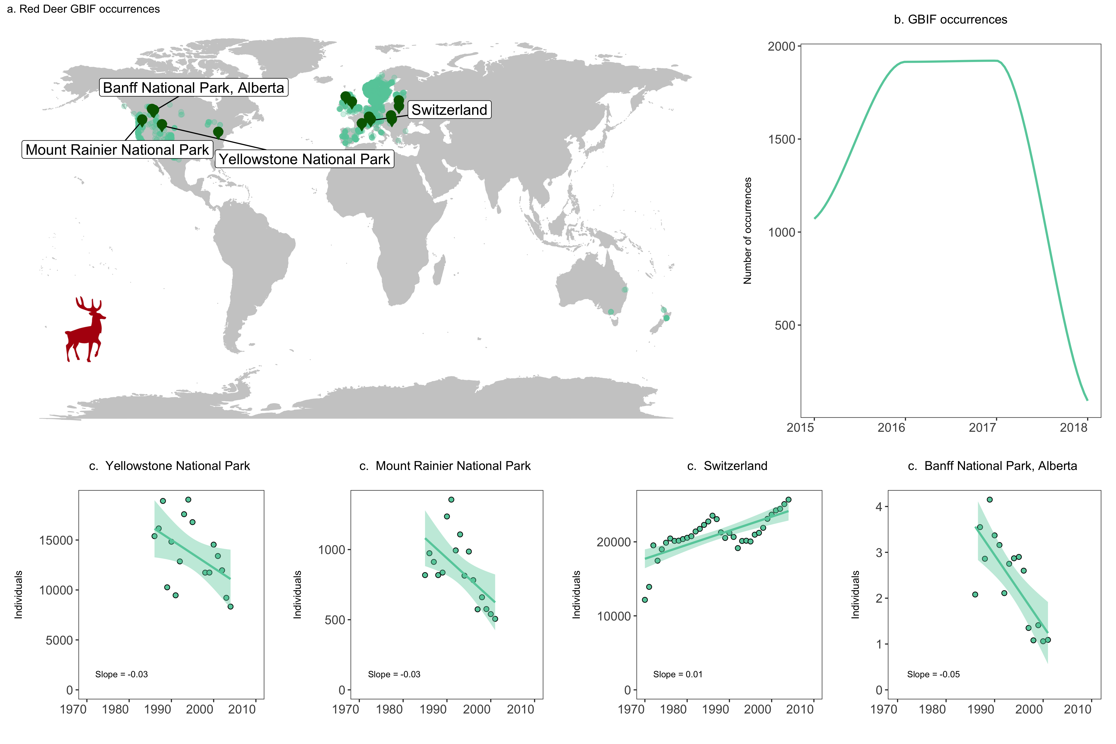
labs(title = "a. Red Deer GBIF occurrences", size = 12))
Let’s add some additional plots to our figure, for example how many occurrences there are for each year.
# Visualise the number of occurrence records through time ----
# This plot is more impressive if you have downloaded more records
# as GBIF downloads the most recent records first
yearly.obs <- deer.locations %>% group_by(year) %>% tally() %>% ungroup() %>% filter(is.na(year) == FALSE)

(occurrences <- ggplot(yearly.obs, aes(x = year, y = n)) +
    geom_smooth(colour = "aquamarine3", method = 'loess', size = 1) +
    labs(x = NULL, y = "Number of occurrences\n",
         title = "b. GBIF occurrences\n", size = 12) +
    # Use our customised theme, saves many lines of code!
    theme_LPD() +
    # if you want to change things about your theme, you need to include the changes after adding the theme
    theme(plot.title = element_text(size = 12), axis.title.y = element_text(size = 10)))
We can add plots that show the population trends for those populations we’ve labelled. Given that we will be doing the same thing for multiple objects (the same type of plot for each population), we can practice functional programming and using purrr again here. The function looks very similar to a normal ggplot2 code chunk, except we’ve wrapped it up in a function and we are not using any specific objects, just x, y and z as the three arguments the function needs.
# Visualise population trends ----
# Visualising the population trends of four deer populations

# Let's practice functional programming here
# *** Functional Programming ***
# Let's make a function to make the population trend plots
# First we need to decide what values the function needs to take
# x - The population data
# y - the slope value
# z - the location of the monitoring
# This function needs to take three arguments

# Let's make the ggplot function
pop.graph <- function(x, y, z) {
  # Make a ggplot graph with the 'x'
  ggplot(x, aes(x = year, y = pop)) +
  # Shape 21 chooses a point with a black outline filled with aquamarine
  geom_point(shape = 21, fill = "aquamarine3", size = 2) +
  # Adds a linear model fit, alpha controls the transparency of the confidence intervals
  geom_smooth(method = "lm", colour = "aquamarine3", fill = "aquamarine3", alpha = 0.4) +
  # Add the monitoring location 'y' into the plot
  labs(x = "", y = "Individuals\n", title = paste("c. ", y, "\n"), size = 7) +
  # Set the y limit to the maximum population for each 'x'
  ylim(0, max(x$pop)) +
  # Set the x limit to the range of years of data
  xlim(1970, 2010) +
  # Add the slope 'y' into the plot
  annotate("text", x = 1972, y = 0,  hjust = 0, vjust = -2, label = paste("Slope =", z), size = 3) +
  theme_LPD() +
  theme(plot.title = element_text(size=12), axis.title.y = element_text(size=10))
}
We will focus on four populations in the USA, Switzerland and Canada. We will make three objects for each population, which represent the three arguments the function takes - the population data, the slope value and the location of the population. Then we will run our function pop.graph() using those objects.
# Find all unique ids for red deer populations
unique(deer.slopes$id)

# Create an object each of the unique populations
# Deer population 1 - Northern Yellowstone National Park
deer1 <- filter(deer.data, id == "6395")
slope_deer1 <- round(deer.slopes$estimate[deer.slopes$id == "6395"],2)
location_deer1 <- deer.slopes$location.of.population[deer.slopes$id == "6395"]
yellowstone <- pop.graph(deer1, location_deer1, slope_deer1)

# Deer population 2 - Mount Rainier National Park, USA
deer2 <- filter(deer.data, id == "3425")
slope_deer2 <- round(deer.slopes$estimate[deer.slopes$id == "3425"],2)
location_deer2 <- deer.slopes$location.of.population[deer.slopes$id == "3425"]
rainier <- pop.graph(deer2, location_deer2, slope_deer2)

# Deer population 3 - Switzerland
deer3 <- filter(deer.data, id == "11170")
slope_deer3 <- round(deer.slopes$estimate[deer.slopes$id == "11170"],2)
location_deer3 <- deer.slopes$location.of.population[deer.slopes$id == "11170"]
switzerland <- pop.graph(deer3, location_deer3, slope_deer3)

# Deer population 4 - Banff National Park, Alberta (there are more populations here)
deer4 <- filter(deer.data, id == "4383")
slope_deer4 <- round(deer.slopes$estimate[deer.slopes$id == "4383"],2)
location_deer4 <- deer.slopes$location.of.population[deer.slopes$id == "4383"]
banff <- pop.graph(deer4, location_deer4, slope_deer4)
We are now ready to combine all of our graphs into one panel. When using grid.arrange(), you can add an additional argument widths = c() or heights = c(), which controls the ratios between the different plots. By default, grid.arrange() will give equal space to each graph, but sometimes you might want one graph to be wider than others, like here we want the map to have more space.
# Create panel of all graphs
# Makes a panel of the map and occurrence plot and specifies the ratio
# i.e., we want the map to be wider than the other plots
# suppressWarnings() suppresses warnings in the ggplot call here
row1 <- suppressWarnings(grid.arrange(deer.map.final, occurrences, ncol = 2, widths = c(1.96, 1.04)))
# Makes a panel of the four population plots
row2 <- grid.arrange(yellowstone, rainier, switzerland, banff, ncol = 4, widths = c(1, 1, 1, 1))

# Makes a panel of all the population plots and sets the ratio
# Stich all of your plots together
deer.panel <- grid.arrange(row1, row2, nrow = 2, heights = c(1.2, 0.8))

ggsave(deer.panel, filename = "deer_panel2.png", height = 10, width = 15)
A challenge for later if you are keen
If that wasn’t challenging enough for you, we have a challenge for you to figure out on your own. Take what you have learned about pipes and make a map for the five most well-sampled populations in the LPD database (the ones with the most replicate populations). You get extra points for incorporating a handwritten function to make the map and for using purr to implement that function.
4. Create a reproducible report using Markdown
What is R Markdown?
R Markdown allows you to create documents that serve as a neat record of your analysis. In the world of reproducible research, we want other researchers to easily understand what we did in our analysis. You might choose to create an R markdown document as an appendix to a paper or project assignment that you are doing, upload it to an online repository such as Github, or simply to keep as a personal record so you can quickly look back at your code and see what you did. R Markdown presents your code alongside its output (graphs, tables, etc.) with conventional text to explain it, a bit like a notebook. Your report can also be what you base your future methods and results sections in your manuscripts, thesis chapters, etc.
R Markdown uses markdown syntax. Markdown is a very simple ‘markup’ language which provides methods for creating documents with headers, images, links etc. from plain text files, while keeping the original plain text file easy to read. You can convert Markdown documents to other file types like .html or .pdf.
Download R Markdown
To get R Markdown working in RStudio, the first thing you need is the rmarkdown package, which you can get from CRAN by running the following commands in R or RStudio:
install.packages("rmarkdown")
library(rmarkdown)
The different parts of an R Markdown file
The YAML Header
At the top of any R Markdown script is a YAML header section enclosed by ---. By default this includes a title, author, date and the file type you want to output to. Many other options are available for different functions and formatting, see here for .html and here for .pdf options. Rules in the header section will alter the whole document.
Add your own details at the top of your.Rmd script, e.g.:
---
title: "The tidyverse in action - population change in forests"
author: Gergana Daskalova
date: 22/Oct/2016
output: html_document
---
By default, the title, author, date and output format are printed at the top of your .html document.
Now that we have our first piece of content, we can test the .Rmd file by compiling it to .html. To compile your .Rmd file into a .html document, you should press the Knit button in the taskbar:
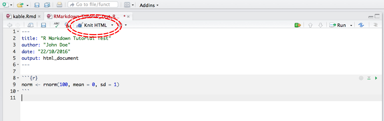
Not only does a preview appear in the Viewer window in RStudio, but it also saves a .html file to the same folder where you saved your .Rmd file.
Code Chunks
Have a read through the text below to learn a bit more about how Markdown works and then you can start compiling the rest of your .Md file.
The setup chunk
This code chunk appears in .Md files in R by default, it won’t appear in your html or pdf document, it just sets up the document.
```{r setup, include = FALSE}
knitr::opts_chunk$set(echo = TRUE)
```
The rest of the code chunks
This is where you can add your own code, accompanying explanation and any outputs. Code that is included in your .Rmd document should be enclosed by three backwards apostrophes ``` (grave accents!). These are known as code chunks and look like this (no need to copy this, just an example):
```{r}
norm <- rnorm(100, mean = 0, sd = 1)
```
Inside the curly brackets is a space where you can assign rules for that code chunk. The code chunk above says that the code is R code.
It’s important to remember when you are creating an R Markdown file that if you want to run code that refers to an object, for example:
```{r}
plot(dataframe)
```
You have to include the code that defines what dataframe is, just like in a normal R script. For example:
```{r}
A <- c("a", "a", "b", "b")
B <- c(5, 10, 15, 20)
dataframe <- data.frame(A, B)
plot(dataframe)
```
Or if you are loading a dataframe from a .csv file, you must include the code in the .Rmd:
```{r}
dataframe <- read.csv("~/Desktop/Code/dataframe.csv")
```
Similarly, if you are using any packages in your analysis, you have to load them in the .Rmd file using library() like in a normal R script.
```{r}
library(dplyr)
```
Hiding code chunks
If you don’t want the code of a particular code chunk to appear in the final document, but still want to show the output (e.g. a plot), then you can include echo = FALSE in the code chunk instructions.
```{r, echo = FALSE}
A <- c("a", "a", "b", "b")
B <- c(5, 10, 15, 20)
dataframe <- data.frame(A, B)
plot(dataframe)
```
Sometimes, you might want to create an object, but not include both the code and its output in the final .html file. To do this you can use, include = FALSE. Be aware though, when making reproducible research it’s often not a good idea to completely hide some part of your analysis:
REMEMBER: R Markdown doesn’t pay attention to anything you have loaded in other R scripts, you have to load all objects and packages in the R Markdown script.
Now you can start copying across the code from your tidyverse script and insert it into a code chunk in your .Rmd document. Better not to do it all at once, you can start with the first parts of the tidyverse script and gradually add on more after you’ve seen what the .Rmd output looks like.
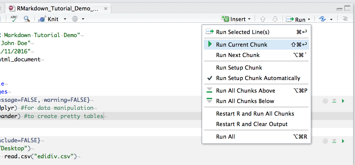
You can run an individual chunk of code at any time by placing your cursor inside the code chunk and selecting Run -> Run Current Chunk:
Summary of code chunk instructions
| Rule | Example (default) |
Function |
|---|---|---|
| eval | eval=TRUE | Is the code run and the results included in the output? | include | include=TRUE | Are the code and the results included in the output? | </tr>
| echo | echo=TRUE | Is the code displayed alongside the results? |
| warning | warning=TRUE | Are warning messages displayed? |
| error | error=FALSE | Are error messages displayed? |
| message | message=TRUE | Are messages displayed? |
| tidy | tidy=FALSE | Is the code reformatted to make it look “tidy”? |
| results | results="markup" | How are results treated? "hide" = no results "asis" = results without formatting "hold" = results only compiled at end of chunk (use if many commands act on one object) |
| cache | cache=FALSE | Are the results cached for future renders? |
| comment | comment="##" | What character are comments prefaced with? |
| fig.width, fig.height | fig.width=7 | What width/height (in inches) are the plots? |
| fig.align | fig.align="left" | "left" "right" "center" |
Inserting Figures
By default, RMarkdown will place graphs by maximising their height, while keeping them within the margins of the page and maintaining aspect ratio. If you have a particularly tall figure, this can mean a really huge graph. To manually set the figure dimensions, you can insert an instruction into the curly braces:
```{r, fig.width = 2.5, fig.height = 7.5}
ggplot(df, aes(x = x, y = y) + geom_point()
```
Inserting Tables
R Markdown can print the contents of a data frame easily by enclosing the name of the data frame in a code chunk:
```{r}
dataframe
```
This can look a bit messy, especially with data frames with a lot of columns. You can also use a table formatting function, e.g. kable() from the knitr package. The first argument tells kable to make a table out of the object dataframe and that numbers should have two significant figures. Remember to load the knitr package in your .Rmd file, if you are using the kable() function.
```{r}
kable(dataframe, digits = 2)
```
If you want a bit more control over the content of your table you can use pander() from the pander package. Imagine I want the 3rd column to appear in italics:
```{r}
emphasize.italics.cols(3)  # Make the 3rd column italics
pander(richness_abund)  # Create the table
```
Extra resources
You can find more info on pander here.
To learn more about the power of pipes check out: the tidyverse website and the R for Data Science book.
To learn more about purrr check out the tidiverse website and the R for Data Science book.
For more information on functional programming see the R for Data Science book chapter here.
To learn more about the tidyverse in general, check out Charlotte Wickham’s slides here.
Git in the command line
Traditionally, Git uses the command line to perform actions on local Git repositories. In this tutorial we ignored the command line but it is necessary if you want more control over Git. There are several excellent introductory guides on version control using Git, e.g. Prof Simon Mudd’s Numeracy, Modelling and Data management guide, The Software Carpentry guide, and this guide from the British Ecological Society Version Control workshop. For more generic command line tools, look at this general cheat sheet and this cheat-sheet for mac users. We have also created a table and flow diagram with some basic Git commands and how they fit into the Git/Github workflow. Orange lines refer to the core workflow, the blue lines describe extra functions and the green lines deal with branches:
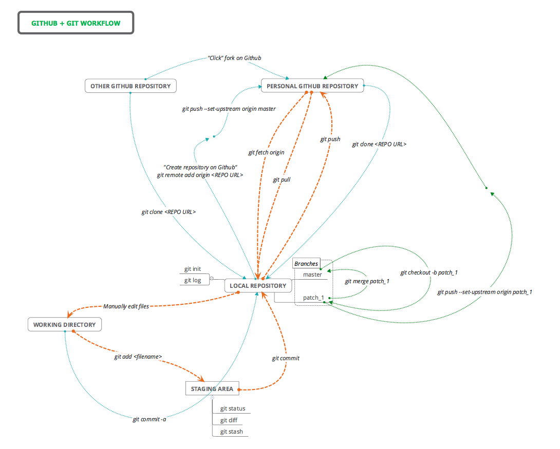
| Command | Origin | Destination | Description |
|---|---|---|---|
git clone REPO_URL |
Personal Github | Local | Creates a local copy of a Github repo. The URL can be copied from Github.com by clicking the `Clone or Download` button. |
git add README.md |
Working Dir | Staging Area | Add "README.md" to staging area. |
git commit |
Staging Area | Local | Commits changes to files to the local repo. |
git commit -a |
Working Dir | Local | adds and commits all file changes to the local repo. |
git pull |
Personal Github | Local | Retrieve any changes from a Github repo. |
git push |
Local | Personal Github | Sends commited file changes to Github repo. |
git merge |
Other branch | Current branch | Merge any changes in the named branch with the current branch. |
git checkout -b patch1 |
NA | NA | Create a branch called "patch1" from the current branch and switch to it. |
git init |
NA | NA | Initialise a directory as a Git repo. |
git log |
NA | NA | Display the commit history for the current repo |
git status |
NA | NA | See which files are staged/unstaged/changed |
git diff |
NA | NA | See the difference between staged uncomitted changes and the most recent commit |
git stash |
NA | NA | Save uncommitted changes in a temporary version and revert to the most recent commit |
Below is a quick exercise so you can familiarise yourself with these command line tools. There are a few ways to use interact with Git using the terminal:
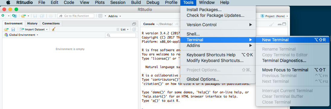
- If you are already in RStudio on a Mac or Linux machine, you can open a terminal within RStudio by going to
Tools -> Terminal -> New Terminalin the menu.
- If you are on a Mac or Linux machine you could just open a terminal program and run Git from there. Most Mac and Linux machines will have Git installed by default. On Mac you can go open a terminal by going to:
Applications/Utilities/Terminal.app. - If you are on a personal Windows machine, you can run Git using Git Bash, which can be installed when you installed Git.
Once you have opened a terminal using one of the above methods, start by creating a folder somewhere on your local system called git_test, using the mkdir (make directory) command by typing the following into the terminal and hitting “Enter”:
mkdir git_test
Then enter that folder using cd (change directory):
cd git_test
Then, make the folder into a Git repository:
git init
Now the folder has been made into a Git repository, allowing you to track changes to files. Now, lets create a README.md file inside the repository and put some text in it, using whatever text editor you are comfortable with. Make sure to place this README.md file into the repository folder on your device so it can be found!
Now, to add the file to be tracked by the Git repository:
git add README.md
The file has now been added to the staging area, but has not yet been committed to a version of the repository. To commit a version:
git commit
You then have to enter a commit message using the text editor which appears, If you have selected Vim as the default text editor, you will need to press i before you can type, then Esc when you are finished typing. To save and exit, type :wq.
Currently, the Git repository is still only on our local computer. Versions are being committed, but they are not being backed up to a remote version of the repository on Github. Go to Github and create a repository called git_test, like you did earlier on in the workshop, but this time don’t create a README.md because we have just made one on the local computer. Now, copy the HTTPS link for that repository. In the terminal, link the local Git repository with the remote repository using the following code, replacing <HTTPS_LINK> with the link you copied:
git remote add origin <HTTPS_LINK>
Then make the first push to that newly linked remote repository:
git push -u origin master
Now you can continue editing files, adding changes (git add <FILE>), committing changes (git commit), pulling (git pull) and pushing (git push) changes, similar to the process you did with clicking buttons in RStudio.