Tutorial aims:
- Chain together multiple lines of codes with pipes
%>% - Use
dplyrto its full potential - Automate advanced tasks like plotting without writing a loop
Steps:
- An introduction to pipes
- Discover more functions of
dplyr - Rename and reorder factor levels or create categorical variables
- Advanced piping
- Challenge yourself!
Welcome to our second tutorial on data manipulation! In our (anything but) basic tutorial, we learned to subset and modify data to suit most of our coding needs, and to use a tidy data format. Today we dig deeper into the wonderful world of dplyr with one of our favourite feature, the pipe operator %>%. We also explore some extra dplyr functions and give some tips to recode and reclassify values.
All the files you need to complete this tutorial can be downloaded from this repository. Clone and download the repo as a zip file, then unzip it.
We are working with a subset of a larger dataset of trees within the City of Edinburgh*. We subsetted this large dataset (over 50 thousand trees!) to the Special Landscape Area around Craigmillar Castle. Our Spatial analysis tutorials could teach you how to do this yourself, but for now the file is all ready for you to use and is named trees.csv.
*(Copyright City of Edinburgh Council, contains Ordnance Survey data © Crown copyright and database right 2019)
Create a new, blank script, and add in some information at the top, for instance the title of the tutorial, your name, and the date (remember to use hasthags # to comment and annotate your script).
1. An introduction to pipes
The pipe operator %>% is a funny little thing that serves as a channel for the output of a command to be passed to another function seamlessly, i.e., without creating intermediary objects. It really makes your code flow, and avoids repetition. Let’s first import the data, and then we’ll see what pipes are all about.
# LIBRARIES
library(dplyr)     # for data manipulation
library(ggplot2)   # for making graphs; make sure you have it installed, or install it now

# Set your working directory
setwd("your-file-path")   # replace with the tutorial folder path on your computer
# If you're working in an R project, skip this step

# LOAD DATA
trees <- read.csv(file = "trees.csv", header = TRUE)

head(trees)  # make sure the data imported OK, familiarise yourself with the variables
Let’s say we want to know how many trees of each species are found in the dataset. If you remember our first data manipulation tutorial, this is a task made for the functions group_by() and summarise(). So we could do this:
# Count the number of trees for each species

trees.grouped <- group_by(trees, CommonName)    # create an internal grouping structure, so that the next function acts on groups (here, species) separately.

trees.summary <- summarise(trees.grouped, count = length(CommonName))   # here we use length to count the number of rows (trees) for each group (species). We could have used any row name.

# Alternatively, dplyr has a tally function that does the counts for you!
trees.summary <- tally(trees.grouped)
This works well, but notice how we had to create an extra data frame, trees.grouped, before achieving our desired output of trees.summary. For a larger, complex analysis, this would rapidly clutter your environment with lots of objects you don’t really need!
This is where the pipe comes in to save the day. It takes the data frame created on its left side, and passes it to the function on its right side. This saves you the need for creating intermediary objects, and also avoids repeating the object name in every function: the tidyverse functions “know” that the object that is passed through the pipe is the data = argument of that function.
# Count the number of trees for each species, with a pipe!

trees.summary <- trees %>%                   # the data frame object that will be passed in the pipe
                 group_by(CommonName) %>%    # see how we don't need to name the object, just the grouping variable?
                 tally()                     # and we don't need anything at all here, it has been passed through the pipe!
See how we go from trees to trees.summary while running one single chunk of code?
Important notes: Pipes only work on data frame objects, and functions outside the tidyverse often require that you specify the data source with a full stop dot .. But as we will see later, you can still do advanced things while keeping these limitations in mind!
We’re not lazy, but we love shortcuts! In RStudio, you can use Ctrl + Shift + M (or Cmd + Shift + M on a Mac) to create the %>% operator.
Let’s use some more of our favourite dplyr functions in pipe chains. Can you guess what this does?
trees.subset <- trees %>%
                filter(CommonName %in% c('Common Ash', 'Rowan', 'Scots Pine')) %>%
                group_by(CommonName, AgeGroup) %>%
                tally()
Here we are first subsetting the data frame to only three species, and counting the number of trees for each species, but also breaking them down by age group. The intuitive names of dplyr’s actions make the code very readable for your colleagues, too.
Neat, uh? Now let’s play around with other functions that dplyr has to offer.
2. More functions of dplyr
An extension of the core dplyr functions is summarise_all(): you may have guessed, it will run a summary function of your choice over ALL the columns. Not meaningful here, but could be if all values were numeric, for instance.
2a. summarise_all() - quickly generate a summary dataframe
summ.all <- summarise_all(trees, mean)
As only two of the columns had numeric values over which a mean could be calculated, the other columns have missing values.
Now let’s move on to a truly exciting function that not so many people know about.
2b. case_when() - a favourite for re-classifying values or factors
But first, it seems poor form to introduce this function without also introducing the simpler function upon which it builds, ifelse(). You give ifelse() a conditional statement which it will evaluate, and the values it should return when this statement is true or false. Let’s do a very simple example to begin with:
vector <- c(4, 13, 15, 6)      # create a vector to evaluate

ifelse(vector < 10, "A", "B")  # give the conditions: if inferior to 10, return A, if not, return B

# Congrats, you're a dancing queen! (Or king!)
The super useful case_when() is a generalisation of ifelse() that lets you assign more than two outcomes. All logical operators are available, and you assign the new value with a tilde ~. For instance:
vector2 <- c("What am I?", "A", "B", "C", "D")

case_when(vector2 == "What am I?" ~ "I am the walrus",
          vector2 %in% c("A", "B") ~ "goo",
          vector2 == "C" ~ "ga",
          vector2 == "D" ~ "joob")
But enough singing, and let’s see how we can use those functions in real life to reclassify our variables.
3. Changing factor levels or create categorical variables
The use of mutate() together with case_when() is a great way to change the names of factor levels, or create a new variable based on existing ones. We see from the LatinName columns that there are many tree species belonging to some genera, like birches (Betula), or willows (Salix), for example. We may want to create a Genus column using mutate() that will hold that information.
We will do this using a character string search with the grepl function, which looks for patterns in the data, and specify what to return for each genus. Before we do that, we may want the full list of species occuring in the data!
unique(trees$LatinName)  # Shows all the species names

# Create a new column with the tree genera

trees.genus <- trees %>%
               mutate(Genus = case_when(               # creates the genus column and specifies conditions
                  grepl("Acer", LatinName) ~ "Acer",
                  grepl("Fraxinus", LatinName) ~ "Fraxinus",
                  grepl("Sorbus", LatinName) ~ "Sorbus",
                  grepl("Betula", LatinName) ~ "Betula",
                  grepl("Populus", LatinName) ~ "Populus",
                  grepl("Laburnum", LatinName) ~ "Laburnum",
                  grepl("Aesculus", LatinName) ~ "Aesculus",
                  grepl("Fagus", LatinName) ~ "Fagus",
                  grepl("Prunus", LatinName) ~ "Prunus",
                  grepl("Pinus", LatinName) ~ "Pinus",
                  grepl("Sambucus", LatinName) ~ "Sambucus",
                  grepl("Crataegus", LatinName) ~ "Crataegus",
                  grepl("Ilex", LatinName) ~ "Ilex",
                  grepl("Quercus", LatinName) ~ "Quercus",
                  grepl("Larix", LatinName) ~ "Larix",
                  grepl("Salix", LatinName) ~ "Salix",
                  grepl("Alnus", LatinName) ~ "Alnus")
               )
We have searched through the LatinNamecolumn for each genus name, and specified a value to put in the new Genus column for each case. It’s a lot of typing, but still quicker than specifying the genus individually for related trees (e.g. Acer pseudoplatanus, Acer platanoides, Acer spp.).
BONUS FUNCTION! In our specific case, we could have achieved the same result much quicker. The genus is always the first word of the LatinName column, and always separated from the next word by a space. We could use the separate() function from the tidyr package to split the column into several new columns filled with the words making up the species names, and keep only the first one.
library(tidyr)
trees.genus.2 <- trees %>%
                  tidyr::separate(LatinName, c("Genus", "Species"), sep = " ", remove = FALSE) %>%
                  dplyr::select(-Species)

# we're creating two new columns in a vector (genus name and species name), "sep" refers to the separator, here space between the words, and remove = FALSE means that we want to keep the original column LatinName in the data frame
Mind blowing! Of course, sometimes you have to be typing more, so here is another example of how we can reclassify a factor. The Height factor has 5 levels representing brackets of tree heights, but let’s say three categories would be enough for our purposes. We create a new height category variable Height.cat:
trees.genus <- trees.genus %>%   # overwriting our data frame
               mutate(Height.cat =   # creating our new column
                         case_when(Height %in% c("Up to 5 meters", "5 to 10 meters") ~ "Short",
                                   Height %in% c("10 to 15 meters", "15 to 20 meters") ~ "Medium",
                                   Height == "20 to 25 meters" ~ "Tall")
                      )
Reordering factors levels
We’ve seen how we can change the names of a factor’s levels, but what if you want to change the order in which they display? R will always show them in alphabetical order, which is not very handy if you want them to appear in a more logical order.
For instance, if we plot the number of trees in each of our new height categories, we may want the bars to read, from left to right: ‘Short’, ‘Medium’, ‘Tall’. However, by default, R will order them ‘Medium’, ‘Short’, ‘Tall’.
To fix this, you can specify the order explicitly, and even add labels if you want to change the names of the factor levels. Here, we put them in all capitals to illustrate.
## Reordering a factor's levels

levels(trees.genus$Height.cat)  # shows the different factor levels in their default order

trees.genus$Height.cat <- factor(trees.genus$Height.cat,
                                 levels = c('Short', 'Medium', 'Tall'),   # whichever order you choose will be reflected in plots etc
                                 labels = c('SHORT', 'MEDIUM', 'TALL')    # Make sure you match the new names to the original levels!
                                 )

levels(trees.genus$Height.cat)  # a new order and new names for the levels
Are you now itching to make graphs too? We’ve kept to base R plotting in our intro tutorials, but we are big fans of ggplot2 and that’s what we’ll be using in the next section while we learn to make graphs as outputs of a pipe chain. If you haven’t used ggplot2 before, don’t worry, we won’t go far with it today. We have two tutorials dedicated to making pretty and informative plots with it. Install and load the package if you need to:
install.packages("ggplot2")
library(ggplot2)
And let’s build up a plot-producing factory chain!
4. Advanced piping
Earlier in the tutorial, we used pipes to gradually transform our dataframes by adding new columns or transforming the variables they contain. But sometimes you may want to use the really neat grouping functionalities of dplyr with non native dplyr functions, for instance to run series of models or produce plots. It can be tricky, but it’s sometimes easier to write than a loop. (You can learn to write loops here.)
First, we’ll subset our dataset to just a few tree genera to keep things light. Pick your favourite five, or use those we have defined here! Then we’ll map them to see how they are distributed.
# Subset data frame to fewer genera

trees.five <- trees.genus %>%
               filter(Genus %in% c("Acer", "Fraxinus", "Salix", "Aesculus", "Pinus"))

# Map all the trees

(map.all <- ggplot(trees.five) +
            geom_point(aes(x = Easting, y = Northing, size = Height.cat, colour = Genus), alpha = 0.5) +
            theme_bw() +
            theme(panel.grid = element_blank(),
                  axis.text = element_text(size = 12),
                  legend.text = element_text(size = 12))
)
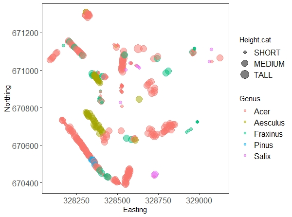
Don’t worry too much about all the arguments in the ggplot code, they are there to make the graph prettier. The interesting bits are the x and y axis, and the other two parameters we put in the aes() call: we’re telling the plot to colour the dots according to genus, and to make them bigger or smaller according to our tree height factor. We’ll explain everything else in our data visualisation tutorial.
Now, let’s say we want to save a separate map for each genus (so 5 maps in total). You could filter the data frame five times for each individual genus, and copy and paste the plotting code five times too, but imagine we kept all 17 genera! This is where pipes and dplyr come to the rescue again. (If you’re savvy with ggplot2, you’ll know that facetting is often a better option, but sometimes you do want to save things as separate files.) The do() function allows us to use pretty much any R function within a pipe chain, provided that we supply the data as data = . where the function requires it.
# Plotting a map for each genus

tree.plots <-
   trees.five  %>%      # the data frame
   group_by(Genus) %>%  # grouping by genus
   do(plots =           # the plotting call within the do function
         ggplot(data = .) +
         geom_point(aes(x = Easting, y = Northing, size = Height.cat), alpha = 0.5) +
         labs(title = paste("Map of", .$Genus, "at Craigmillar Castle", sep = " ")) +
         theme_bw() +
         theme(panel.grid = element_blank(),
               axis.text = element_text(size = 14),
               legend.text = element_text(size = 12),
               plot.title = element_text(hjust = 0.5),
               legend.position = "bottom")
   )

# You can view the graphs before saving them
tree.plots$plots

# Saving the plots to file

tree.plots %>%              # the saving call within the do function
   do(.,
      ggsave(.$plots, filename = paste(getwd(), "/", "map-", .$Genus, ".png", sep = ""), device = "png", height = 12, width = 16, units = "cm"))
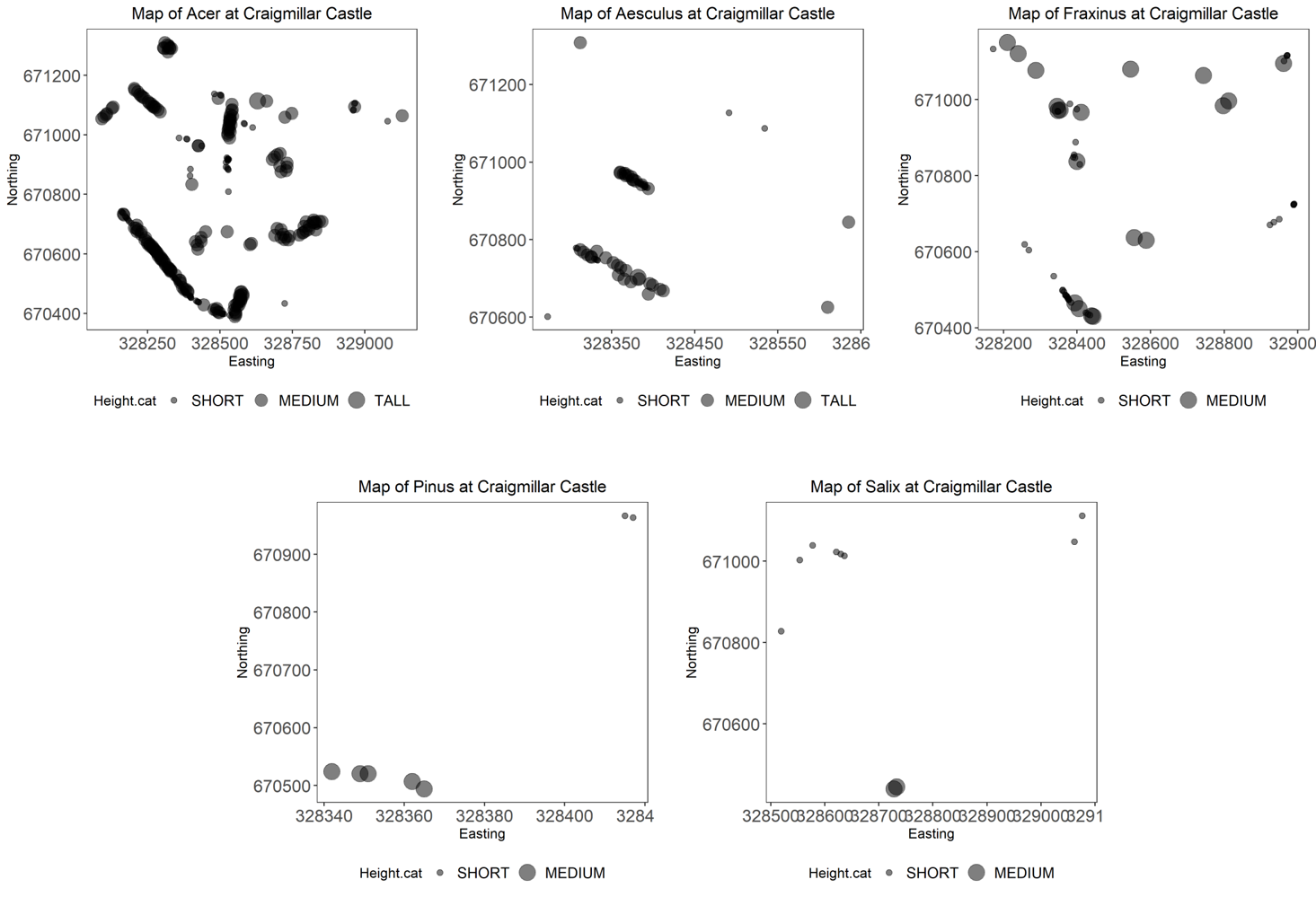
You should get five different plots looking something like the one above.
Phew! This could even be chained in one long call without creating the tree.plots object, but take a moment to explore this object: the plots are saved as lists within the plots column that we created. The do() function allows to use a lot of external functions within dplyr pipe chains. However, it is sometimes tricky to use and is becoming deprecated. This page shows an alternative solution using the purr package to save the files.
Sticking things together with paste()
Did you notice how we used the paste() function to define the filename= argument of the last piece of code? (We did the same to define the titles that appear on the graphs.) It’s a useful function that lets you combine text strings as well as outputs from functions or object names in the environment. Let’s take apart that last piece of code here:
paste(getwd(), '/', 'map-', .$Genus, '.png', sep = '')
getwd(): You are familiar with this call: try it in the console now! It writes the path to your working directory, i.e. the root folder where we want to save the plots.- ’/’: we want to add a slash after the directory folder and before writing the name of the plot
- ‘map-‘: a custom text bit that will be shared by all the plots. We’re drawing maps after all!
- ’.$Genus’: accesses the Genus name of the tree.plots object, so each plot will bear a different name according to the tree genus.
- ‘.png’: the file extension; we could also have chosen a pdf, jpg, etc.
- ‘sep = ‘’’: we want all the previous bits to be pasted together with nothing separating them
So, in the end, the whole string could read something like: ‘C:/Coding_Club/map-Acer.png’.
We hope you’ve learned new hacks that will simplify your code and make it more efficient! Let’s see if you can use what we learned today to accomplish a last data task.
5. Challenge yourself!
The Craigmillar Castle team would like a summary of the different species found within its grounds, but broken down in four quadrants (NE, NW, SE, SW). You can start from the trees.genus object created earlier.
- Can you calculate the species richness (e.g. the number of different species) in each quadrant?
- They would also like to know how abundant the genus Acer is (as a % of the total number of trees) in each quadrant.
- Finally, they would like, for each quadrant separately, a bar plot showing counts of Acer trees in the different age classes, ordered so they read from Young (lumping together juvenile and semi-mature trees), Middle Aged, and Mature.
Click this line to see the solution!
First of all, we need to create the four quadrants. This only requires simple maths and the use of mutate to create a new factor.
## Calculate the quadrants

# Find the center coordinates that will divide the data (adding half of the range in longitude and latitude to the smallest value)

lon <- (max(trees.genus$Easting) - min(trees.genus$Easting))/2 + min(trees.genus$Easting)
lat <- (max(trees.genus$Northing) - min(trees.genus$Northing))/2 + min(trees.genus$Northing)

# Create the column

trees.genus <- trees.genus %>%
   mutate(Quadrant = case_when(
                     Easting < lon & Northing > lat ~ 'NW',
                     Easting < lon & Northing < lat ~ 'SW',
                     Easting > lon & Northing > lat ~ 'NE',
                     Easting > lon & Northing < lat ~ 'SE')
   )

# We can check that it worked
ggplot(trees.genus) +
   geom_point(aes(x = Easting, y = Northing, colour = Quadrant)) +
   theme_bw()
It did work, but there is a NA value (check the legend)! Probably this point has the exact integer value of middle Easting, and should be attributed to one side or the other (your choice).
trees.genus <- trees.genus %>%
   mutate(Quadrant = case_when(
      Easting <= lon & Northing > lat ~ 'NW',  # using inferior OR EQUAL ensures that no point is forgotten
      Easting <= lon & Northing < lat ~ 'SW',
      Easting > lon & Northing > lat ~ 'NE',
      Easting > lon & Northing < lat ~ 'SE')
   )
To answer the first question, a simple pipeline combining group_by() and summarise() is what we need.
sp.richness <- trees.genus %>%
group_by(Quadrant) %>%
summarise(richness = length(unique(LatinName)))
There we are! We have 7, 15, 8 and 21 species for the NE, NW, SE, and SW corners respectively!
There are different ways to calculate the proportion of Acer trees, here is one (maybe base R would have been less convoluted in this case!):
acer.percent <- trees.genus %>%
   group_by(Quadrant, Genus) %>%
   tally() %>%                      # get the count of trees in each quadrant x genus
   group_by(Quadrant) %>%           # regroup only by quadrant
   mutate(total = sum(n)) %>%       # sum the total of trees in a new column
   filter(Genus == 'Acer') %>%      # keep only acer
   mutate(percent = n/total)        # calculate the proportion

# We can make a plot representing the %

ggplot(acer.percent) +
   geom_col(aes(x = Quadrant, y = percent)) +
   labs(x = 'Quadrant', y = 'Proportion of Acer') +
   theme_bw()
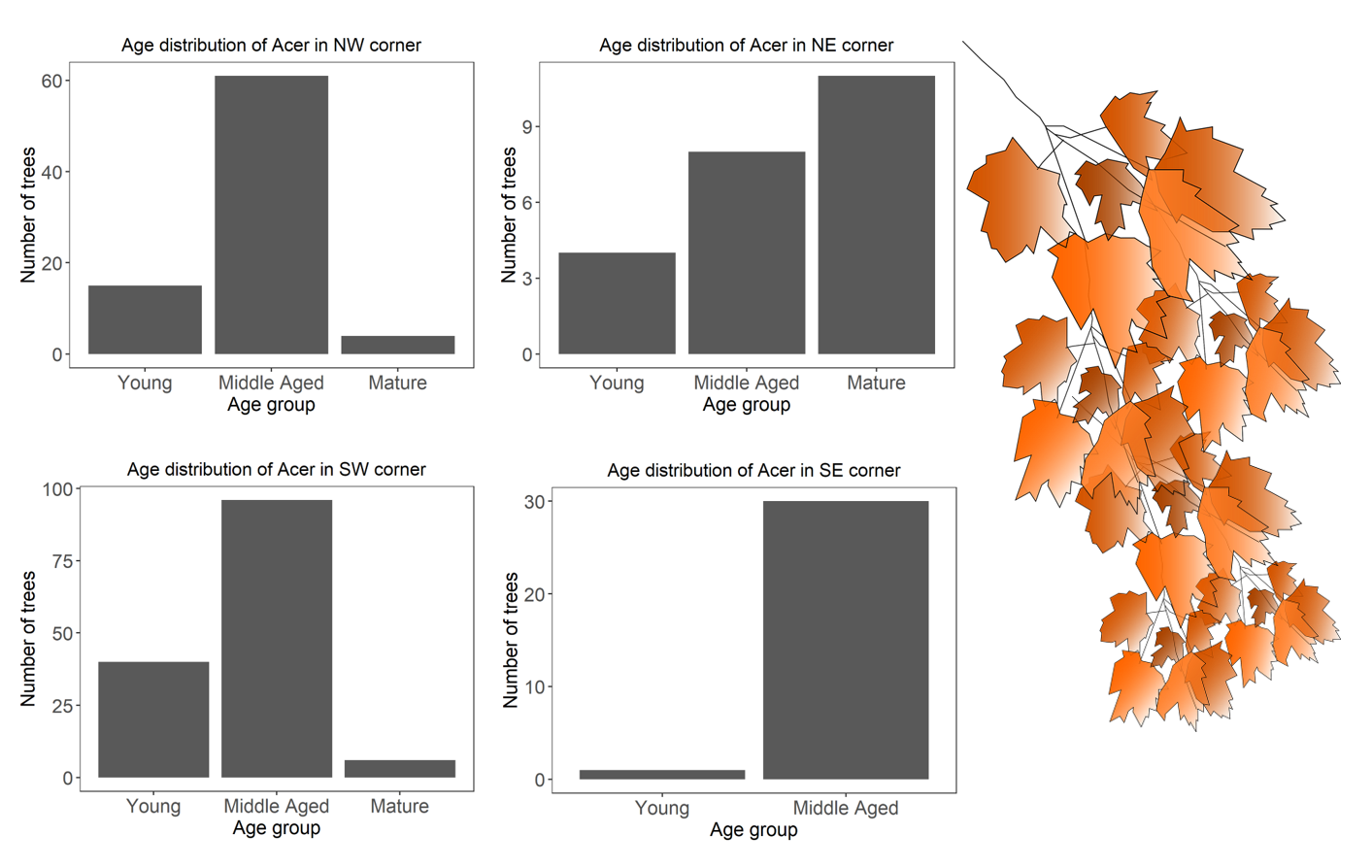
And finally, we can use our manipulation skills to subset the data frame to Acer only and change the age factor, and then use our pipes to create the four plots.
# Create an Acer-only data frame

acer <- trees.genus %>%
   filter(Genus == 'Acer')


# Rename and reorder age factor

acer$AgeGroup <- factor(acer$AgeGroup,
                        levels = c('Juvenile', 'Semi-mature', 'Middle Aged', 'Mature'),
                        labels = c('Young', 'Young', 'Middle Aged', 'Mature'))


# Plot the graphs for each quadrant

acer.plots <- acer %>%
   group_by(Quadrant) %>%
   do(plots =           # the plotting call within the do function
         ggplot(data = .) +
         geom_bar(aes(x = AgeGroup)) +
         labs(title = paste('Age distribution of Acer in ', .$Quadrant, ' corner', sep = ''),
              x = 'Age group', y = 'Number of trees') +
         theme_bw() +
         theme(panel.grid = element_blank(),
               axis.title = element_text(size = 14),
               axis.text = element_text(size = 14),
               plot.title = element_text(hjust = 0.5))
   )

# View the plots (use the arrows on the Plots viewer)
acer.plots$plots
Well done for getting so far!
We hope this was useful. Let’s look back at what you can now do, and as always, get in touch if there is more content you would like to see!
Tutorial Outcomes:
- You can streamline your code using pipes
- You know how to reclassify values or recode factors using logical statements
- You can tweak
dplyr’s functiongroup_by()to act as a loop without having to write one, following it bydo()
Eager to learn even more data manipulation functions? We have it covered in our Advanced Data Manipulation tutorial!
Doing this tutorial as part of our Data Science for Ecologists and Environmental Scientists online course?
This tutorial is part of the Stats from Scratch stream from our online course. Go to the stream page to find out about the other tutorials part of this stream!
If you have already signed up for our course and you are ready to take the quiz, go to our quiz centre. Note that you need to sign up first before you can take the quiz. If you haven't heard about the course before and want to learn more about it, check out the course page.

This tutorial is also part of the Wiz of Data Vis stream from our online course. Go to the stream page to find out about the other tutorials part of this stream!
If you have already signed up for our course and you are ready to take the quiz, go to our quiz centre. Note that you need to sign up first before you can take the quiz. If you haven't heard about the course before and want to learn more about it, check out the course page.