In this tutorial we will do some basic exploratory visualisation and analysis of time series data. We will learn how to create a pandas.DataFrame object from an input data file, plot its contents in various ways, work with resampling and rolling calculations, and identify correlations and periodicity.
To complete the tutorial, you will need a Python environment with a recent version of pandas (I used v0.23.4). I strongly recommend using Jupyter for this kind of work - you can read more about Jupyter here.
Tutorial aims:
- What is a time series and how can pandas help?
- Loading data into a pandas dataframe
- Creating a datetime index
- Plotting dataframe contents
- Resampling, rolling calculations, and differencing
- Identifying periodicity and correlation
- Splitting and stacking cycles
0. What is a time series and how can pandas help?
If you are not already familiar with pandas then you may want to start with our previous tutorial but you should be okay if you understand the concept of a dataframe. It will also help if you are already familiar with the datetime module.
Quantitative work often involves working with time series data in various guises. A time series is an ordered sequence of data that typically represents how some quantity changes over time. Examples of such quantities could be high frequency measurements from a seismometer over a few days, to yearly temperature averages measured at a range of locations across a century, to population changes of different species, but we can use the same software tools to work with them!
In Python it is very popular to use the pandas package to work with time series. It offers a powerful suite of optimised tools that can produce useful analyses in just a few lines of code. A pandas.DataFrame object can contain several quantities, each of which can be extracted as an individual pandas.Series object, and these objects have a number of useful methods specifically for working with time series data.
First import the packages we will use:
import pandas as pd
import numpy as np
import matplotlib.pyplot as plt
1. Loading data into a pandas dataframe
This tutorial will use a heliophysics dataset as an example which contains a range of different measurements. The version of the dataset we will use is available as a raw text file and contains hourly measurements from the beginning of 1963 onwards. This type of file (often .dat, .txt, or .csv) is the least sophisticated and is not the right solution for larger datasets but is okay here (the file is around 150MB) - large/new datasets will often use formats like HDF or NetCDF. pandas contains a range of IO tools for different formats - look here when you want to read or write a dataset.
Read!
Please bear with us while we update this tutorial!
In August 2019, NASA changed their data access protocol, so the ftp links and code below won’t work. To access the data and proceed with the tutorial, we propose the following workaround:
- Use the http address instead
- Right-click to Save As
omni2_all_years.dat - Continue the tutorial!
[IGNORE THIS BIT!]
Download the dataset from ftp://spdf.gsfc.nasa.gov/pub/data/omni/low_res_omni/omni2_all_years.dat and take a quick look at the accompanying description: ftp://spdf.gsfc.nasa.gov/pub/data/omni/low_res_omni/omni2.tex Look for OMNI2_YYYY.DAT FORMAT DESCRIPTION to see the list of columns contained in the dataset. This is pretty complicated! but we will only use a few of the columns:
- columns 1, 2, 3 giving the year, day of year (DOY), and hour of day of each measurement
- column 40: the sunspot number (R) - the number of spots on the surface of the Sun, indicating how active it is
- column 41: the Dst index - an hourly magnetic activity index measured at Earth’s surface, in nT
- column 51: the F10.7 index - the radio flux at 10.7cm (i.e. how bright the Sun is at that wavelength), in “solar flux units” (sfu)
We will investigate this data to see if there is a connection between conditions on the Sun (R and Dst), and magnetic conditions at Earth (Dst).
NB: if you in a Jupyter notebook you can download the file with (this code won’t work now due to change in NASA ftp access):
!wget ftp://spdf.gsfc.nasa.gov/pub/data/omni/low_res_omni/omni2_all_years.dat
Take a quick look at the first line of the data file:
with open("omni2_all_years.dat") as f:
    print(f.readline())
You should see something like:
1963 1 0 1771 99 99 999 999 999.9 999.9 999.9 999.9 999.9 999.9 999.9 999.9 999.9 999.9 999.9 999.9 999.9 999.9 9999999. 999.9 9999. 999.9 999.9 9.999 99.99 9999999. 999.9 9999. 999.9 999.9 9.999 999.99 999.99 999.9 7 33 -6 119 999999.99 99999.99 99999.99 99999.99 99999.99 99999.99 0 3 999.9 999.9 99999 99999 99.9
It’s a pretty unfriendly file with the column names explained in the other file, so we have to do some careful work to load the data and ensure we know what is what. Some pandas magic to load it is this (there are also other ways):
df = pd.read_csv("omni2_all_years.dat",
                 delim_whitespace=True,
                 usecols=[0, 1, 2, 39, 40, 50],
                 names=["Year", "DOY", "Hour", "R", "Dst", "F10.7"])
We specify that columns are delimited by white space, the columns we want to extract (remembering that we count from 0 instead of 1), and the names to assign to them. We have now created the dataframe, df. Take a look at the top of it with df.head(). It should look like:
   Year  DOY  Hour   R  Dst  F10.7
0  1963    1     0  33   -6  999.9
1  1963    1     1  33   -5  999.9
2  1963    1     2  33   -5  999.9
3  1963    1     3  33   -3  999.9
4  1963    1     4  33   -3  999.9
2. Creating a datetime index
Now we have the data loaded, we want to fix it a bit to make it more useful. First we will change the index from its current state as a sequence of integers to the more functional pandas.DatetimeIndex which is based on Python datetime objects,.
We use the pandas.to_datetime() function to create the new index from the “Year”, “DOY”, and “Hour” columns, then assign it directly to the .index property of df, then drop the unneeded columns:
df.index = pd.to_datetime(df["Year"] * 100000 + df["DOY"] * 100 + df["Hour"], format="%Y%j%H")
df = df.drop(columns=["Year", "DOY", "Hour"])
df["Year"] * 100000 + df["DOY"] * 100 + df["Hour"] combines the columns into one column of fixed-width numbers following the [YearDOYHour] pattern that can be parsed by the "%Y%j%H" format specifier. df.head() should now show:
                      R  Dst  F10.7
1963-01-01 00:00:00  33   -6  999.9
1963-01-01 01:00:00  33   -5  999.9
1963-01-01 02:00:00  33   -5  999.9
1963-01-01 03:00:00  33   -3  999.9
1963-01-01 04:00:00  33   -3  999.9
When working with other data, you will need to find an appropriate way to build the index from the time stamps in your data, but pandas.to_datetime() will often help. Now that we are using a DatetimeIndex, we have access to a number of time series-specific functionality within pandas.
In this dataset, data gaps have been infilled with 9’s. We can replace these occurrences with NaN:
df = df.replace({"R":999,
                 "Dst":99999,
                 "F10.7":999.9}, np.nan)
We should now have:
                      R  Dst  F10.7
1963-01-01 00:00:00  33   -6    NaN
1963-01-01 01:00:00  33   -5    NaN
1963-01-01 02:00:00  33   -5    NaN
1963-01-01 03:00:00  33   -3    NaN
1963-01-01 04:00:00  33   -3    NaN
It’s good practice to perform a few checks on the data. For instance, is the data really sampled every hour? Are there any gaps? We can check this:
print("Dataframe shape: ", df.shape)
dt = (df.index[-1] - df.index[0])
print("Number of hours between start and end dates: ", dt.total_seconds()/3600 + 1)
This tells us that there is the same number of records in the dataset as the number of hours between the first and last times sampled. We are dealing with over 55 years of hourly samples that results in about half a million records:
h, d, y = 24, 365, 55
print(f"{h} hours/day * {d} days/year * {y} years = {h*d*y} hours")
NB: The last line uses “f-strings” which are new in Python 3.6. The old, and older, ways of doing this are:
print("{} hours/day * {} days/year * {} years = {} hours".format(h, d , y, h*d*y))
print("%d hours/day * %d days/year * %d years = %d hours"%(h, d , y, h*d*y))
3. Plotting dataframe contents
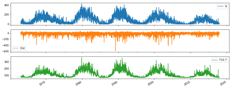
The data should now be in an “analysis-ready” format and we should start inspecting it. Let’s start by using the .plot() method. Try each of the following and compare what you get:
df.plot(figsize=(15,4))
df.plot(subplots=True, figsize=(15,6))
df.plot(y=["R", "F10.7"], figsize=(15,4))
df.plot(x="R", y=["F10.7", "Dst"], style='.')
This has quickly achieved four different plots:
- Plotting all the time series on one axis
- Plotting them all on separate subplots to see them more clearly (sharing the x axis)
- Plotting a selection of columns
- Plotting two of the variables against one of the others
Now you can start to get a feel for the data. F10.7 and R look well correlated, each with 5 peaks evenly spaced over time. There is a lot of noise in all the measurements, and it is hard to see any relation with Dst. So what can we do to look deeper for trends and relationships?
4. Resampling, rolling calculations, and differencing
To reduce the noise in the data, we can smooth it. There are various ways to do this and so there is a choice to be made about the method to use and the degree of smoothing required. pandas offers a convenient way to reduce the data cadence by resampling with the .resample() method:
df[["F10.7", "R"]].resample("1y").median().plot(figsize=(15,4))
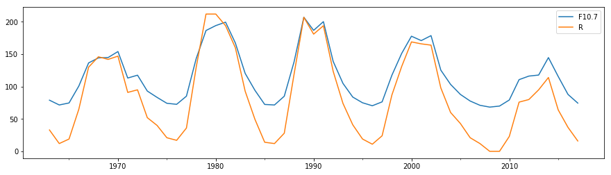
Here we have extracted a dataframe with the columns we are interested in with df[["F10.7", "R"]], produced a year-based “resampler” object, which is then reduced to the new yearly time series by taking medians over each year interval.
.resample() has given us a lower cadence dataset which then doesn’t contain the high frequency noise. Similar to this are rolling window calculations, which return the same cadence of data as the input but calculations are performed over a rolling window of a given width about each datapoint. We can use the .rolling() method to do this. Here we construct a moving median filter:
df[["F10.7", "R"]].rolling(24*365).median().plot(figsize=(15,4))
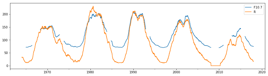
Rolling calculations take the size of the window as the argument, whereas resampling takes a frequency specifier as the argument. NB: we can now see the appearance of some gaps in the F10.7 time series since by default no gaps are allowed within each window calculated - this behaviour can be changed with the min_periods argument.
Take a look at the documentation to see what other calculations can be done on resampler and rolling objects.
Differencing is often a useful tool which can be part of time series algorithms. See for example how we can use smoothing and differencing to more clearly isolate the periodic signal:
df[["F10.7", "R"]].resample("3y").median().diff().plot(subplots=True, figsize=(15,4))
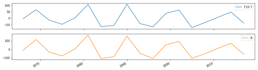
The centres of the maximum and minimum of each period of the cycle can be defined by the maxima and minima of this curve.
5. Identifying periodicity and correlation
We can see by eye that there is an approximately 10 year cycle in R and F10.7. A handy high level tool to identify this periodicity is pandas.plotting.autocorrelation_plot():
pd.plotting.autocorrelation_plot(df["R"].resample("1y").median())
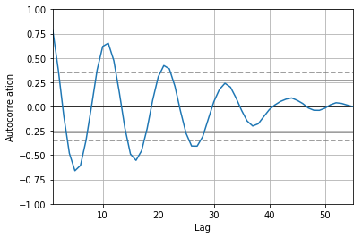
This produces an autocorrelation plot: the correlation of a time series with itself at a range of lag times. We have applied it to the downsampled yearly time series which makes the calculation a lot quicker. Since the cadence of the time series is one year, the “Lag” axis is measured in years. The first peak (after a lag of 0) is around 11 years, meaning that the series correlates well with itself at a lag time of 11 years. This is the well-known solar activity cycle.
Let’s look again at the Dst index and try to find if there is a connection to R. It is helpful to consider the context of the quantities we are examining. R, the sunspot number, indicates solar activity, and Dst indicates geomagnetic activity, the magnetic field created by time-varying large scale electric currents around Earth. We could try to smooth Dst as well to try to reduce the noise to see if there is some correlation with R, but I can tell you now that it will be tricky to prove something from that. Variations in Dst actually tend to occur in discrete events called “geomagnetic storms”, where Dst suddenly drops well below 0nT and takes some hours or days to recover back to 0. We can classify a large storm as when Dst drops below -100nT. Let’s use this to search for occurrences of large storms!
We can mask out where Dst drops below -100 with df["Dst"].where(df["Dst"]<-100), and then count how many entries there are each year that satisfy this condition:
Dst_count = df["Dst"].where(df["Dst"]<-100).resample("1y").count()
Dst_count = Dst_count.reindex(df.index, method="bfill")
We have also reindexed Dst_count so that its index will match that of df (instead of the yearly index created by the resampling). Let’s append this “yearly storm count” back onto df and plot it along with R:
df["Dst_count"] = Dst_count
df.plot(y=["R", "Dst_count"], figsize=(15,4));
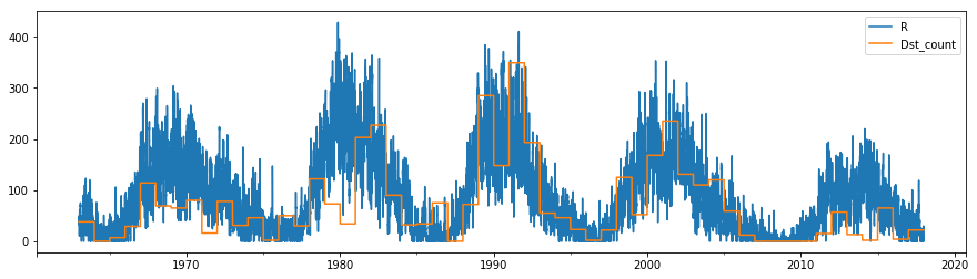
It looks like there is a correlation between high sunspot numbers (the peaks of the solar cycle) and the occurrence rate of large storms. However, there is a lot more variation in this storm rate - lots of sunspots doesn’t guarantee lots of storms, and storms can still occur when there are few sunspots.
6. Splitting and stacking cycles
Let’s split the time series up into its constituent cycles and stack them together. This requires some more complex work with pandas and matplotlib. At this point we will also downsample to a daily rate, which makes the plot a bit clearer and quicker to generate.
# https://en.wikipedia.org/wiki/List_of_solar_cycles
minima = ["1964-10", "1976-03", "1986-09", "1996-08", "2008-12", "2019-12"]
df_daily = df.resample("1D").mean()

def split_into_cycles(df):
    """Returns a list of dataframes, one for each solar cycle"""
    cycles = []
    # Split by solar cycle
    for start, end in zip(minima[0:-1], minima[1:]):
        cycle = df[start:end]
        # Convert from dates to days from minimum
        cycle.index = (cycle.index - cycle.index[0]).days
        # Extend so that each cycle lasts a full 5000 days (filled with nan)
        ix = pd.Int64Index(np.arange(0,5000))
        cycle.reindex(ix)
        cycles.append(cycle)
    return cycles

cycles = split_into_cycles(df_daily)
We now have a list, cycles, containing five dataframes, each containing a different cycle. On each dataframe, we have changed the index into the number of days from the minimum, and used .reindex() to fix them all to the same length so that we can perform arithmetic operations on them together. The following will create a plot of each parameter, with the cycles superposed over each other. In this example, we first create the figure and its axes using matplotlib directly (using sharex=True to link the x-axes on each plot), then direct the pandas plotting commands to point them to the axis we want each thing to plot onto using the ax kwarg. We also calculate the mean of the stacked time series.
fig, axes = plt.subplots(3, 1, figsize=(15,10), sharex=True)
for i, cycle in enumerate(cycles):
    cycle["R"].plot(ax=axes[0], label=f"Cycle {i}")
    cycle["F10.7"].plot(ax=axes[1])
    cycle["Dst_count"].plot(ax=axes[2])
N_cycles = len(cycles)
(sum(cycles)["R"]/N_cycles).plot(ax=axes[0], color="black", label="Mean")
(sum(cycles)["F10.7"]/N_cycles).plot(ax=axes[1], color="black")
(sum(cycles)["Dst_count"]/N_cycles).plot(ax=axes[2], color="black")
axes[0].legend()
axes[0].set_ylabel("Sunspot Number")
axes[1].set_ylabel("F10.7")
axes[2].set_ylabel("Storm rate")
axes[2].set_xlabel("Days since minimum")
for ax in axes:
    ax.grid()
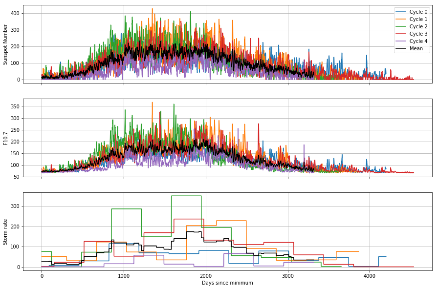
This helps us to see how the cycles differ from each other: for example, the most recent cycle is consistently lower than the mean, both in the solar conditions and the rate of geomagnetic storms. By constructing the mean of the cycles, we are actually reinforcing the similar pattern over each cycle and reducing the effect of the random noise. This is the basis of a technique called superposed epoch analysis, which is useful for identifying periodicities and similarities between noisy time series.
Summary
We have explored how we can do some first steps in investigating time series using the power of pandas. We have shown how methods can be stringed along to perform complex operations on a dataframe in a single line and results plotted easily.
See here if you would like to know a bit more about solar activity and the upcoming solar minimum!
Tutorial outcomes
- Know how to create dataframes with datetime indexes
- Know where to look to figure out how to do things with pandas
- Can manipulate time series, performing resampling and rolling calculations
- Comfortable with inspecting and plotting time series in different ways