Tutorial Aims:
- Plot simple maps in ggplot2
- Manipulate spatial polygons
- Import, manipulate and plot shapefiles
Steps:
- Why use
Rto make maps? - Downloading the relevant packages
- Getting your head around spatial data
- Creating a map using
ggplot2andrworldmap - Using shapefiles
All the resources for this tutorial, including some helpful cheatsheets can be downloaded from this Github repository. Click on Code/Download ZIP and unzip the folder, or clone the repository to your own GitHub account.
Next, open up a new R Script where you will add the code for your maps. Set the folder you just downloaded as your working directory by running the code below, replacing PATH_TO_FOLDER with the location of the downloaded folder on your computer, e.g. ~/Downloads/CC-6-Maps-master:
setwd("PATH_TO_FOLDER")
1. Why use R for spatial data?
- Less clicking:
- Most conventional GIS software use a Graphical User Interface (GUI) which makes them easier to fumble through when you don’t know what you’re doing, but point and click interfaces become very laborious when performing analyses for the n th time or when you really know your way around the software. R uses a Command Line Interface, using text commands, so while there may be more of a learning curve to begin with, it’s very efficient once you know what to do.
- Reproducible analyses with new data:
- Imagine you have a project where you are given new data every week, which you want to compare using maps. Using a GUI, you would have to repeat your analyses step by step, every time the data came in, being careful to maintain formatting between maps. Using the command line in R, you only have to plug in the new data to the script and the maps will look the same every time.
- It’s free:
- While ArcMap and SuperGIS cost money to use, R packages are free and probably always will be.
- A range of GIS packages for different applications:
- Using the R package system you can find the right GIS application for your project, and you can adapt and hack the packages already there to create something specific for your project.
2. Downloading the relevant packages
Load the following packages into R by running the following lines of code in your R script. Remember if you haven’t installed the packages first, you will have to use install.packages("PACKAGE_NAME") first:
library(ggplot2)  # ggplot() fortify()
library(dplyr)  # %>% select() filter() bind_rows()
library(rgdal)  # readOGR() spTransform()
library(raster)  # intersect()
library(ggsn)  # north2() scalebar()
library(rworldmap)  # getMap()
In previous versions of this workshop, we used the ggmap package for grabbing background map tiles from Google Maps and other sources, but this package has become difficult to use, especially since Google now requires a non-free API key to download their map tiles. There are lots of other resources online for ggmap and I’d still recommend having a look if you have specific need for Google Maps basemaps. For now however, we will focus on other R packages.
3. Getting your head around map data
The easiest way to think about map data is to first imagine a graph displaying whatever data you want, but where the x and y axes denote spatial coordinates such as longitude and latitude instead of a variable:
Then it’s a simple case of adding a background map to your image to place the data points in the real world. In this case, the map was pulled from data provided by the maps package:
That was a simple example, maps can incorporate more complex elements like polygons and lines, each with their own values:
4. Creating a map using ggplot2 and rworldmap
In this part of the workshop we are going to create a map showing occurrence records of two species of bird. Rueppell’s Vulture (Gyps rueppellii) feeds on large mammalian carrion and the African Penguin (Spheniscus demersus) feeds on small marine fish. It’s likely that their distributions have distinct spatial patterns, we shall see! We will use species occurence data from the Global Biodiversity Information Facility (GBIF), which can be found in the repository for this tutorial, which you should download if you haven’t done so already.
First, import the data we need, Gyps_rueppellii_GBIF.csv and Spheniscus_dermersus_GBIF.csv:
vulture <- read.csv("Gyps_rueppellii_GBIF.csv", sep = "\t")
penguin <- read.csv("Spheniscus_dermersus_GBIF.csv", sep = "\t")
Now onto cleaning up the data using dplyr. If you are keen to learn more about using the dplyr package, check out our tutorial on data formatting and manipulation.
# Keep only the columns we need
vars <- c("gbifid", "scientificname", "locality", "decimallongitude",
    "decimallatitude", "coordinateuncertaintyinmeters")

vulture_trim <- vulture %>% dplyr::select(one_of(vars))
penguin_trim <- penguin %>% dplyr::select(one_of(vars))
	# `one_of()` is part of `dplyr` and selects all columns specified in `vars`

# Combine the dataframes
pc_trim <- bind_rows(vulture_trim, penguin_trim)

# Check column names and content
str(pc_trim)

# Check that species names are consistent
unique(pc_trim$scientificname)
  # Needs cleaning up

# Clean up "scientificname" to make names consistent
pc_trim$scientificname <- pc_trim$scientificname %>%
    recode("Gyps rueppellii (A. E. Brehm, 1852)" = "Gyps rueppellii",
        "Gyps rueppellii subsp. erlangeri Salvadori, 1908" = "Gyps rueppellii",
        "Gyps rueppelli rueppelli" = "Gyps rueppellii",
        "Spheniscus demersus (Linnaeus, 1758)" = "Spheniscus demersus")

# Checking names to ensure only two names are now present
unique(pc_trim$scientificname)
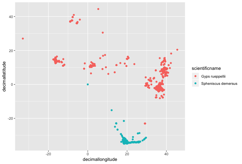
Now we can make a preliminary plot to make sure the data looks right. Remember, a map is just a graph with longitude and latitude as the x and y axes:
(prelim_plot <- ggplot(pc_trim, aes(x = decimallongitude, y = decimallatitude,
    colour = scientificname)) +
    geom_point())
Note that putting your entire ggplot code in brackets () creates the graph and then shows it in the plot viewer. If you don’t have the brackets, you’ve only created the object, but haven’t visualized it. You would then have to call the object such that it will be displayed by just typing prelim_plot after you’ve created the “prelim_plot” object.
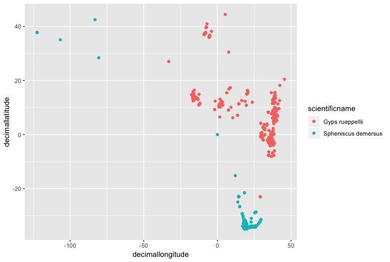
If you squint, you might be able to see the southern African cape, with lots of penguins on it. It looks like some of the penguin populations might be from zoos in U.S cities, but we only want to plot natural populations, so let’s remove those entries by removing records with a longitude less than -50:
pc_trim_us <- pc_trim %>% filter(decimallongitude > -50)
Plot it again:
(zoomed <- ggplot(pc_trim_us, aes(x = decimallongitude, y = decimallatitude,
    colour = scientificname)) +
    geom_point())
Now we can add some simple country outline data from the rworldmap package, which has data of country boundaries at various resolutions.
First we need to pull the map data:
world <- getMap(resolution = "low")
world is a SpatialPolygonsDataFrame, a complex object type with specific slots for different types of data.
world@data contains a dataframe with metadata for each polygon. Columns can be accessed like this: world@data$REGION.
world@polygons contains coordinate data for all the polygons in the object, in the form of a list
world@plotOrder contains an integer vector specifying the order in which polygons should be drawn, to deal with holes and overlaps.
world@bbox contains the minimum and maximum x and y coordinates in which the polygons are found
world@proj4string contains the Coordinate Reference System (CRS) for the polygons. A CRS specifies how the coordinates of the 2D map displayed on the computer screen are related to the real globe, which is roughly spherical. There are lot’s of different CRSs, used for maps of different scales, or of different parts of the globe (e.g. the poles vs. the equator) and it is important to keep them consistent amongst all the elements of your map. You can use proj4string() to check the CRS. For more information on CRSs have a look at “Coord_Ref_Systems.pdf” in the repository you downloaded earlier.
Now we have to check that the shapefile has the right Coordinate Reference System (CRS) to be read by ggplot2.
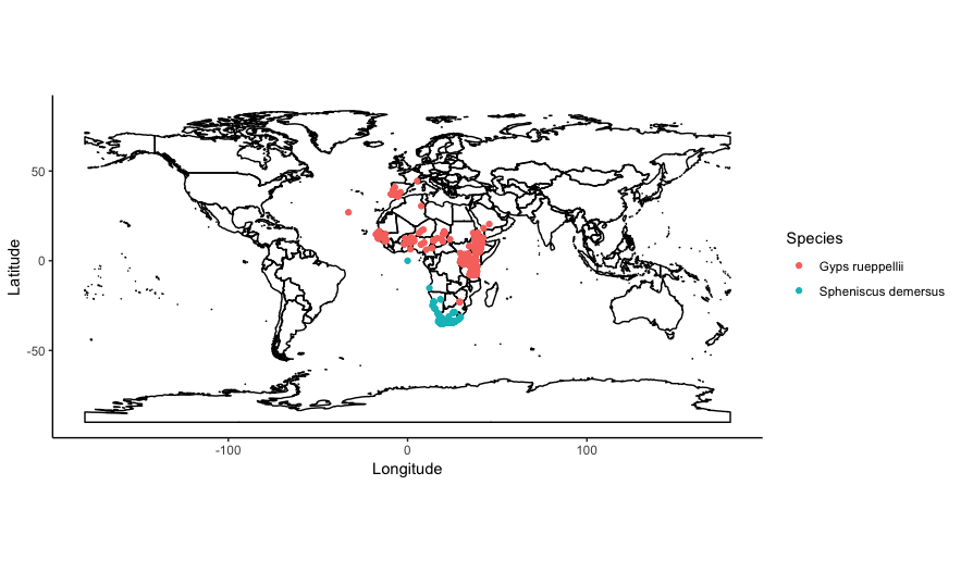
You can plot world by simply adding it to your ggplot2 call using geom_polygon() and designating the ggplot() as a map using coord_quickmap():
(with_world <- ggplot() +
	geom_polygon(data = world,
		aes(x = long, y = lat, group = group),
		fill = NA, colour = "black") +
	geom_point(data = pc_trim_us,  # Add and plot species data
		aes(x = decimallongitude, y = decimallatitude,
			colour = scientificname)) +
	coord_quickmap() +  # Prevents stretching when resizing
	theme_classic() +  # Remove ugly grey background
	xlab("Longitude") +
	ylab("Latitude") +
	guides(colour=guide_legend(title="Species")))
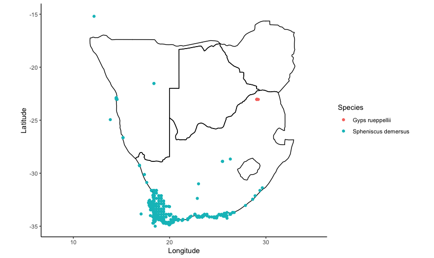
You can also subset the contents of world, to only plot a particular country or set of countries. Say we wanted to only plot the distribution of vultures and penguins in southern Africa, in the countries of South Africa, Namibia, Botswana, Zimbabwe. We can subset the column world@data$ADMIN to only include those country names:
# Make a vector of country names
saf_countries <- c("South Africa", "Namibia", "Botswana", "Zimbabwe")

# Call the vector in `borders()`
world_saf <- world[world@data$ADMIN %in% saf_countries, ]
%in% is a special R operator which matches multiple values in a vector, rather than just a single value like ==.
Then define the x and y axis limits in ggplot() using xlim() and ylim() with a bit of trial and error:
(southern_africa <- ggplot() +
	geom_polygon(data = world_saf,
		aes(x = long, y = lat, group = group),
		fill = NA, colour = "black") +
	geom_point(data = pc_trim_us,  # Add and plot speices data
		aes(x = decimallongitude, y = decimallatitude,
			colour = scientificname)) +
	coord_quickmap() +
	xlim(8, 35) +  # Set x axis limits, xlim(min, max)
	ylim(-35, -15) +  # Set y axis limits
	theme_classic() +  # Remove ugly grey background
	xlab("Longitude") +
	ylab("Latitude") +
	guides(colour=guide_legend(title="Species")))
5. Using shapefiles
Shapefiles are a data format developed by ESRI used to hold information on spatial objects. They are pretty ubiquitous and can be used by a lot of GIS packages Shapefiles can hold polygon, line or point data. Despite the name, a shapefile consists of a few different files:
Mandatory files:
.shp = The main file containing the geometry data
.shx = An index file
.dbf = An attribute file holding information on each object
Common additional files:
.prj = A file containing information on the Coordinate Reference system
.shp.xml = a file containing object metadata, citations for data, etc.
And many more!
We are going to use a shapefile of the World’s Freshwater Ecoregions provided by The Nature Conservancy to investigate the range of the Brown Trout in Europe using data from the GBIF database.
Read in the GBIF data for the Brown Trout:
brown_trout <- read.csv("Brown_Trout_GBIF_clip.csv")
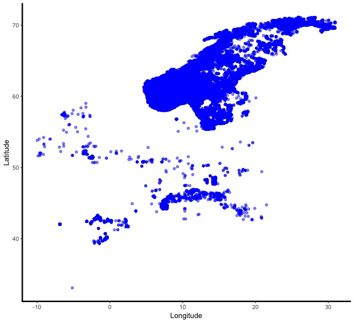
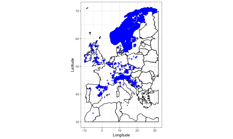
Check that the data is displaying correctly using ggplot() like in the previous example:
(trout_check <- ggplot(brown_trout, mapping = aes(x = decimallongitude, y = decimallatitude)) +
    geom_point(alpha = 0.5))
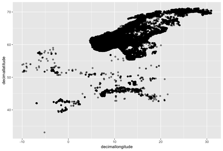
We can roughly see the outline of Scandinavia and maybe the Northern Mediterranean if you squint.
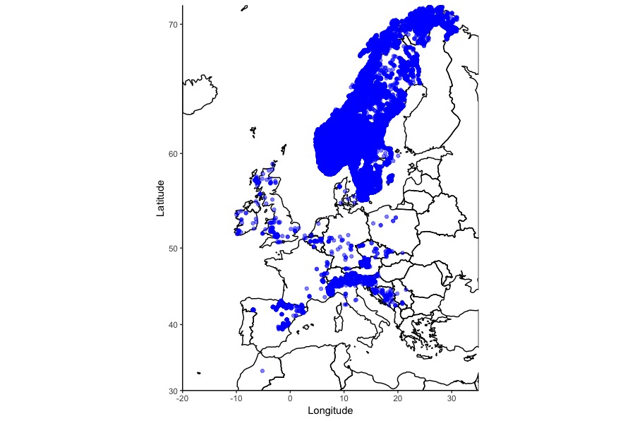
To plot a preliminary map, crop the world map provided by the rworldmap package using:
clipper_europe <- as(extent(-10, 32, 30, 72), "SpatialPolygons")

proj4string(clipper_europe) <- CRS(proj4string(world))

world_clip <- raster::intersect(world, clipper_europe)

world_clip_f <- fortify(world_clip)
The first line uses extent() to make a SpatialPolygons object which defines a bounding box inside which to crop the world map polygons. The arguments in extent() are: extent(min_longitude, max_longitude, min_latitude, max_latitude).
The second line changes the coordinate reference systems of both the counding box and the world map to be equal.
The third line uses intersect() to clip world by the area of the bounding box, clipper_europe.
The fourth line converts the SpatialPolygonsDataFrame to a normal flat dataframe for use in ggplot()
Then we can plot the map tiles with the data using geom_polygon():
(trout_map <- ggplot() +
	geom_polygon(data = world_clip_f,
		aes(x = long, y = lat, group = group),
		fill = NA, colour = "black") +
	geom_point(colour = "blue", alpha = 0.5,
		aes(x = decimallongitude, y = decimallatitude),
		data = brown_trout) +
	theme_bw() +
	xlab("Longitude") +
	ylab("Latitude") +
	coord_quickmap())
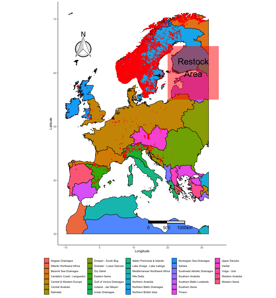
The country outlines work well, but to tell us more about the habitat the Brown Trout lives in we can also plot the ecoregions data on the map.
To read in the shapefiles we can use readOGR(), which converts a shapefile into a SpatialPolygons object that can be interpreted by R. dsn = "FEOW-TNC" gives the name of the folder where the shapefile can be found, layer = "FEOWv1_TNC" gives the name of the files to read in. It’s important to keep filenames identical in a shapefile:
shpdata_FEOW <- readOGR(dsn = "FEOW-TNC", layer = "FEOWv1_TNC")
Now we have to check that the shapefile has the right Co-ordinate Reference System (CRS) to be read by ggplot2.
proj4string(shpdata_FEOW)
To transform the CRS, we can use spTransform and specify the correct CRS, which in this case is EPSG:WGS84 (+proj=longlat +datum=WGS84). WGS84 is normallly used to display large maps of the world.:
shpdata_FEOW <- spTransform(shpdata_FEOW, CRS("+proj=longlat +datum=WGS84"))
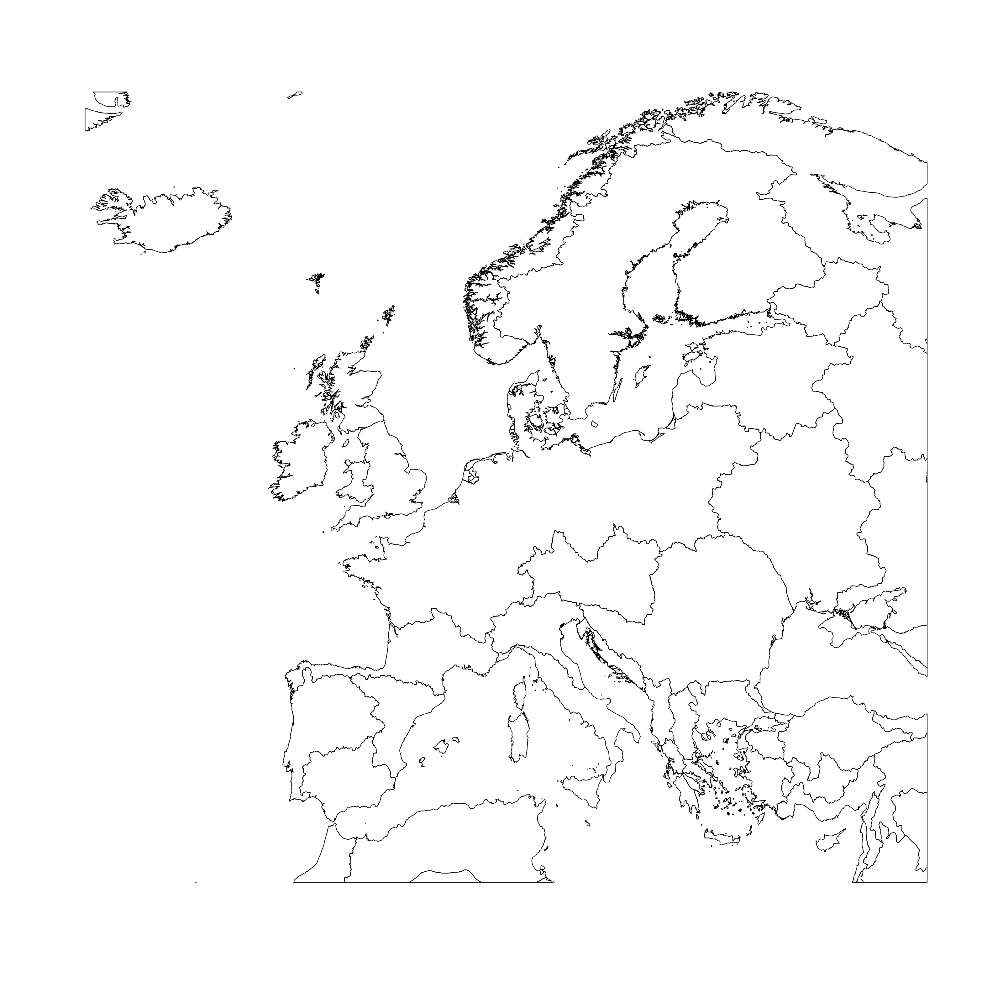
At this point I wouldn’t recommend plotting shpdata_FEOW, it’s a pretty big file, but so you can get an idea of what it looks like:
The shapefile contains ecoregions for the entire world, but we only want to plot the ecoregions where the brown trout is found. shpdata_FEOW is a SpatialPolygonsDataFrame, so we can use the same method as before to crop the object to the extent of a bounding box, using intersect():
shpdata_FEOW_clip <- raster::intersect(shpdata_FEOW, clipper_europe)
Plot shpdata_FEOW_clip to see that intersect() has cropped out polygons that were outside our bounding box, and has helpfully joined up the perimeters of any polygons that straddle the edge of the bounding box:
plot(shpdata_FEOW_clip)
Then we need to restructure the object into a data frame ready for plotting. the dataframe needs to contain the id for each polygon, in this case the name of the ecoregion it is from. explore the contents of shpdata_feow_clip, using str. Remember that @ accesses slots within the shpdata_FEOW spatial object:
str(shpdata_FEOW_clip@data)
ECOREGION contains all the data for the different types of ecoregions, they have names like “Aegean Drainages” and “Central Prairie”. Now we can use ECOREGION as an identifier in the fortify() command to transform the spatial object to a dataframe, where each polygon will be given an id of which ECOREGION it is from. Transforming to a dataframe is necessary to keep the metadata for each polygon, which is necessary to colour the points in the ggplot.
shpdata_FEOW_clip_f <- fortify(shpdata_FEOW_clip, region = "ECOREGION") # this could take a while
Now, plot the map, point data and shapefile together. The ecoregion polygons can be plotted using geom_polygon(), just like when you plotted the country outlines, specifying that the map (i.e. the polygons) and the data (i.e. the colours filling the shapes) both come from the dataframe, color = black makes the shape outlines black:
(map_FEOW <- ggplot() +
	geom_polygon(data = shpdata_FEOW_clip_f,
		aes(x = long, y = lat, group = group, fill = id),
		color = "black", size = 0.5) +
	geom_point(colour = "red", alpha = 0.5, size = 0.5,
		aes(x = decimallongitude, y = decimallatitude),
		data = brown_trout) +
	theme_classic() +
	theme(legend.position="bottom") +
	theme(legend.title=element_blank()) +
	xlab("Longitude") +
	ylab("Latitude") +
	coord_quickmap())
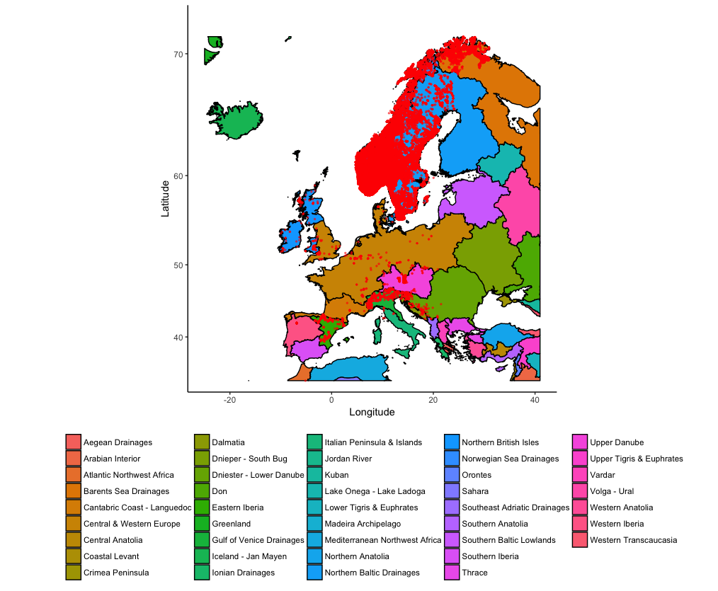
The super useful thing about plotting maps with ggplot() is that you can add other elements to the plot using normal ggplot2 syntax. Imagine that we want to indicate a potential area for a trout re-introduction program. Finland and Estonia have hardly any trout, but would probably have the right conditions according to the ecoregions:
(map_FEOW_annot <- map_FEOW +
	annotate("rect", xmin = 20 , xmax = 35, ymin = 55, ymax = 65, fill="red", alpha=0.5) +
	annotate("text", x = 27.5, y = 61, size = 10, label = "Restock\nArea"))
To further explore which ecoregions would be suitable for a trout re-introduction program, you can also check which trout records fall within which ecoregion polygons using the rgdal package. First, create a SpatialPoints object from the Brown Trout records:
brown_trout_sp <- SpatialPoints(
	coords = data.frame(brown_trout$decimallongitude, brown_trout$decimallatitude),
	proj4string = CRS(proj4string(shpdata_FEOW_clip)))
coords = uses the coordinates from the brown trout dataset formatted as a dataframe. the CRS (proj4string) is set to be the CRS of the ecoregions spatial object.
over() from the sp package (loaded by default by many other R spatial analysis packages) then creates a dataframe with the same number of rows as brown_trout_sp, where each row contains the data of the polygon in which the data point is found.
point_match <- over(
	brown_trout_sp,
	shpdata_FEOW_clip)
It’s then easy to use commands from the dplyr package to create a summary table counting the number of rows grouped by ECOREGION.
point_match %>%
	group_by(ECOREGION) %>%
	tally() %>%
	arrange(desc(n))
The Northern Baltic Drainages, Norwegian Sea Drainages and Eastern Iberia all have over 10,000 records.
Finally, to make our map look more professional, we can add a scale bar and a north arrow. To add these you can use the ggsn package.
Adding a scalebar. transform = TRUE confirms that the coordinates of the map are in decimal degrees, if this was set to FALSE scalebar() would assume the coordinates were in metres. dist defines the distance for each gradation of the scalebar, height defines the height of the scalebar according to y axis measurements, so 0.01 is 0.01 decimal degrees latitude. location sets the location of the scalebar, in this case to the bottomright. anchor sets the location of the bottom right corner of the scalebar box, in map units of decimal degrees. If location = topleft, anchor would instead define the location of the top left corner of the scalebar box.
map_FEOW_scale <- map_FEOW_annot +
  scalebar(data = shpdata_FEOW_clip_f,
    transform = TRUE, dist = 500, dist_unit = "km", model='WGS84',
    height = 0.01, location = "bottomright", anchor = c(x = 25, y = 32))
Adding a north arrow. Currently the default north command from the ggsn package doesn’t work properly, so we can’t just do map_FEOW + north(). Instead north2() has to be used as an alternative. You can change the symbol by changing symbol to any integer from 1 to 8. You might get an error saying: “Error: Don’t know how to add o to a plot” and your arrow might be placed in a strange location - you can change the values for x and y till your arrow moves to where you want it to be.
north2(map_FEOW_scale, x = 0.3, y = 0.85, scale = 0.1, symbol = 1)
There are lots of ways to visualise and analyse spatial data in R. This workshop touched on a few of them, focussing on workflows involving ggplot2, but it is recommended to explore more online resources for your specific needs.