Tutorial Aims:
All the files needed to complete this tutorial can be downloaded from this Github repository. Click on Clone or Download/Download ZIP and then unzip the files.
This is a short tutorial we used as an example of our work at the “Transferring quantitative skills among ecologists” workshop we led at the Ecology Across Borders 2018 Conference in Ghent, Belgium.
For more detailed tutorials on working with large datasets and visualising changes in populations and species’ occurrence, check out: Working efficiently with large datasets, Advanced tidyverse workflows and Manipulation and visualisation of species occurrence data.
In this tutorial we will create a map showing the locations of vertebrate species populations from different orders and the direction in which those populations have changed in the last 60 years. We will use a dataset from the Living Planet Index Database, which is publicly available. For the purpose of this tutorial, we have extracted a subset of the database (LPI_EU.csv) that includes vertebrate populations from the ten most common orders in Europe - Passeriformes, Carnivora, Charadriiformes, Anseriformes, Falconiformes, Salmoniformes, Ciconiiformes, Artiodactyla, Perciformes, Cypriniformes.
Here is an example map showing where the populations from the order Anseriformes were located, as well as how their populations have changed between 1950 and 2015. Looks like most of the populations have remained stable, with a slope around zero, three populations have increased and a few have decreased. Here, we have demonstrated how to do the analysis on the population level, with a focus on how all species within a given order are changing, but you can filter the dataset if there is a particular species you are interested in.
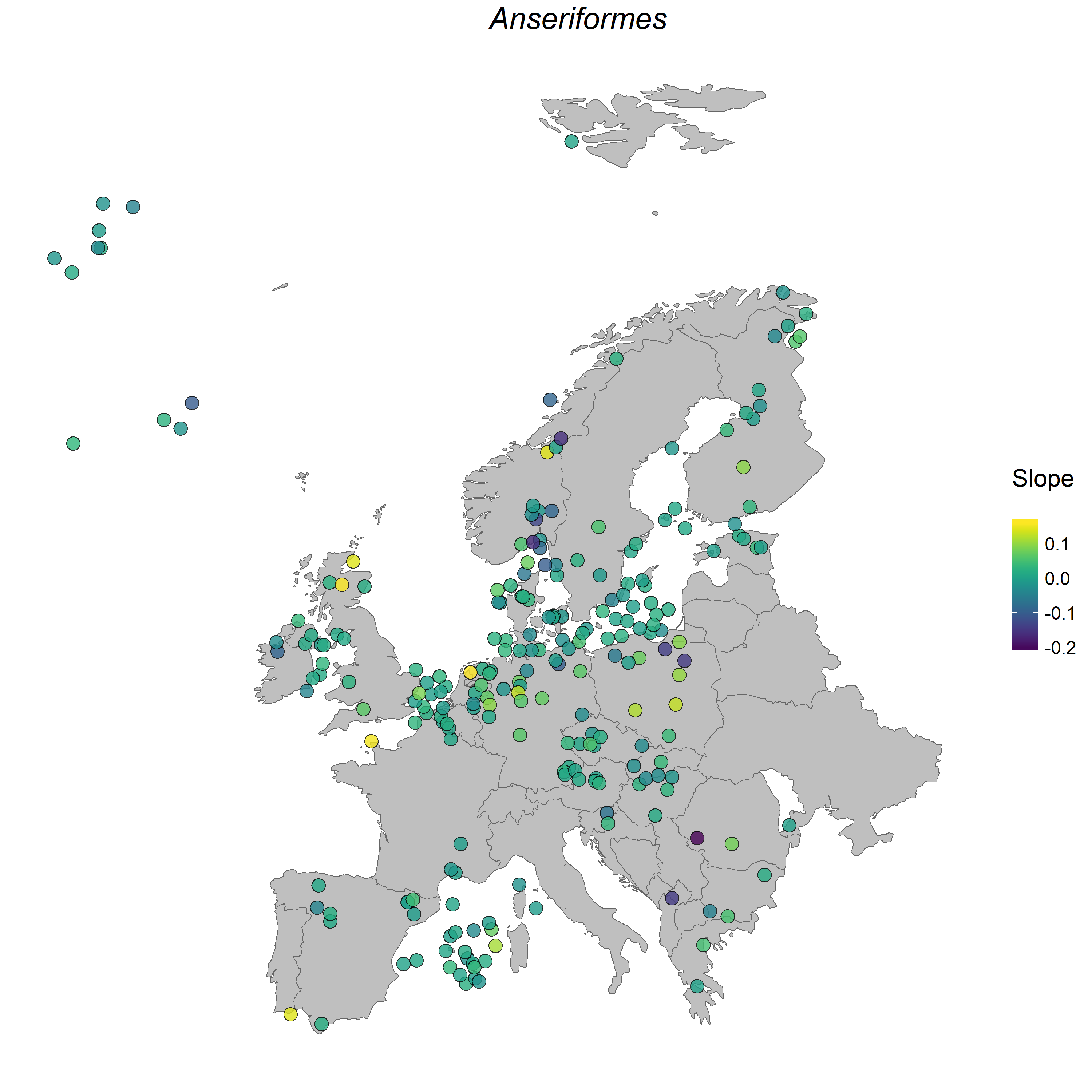 Figure 1. Anseriformes populations in Europe.
Open RStudio and make a new script by clicking on File/New File/R Script. Usually we open RStudio on half of our screen and the tutorial on the other half, as that way it’s easy to copy code across and google errors if they arise.

Headers and comments outline why we are taking the various steps in our analyses. Future you, your supervisors or collaborators will all benefit from informative comments.
# Aim of the script
# Your name and date

# Set working directory to where you saved the LPI EU data
setwd("D:/R/workshops/AEB")
# This is a sample filepath, it will be different on your laptop
# Alternatively, you can click on Session/Set Working Directory/Choose directory and navigate to your folder, but we recommend you still copy the code from the console to your script, so that future you knows from where the files came

# Load libraries ----
library(readr)
library(tidyr)
library(dplyr)
library(broom)
library(ggplot2)
library(ggthemes)
library(maps)
library(mapdata)
library(viridis)

# Load data ----
LPI_EU <- read_csv("AEB/LPI_EU.csv")
# Use read_csv not read.csv, so that the year columns are read in as characters
# They have an awkward "x" in front of the numbers, you'll see it later when we get rid of it

head(LPI_EU)
tail(LPI_EU)
str(LPI_EU)
View(LPI_EU)
1. Tidy the data
The data are currently in wide format: each year is a column, which is not convenient for analysis. In a tidy dataset each row is an observation. We can transform the dataset into long format using the gather() function from the tidyr package.
# Transform data to long format ----
LPI_long <- gather(data = LPI_EU, key = "year", value = "population", select = 24:89)
# `select = 24:89` refers to the columns we want to gather, from the 24th to the 89th column

# Turn the year column into a numeric variable and get rid of the "x"
LPI_long$year <- parse_number(LPI_long$year)
str(LPI_long)  # population and year shouldn't be character variables
LPI_long$year <- as.numeric(as.character(LPI_long$year))
LPI_long$population <- as.numeric(as.character(LPI_long$population))
If you’ve worked with dplyr before, you might know that parse_number is meant to have converted the Year terms into numerals (from the characters that they originally were). However, sometimes R messes around and the parse_number function doesn’t work perfectly to convert the values to their appropriate structure - and so you would have to use as.numeric to convert it to numeric terms!
The Living Planet Index Database contains records from hundreds of populations from 1950 to recent time, but the populations weren’t surveyed every year, thus there are rows which say NULL. We can remove those rows so that the population column contains only numeric values.
Since we will be calculating population change, to get more reliable estimates, we can conduct the analysis only using populations which have at least 5 records. Populations with only a few records might show a strong directional population change that is actually just noise in the data collection. We can also scale population size so that the abundance of each species in each year is somewhere between 0 and 1. This helps when we are analysing many different populations whose numbers are very variable - e.g. some populations have 10-20 individuals, others have thousands.
Pipes, designated by the pipe operator %>%, are a way to streamline your analysis. Imagine your data going in one end of a pipe, then you transform it, do some analysis on it, and then whatever comes out the other end of the pipe gets saved in the object to which you are assigning the pipe. You can find a more detailed explanation of data manipulation using dplyr in our data formatting and manipulation tutorial.
# Remove rows with no population information (population = NULL)
LPI_long <- filter(LPI_long, population != "NULL")

# Select only populations which have at least 5 data points
LPI_long <- LPI_long %>%
	group_by(id) %>%
	filter(length(unique(year)) > 4)

# Scale population size to be from 0 to 1 for each population and store the info in a new column scalepop
LPI_long <- LPI_long %>%
	group_by(id) %>%
	mutate(scalepop = (population - min(population))/(max(population)-min(population)))
2. Calculate population change
We have subsetted the data for the ten most common orders in the LPI European database so we can quantify the change in populations from an order of our choice. Alternatively, we can calculate population change for all orders or for just the marine or terrestrial ones: many options!
# Calculate population change for an order of your choice ----
unique(LPI_long$order)  # displays all order options
anseriformes <- filter(LPI_long, order == "Anseriformes")
We will use the dplyr and broom packages, which together create an efficient workflow in calculating population change. We will use linear models, from which we will extract the slope values. Positive slopes indicate a population increase, negative slopes signify a population decline and a slope of zero indicates no net change.
pop_change <- anseriformes %>%
  group_by(latitude, longitude, binomial, id) %>%  # any column you want to keep, include here
  # the functions that follow will act on the last variable in the grouping
  # id represents a column with a unique number for each population
  # binomial is the species name
  do(mod = lm(scalepop ~ year, data = .)) %>%  # Create a linear model for each group
  # when using a non-dplyr function in a pipe, you have to put do() around it
  tidy(mod) %>%  # Extract model coefficients
  select(., latitude, longitude, binomial, id, term, estimate) %>%  # select the columns we want
  spread(., term, estimate) %>%  # transform them in a useful format
  ungroup()  # get rid of the grouping
3. Make a map of vertebrate population change in Europe
We are now all set to make our map! This is a simple map we will make using ggplot2 - it doesn’t have topography, or cities and roads. Instead, it presents a stylised view of European countries and focuses on where the different populations are located and how they have changed.
We are using the viridis package for the colour palette of the points. The viridis package contains four colour palettes, which are friendly to colour blind people and they look quite nice in general.
You can use the default viridis palette by just specifying scale_colour_viridis() and if you want to try the other three options, you can instead use scale_colour_viridis(option = "magma"). The other two options are inferno and plasma.
(EU_pop <- ggplot(pop_change, aes(x = longitude, y = latitude, fill = year)) +
    borders("world", xlim = c(-10, 25), ylim = c(40, 80), colour = "gray40", fill = "gray75", size = 0.3) +
    theme_map() +
    geom_point(shape = 21, colour = "black", alpha = 0.8, size = 4, position = position_jitter(w = 1.5, h = 1.5)) +
    # there are quite a few points, so we can use jittering to avoid overplotting
    scale_fill_viridis() +
    theme(legend.position = "right",
          legend.title = element_text(size = 16),
          legend.text = element_text(size = 12),
          legend.justification = "center",
          plot.title = element_text(size = 20, vjust = 1, hjust = 0.6, face = "italic")) +
    labs(fill = "Slope\n", title = "Anseriformes"))  # \n adds a blank line below the legend title
Note that putting your entire ggplot code in brackets () creates the figure and then shows it in the plot viewer. If you don’t have the brackets, you’ve only created the object, but haven’t visualized it. You would then have to call the object such that it will be displayed by just typing EU_pop after you’ve created the “EU_pop” object.
We can save our map using ggsave() from the ggplot2 package. The default width and height are measured in inches. If you want to swap to pixels or centimeters, you can add units = "px" or units = "cm" inside the ggsave() brackets, e.g. ggsave(object, filename = "mymap.png", width = 1000, height = 1000, units = "px".
ggsave(EU_pop, filename = "anseriformes.pdf", width = 10, height = 10)
ggsave(EU_pop, filename = "anseriformes.png", width = 10, height = 10)
Here we have created a map for Anseriformes, an order which includes many species of waterfowl, like the mallard and pochard. Curious to see how vertebrate populations across the whole LPI database have changed? You can check out our tutorial on efficient ways to quantify population change, where we compare how for-loops, lapply() functions and pipes compare when it comes to dealing with a lot of data.
We’d love to see the maps you’ve made so feel free to email them to us at ourcodingclub(at)gmail.com!