Tutorial Aims:
- Download, format and manipulate biodiversity data
- Clean species occurrence data
- Visualise & customise species occurrence and population trends
All the files you need to complete this tutorial can be downloaded from this repository. Click on Clone/Download/Download ZIP and unzip the folder, or clone the repository to your own GitHub account.
In this tutorial, we will focus on how to efficiently format, manipulate and visualise large species occurrence and population trend datasets. We will use the tidyr and dplyr packages to clean up dataframes and calculate new variables. Then, we will do a further clean up of species occurrence data using the CleanCoordinates function from the CoordinateCleaner package. Species occurrence records often include thousands, if not millions of latitude and longitude points, but are they all valid points? Sometimes the latitude and longitude values are reversed, there are unwanted zeros, or terrestrial species are seen out at sea and marine species very inland! The CoordinateCleaner package, developed by Alexander Zizka, flags potentially erroneous coordinates so that you can decide whether or not to include them in your analysis (more info here). Finally, we will use the ggplot2 package to make simple maps of occurrence records, visualise a few trends in time and then we will arrange all of our graphs together using the gridExtra package.
1. Download, format and manipulate biodiversity data
We will be working with occurrence data for the beluga whale from the Global Biodiversity Information Facility and population data for the same species from the Living Planet Database, both of which are publicly available datasets.
Set your working directory.
It helps to keep all your data, scripts, image outputs etc. in a single folder. This minimises the chance of losing any part of your analysis and makes it easier to move the analysis on your computer without breaking filepaths. Note that filepaths are defined differently on Mac/Linux and Windows machines. On a Mac/Linux machine, user files are found in the ‘home’ directory (~), whereas on a Windows machine, files can be placed in multiple ‘drives’ (e.g. D:). Also note that on a Windows machine, if you copy and paste a filepath from Windows Explorer into RStudio, it will appear with backslashes (\ ), but R requires all filepaths to be written using forward-slashes (/) so you will have to change those manually.
Set your working directory to the folder you downloaded from Github earlier. It should be called CC-occurrence-master or however you renamed it when unzipping. See below for some examples for both Windows and Mac/Linux:
# Set the working directory on Windows
setwd("D:/Work/coding_club/CC-occurrence-master")

# Set the working directory on Mac/Linux
setwd("~/Work/coding_club/CC-occurrence-master")
Make a new script file using File/ New File/ R Script and we are all set to start exploring where beluga whales have been recorded and how their populations have changed in the last few decades.
Organise your script into sections
As with any piece of writing, when writing an R script it really helps to have a clear structure. A script is a .R file that contains your code. You could directly type code into the R console, but that way you have no record of it and you won’t be able to reuse it later. To make a new .R file, open RStudio and go to File/New file/R script. For more information on the general RStudio layout, you can check out our Intro to RStudio tutorial. A clearly structured script allows both the writer and the reader to easily navigate through the code to find the desired section.
The best way to split your script into sections is to use comments. You can define a comment by adding # to the start of any line and typing text after it, e.g. # Load data. Then, underneath that comment, you would write the code for importing your data in R. RStudio has a great feature allowing you to turn your sections into an outline, similar to that which you can find in Microsoft Word. To add a comment to the outline, type four - after your comment text, e.g. # Load data ----. To view your outline, click on the button shown below. You can then click on an outline item and jump straight to it - no more scrolling!
NOTE: If you don’t see the outline icon, you most likely do not have the newest version of RStudio. If you want to get this feature, you can download the newest version of RStudio.
Write an informative header
Whatever your coding adventure, it will be way smoother if you record what you are doing and why you are doing it, so that your collaborators and future you can come back to the script and not be puzzled by the thousands of line of code. It’s good practice to start a script with information on who you are, what the code is for and when you are writing it. We have some comments throughout the code in the tutorial. Feel free to add more comments to your script using a hashtag # before a line of text.
# Marine mammal distribution and population change
# Data formatting, manipulation and visualisation

# Conference workshop
# Your name
# Date
Next, load (library()) the packages needed for this tutorial. If you don’t have some of them installed, you can install them using ìnstall.packages("package-name").
# Packages ----
library(readr)
library(tidyr)
library(dplyr)
library(broom)
library(ggplot2)
library(ggthemes)
library(mapdata)
library(maps)
library(rgbif)
library(CoordinateCleaner)
library(ggrepel)
library(png)
library(gridExtra)
Make your own ggplot2 theme
If you’ve ever tried to perfect your ggplot2 graphs, you might have noticed that the lines starting with theme() quickly pile up: you adjust the font size of the axes and the labels, the position of the title, the background colour of the plot, you remove the grid lines in the background, etc. And then you have to do the same for the next plot, which really increases the amount of code you use. Here is a simple solution: create a customised theme that combines all the theme() elements you want and apply it to your graphs to make things easier and increase consistency. You can include as many elements in your theme as you want, as long as they don’t contradict one another, and then when you apply your theme to a graph, only the relevant elements will be considered - e.g. for our graphs we won’t need to use legend.position, but it’s fine to keep it in the theme in case any future graphs we apply it to do have the need for legends.
# Personalised ggplot2 theme
theme_marine <- function(){
  theme_bw() +
    theme(axis.text = element_text(size = 16),
          axis.title = element_text(size = 20),
          axis.line.x = element_line(color="black"),
          axis.line.y = element_line(color="black"),
          panel.border = element_blank(),
          panel.grid.major.x = element_blank(),
          panel.grid.minor.x = element_blank(),
          panel.grid.minor.y = element_blank(),
          panel.grid.major.y = element_blank(),
          plot.margin = unit(c(1, 1, 1, 1), units = , "cm"),
          plot.title = element_text(size = 20),
          legend.text = element_text(size = 12),
          legend.title = element_blank(),
          legend.position = c(0.9, 0.9),
          legend.key = element_blank(),
          legend.background = element_rect(color = "black",
                                           fill = "transparent",
                                           size = 2, linetype="blank"))
}
Load species occurrence and population trend data
The data are in an .RData format, as those are quicker to use, since .Rdata files are more compressed. Of course, a drawback is that .RData files can only be used within R, whereas .csv files are more transferable.
# Load data ----

# Download species occurrence records from the Global Biodiversity Information Facility
# beluga <- occ_search(scientificName = "Delphinapterus leucas", limit = 20000,
#                      hasCoordinate = TRUE, return = "data")

# Downloading takes a while so unless you have time to wait, you can use the file we downloaded in advance

load("beluga.RData")

# Load population change data for marine species from the Living Planet Database
load("marine.RData")
Data formatting
The beluga object contains hundreds of columns with information about the GBIF records. To make our analysis quicker, we can select just the ones we need using the select function from the dplyr package, which picks out just the columns we asked for. Note that you can also use select to remove columns from a data frame by adding a - before a column name, e.g. -region.
# Data formatting & manipulation ----
# Simplify occurrence data frame
beluga <- beluga %>% dplyr::select(key, name, decimalLongitude, decimalLatitude, year, individualCount, country)
We specified that we want the select function from exactly the dplyr package and not any other package we have loaded using dplyr::select. Otherwise, you might get this error:
#Error in (function (classes, fdef, mtable)  :
#            unable to find an inherited method for function select for signature "grouped_df"
Format and manipulate population change dataset
Next, we will follow a few consecutive steps to format the population change data, exclude NA values and prepare the abundance data for analysis. Each step follows logically from the one before and we don’t need to store intermediate objects along the way - we just need the final object. For this purpose, we can use pipes.
__Pipes (%>%) are a way of streamlining data manipulation. Imagine all of your data coming in one end of the pipe, while they are in there, they are manipulated, summarised, etc., then the output (e.g. your new data frame or summary statistics) comes out the other end of the pipe. At each step of the pipe processing, the pipe takes the output of the previous step and applies the function you’ve chosen. For more information on data manipulation using pipes, you can check out our data manipulation tutorial.
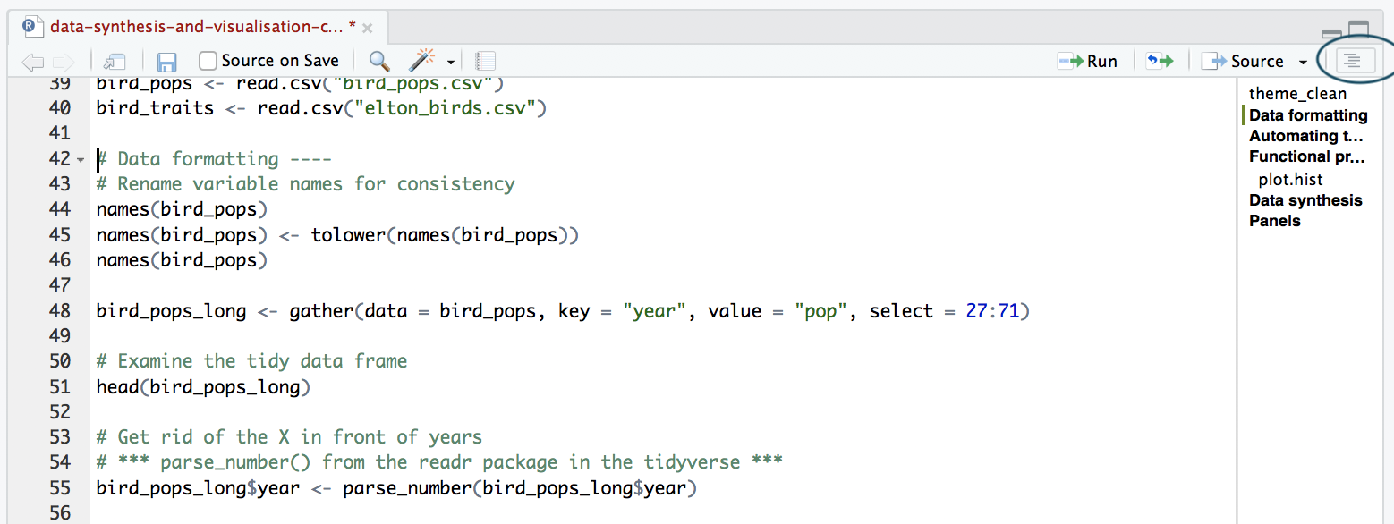
The population change data are in a wide format: each row contains a population that has been monitored over time and towards the right of the data frame, there are a lot of columns with population estimates for each year. To make this data “tidy” (one column per variable) we can use gather() to transform the data so there is a new column containing all the years for each population and an adjacent column containing all the population estimates for those years. Now if you wanted to compare between groups, treatments, species, etc, R would be able to split the dataframe correctly, as each grouping factor has its own column.
We will take our original dataset marine, filter to include just the beluga populations and create a new column called year, fill it with column names from columns numbers 26 to 70 (26:70) and then use the data from these columns to make another column called abundance.
We should also scale the population data, because, since the data come from many species, the units and magnitude of the data are very different. Imagine tiny fish whose abundance is in the millions and large carnivores whose abundance is much smaller. By scaling the data, we are also normalising it so that later on we can use linear models with a normal distribution to quantify overall experienced population change.
# Take a look at the population change data
View(marine)

# Format population change data
beluga.pop <- marine %>% filter(species == "Delphinapterus leucas") %>%  # Select only beluga populations
  gather(key = "year", value = "abundance", select = 26:70) %>%  # Turn data frame from wide to long format
  filter(is.na(abundance) == FALSE) %>%  # Remove empty rows
  group_by(id) %>%   # Group rows so that each group is one population
  mutate(scalepop = (abundance-min(abundance))/(max(abundance)-min(abundance))) %>%  # Scale abundance from 0 to 1
  filter(length(unique(year)) > 4) %>% # Only include populations monitored at least 5 times
  ungroup()  # Remove the grouping
Because column names are coded in as characters, when we turned the column names (1970, 1971, 1972, etc.) into rows, R automatically put an X in front of the numbers to force them to remain characters. We don’t want that, so to turn year into a numeric variable, you can use the parse_number function from the readr package.
# Explore data frame
str(beluga.pop)
# Year is a character variable because the years used to be column names
# We have to remove the "X" in front of all years to make year numeric

# Get rid of the X in front of years
beluga.pop$year <- parse_number(beluga.pop$year)
Quantify population change
We will fit simple linear models (abundance over time for each population, abundance ~ year) to get a measure of the overall change experienced by each population for the period it was monitored. We will extract the slope, i.e. the estimate for the year term for each population. We can do this in a pipe as well, which makes for an efficient analysis. Here, we are analysing five populations, but you can also do it for thousands. With the broom package, we can extract model coefficients using one single line: tidy(model_name).
# Calculate population change using linear models
beluga.slopes <- beluga.pop %>%
  group_by(Location.of.population, Decimal.Latitude, Decimal.Longitude, id) %>%  # Group data so that we fit one model per population
  # id is the identifier for each population
  do(mod = lm(scalepop ~ year, data = .)) %>%  # Fit a linear model
  tidy(mod)  # extract model coefficients using tidy() from the broom package

View(beluga.slopes)

# For analysis and plotting, we often need the intercept and slopes to be columns, not rows
# Format data frame with model outputs
beluga.slopes <- beluga.slopes %>%
  dplyr::select(Location.of.population, Decimal.Latitude,
                Decimal.Longitude, id, term, estimate) %>%
                # Select the columns we need
  spread(term, estimate) %>%  # spread() is the opposite of gather()
  ungroup()
2. Clean species occurrence data
We have over a thousand GBIF occurrence records of belugas. Using the CleanCoordinates function from the CoordinateCleaner package, developed by Alexander Zizka, we can perform different tests of validity to flag potentially wrong coordinates (more info here). For example, we are currently working with a marine species, the beluga whale, so we don’t expect to see those on land. Nevertheless, people sometimes see whales from land, i.e. when they are whalewatching from the coastline and when they take a GPS reading. That occurrence would technically be on land, since it’s for the land-based observer, not the whale swimming by. Additionally, some of the records might be from zoos, which can explain species appearing to occur outside of their usual ranges.
Before we perform the coordinate tests, we can make a quick map to get an idea of the spatial spread of the beluga GBIF records. With ggplot2 and the ggthemes packages (the theme_map() function comes from ggthemes), you can make quick and easy maps. To choose colours for your map, you can use the Rcolourpicker addin, which offers a really easy way to get the colour codes for whatever colours you want right within RStudio.
Picking colours using the Rcolourpicker addin
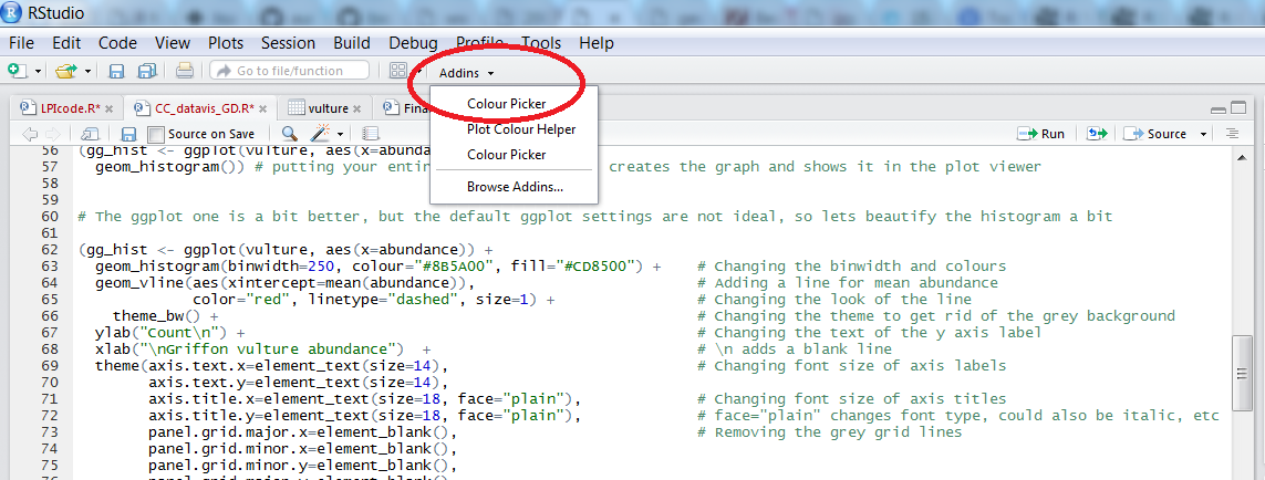
Setting custom colours for your graphs can set them apart from all the rest (we all know what the default ggplot2 colours look like!), make them prettier and most importantly, give your work a consistent and logical colour scheme. Finding the codes, e.g. colour="#8B5A00", for your chosen colours, however, can be a bit tedious. Though one can always use Paint / Photoshop / google colour codes, there is a way to do this within RStudio thanks to the addin colourpicker. RStudio addins are installed the same way as packages and you can access them by clicking on Addins in your RStudio menu. To install colourpicker, run the following code:
install.packages("colourpicker")
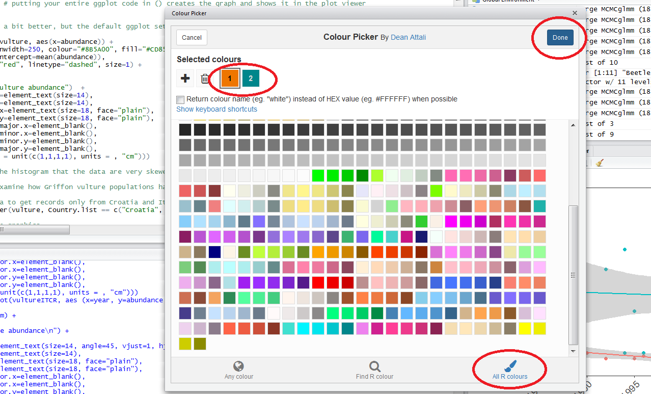
To find out what the code for a colour you like is, click on Addins/Colour picker.
When you click on All R colours you will see lots of different colours you can choose from. A good colour scheme makes your graph stand out, but of course, don’t go crazy with the colours. When you click on 1, and then on a certain colour, you fill up 1 with that colour. The same goes for 2, 3 - you can add mode colours with the + or delete them by clicking the bin. Once you’ve made your pick, click Done. You will see a line of code c("#8B5A00", "#CD8500") appear. In this case, we just need the colour code so we can copy that and delete the rest.
Now that we have our colours, we can make a map. A map is really like any other graph. In our ggplot() code, we have to specify a dataframe and then say what should be plotted on the x axis and on the y axis: in our case, the longitude and latitude of each occurrence record.
# Data visualisation ----

# Sample colour scheme c("gray40", "aquamarine3", "tan1")

# ** Map of GBIF occurrences ----
(beluga.map <- ggplot(beluga, aes(x = decimalLongitude, y = decimalLatitude)) +
   borders("worldHires", ylim = c(40, 100), colour = "gray40", fill = "gray40", size = 0.3) +
	 # get a high resolution map of the world
   theme_map() +
   geom_point(alpha = 0.5, size = 2, colour = "aquamarine3"))  # alpha controls the transparency, 1 is fully transparent
Note that putting your entire ggplot code in brackets () creates the graph and then shows it in the plot viewer. If you don’t have the brackets, you’ve only created the object, but haven’t visualised it. You would then have to call the object such that it will be displayed by just typing beluga.map after you’ve created the “beluga.map” object.
ggplot2 works with aesthetics. That is the aes argument which “maps” your variables to the x and y axises.
When you want to change the colour, fill, shape or size of your points, bars or lines to vary depending on a certain variable, you have to include that argument inside the aes() code, e.g. geom_point(alpha = 0.5, size = 2, aes(colour = individualCount) will change the colour of the points based on the individualCount variable, which is a continuous variable showing how many individuals were recorded.
When you want to specify particular colours, shapes or sizes, those are included outside of the aes() code, e.g. geom_point(alpha = 0.5, size = 2, colour = "aquamarine3").
Later on, if you are interested in learning how to use the ggplot2 package to make many different types of graphs, you can check out our tutorial introducing ggplot2 and our tutorial on further customisation and data visualisation.
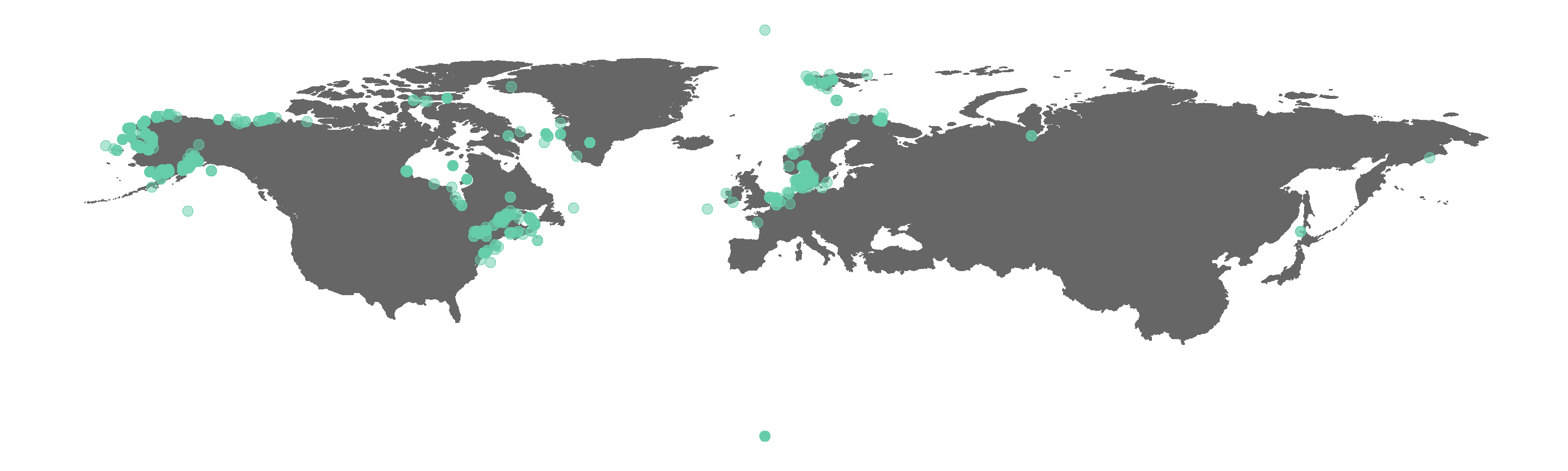 Figure 1. Map of all GBIF occurrences for the beluga whale.
Do you spot any beluga whales where there shouldn’t be any? We can check what the CleanCoordinates function flags as potentially wrong records. The function performs a series of tests, e.g. are there any zeros among the longitude and latitude values, and then returns a summary dataframe of whether each occurrence record failed or passed each test (i.e. FALSE vs TRUE).
# ** Clean coordinate data ----
# There are some obvious outliers
# We should check the coordinates for all occurrences

# Load an object with a buffered coastline to asses if points are on land or at sea
load("buffland_1deg.rda")
# E.g. if we would like to keep the terrestrial records that perhaps refer to
# people spotting belugas from the coast

# Test coordinates using clean_coordinates() from the CoordinateCleaner package
beluga.coord.test <- clean_coordinates(beluga, lon = "decimalLongitude", lat = "decimalLatitude",
                                       species = "name", tests = c("outliers", "seas", "zeros"),
                                       outliers_method = "distance", outliers_td = 5000,
                                       seas_ref = buffland)
# species = "" refers to the name of the column which has the species name
# By default, outliers are occurrences further than 1000km from any other occurrence
# We can change that using outliers.td() with a value of our choice
# We'll also test if occurrences are on land or at sea and if there are any zeros for lat and long

# No need to worry about the warning message, just lets you know about one of the default tests
Check out the result.
View(beluga.coord.test)

# Some the occurrences are on land, probably referring to the spot
# on the coast from where someone saw the belugas or to a non-existing false record

# Extract just occurrence classified as TRUE in the summary
# using value = "clean"
beluga.clean <- clean_coordinates(beluga, lon = "decimalLongitude", lat = "decimalLatitude",
                                       species = "name", tests = c("outliers", "seas", "zeros"),
                                       outliers_method = "distance", outliers_td = 5000,
                                       seas_ref = buffland, value = "clean")
# Check out the result
View(beluga.clean)
Now we can update our map by swapping the beluga object with the beluga.clean object to see what difference cleaning the coordinate data made. When cleaning coordinate data for your own analyses, you can include further tests, e.g. if you are doing a UK-scale analysis, you can check whether the points are actually in the UK. As usual with research, the decision about what to include or exclude is yours and the clean_coordinates function offers one way to inform your decision.
# Make a map of the clean GBIF occurrences
(beluga.map.clean <- ggplot(beluga.clean, aes(x = decimalLongitude, y = decimalLatitude)) +
    borders("worldHires", ylim = c(40, 100), colour = "gray40", fill = "gray40", size = 0.3) +
    theme_map() +
    geom_point(alpha = 0.5, size = 2, colour = "aquamarine3"))
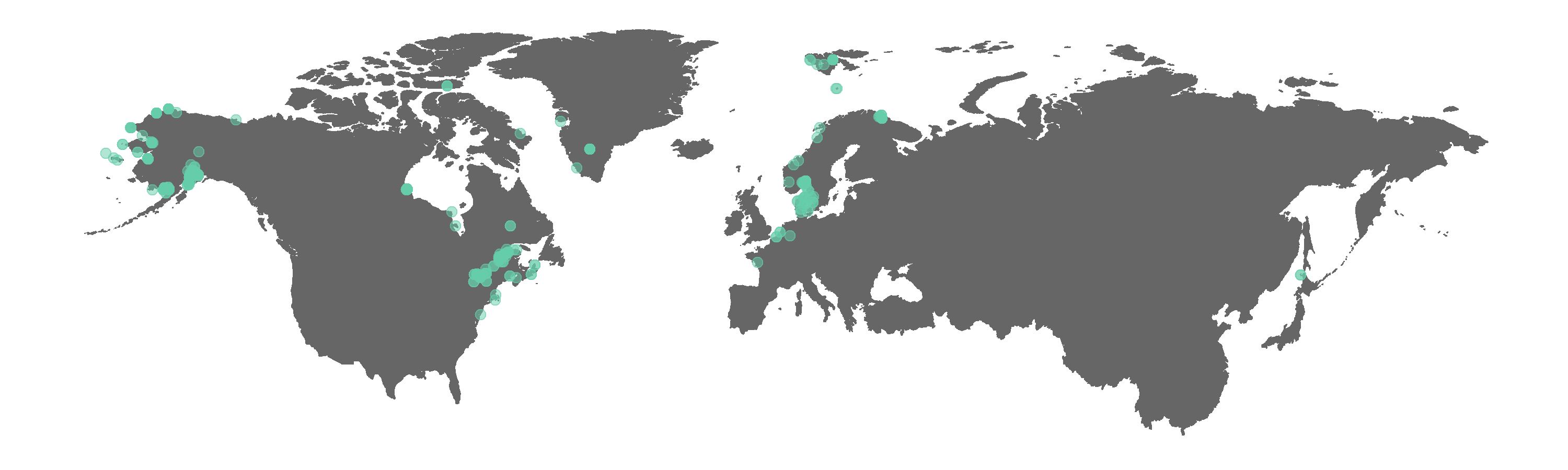 Figure 2. Map of GBIF occurrences for the beluga whale after filtering for records that passed the coordinate validity tests.
Interestingly, some land points still appear. The tests did remove the obvious outliers, like the beluga record near Africa. We can manually exclude points we think are not real if we wish, e.g. the Greenland land point is fairly distinct and easy to remove.
greenland <- filter(beluga, country == "Greenland")

# Get the unique coordinates as some occurrences are from the same place
greenland <- dplyr::select(greenland, decimalLongitude, decimalLatitude) %>%
  distinct()

View(greenland)

# The point to exclude is the one in the far east
# Longitude -46.00000  Latitude 65.00000

# Find out which rows match that criteria using which()
which(beluga.clean$decimalLongitude == -46 & beluga.clean$decimalLatitude == 65)
# rows numbers 1421 1422 1423 1424 1530

beluga.base <- beluga.clean[-c(1421, 1422, 1423, 1424, 1530),] # selects all columns and removes those rows

# Alternatively, you can filter those points out in a pipe
beluga.pipe <- beluga.clean %>% filter(decimalLongitude != -46 | decimalLatitude != 65)

# The results are the same, which you can confirm using anti_join() from dplyr
anti_join(beluga.base, beluga.pipe)  # There are no differences
We could keep going with the occurrence clean up and you could use the identifier for each record (the key column in the data frame that has a unique value for each record) to go back to the original GBIF data and filter out that record, using e.g. new.beluga <- filter(beluga.clean, key != "whatever the key number is"). You can also look up the many columns of data from the original GBIF dataframe to get more information on that specific record, e.g. is it from a wild population, how was it collected and by whom. Then you might decide you want to exclude more records.
3. Visualise & customise species occurrence and population trends
For now, we will move onto more data visualisation. We will customise our map of beluga occurrence, visualise when the records were collected and how some of the beluga populations have changed through time.
# Make a new map and include the locations of the populations part of the Living Planet Database
(beluga.map.LPI <- ggplot(beluga.base, aes(x = decimalLongitude, y = decimalLatitude)) +
    borders("worldHires", ylim = c(40, 100), colour = "gray40", fill = "gray40", size = 0.3) +
    theme_map() +
    geom_point(alpha = 0.3, size = 2, colour = "aquamarine3") +
    geom_point(data = beluga.slopes, aes(x = Decimal.Longitude, y = Decimal.Latitude),  # Add the points from the population change data
               size = 4, colour = "tan1"))
# You have to specify where the data come from when plotting from more than one dataframe using data = ""
The ggplot2 package offers many different ways you can customise your graphs. We will use some of those here and we will also use an additional package, ggrepel, which adds nice labels for the points we specified, e.g. from our map, we know where belugas occur (the GBIF records) and some of the places where they have been monitored (the population change points) and we can label the monitoring sites. First, we have to make sure the names are consistent and we don’t want them to be too long so we can rename them using the recode() function from dplyr.
# Customising map ----
# Beautify by adding labels for the three sites and a beluga icon

# Check site names
print(beluga.slopes$Location.of.population)

# Make site names consistent
# Make sure the original names are the same as shown on your computer - sometimes R will read
# in the variables differently i.e. Quebec may be "Qu<ed><a9>bec" or "Qu\xed\xa9bec"
beluga.slopes$Location.of.population <- recode(beluga.slopes$Location.of.population,
                                               "Cook Inlet stock, Alaska" = "Cook Inlet stock")
beluga.slopes$Location.of.population <- recode(beluga.slopes$Location.of.population,
                                               "Eastern Hudson Bay, Quí©bec" = "Eastern Hudson Bay")
beluga.slopes$Location.of.population <- recode(beluga.slopes$Location.of.population,
                                               "St. Lawrence estuary population" = "St. Lawrence Estuary")
beluga.slopes$Location.of.population <- recode(beluga.slopes$Location.of.population,
                                               "St. Lawrence Estuary population" = "St. Lawrence Estuary")
beluga.slopes$Location.of.population <- recode(beluga.slopes$Location.of.population,
                                               "St. Lawrence estuary, Canada" = "St. Lawrence Estuary")

# Check names
print(beluga.slopes$Location.of.population)
# Note that even though we have filtered for just the beluga records, the rest of the locations
# for the other marine LPI populations feature as object attributes, but not to worry, those don't get analysed
We can use the annotation_custom function from ggplot2 to add images to our graphs, for example, a beluga icon. Sometimes you have to make the same graphs, but for different places or species groups, so adding icons can help quickly orient the viewer.
# Load packages for adding images
packs <- c("png","grid")
lapply(packs, require, character.only = TRUE)

# Load beluga icon
icon <- readPNG("beluga_icon.png")
icon <- rasterGrob(icon, interpolate=TRUE)

# You can ignore the warning message, it's referring to the colour profile of the image
# Doesn't matter for our icon
Now comes what looks like a gigantic chunk of code! We have explained each step in the comments so you can read through the code before you run it. This doesn’t mean that every time you make a map, your code has to be this long. From the maps above, you can see that 4-5 lines of code make a pretty decent map. Here, we have included a lot of customising options, including how to plot points from different data frames on the same map, how to add labels, icons and change the title so that when it comes to making your own maps, you can pick and choose whichever ones are relevant for your map.
# Update map
(beluga.map.final <- ggplot(beluga.base, aes(x = decimalLongitude, y = decimalLatitude)) +
borders("worldHires", ylim = c(40, 100), colour = "gray40", fill = "gray40", size = 0.3) +
theme_map() +
geom_point(alpha = 0.3, size = 2, colour = "aquamarine3") +
geom_label_repel(data = beluga.slopes[1:3,], aes(x = Decimal.Longitude, y = Decimal.Latitude,
label = Location.of.population),
box.padding = 1, size = 5, nudge_x = 1,
nudge_y = ifelse(beluga.slopes[1:3,]$id == 13273, 4, -4),
min.segment.length = 0, inherit.aes = FALSE) +
# Adding labels, here is what is happening step by step for the labels
# We are specifying the dataframe for the labels - one site has three monitored populations
# but we only want to label it once so we are subsetting using data = beluga.slopes[1:3,]
# to get only the first three rows and all columns
# We are specifying the size of the labels and nudging the points so that they
# don't hide data points, along the x axis we are nudging by one and along the
# y axis, we have an ifelse statement.
# Ifelse statements are great! All this means is that if the population id is 13273,
# that label will be nudged upwards by four, if it's not, i.e. "else", it will
# be nudged downwards by four. This way the labels can be nudged in different directions
geom_point(data = beluga.slopes, aes(x = Decimal.Longitude, y = Decimal.Latitude + 0.6),
size = 4, colour = "tan1") +
geom_point(data = beluga.slopes, aes(x = Decimal.Longitude, y = Decimal.Latitude - 0.3),
size = 3, fill = "tan1", colour = "tan1", shape = 25) +
# Adding the points for population change
# We can recreate the shape of a dropped pin by overlaying a circle and a triangle
annotation_custom(icon, xmin = -210, xmax = -120, ymin = 15, ymax = 35) + # Adding the icon
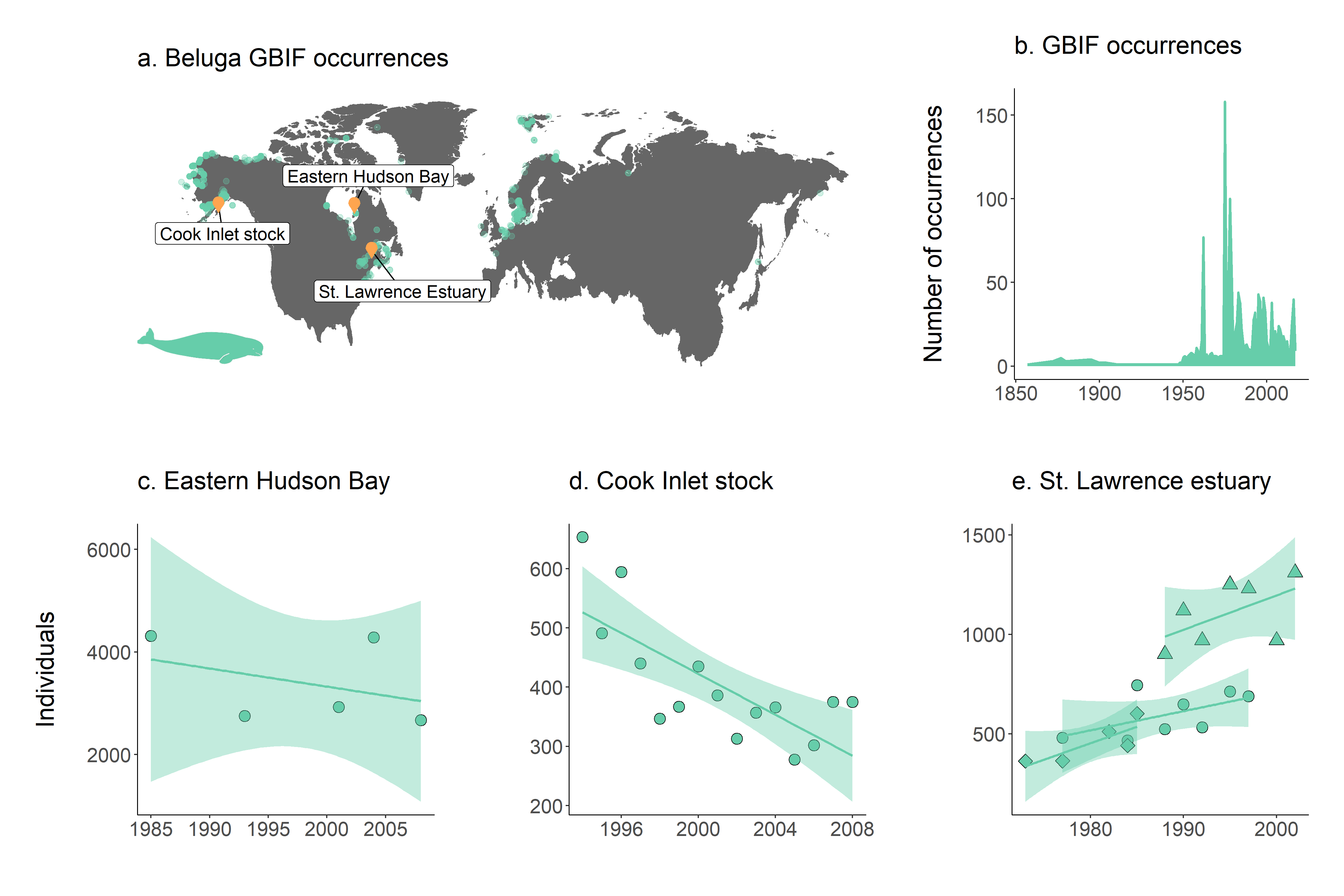
labs(title = "a. Beluga GBIF occurrences") + # Adding a title
theme(plot.title = element_text(size = 20))) # Setting the size for the title
We can use ggsave() to save the map. By default, the width and height are measured in inches.`
# Save the plot, it will get saved in your working directory
# You can use getwd() to find out where your working directory was
getwd()

ggsave(beluga.map.final, filename = "beluga_map_final.png", width = 10, height = 3)
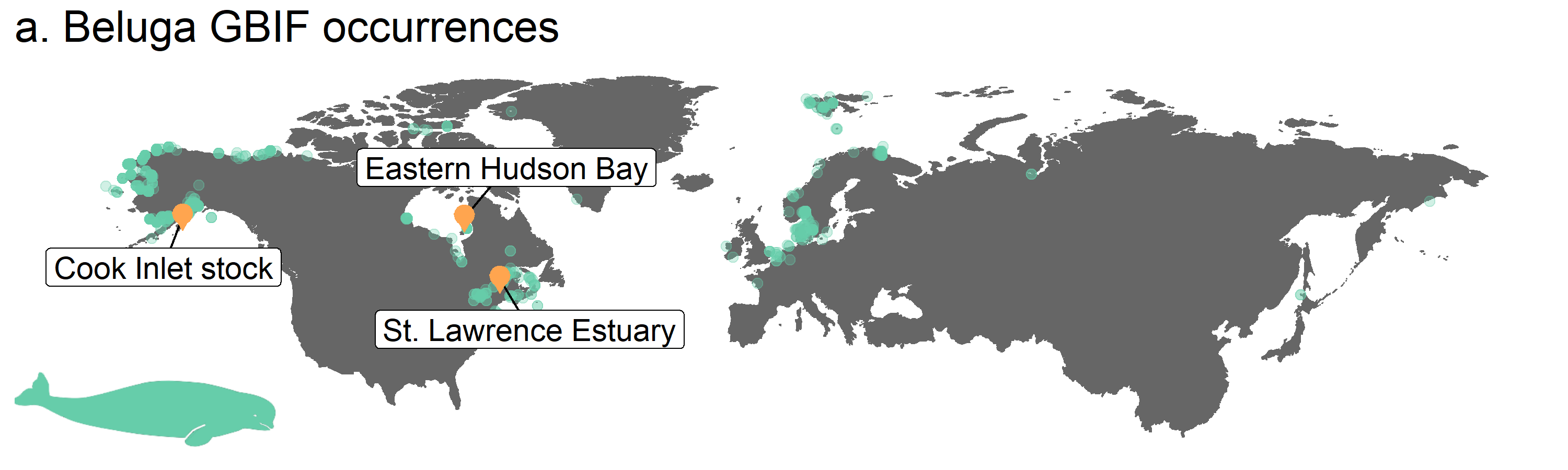 Figure 3. Map of beluga occurrence and monitoring sites
Next, we will have a go at two other kinds of graphs, a line graph and a few scatterplots with linear model fits. We can use our custom ggplot2 theme, theme_marine, so that all of our graphs have consistent formatting and we don’t need to repeat the same code, e.g. to make the font a certain size, many times.
# Number of occurrence records through time
yearly.obs <- beluga.clean %>% group_by(year) %>% tally() %>% ungroup() %>% filter(is.na(year) == FALSE)

(occurrences <- ggplot(yearly.obs, aes(x = year, y = n)) +
    geom_line(colour = "aquamarine3", size = 1) +
    geom_area(aes(y = n), fill = "aquamarine3") +  # Fill the area below the line graph with colour
    labs(x = NULL, y = "Number of occurrences\n",  # x = NULL means no x axis label
         title = "b. GBIF occurrences\n") +
    theme_marine())  # Use our customised theme, saves many lines of code!
For our final set of graphs, we will plot beluga abundance through time and a linear model fit of population change for each beluga population, part of the Living Planet Database.
# ** Population trends ----
# Visualising the population trends of five beluga populations

# Create an object for the Hudson Bay population
beluga1 <- filter(beluga.pop, id == "13273")

# Get the slope of population change to print on the graph if you wish
print(beluga.slopes$year[beluga.slopes$id == "13273"])

(hudson.bay <- ggplot(beluga1, aes(x = year, y = abundance)) +
    geom_point(shape = 21, fill = "aquamarine3", size = 4) +
		# shape 21 chooses a point with a black outline filled with aquamarine
    geom_smooth(method = "lm", colour = "aquamarine3", fill = "aquamarine3", alpha = 0.4) +
		# Adds a linear model fit, alpha controls the transparency of the confidence intervals
    labs(x = "", y = "Individuals\n", title = "c. Eastern Hudson Bay\n") +
    # annotate("text", x = 2002, y = 6000, label = "Slope = -0.02", size = 7) +
    # if you want to add text, uncomment the line above
    theme_marine())
Now, we can modify the code a bit to make a graph for the Cook Inlet stock population.
beluga2 <- filter(beluga.pop, id == "2191")

(cook.inlet <- ggplot(beluga2, aes(x = year, y = abundance)) +
    geom_point(shape = 21, fill = "aquamarine3", size = 4) +
    geom_smooth(method = "lm", colour = "aquamarine3", fill = "aquamarine3", alpha = 0.4) +
    labs(x = "", y = "", title = "d. Cook Inlet stock\n") +
    theme_marine())
The last site, St. Lawrence estuary, has been monitored by three different studies in different time periods.
# Create an object containing the three populations in the St. Lawrence estuary
# using the "|" operator
beluga3 <- filter(beluga.pop, id == "1950" | id == "4557" | id == "4558")

(st.lawrence.est <- ggplot(beluga3, aes(x = year, y = abundance, shape = as.factor(id))) +
    geom_point(fill = "aquamarine3", size = 4) +
    scale_shape_manual(values = c(21, 23, 24)) +
    geom_smooth(method = "lm", colour = "aquamarine3", fill = "aquamarine3", alpha = 0.4) +
    labs(x = "", y = "", title = "e. St. Lawrence estuary\n") +
    theme_marine() +
    guides(shape = FALSE))
You might have noticed that the process is a bit repetitive. We are performing the same action, but for different species. It’s not that big of a deal for three populations, but imagine we had a thousand! If that were the case, we could have used a loop that goes through each population and makes a graph, or we could have used a pipe, where we group by population id and then make the graphs and finally we could have used the lapply() function which applies a function, in our case making a graph, to e.g. each population. There are many options and if you would like to learn more on how to automate your analysis and data visualisation when doing the same thing for many places or species, you can check out our tutorial comparing loops, pipes and lapply() and our tutorial on using functions and loops.
Arrange all graphs in a panel with the gridExtra package
The grid.arrange function from the gridExtra package creates panels of different graphs. You can check out our data visualisation tutorial to find out more about grid.arrange.
# Create panel of all graphs
row1 <- grid.arrange(beluga.map.final, occurrences, ncol = 2, widths = c(1.96, 1.04))
# Makes a panel of the map and occurrence plot and specifies the ratio, i.e. we want the map to be wider than the graph
row2 <- grid.arrange(hudson.bay, cook.inlet, st.lawrence.est, ncol = 3, widths = c(1.1, 1, 1))
# Makes a panel of all the population plots and sets the ratio
# We are giving the first graph more space because that's the one with the y axis label
beluga.panel <- grid.arrange(row1, row2, nrow = 2, heights = c(0.9, 1.1))
# Stitching it all together
Figure 4. a. Map of beluga occurrence and monitoring sites; b. occurrence records through time and population trends in c. Hudson Bay, d. Cook Inlet stock and e. St. Lawrence estuary. Note that in St. Lawrence estuary, beluga populations were monitored in three separate studies.