Tutorial Aims:
- Create a reproducible report using Markdown
- Learn about the
tidyverse - Use pipes to make figures with large datasets
- Download and map data from large datasets

This tutorial was developed for the British Ecological Society Quantitative Ecology Special Interest Group Advanced R workshop. Check out the QE SIG website for more info!
You can follow the BES QE SIG on Twitter, too.
All the files you need to complete this tutorial can be downloaded from this repository. Click on Clone/Download/Download ZIP and unzip the folder, or clone the repository to your own GitHub account.
1. Create a reproducible report using Markdown
What is R Markdown?
R Markdown allows you to create documents that serve as a neat record of your analysis. In the world of reproducible research, we want other researchers to easily understand what we did in our analysis. You might choose to create an R markdown document as an appendix to a paper or project assignment that you are doing, upload it to an online repository such as Github, or simply to keep as a personal record so you can quickly look back at your code and see what you did. R Markdown presents your code alongside its output (graphs, tables, etc.) with conventional text to explain it, a bit like a notebook. Your report can also be what you base your future methods and results sections in your manuscripts, thesis chapters, etc.
R Markdown uses markdown syntax. Markdown is a very simple ‘markup’ language which provides methods for creating documents with headers, images, links etc. from plain text files, while keeping the original plain text file easy to read. You can convert Markdown documents to other file types like .html or .pdf.
Download R Markdown
To get R Markdown working in RStudio, the first thing you need is the rmarkdown package, which you can get from CRAN by running the following commands in R or RStudio:
install.packages("rmarkdown")
library(rmarkdown)
The different parts of an R Markdown file
To make your Markdown file - go to File/New File/RMarkdown.
The YAML Header
At the top of any R Markdown script is a YAML header section enclosed by ---. By default this includes a title, author, date and the file type you want to output to. Many other options are available for different functions and formatting, see here for .html options and here for .pdf options. Rules in the header section will alter the whole document.
Add your own details at the top of your.Rmd script, e.g.:
---
title: "The tidyverse in action - population change in forests"
author: Gergana Daskalova
date: 22/Oct/2016
output: html_document
---
By default, the title, author, date and output format are printed at the top of your .html document.
Now that we have our first piece of content, we can test the .Rmd file by compiling it to .html. To compile your .Rmd file into a .html document, you should press the Knit button in the taskbar:
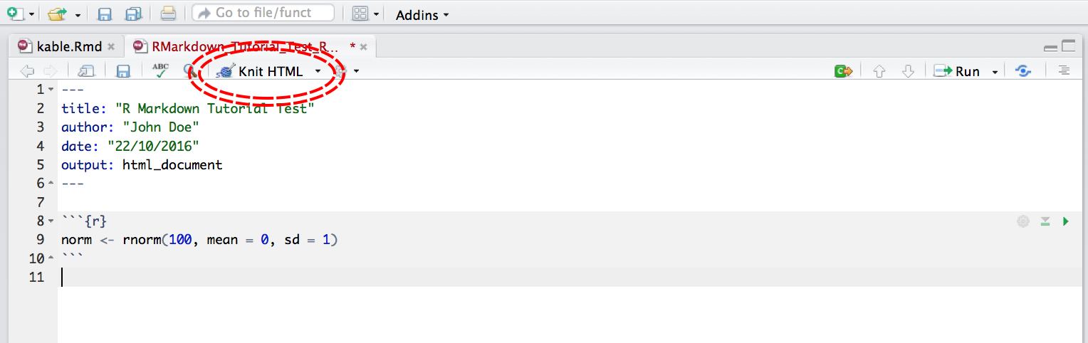
Not only does a preview appear in the Viewer window in RStudio, but it also saves a .html file to the same folder where you saved your .Rmd file.
Code Chunks
Have a read through the text below to learn a bit more about how Markdown works and then you can start compiling the rest of your .md file.
The setup chunk
This code chunk appears in .md files in R by default, it won’t appear in your html or pdf document, it just sets up the document.
```{r setup, include = FALSE}
knitr::opts_chunk$set(echo = TRUE)
```
The rest of the code chunks
This is where you can add your own code, accompanying explanation and any outputs. Code that is included in your .Rmd document should be enclosed by three backwards apostrophes ``` (grave accents!). These are known as code chunks and look like this (no need to copy this, just an example):
```{r}
norm <- rnorm(100, mean = 0, sd = 1)
```
Inside the curly brackets is a space where you can assign rules for that code chunk. The code chunk above says that the code is R code.
It’s important to remember when you are creating an R Markdown file that if you want to run code that refers to an object, for example:
```{r}
plot(dataframe)
```
You have to include the code that defines what dataframe is, just like in a normal R script. For example:
```{r}
A <- c("a", "a", "b", "b")
B <- c(5, 10, 15, 20)
dataframe <- data.frame(A, B)
plot(dataframe)
```
Or if you are loading a dataframe from a .csv file, you must include the code in the .Rmd:
```{r}
dataframe <- read.csv("~/Desktop/Code/dataframe.csv")
# Note that the file path should be whatever the file path to your own file is
```
Similarly, if you are using any packages in your analysis, you have to load them in the .Rmd file using library() like in a normal R script.
```{r}
library(dplyr)
```
Hiding code chunks
If you don’t want the code of a particular code chunk to appear in the final document, but still want to show the output (e.g. a plot), then you can include echo = FALSE in the code chunk instructions.
```{r, echo = FALSE}
A <- c("a", "a", "b", "b")
B <- c(5, 10, 15, 20)
dataframe <- data.frame(A, B)
plot(dataframe)
```
Sometimes, you might want to create an object, but not include both the code and its output in the final .html file. To do this you can use, include = FALSE. Be aware though, when making reproducible research it’s often not a good idea to completely hide some part of your analysis:
REMEMBER: ‘R Markdown’ doesn’t pay attention to anything you have loaded in other R scripts, you have to load all objects and packages in the R Markdown script.
If you are keen, you can complete the rest of the workshop using an ‘R Markdown’ document - essentially depends on your workflow - sometimes you might make a ‘Markdown’ report, other times having your code and comments is enough.
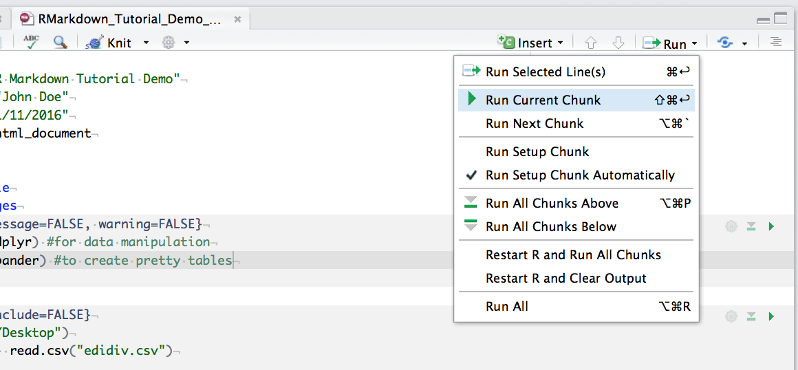
You can run an individual chunk of code at any time by placing your cursor inside the code chunk and selecting Run -> Run Current Chunk:
Summary of code chunk instructions
| Rule | Example (default) |
Function |
|---|---|---|
| eval | eval=TRUE | Is the code run and the results included in the output? | include | include=TRUE | Are the code and the results included in the output? | </tr>
| echo | echo=TRUE | Is the code displayed alongside the results? |
| warning | warning=TRUE | Are warning messages displayed? |
| error | error=FALSE | Are error messages displayed? |
| message | message=TRUE | Are messages displayed? |
| tidy | tidy=FALSE | Is the code reformatted to make it look “tidy”? |
| results | results="markup" | How are results treated? "hide" = no results "asis" = results without formatting "hold" = results only compiled at end of chunk (use if many commands act on one object) |
| cache | cache=FALSE | Are the results cached for future renders? |
| comment | comment="##" | What character are comments prefaced with? |
| fig.width, fig.height | fig.width=7 | What width/height (in inches) are the plots? |
| fig.align | fig.align="left" | "left" "right" "center" |
Inserting figures
By default, RMarkdown will place graphs by maximising their height, while keeping them within the margins of the page and maintaining aspect ratio. If you have a particularly tall figure, this can mean a really huge graph. To manually set the figure dimensions, you can insert an instruction into the curly braces:
```{r, fig.width = 2.5, fig.height = 7.5}
ggplot(df, aes(x = x, y = y) + geom_point()
```
Inserting Tables
R Markdown can print the contents of a data frame easily by enclosing the name of the data frame in a code chunk:
```{r}
dataframe
```
This can look a bit messy, especially with data frames with a lot of columns. You can also use a table formatting function, e.g. kable() from the knitr package. The first argument tells kable to make a table out of the object dataframe and that numbers should have two significant figures. Remember to load the knitr package in your .Rmd file, if you are using the kable() function.
```{r}
kable(dataframe, digits = 2)
```
If you want a bit more control over the content of your table you can use pander() from the pander package. Imagine I want the 3rd column to appear in italics:
```{r}
emphasize.italics.cols(3)  # Make the 3rd column italics
pander(richness_abund)  # Create the table
```
Now that you have started your ‘Markdown’ document, you can use that when completing the next part of the tutorial, i.e., inserting the code that follows into code chunks and then generating a report at the end of this tutorial.
2. Analyse and visualise data using the tidyverse
Learning Objectives
PART 1: Intro to the tidyverse - How to analyse population change of forest vertebrates
- How to write a custom
ggplot2function - How to use
gather()andspread()from thetidyrpackage - How to parse numbers using
parse_number()from thereadrpackage - How to use the
distinct()function fromdplyr - How to use the
filter()function fromdplyr - How to use the
mutate()function fromdplyr - How to use the
summarise()/summarize()function fromdplyr - How to use the
tidy()function from thebroompackage to summarise model results - How to use the
select()function fromdplyr
In this tutorial, we will focus on how to efficiently format, manipulate and visualise large datasets. We will use the tidyr and dplyr packages to clean up data frames and calculate new variables. We will use the broom and purr packages to make the modelling of thousands of population trends more efficient. We will use the ggplot2 package to make graphs, maps of occurrence records, and to visualise ppulation trends and then we will arrange all of our graphs together using the gridExtra package.
We will be working with population data from the Living Planet Database and red deer occurrence data from the Global Biodiversity Information Facility, both of which are publicly available datasets.
First, we will model population change for vertebrate forest species to see whether greater population change is found for longer duration studies.
Make sure you have set the working directory to where you saved your files.
Here are the packages we need. Note that not all tidyverse packages load automatically with library(tidyverse) - only the core ones do, so you need to load broom separately. If you don’t have some of the packages installed, you can install them using ìnstall.packages("package-name").
# Packages ----
library(tidyverse)  # Hadley Wickham's tidyverse - the theme of this tutorial
library(broom)  # To summarise model outputs
library(ggExtra)  # To make pretty graphs - addon package to ggplot2
library(maps)  # To make pretty maps - warning: maps masks map from purr!
library(RColorBrewer)  # To make pretty colours
library(gridExtra)  # To arrange multi-plot panels
If you’ve ever tried to perfect your ggplot2 graphs, you might have noticed that the lines starting with theme() quickly pile up: you adjust the font size of the axes and the labels, the position of the title, the background colour of the plot, you remove the grid lines in the background, etc. And then you have to do the same for the next plot, which really increases the amount of code you use. Here is a simple solution: create a customised theme that combines all the theme() elements you want and apply it to your graphs to make things easier and increase consistency. You can include as many elements in your theme as you want, as long as they don’t contradict one another and then when you apply your theme to a graph, only the relevant elements will be considered - e.g. for our graphs we won’t need to use legend.position, but it’s fine to keep it in the theme in case any future graphs we apply it to do have the need for legends.
# Setting a custom ggplot2 function ---
# *** Functional Programming ***
# This function makes a pretty ggplot theme
# This function takes no arguments!
theme_LPD <- function(){
  theme_bw()+
    theme(axis.text.x = element_text(size = 12, vjust = 1, hjust = 1),
          axis.text.y = element_text(size = 12),
          axis.title.x = element_text(size = 14, face = "plain"),
          axis.title.y = element_text(size = 14, face = "plain"),
          panel.grid.major.x = element_blank(),
          panel.grid.minor.x = element_blank(),
          panel.grid.minor.y = element_blank(),
          panel.grid.major.y = element_blank(),
          plot.margin = unit(c(0.5, 0.5, 0.5, 0.5), units = , "cm"),
          plot.title = element_text(size = 20, vjust = 1, hjust = 0.5),
          legend.text = element_text(size = 12, face = "italic"),
          legend.title = element_blank(),
          legend.position = c(0.5, 0.8))
}
Load population trend data
The data are in a .RData format, as those are quicker to use, since .Rdata files are more compressed. Of course, a drawback is that .RData files can only be used within R, whereas .csv files are more transferable.
# Load data ----
load("LPDdata_Feb2016.RData")
# Inspect data ----
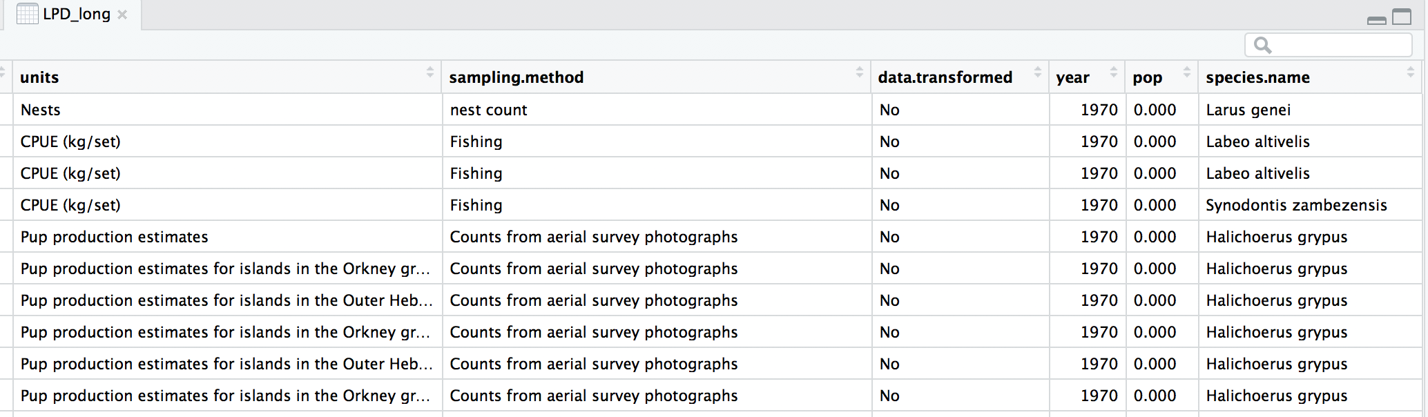
head(LPDdata_Feb2016)
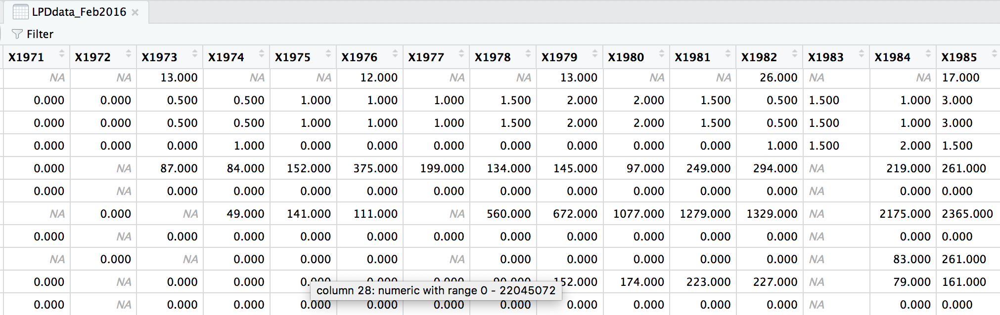
At the moment, each row contains a population that has been monitored over time and towards the right of the data frame there are lots of columns with population estimates for each year. To make this data “tidy” (one column per variable) we can use gather() to transform the data so there is a new column containing all the years for each population and an adjacent column containing all the population estimates for those years.
This takes our original dataset LPIdata_Feb2016 and creates a new column called year, fills it with column names from columns 26:70 and then uses the data from these columns to make another column called pop.
# Format data for analysis ----

# Transform from wide to long format usign gather (opposite is spread)
# *** gather() function from the dplyr package in the tidyverse ***
LPD_long <- gather(data = LPDdata_Feb2016, key = "year", value = "pop", select = 26:70)
Because column names are coded in as characters, when we turned the column names (1970, 1971, 1972, etc.) into rows, R automatically put an X in front of the numbers to force them to remain characters. We don’t want that, so to turn year into a numeric variable, use the parse_number() function from the readr package. We can also make all the column names lowercase and remove some of the funky characters in the country column - strange characters mess up things in general, e.g. when you want to save files, push them to GitHub, etc.
# Get rid of the X in front of years
# *** parse_number() from the readr package in the tidyverse ***
LPD_long$year <- parse_number(LPD_long$year)

# Rename variable names for consistency
names(LPD_long)
names(LPD_long) <- tolower(names(LPD_long))
names(LPD_long)

# Create new column with genus and species together
LPD_long$species.name <- paste(LPD_long$genus, LPD_long$species, sep = " ")

# Get rid of strange characters like " / "
LPD_long$country.list <- gsub(",", "", LPD_long$country.list, fixed = TRUE)
LPD_long$biome <- gsub("/", "", LPD_long$biome, fixed = TRUE)

# Examine the tidy data frame
head(LPD_long)
Now that our dataset is tidy we can get it ready for our analysis. We want to only use populations that have more than 5 years of data to make sure our analysis has enough data to capture population change. We should also scale the population data, because since the data come from many species, the units and magnitude of the data are very different - imagine tiny fish whose abundance is in the millions, and large carnivores whose abundance is much smaller. Scaling also normalises the data, as later on we will be using linear models assuming a normal distribution. To do all of this in one go, we can use pipes.
Pipes (%>%) are a way of streamlining data manipulation - imagine all of your data coming in one end of the pipe, while they are in there, they are manipulated, summarised, etc., then the output (e.g. your new data frame or summary statistics) comes out the other end of the pipe. At each step of the pipe processing, the pipe is using the ouput of the previous step.
# Data manipulation ----

# *** piping from from dplyr
LPD_long2 <- LPD_long %>%
  # Remove duplicate rows
  # *** distinct() function from dplyr
  distinct() %>%
  # remove NAs in the population column
  # *** filter() function from dplyr
  filter(is.finite(pop)) %>%
  # Group rows so that each group is one population
  # *** group_by() function from dplyr
  group_by(id) %>%
  # Make some calculations
  # *** mutate() function from dplyr
  mutate(maxyear = max(year), minyear = min(year),
         # Calculate duration
         duration = maxyear - minyear,
         # Scale population trend data
         scalepop = (pop - min(pop))/(max(pop) - min(pop))) %>%
  # Keep populations with >5 years worth of data and calculate length of monitoring
  filter(is.finite(scalepop),
         length(unique(year)) > 5) %>%
  # Remove any groupings you've greated in the pipe
  ungroup()
Now we can explore our data a bit. Let’s create a few basic summary statistics for each biome and store them in a new data frame:
# Calculate summary statistics for each biome
LPD_biome_sum <- LPD_long2 %>%
  # Group by biome
  group_by(biome) %>%
  # Create columns, number of populations
  #  *** summarise()/summarize() function from dplyr in the tidyverse ***
  summarise(populations = n(),
            # Calculate the mean study length
            mean_study_length_years = mean(duration),
            # Model sampling method
            dominant_sampling_method = names(which.max(table(sampling.method))),
            # Model unit type
            dominant_units = names(which.max(table(units)))) %>%
  # Remove any groupings you've created in the pipe
  ungroup()

# Take a look at some of the records
head(LPD_biome_sum)
Next we will explore how populations from two of these biomes, temperate coniferous and temperate broadleaf forests, have changed over the monitoring duration. We will make the biome variable a factor (before it is just a character variable), so that later on we can make graphs based on the two categories (coniferous and broadleaf forests). We’ll use the filter() function from dplyr to subset the data to just the forest species.
# Subset to just temperate forest species -----
  # Notice the difference between | and & when filtering
  # | is an "or" whereas & is "and", i.e. both conditions have to be met
  # at the same time
LPD_long2$biome <- as.factor(LPD_long2$biome)
LPD.forest <- filter(LPD_long2, biome == "Temperate broadleaf and mixed forests" |
                                      biome == "Temperate coniferous forests")
Before running models, it’s a good idea to visualise our data to explore what kind of distribution we are working with.
The gg in ggplot2 stands for grammar of graphics. Writing the code for your graph is like constructing a sentence made up of different parts that logically follow from one another. In a data visualisation context, the different elements of the code represent layers - first you make an empty plot, then you add a layer with your data points, then your measure of uncertainty, the axis labels and so on.
When using ggplot2, you usually start your code with ggplot(your_data, aes(x = independent_variable, y = dependent_variable)), then you add the type of plot you want to make using + geom_boxplot(), + geom_histogram(), etc. aes stands for aesthetics, hinting to the fact that using ggplot2 you can make aesthetically pleasing graphs - there are many ggplot2 functions to help you clearly communicate your results, and we will now go through some of them.
When we want to change the colour, shape or fill of a variable based on another variable, e.g. colour-code by species, we include colour = species inside the aes() function. When we want to set a specific colour, shape or fill, e.g. colour = "black", we put that outside of the aes() function.
We will see our custom theme theme_LPD() in action as well!
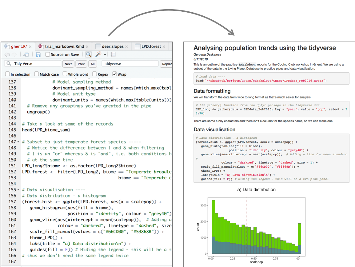
# Data visualisation ----
# Data distribution - a histogram
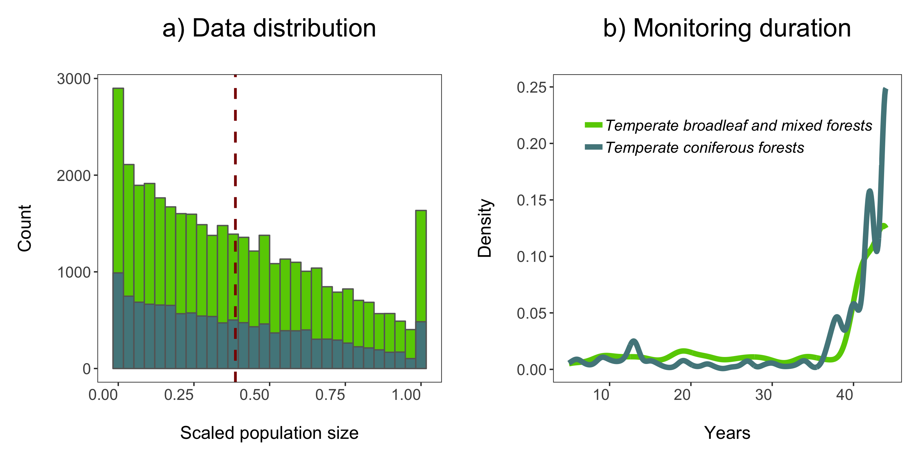
(forest.hist <- ggplot(LPD.forest, aes(x = scalepop)) +
geom_histogram(aes(fill = biome),
position = "identity", colour = "grey40") +
geom_vline(aes(xintercept = mean(scalepop)), # Adding a line for mean abundance
colour = "darkred", linetype = "dashed", size = 1) +
scale_fill_manual(values = c("#66CD00", "#53868B")) +
theme_LPD() +
labs(title = "a) Data distribution\n", x = "\nScaled population size",
y = "Count\n") +
# \n adds a blank line
guides(fill = F)) # Hiding the legend - this will be a two plot panel
# thus we don't need the same legend twice
Next up we can explore for how long populations have been monitored in the two biomes using a density histogram.
# Density histogram of duration of studies in the two biomes
(duration.forests <- ggplot(LPD.forest, aes(duration, colour = biome)) +
   stat_density(geom = "line", size = 2, position = "identity") +
   theme_LPD() +
   scale_colour_manual(values = c("#66CD00", "#53868B")) +
   labs(x = "\nYears", y = "Density\n", title = "b) Monitoring duration\n"))
We’ll use the grid.arrange function from the gridExtra package to combine the two plots in a panel. You can specify the number of columns using ncol = and the number of rows using nrow =.
# Arrange in a panel and save
forest.panel <- grid.arrange(forest.hist, duration.forests, ncol = 2)
ggsave(forest.panel, file = "forest_panel.png", height = 5, width = 10)
We are now ready to model how each population has changed over time. There are 1785 populations, so with this one code chunk, we will run 1785 models and tidy up their outputs. You can read through the line-by-line comments to get a feel for what each line of code is doing.
One specific thing to note is that when you add the lm() function in a pipe, you have to add data = ., which means use the outcome of the previous step in the pipe for the model.
# Calculate population change for each forest population
# 1785 models in one go!
# Using a pipe
forest.slopes <- LPD.forest %>%
  # Group by the key variables that we want to iterate over
  # note that if we only include e.g. id (the population id), then we only get the
  # id column in the model summary, not e.g. duration, latitude, class...
  group_by(decimal.latitude, decimal.longitude, class,
           species.name, id, duration, location.of.population) %>%
  # Create a linear model for each group
  do(mod = lm(scalepop ~ year, data = .)) %>%
  # Extract model coefficients using tidy() from the
  # *** tidy() function from the broom package ***
  tidy(mod) %>%
  # Filter out slopes and remove intercept values
  filter(term == "year") %>%
  # Get rid of the column term as we don't need it any more
  #  *** select() function from dplyr in the tidyverse ***
  dplyr::select(-term) %>%
  # Remove any groupings you've greated in the pipe
  ungroup()
We are ungrouping at the end of our pipe just because otherwise the object remains grouped and later on that might cause problems, if we forget about it.
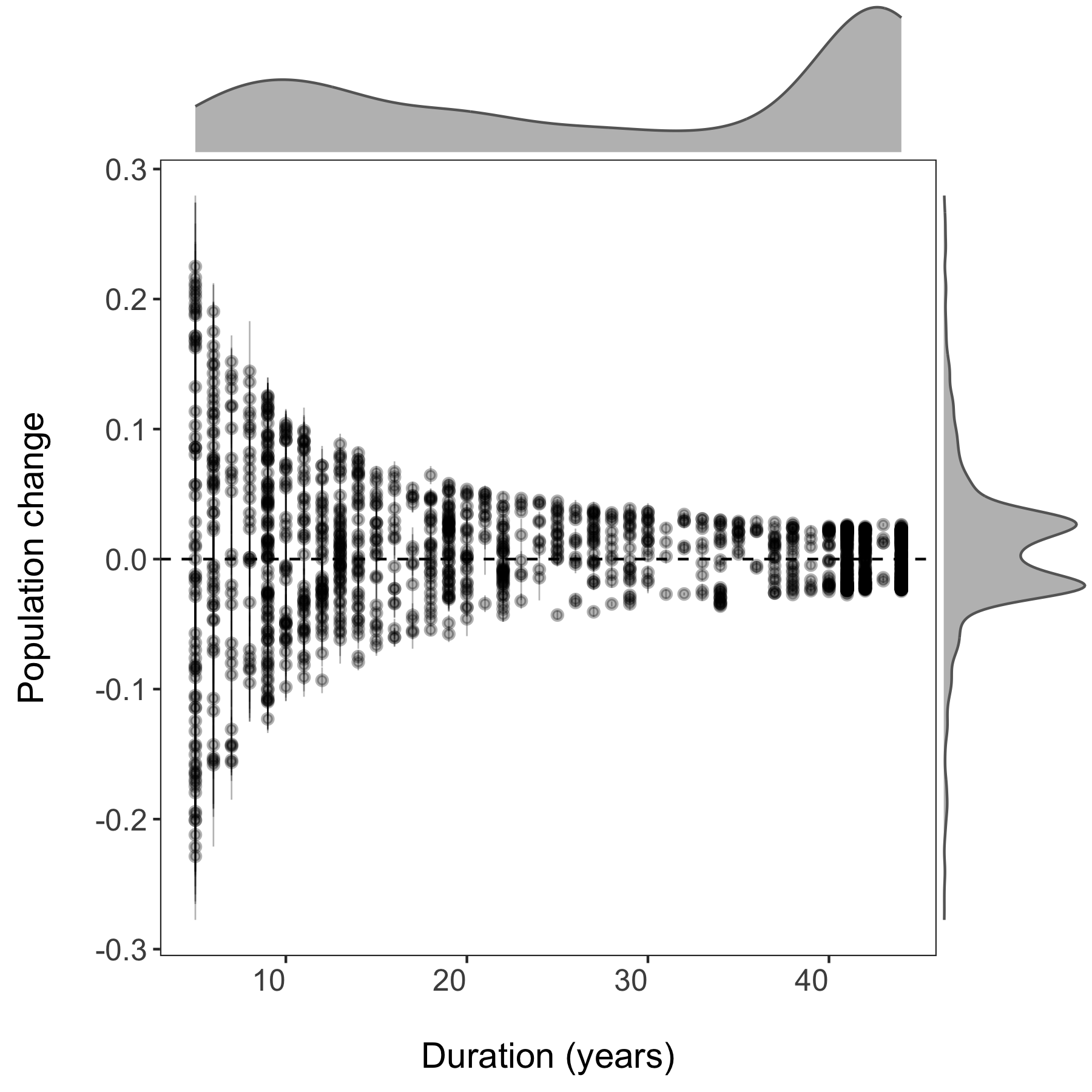
Now we can visualise the outputs of all our models and see how they vary based on study duration. We will add density histograms along the margins of the graph which makes for a more informative graph using the ggMarginal() function from the ggExtra package. Note that ggExtra is also an addin in RStudio, so for future reference, if you select some ggplot2 code, then click on Addins/ggplot2 Marginal plots (the menu is in the middle top part of the screen), you can customise marginal histograms and the code gets automatically generated.
# Visualising model outputs ----

# Plotting slope estimates and standard errors for all populations and adding histograms along the margins
(all.slopes <- ggplot(forest.slopes, aes(x = duration, y = estimate)) +
         geom_pointrange(aes(ymin = estimate - std.error,
                             ymax = estimate + std.error),
                         alpha = 0.3, size = 0.3) +
         geom_hline(yintercept = 0, linetype = "dashed") +
         theme_LPD() +
         ylab("Population change\n") +
         xlab("\nDuration (years)"))

(density.slopes <- ggExtra::ggMarginal(
  p = all.slopes,
  type = 'density',
  margins = 'both',
  size = 5,
  col = 'gray40',
  fill = 'gray'
))

# Save the plot
ggsave(density.slopes, filename = "slopes_duration.png", height = 6, width = 6)
3. Using pipes to make figures with large datasets
How to print plots of population change for multiple taxa
- How to set up file paths and folders in R
- How to use a pipe to plot many plots by taxa
- How to use the purrr package and functional programming
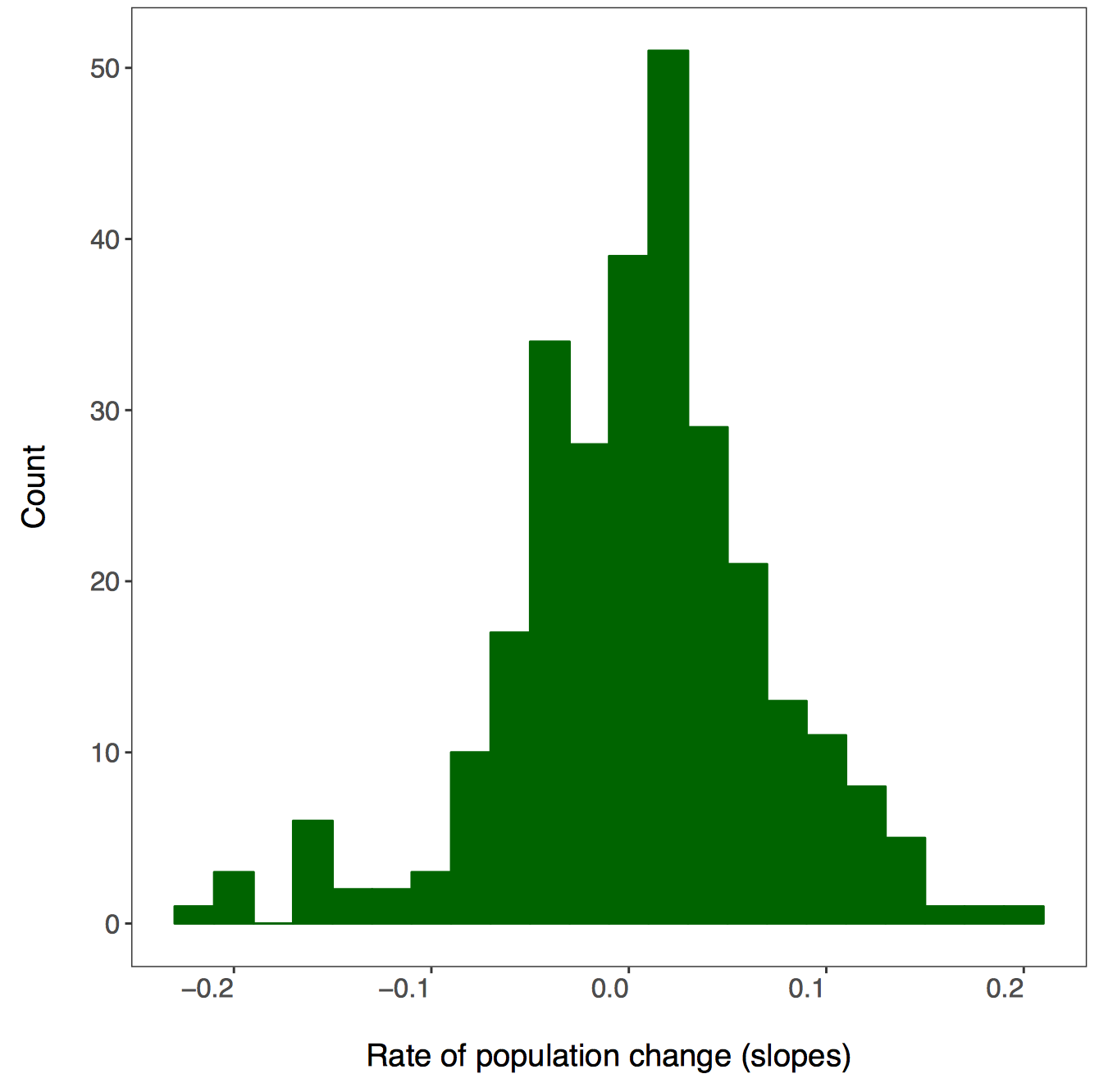
In the next part of the tutorial, we will focus on automating iterative actions, for example when we want to create the same type of graph for different subsets of our data. In our case, we will make histograms of the population change experienced by different vertebrate taxa in forests. When making multiple graphs at once, we have to specify the folder where they will be saved first.
# PART 2: Using pipes to make figures with large datasets ----

# Make histograms of slope estimates for each taxa -----
# Set up new folder for figures
# Set path to relevant path on your computer/in your repository
path1 <- "Taxa_Forest_LPD/"
# Create new folder
dir.create(path1)
There isn’t a right answer here, there are different ways to achieve the same result and you can decide which one works best for your workflow. First we will use dplyr and pipes %>%. Since we want one graph per taxa, we are going to group by the class variable. You can add functions that are not part of the dplyr package to pipes using do - in our case, we are saying that we want R to do our requested action (making and saving the histograms) for each taxa.
# First we will do this using dplyr and a pipe

forest.slopes %>%
# Select the relevant data
dplyr::select(id, class, species.name, estimate) %>%
# Group by taxa
group_by(class) %>%
# Save all plots in new folder
do(ggsave(ggplot(., aes(x = estimate)) +
            # Add histograms
            geom_histogram(colour = "darkgreen", fill = "darkgreen", binwidth = 0.02) +
            # Use custom theme
            theme_LPD() +
            # Add axis lables
            xlab("Rate of population change (slopes)"),
            # Set up file names to print to
            filename = gsub("", "", paste0(path1, unique(as.character(.$class)),
                                          ".pdf")), device = "pdf"))
A warning message pops up: Error: Results 1, 2, 3, 4 must be data frames, not NULL - you can ignore this, it’s because the do() function expects a data frame as an output, but in our case we are making graphs, not data frames.
If you go check out your folder now, you should see four histograms, one per taxa:
Another way to make all those histograms in one go is by creating a function for it. In general, whenever you find yourself copying and pasting lots of code only to change the object name, you’re probably in a position to swap all the code with a function - you can then apply the function using the purrr package.
But what is purrr? It is a way to “map” or “apply” functions to data. Note that there are functions from other packages also called map(), which is why we are specifying we want the map() function from the purrr package. Here we will first format the data taxa.slopes and then we will map it to the mean fuction:
We have to change the format of the data, in our case we will split the data using spread() from the tidyr package.
# Here we select the relevant data
# Let's get rid of the other levels of 'class'
forest.slopes$class <- as.character(forest.slopes$class)
# Selecting the relevant data and splitting it into a list
taxa.slopes <- forest.slopes %>%
  dplyr::select(id, class, estimate) %>%
  spread(class, estimate) %>%
  dplyr::select(-id)
We can apply the mean function using purrr::map():
taxa.mean <- purrr::map(taxa.slopes, ~mean(., na.rm = TRUE))
# Note that we have to specify "."
# so that the function knows to use our taxa.slopes object
# This plots the mean population change per taxa
taxa.mean
Now we can write our own function to make histograms and use the purrr package to apply it to each taxa.
### Intro to the purrr package ----

# First let's write a function to make the plots
# *** Functional Programming ***
# This function takes one argument x, the data vector that we want to make a histogram
plot.hist <- function(x) {
  ggplot() +
  geom_histogram(aes(x), colour = "darkgreen", fill = "darkgreen", binwidth = 0.02) +
  theme_LPD() +
  xlab("Rate of population change (slopes)")
}
Now we can use purr to “map” our figure making function. The first input is your data that you want to iterate over and the second input is the function.
taxa.plots <- purrr::map(taxa.slopes, ~plot.hist(.))
# We need to make a new folder to put these figures in
path2 <- "Taxa_Forest_LPD_purrr/"
dir.create(path2)
First we learned about map() when there is one dataset, but there are other purrr functions,too.
walk2() takes two arguments and returns nothing. In our case we just want to print the graphs, so we don’t need anything returned. The first argument is our file path, the second is our data and ggsave is our function.
# *** walk2() function in purrr from the tidyverse ***
walk2(paste0(path2, names(taxa.slopes), ".pdf"), taxa.plots, ggsave)
4. Downloading and mapping data from large datasets
Map the distribution of a forest vertebrate species and the location of monitored populations
- How to download GBIF records
- How to map occurence data and populations
- How to make a custom function for plotting figures
In this part of the tutorial, we will focus on one particular species, red deer (Cervus elaphus), where it has been recorded around the world, and where it’s populations are being monitored. We will use occurrence data from the Global Biodiversity Information Facility which we will download in R using the rgbif package.
Occurrence data can be messy and when you are working with thousands of records, not all of them might be valid records. If you are keen to find out how to test the validity of geographic coordinates using the CoordinateCleaner package, check out our tutorial here.
### PART 3: Downloading and mapping data from large datasets ----
#### How to map distributions and monitoring locations for one or more taxa

# Packages ----
library(rgbif)  # To extract GBIF data
# library(CoordinateCleaner)  # To clean coordinates if you want to explore that later
library(gridExtra)  # To make pretty graphs
library(ggrepel)  # To add labels with rounded edges
library(png)  # To add icons
library(mapdata)  # To plot maps
library(ggthemes)  # To make maps extra pretty
We are limiting the number of records to 5000 for the sake of time - in the future you can ask for more records as well, there’s just a bit of waiting involved. The records come with a lot of metadata. For our purposes, we will select just the columns we need. Similar to how before we had to specify that we want the map() function from the purrr package, there are often other select() functions, so we are saying that we want the one from dplyr using dplyr::select(). Otherwise, the select() function might not work because of a conflict with another select() function from a different package, e.g. the raster packge.
# Download species occurrence records from the Global Biodiversity Information Facility
# *** rgbif package and the occ_search() function ***
# You can increase the limit to get more records - 10000 takes a couple of minutes
deer.locations <- occ_search(scientificName = "Cervus elaphus", limit = 10000,
                             hasCoordinate = TRUE, return = "data") %>%
                  # Simplify occurrence data frame
                  dplyr::select(key, name, decimalLongitude,
		                decimalLatitude, year,
				individualCount, country)
Next we will extract the red deer population data - the raw time series and the slopes of population change from the two data frames.
# Data formatting & manipulation ----

# Filter out population data for chosen species - red deer
deer.data <- LPD_long2 %>%
  filter(species.name == "Cervus elaphus") %>%
  dplyr::select(id, species.name, location.of.population, year, pop)

# Filter out population estimates for chosen species - red deer
deer.slopes <- forest.slopes %>%
  filter(species.name == "Cervus elaphus")
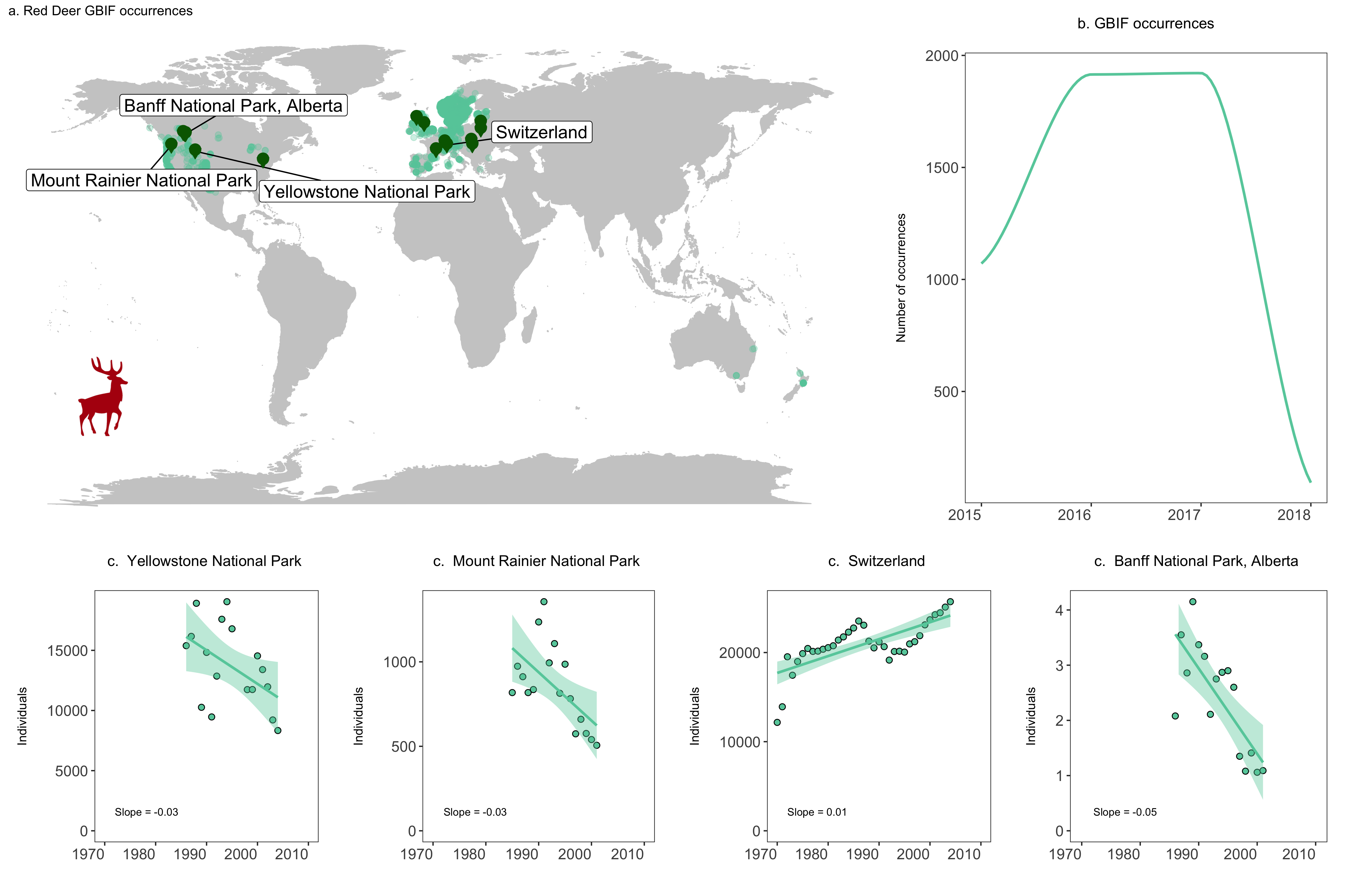
In addition to making histograms, scatterplots and such, you can use ggplot2 to make maps as well - the maps come from the mapdata package we loaded earlier. In this map, we want to visualise information from two separate data frames - where the species occurs (deer.locations, the GBIF data) and where it is monitored (deer.slopes, the Living Planet Database data). We can combine this information in the same ggplot2 code chunk using the geom_point() function twice - the first time it will plot the occurrences since that the data frame associated with the plot in the very first line, and the second time we’ve told the function to specifically use the deer.slopes object using data = deer.slopes.
As you start making your maps, you may get this warning message:
Warning message:
In drawGrob(x) : reached elapsed time limit
We are working with thousands of records, so depending on your computer, making the map might take a while. This message doesn’t mean something is wrong, just lets you know that generating the map took a bit longer than what RStudio expected.
# Make an occurrence map and include the locations of the populations part of the Living Planet Database
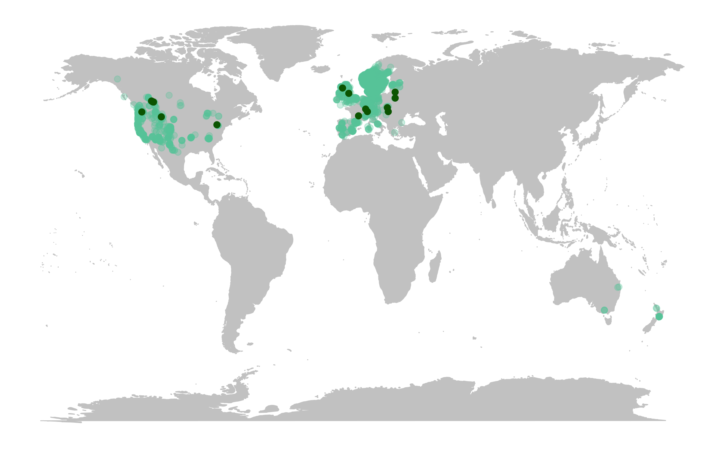
(deer.map.LPD <- ggplot(deer.locations, aes(x = decimalLongitude, y = decimalLatitude)) +
# Add map data
borders("world", colour = "gray80", fill = "gray80", size = 0.3) +
# Use custom map theme from ggthemes package
theme_map() +
# Add the points from the population change data
geom_point(alpha = 0.3, size = 2, colour = "aquamarine3") +
# Specify where the data come from when plotting from more than one data frame using data = ""
geom_point(data = deer.slopes, aes(x = decimal.longitude, y = decimal.latitude),
size = 2, colour = "darkgreen"))
The map already looks fine, but we can customise it further to add more information. For example, we can add labels for the locations of some of the monitored populations and we can add plots of population change next to our map.
First we will rename some of the populations, just so that our labels are not crazy long, using the recode() function from the dplyr package.
# Customising map to make it more beautiful ----

# Check site names
print(deer.slopes$location.of.population)

# Beautify site names
deer.slopes$location.of.population <- recode(deer.slopes$location.of.population,
                                             "Northern Yellowstone National Park"
					     = "Yellowstone National Park")
deer.slopes$location.of.population <- recode(deer.slopes$location.of.population,
                                             "Mount Rainier National Park, USA"
					     = "Mount Rainier National Park")
deer.slopes$location.of.population <- recode(deer.slopes$location.of.population,
                                             "Bow Valley - eastern zone, Banff National Park, Alberta" =
					     "Banff National Park, Alberta")
deer.slopes$location.of.population <- recode(deer.slopes$location.of.population,
                                             "Bow Valley - western zone, Banff National Park, Alberta" =
					     "Banff National Park, Alberta")
deer.slopes$location.of.population <- recode(deer.slopes$location.of.population,
                                             "Bow Valley - central zone, Banff National Park, Alberta" =
					     "Banff National Park, Alberta")
deer.slopes$location.of.population <- recode(deer.slopes$location.of.population,
                                             "Study area within Bow Valley, Banff National Park, Alberta" =
					     "Banff National Park, Alberta")
deer.slopes$location.of.population <- recode(deer.slopes$location.of.population,
                                             "Bow Valley watershed of Banff National Park, Alberta" =
					     "Banff National Park, Alberta")
You can also use ggplot2 to add images to your graphs, so here we will add a deer icon.
# Load packages for adding images
packs <- c("png","grid")
lapply(packs, require, character.only = TRUE)

# Load red deer icon
icon <- readPNG("reddeer.png")
icon <- rasterGrob(icon, interpolate = TRUE)
We can update our map by adding labels and our icon - this looks like a gigantic chunk of code, but we’ve added line by line comments so that you can see what’s happening at each step. The ggrepel package adds labels whilst also aiming to avoid overlap and as a bonus, the labels have rounded edges.
# Update map
# Note - this takes a while depending on your computer
(deer.map.final <- ggplot(deer.locations, aes(x = decimalLongitude, y = decimalLatitude)) +
    # For more localized maps use "worldHires" instead of "world"
    borders("world", colour = "gray80", fill = "gray80", size = 0.3) +
    theme_map() +
    geom_point(alpha = 0.3, size = 2, colour = "aquamarine3") +
    # We are specifying the data frame for the labels - one site has three monitored populations
    # but we only want to label it once so we are subsetting using data = deer.slopes[c(2, 4, 5, 9),]
    # to get only the first rows number 2, 4, 5 and 9
    geom_label_repel(data = deer.slopes[c(2, 4, 5, 9),], aes(x = decimal.longitude, y = decimal.latitude,
                                                     label = location.of.population),
                     box.padding = 1, size = 5, nudge_x = 1,
                     # We are specifying the size of the labels and nudging the points so that they
                     # don't hide data points, along the x axis we are nudging by one
                     min.segment.length = 0, inherit.aes = FALSE) +
    # We can recreate the shape of a dropped pin by overlaying a circle and a triangle
    geom_point(data = deer.slopes, aes(x = decimal.longitude, y = decimal.latitude + 0.6),
               size = 4, colour = "darkgreen") +
    geom_point(data = deer.slopes, aes(x = decimal.longitude, y = decimal.latitude - 0.3),
               size = 3, fill = "darkgreen", colour = "darkgreen", shape = 25) +
    # Adding the icon using the coordinates on the x and y axis
    annotation_custom(icon, xmin = -210, xmax = -100, ymin = -60 , ymax = -30) +
    # Adding a title
    labs(title = "a. Red Deer GBIF occurrences", size = 12))
Let’s add some additional plots to our figure, for example how many occurrences there are for each year.
# Visualise the number of occurrence records through time ----
# This plot is more impressive if you have downloaded more records
# as GBIF downloads the most recent records first
yearly.obs <- deer.locations %>% group_by(year) %>% tally() %>% ungroup() %>% filter(is.na(year) == FALSE)

(occurrences <- ggplot(yearly.obs, aes(x = year, y = n)) +
    geom_smooth(colour = "aquamarine3", method = 'loess', size = 1) +
    labs(x = NULL, y = "Number of occurrences\n",
         title = "b. GBIF occurrences\n", size = 12) +
    # Use our customised theme, saves many lines of code!
    theme_LPD() +
    # if you want to change things about your theme, you need to include the changes after adding the theme
    theme(plot.title = element_text(size = 12), axis.title.y = element_text(size = 10)))
We can add plots that show the population trends for those populations we’ve labelled. Given that we will be doing the same thing for multiple objects (the same type of plot for each population), we can practice functional programming and using purrr again here. The function looks very similar to a normal ggplot2 code chunk, except we’ve wrapped it up in a function and we are not using any specific objects, just x, y and z as the three arguments the function needs.
# Visualise population trends ----
# Visualising the population trends of four deer populations

# Let's practice functional programming here
# *** Functional Programming ***
# Let's make a function to make the population trend plots
# First we need to decide what values the function needs to take
# x - The population data
# y - the slope value
# z - the location of the monitoring
# This function needs to take three arguments

# Let's make the ggplot function
pop.graph <- function(x, y, z) {
  # Make a ggplot graph with the 'x'
  ggplot(x, aes(x = year, y = pop)) +
  # Shape 21 chooses a point with a black outline filled with aquamarine
  geom_point(shape = 21, fill = "aquamarine3", size = 2) +
  # Adds a linear model fit, alpha controls the transparency of the confidence intervals
  geom_smooth(method = "lm", colour = "aquamarine3", fill = "aquamarine3", alpha = 0.4) +
  # Add the monitoring location 'y' into the plot
  labs(x = "", y = "Individuals\n", title = paste("c. ", y, "\n"), size = 7) +
  # Set the y limit to the maximum population for each 'x'
  ylim(0, max(x$pop)) +
  # Set the x limit to the range of years of data
  xlim(1970, 2010) +
  # Add the slope 'y' into the plot
  annotate("text", x = 1972, y = 0,  hjust = 0, vjust = -2, label = paste("Slope =", z), size = 3) +
  theme_LPD() +
  theme(plot.title = element_text(size=12), axis.title.y = element_text(size=10))
}
We will focus on four populations in the USA, Switzerland and Canada. We will make three objects for each population, which represent the three arguments the function takes - the population data, the slope value and the location of the population. Then we will run our function pop.graph() using those objects.
# Find all unique ids for red deer populations
unique(deer.slopes$id)

# Create an object each of the unique populations
# Deer population 1 - Northern Yellowstone National Park
deer1 <- filter(deer.data, id == "6395")
slope_deer1 <- round(deer.slopes$estimate[deer.slopes$id == "6395"],2)
location_deer1 <- deer.slopes$location.of.population[deer.slopes$id == "6395"]
yellowstone <- pop.graph(deer1, location_deer1, slope_deer1)

# Deer population 2 - Mount Rainier National Park, USA
deer2 <- filter(deer.data, id == "3425")
slope_deer2 <- round(deer.slopes$estimate[deer.slopes$id == "3425"],2)
location_deer2 <- deer.slopes$location.of.population[deer.slopes$id == "3425"]
rainier <- pop.graph(deer2, location_deer2, slope_deer2)

# Deer population 3 - Switzerland
deer3 <- filter(deer.data, id == "11170")
slope_deer3 <- round(deer.slopes$estimate[deer.slopes$id == "11170"],2)
location_deer3 <- deer.slopes$location.of.population[deer.slopes$id == "11170"]
switzerland <- pop.graph(deer3, location_deer3, slope_deer3)

# Deer population 4 - Banff National Park, Alberta (there are more populations here)
deer4 <- filter(deer.data, id == "4383")
slope_deer4 <- round(deer.slopes$estimate[deer.slopes$id == "4383"],2)
location_deer4 <- deer.slopes$location.of.population[deer.slopes$id == "4383"]
banff <- pop.graph(deer4, location_deer4, slope_deer4)
We are now ready to combine all of our graphs into one panel. When using grid.arrange(), you can add an additional argument widths = c() or heights = c(), which controls the ratios between the different plots. By default, grid.arrange() will give equal space to each graph, but sometimes you might want one graph to be wider than others, like here we want the map to have more space.
# Create panel of all graphs
# Makes a panel of the map and occurrence plot and specifies the ratio
# i.e., we want the map to be wider than the other plots
# suppressWarnings() suppresses warnings in the ggplot call here
row1 <- suppressWarnings(grid.arrange(deer.map.final, occurrences, ncol = 2, widths = c(1.96, 1.04)))
# Makes a panel of the four population plots
row2 <- grid.arrange(yellowstone, rainier, switzerland, banff, ncol = 4, widths = c(1, 1, 1, 1))

# Makes a panel of all the population plots and sets the ratio
# Stich all of your plots together
deer.panel <- grid.arrange(row1, row2, nrow = 2, heights = c(1.2, 0.8))

ggsave(deer.panel, filename = "deer_panel2.png", height = 10, width = 15)
Challenge
Take what you have learned about pipes and make a map of the five most well-sampled populations in the LPD database (the ones with the most replicate populations) and colour code the points by the population trend (derived from the models we did) and the size by the duration of the time series. You can try incorporating a handwritten function to make the map and using purr to implement that function, or you can go straight into ggplot2.
Pick a country and species of your choice. Download the GBIF records for that species from your selected country (or you can do the world if you don’t mind waiting a few more minutes for the GBIF data to download). Plot where the species occurs. Then, add the locations of the Living Planet Database populations of the same species - do we have long-term records from the whole range of the species? Where are the gaps? You can have a go at combining the LPD and GBIF databases in a meaningful way - hint: look up the different joining functions from dplyr - left_join(), inner_join(), etc.
Use another projection for the map - the default is Mercator, but that’s not the best way to represent the world. Hint - you can still use ggplot2 - look up the proj4 package and how to combine it with ggplot2.
Extra resources
- You can find more info on
panderhere. - To learn more about the power of pipes check out:
- To learn more about
purrrcheck out: - For more information on functional programming see the R for Data Science book chapter here.
- To learn more about the
tidyversein general, check out Charlotte Wickham’s slides.