Tutorial Aims:
1. Make and beautify maps
2. Visualise distributions with raincloud plots
3. Make, customise and annotate histograms
The goal of this tutorial is to advance skills in data visualisation, efficiently handling datasets and customising figures to make them both beautiful and informative. Here, we will focus on ways using packages from the tidyverse collection and a few extras, which together can streamline data visualisation and make your research pop out more!
All the files you need to complete this tutorial can be downloaded from this repository. Click on Clone/Download/Download ZIP and unzip the folder, or clone the repository to your own GitHub account.
R really shines when it comes to data visualisation and with some tweaks, you can make eye-catching plots that make it easier for people to understand your science. The ggplot2 package, part of the tidyverse collection of packages, as well as its many extension packages are a great tool for data visualisation, and that is the world that we will jump into over the course of this tutorial.
The gg in ggplot2 stands for grammar of graphics. Writing the code for your graph is like constructing a sentence made up of different parts that logically follow from one another. In a more visual way, it means adding layers that take care of different elements of the plot. Your plotting workflow will therefore be something like creating an empty plot, adding a layer with your data points, then your measure of uncertainty, the axis labels, and so on.
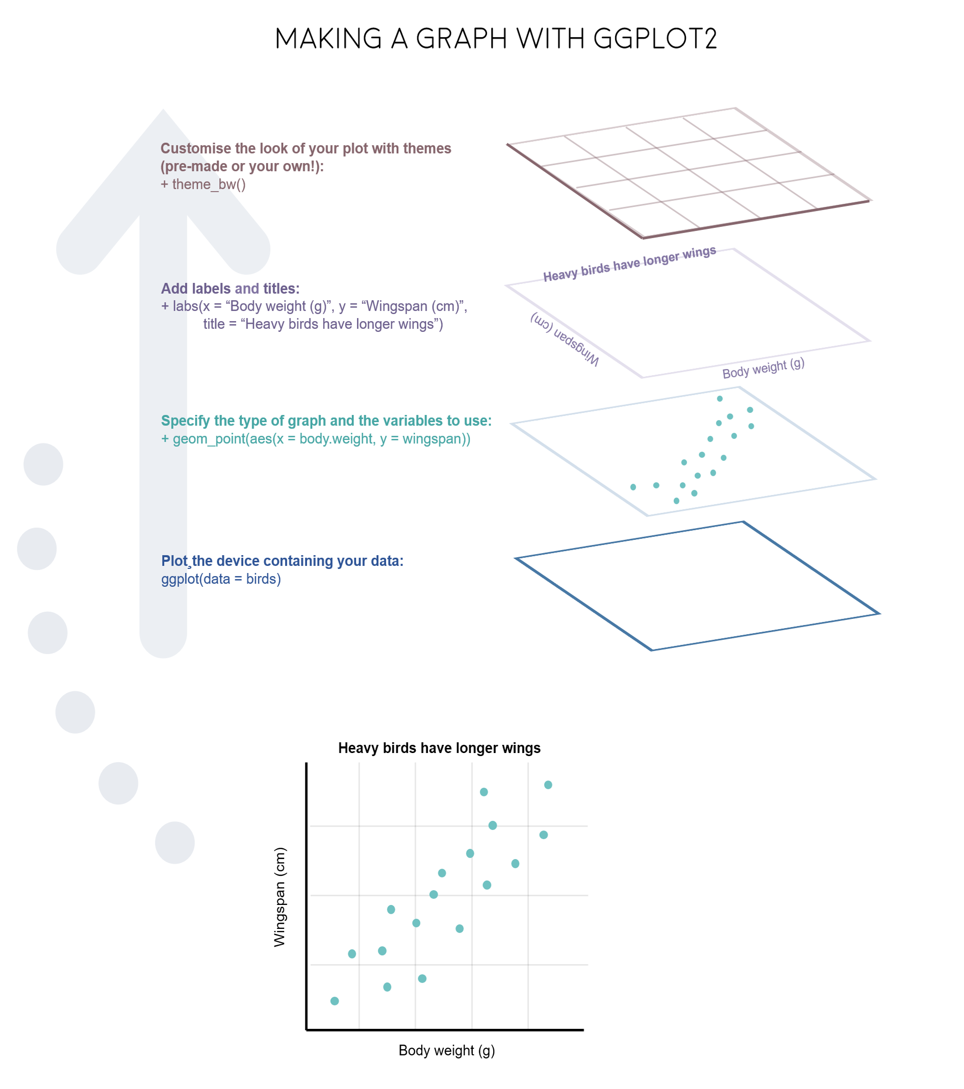
Note: Pressing enter after each “layer” of your plot (i.e. indenting it) prevents the code from being one gigantic line and makes it much easier to read.
Understanding ggplot2’s jargon
Perhaps the trickiest bit when starting out with ggplot2 is understanding what type of elements are responsible for the contents (data) versus the container (general look) of your plot. Let’s de-mystify some of the common words you will encounter.
geom: a geometric object which defines the type of graph you are making. It reads your data in the aesthetics mapping to know which variables to use, and creates the graph accordingly. Some common types are geom_point(), geom_boxplot(), geom_histogram(), geom_col(), etc.
aes: short for aesthetics. Usually placed within a geom_, this is where you specify your data source and variables, AND the properties of the graph which depend on those variables. For instance, if you want all data points to be the same colour, you would define the colour = argument outside the aes() function; if you want the data points to be coloured by a factor’s levels (e.g. by site or species), you specify the colour = argument inside the aes().
stat: a stat layer applies some statistical transformation to the underlying data: for instance, stat_smooth(method = "lm") displays a linear regression line and confidence interval ribbon on top of a scatter plot (defined with geom_point()).
theme: a theme is made of a set of visual parameters that control the background, borders, grid lines, axes, text size, legend position, etc. You can use pre-defined themes, create your own, or use a theme and overwrite only the elements you don’t like. Examples of elements within themes are axis.text, panel.grid, legend.title, and so on. You define their properties with elements_...() functions: element_blank() would return something empty (ideal for removing background colour), while element_text(size = ..., face = ..., angle = ...) lets you control all kinds of text properties.
Also useful to remember is that layers are added on top of each other as you progress into the code, which means that elements written later may hide or overwrite previous elements.
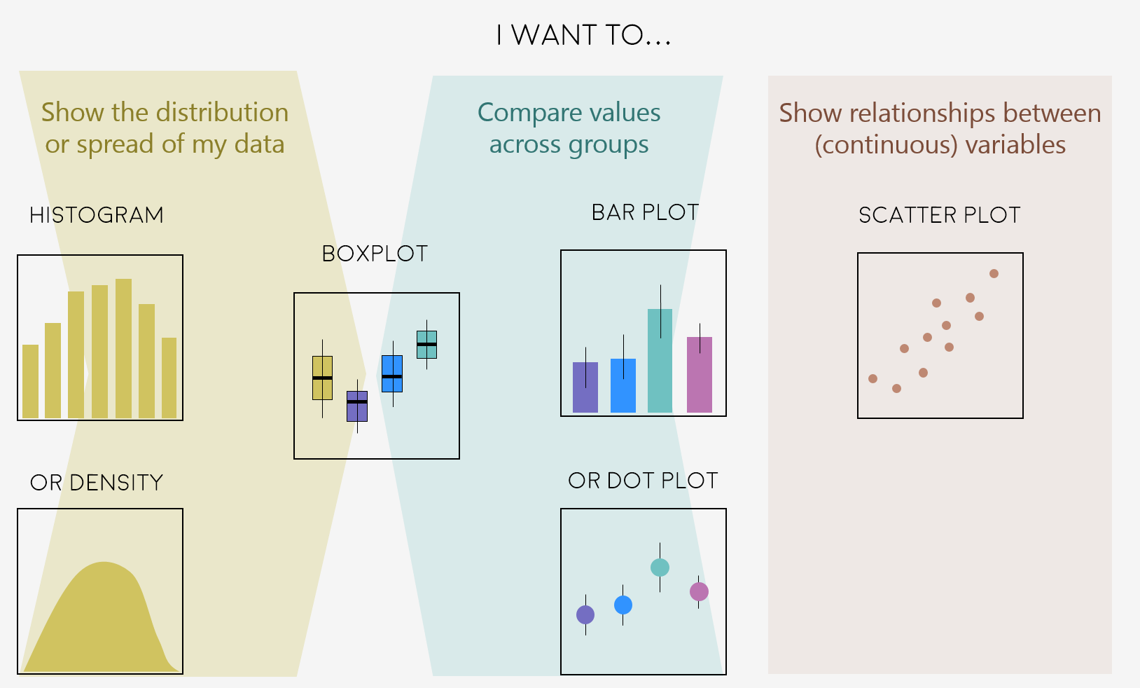
Deciding on the right type of plot
A very key part of making any data visualisation is making sure that it is appropriate to your data type (e.g. discrete vs continuous), and fits your purpose, i.e. what you are trying to communicate!
Here are some common graph types, but really there is loads more, and you can visit the R Graph Galleryfor more inspiration!
Figures can change a lot the more you work on a project, and often they go on what we call a beautification journey - from a quick plot with boring or no colours to a clear and well-illustrated graph. So now that we have the data needed for the examples in this tutorial, we can start the journey.
Open RStudio, select File/New File/R script and start writing your script with the help of this tutorial. You might find it easier to have the tutorial open on half of your screen and RStudio on the other half, so that you can go between the two quickly.
# Purpose of the script
# Your name, date and email
# Your working directory, set to the folder you just downloaded from Github, e.g.:
setwd("~/Downloads/CC-dataviz-beautification")
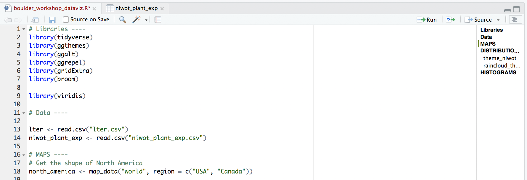
# Libraries ----
# if you haven't installed them before, run the code install.packages("package_name")
library(tidyverse)
library(ggthemes) # for a mapping theme
library(ggalt) # for custom map projections
library(ggrepel) # for annotations
library(viridis) # for nice colours
# Data ----
# Load data - site coordinates and plant records from
# the Long Term Ecological Research Network
# https://lternet.edu and the Niwot Ridge site more specifically
lter <- read.csv("lter.csv")
niwot_plant_exp <- read.csv("niwot_plant_exp.csv")
Managing long scripts: Lines of code pile up quickly! There is an outline feature in RStudio that makes long scripts more organised and easier to navigate. You can make a subsection by writing out a comment and adding four or more characters after the text, e.g. # Section 1 ----. If you’ve included all of the comments from the tutorial in your own script, you should already have some sections.
An important note about graphs made using ggplot2: you’ll notice that throughout this tutorial, the ggplot2 code is always surrounded by brackets. That way, we both make the graph, assign it to an object, e.g. duration1 and we “call” the graph, so we can see it in the plot tab. If you don’t have the brackets around the code chunk, you’ll make the graph, but you won’t actually see it. Alternatively, you can “call” the graph to the plot tab by running just the line duration1. It’s also best to assign your graphs to objects, especially if you want to save them later, otherwise they just disappear and you’ll have to run the code again to see or save the graph.
Make and beautify maps
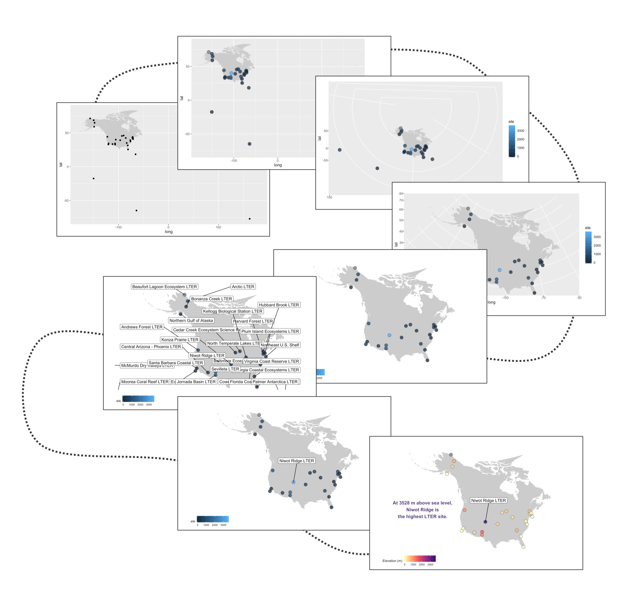
Often we find ourselves needing to plot sites or species’ occurrences on a map and with ggplot2 and a combo of a few of its companion packages, we can make nice and clear maps, with the option to choose among different map projections. Here is the journey this particular map of the sites part of the Long-Term Ecological Research Network are embarking on - small tweaks among the different steps, but ultimately the final map stands out more.
# MAPS ----
# Get the shape of North America
north_america <- map_data("world", region = c("USA", "Canada"))

# Exclude Hawaii if you want to
north_america <- north_america[!(north_america$subregion %in% "Hawaii"),]

# A very basic map
(lter_map1 <- ggplot() +
    geom_map(map = north_america, data = north_america,
             aes(long, lat, map_id = region),
             color = "gray80", fill = "gray80", size = 0.3) +
    # Add points for the site locations
    geom_point(data = lter,
               aes(x = long, y = lat)))

# You can ignore this warning message, it's cause we have forced
# specific lat and long columns onto geom_map()
# Warning: Ignoring unknown aesthetics: x, y

# if you wanted to save this (not amazing) map
# you can use ggsave()
ggsave(lter_map1, filename = "map1.png",
       height = 5, width = 8)  # the units by default are in inches

# the map will be saved in your working directory
# if you have forgotten where that is, use this code to find out
getwd()
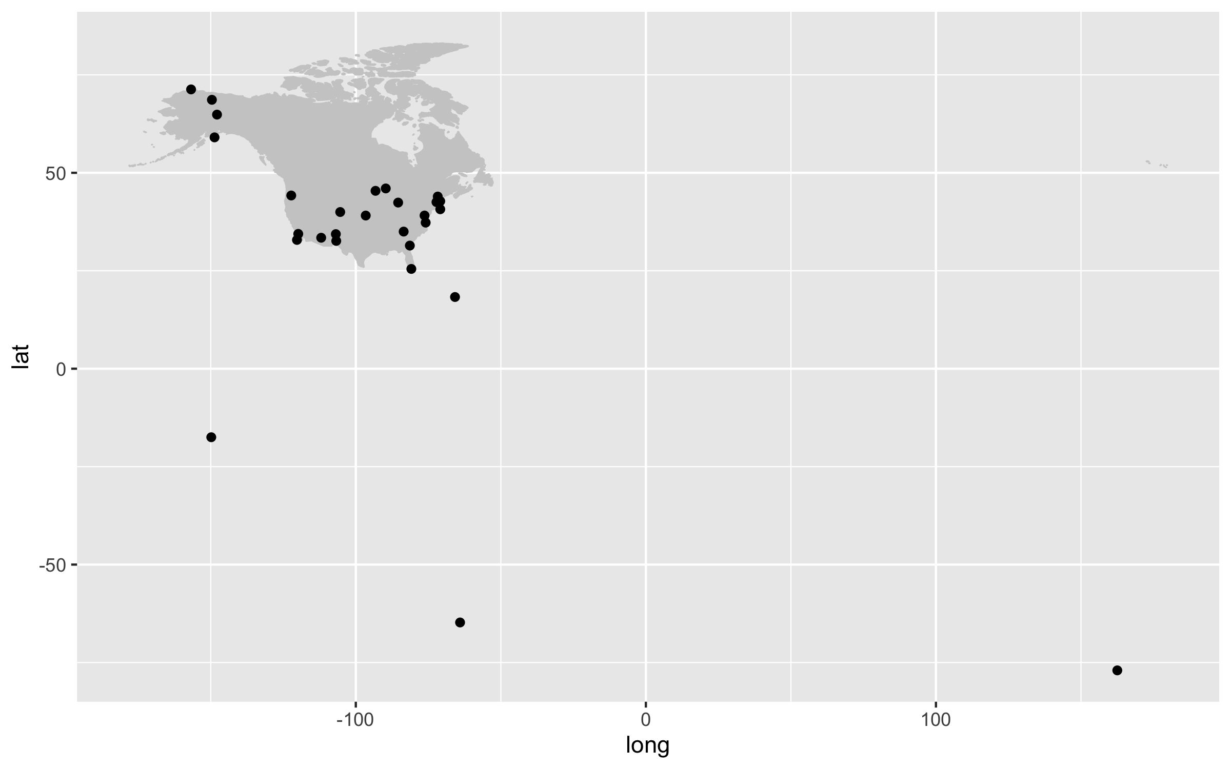
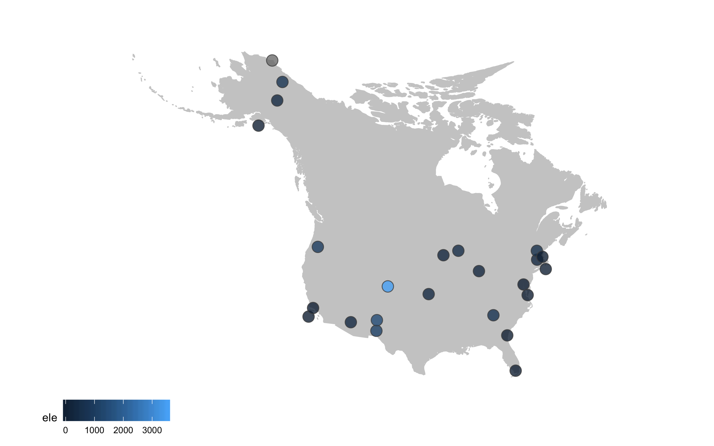
Our first map does a not terrible job at visualising where the sites are, but it looks rather off and is not particularly great to look at. It’s also not communicating much information other than where the sites are. For example, we can use colours to indicate the elevation of each site.
(lter_map2 <- ggplot() +
    geom_map(map = north_america, data = north_america,
             aes(long, lat, map_id = region),
             color = "gray80", fill = "gray80", size = 0.3) +
    geom_point(data = lter,
               aes(x = long, y = lat, fill = ele),
	       # when you set the fill or colour to vary depending on a variable
	       # you put that (e.g., fill = ele) inside the aes() call
	       # when you want to set a specific colour (e.g., colour = "grey30"),
	       # that goes outside of the aes() call
               alpha = 0.8, size = 4, colour = "grey30",
               shape = 21))

ggsave(lter_map2, filename = "map2.png",
       height = 5, width = 8)
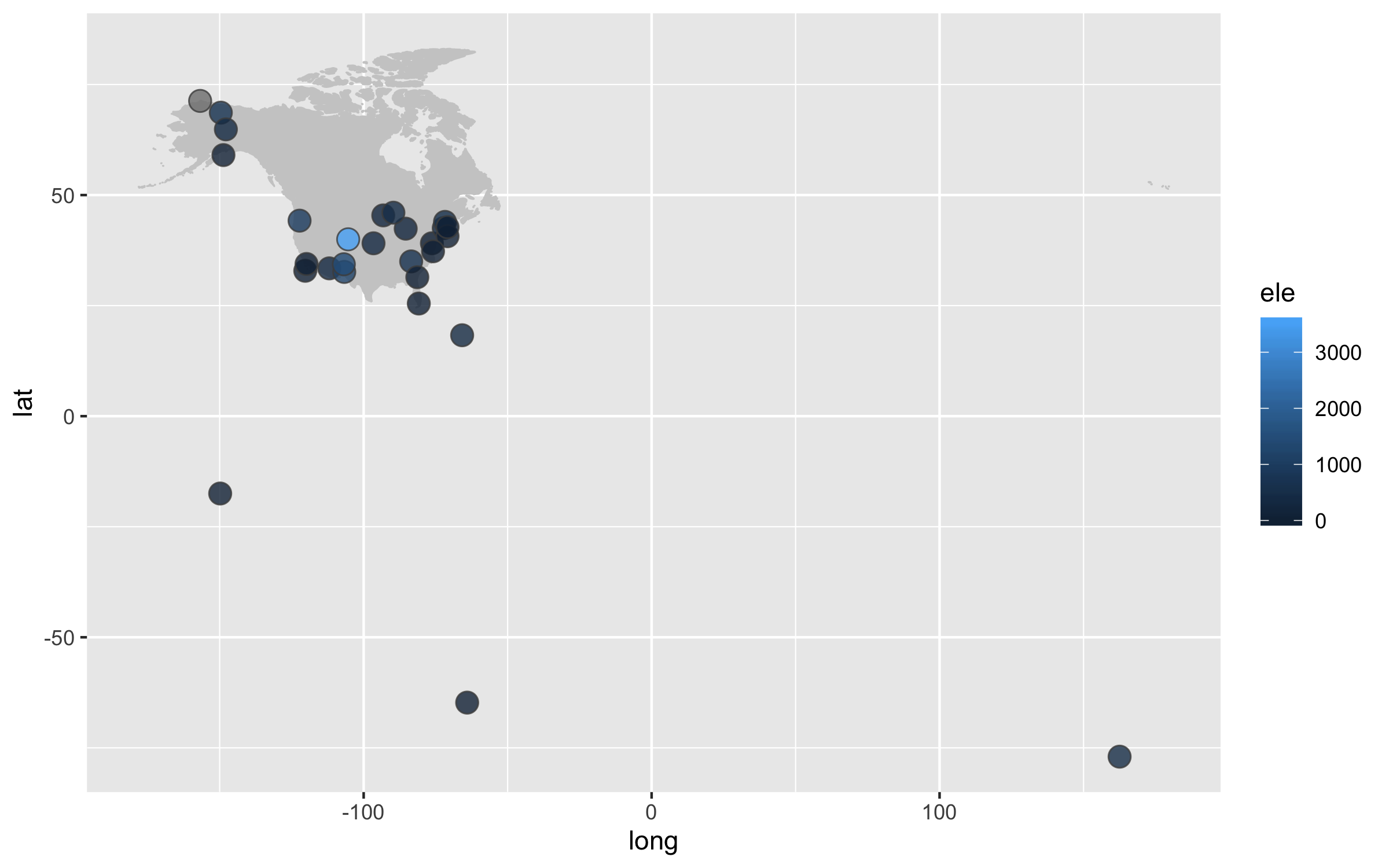
Next up we can work on improving the map projection - by default we get the Mercantor projection but that doesn’t represent the world very realistically. With the ggalt package and the coord_proj function, we can easily swap the default projection.
(lter_map3 <- ggplot() +
    geom_map(map = north_america, data = north_america,
             aes(long, lat, map_id = region),
             color = "gray80", fill = "gray80", size = 0.3) +
    # you can change the projection here
    # coord_proj("+proj=wintri") +
    # the wintri one above is good for the whole world, the one below for just North America
    coord_proj(paste0("+proj=aea +lat_1=29.5 +lat_2=45.5 +lat_0=37.5 +lon_0=-96",
                      " +x_0=0 +y_0=0 +ellps=GRS80 +datum=NAD83 +units=m +no_defs")) +
    geom_point(data = lter,
               aes(x = long, y = lat, fill = ele),
               alpha = 0.8, size = 4, colour = "grey30",
               shape = 21))

# You don't need to worry about the warning messages
# that's just cause we've overwritten the default projection

ggsave(lter_map3, filename = "map3.png",
       height = 5, width = 8)
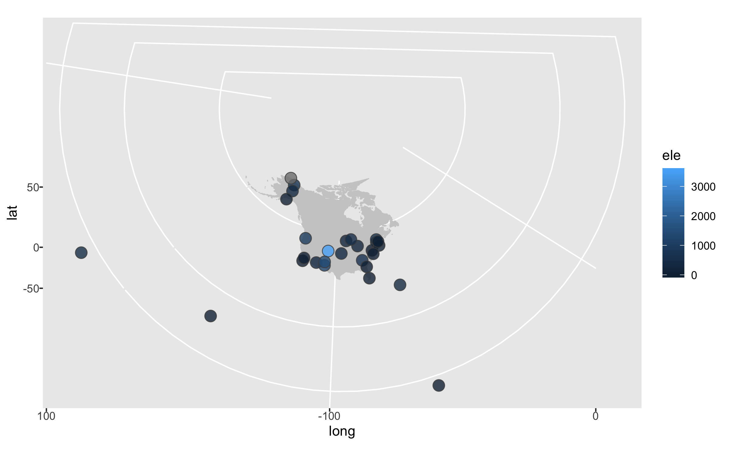
The projection is better now, but because there are a few faraway sites, the map looks quite small. Since those sites are not going to be our focus, we can zoom in on the map.
(lter_map4 <- ggplot() +
    geom_map(map = north_america, data = north_america,
             aes(long, lat, map_id = region),
             color = "gray80", fill = "gray80", size = 0.3) +
    coord_proj(paste0("+proj=aea +lat_1=29.5 +lat_2=45.5 +lat_0=37.5 +lon_0=-96",
                      " +x_0=0 +y_0=0 +ellps=GRS80 +datum=NAD83 +units=m +no_defs"),
	       # zooming in by setting specific coordinates
               ylim = c(25, 80), xlim = c(-175, -50)) +
    geom_point(data = lter,
               aes(x = long, y = lat, fill = ele),
               alpha = 0.8, size = 4, colour = "grey30",
               shape = 21))

ggsave(lter_map4, filename = "map4.png",
       height = 5, width = 8)
Next up we can declutter a bit - we don’t really need that grey background and people know that on a map you have latitude and longitude as the axes.
(lter_map5 <- ggplot() +
    geom_map(map = north_america, data = north_america,
             aes(long, lat, map_id = region),
             color = "gray80", fill = "gray80", size = 0.3) +
    coord_proj(paste0("+proj=aea +lat_1=29.5 +lat_2=45.5 +lat_0=37.5 +lon_0=-96",
                      " +x_0=0 +y_0=0 +ellps=GRS80 +datum=NAD83 +units=m +no_defs"),
               ylim = c(25, 80), xlim = c(-175, -50)) +
    geom_point(data = lter,
               aes(x = long, y = lat, fill = ele),
               alpha = 0.8, size = 4, colour = "grey30",
               shape = 21) +
    # Adding a clean map theme
    theme_map() +
    # Putting the legend at the bottom
    theme(legend.position = "bottom"))

ggsave(lter_map5, filename = "map5.png",
       height = 5, width = 8)
Sometimes we want to annotate points and communicate what’s where - the ggrepel package is very useful in such cases.
(lter_map6 <- ggplot() +
    geom_map(map = north_america, data = north_america,
             aes(long, lat, map_id = region),
             color = "gray80", fill = "gray80", size = 0.3) +
    coord_proj(paste0("+proj=aea +lat_1=29.5 +lat_2=45.5 +lat_0=37.5 +lon_0=-96",
                      " +x_0=0 +y_0=0 +ellps=GRS80 +datum=NAD83 +units=m +no_defs"),
               ylim = c(25, 80), xlim = c(-175, -50)) +
    geom_point(data = lter,
               aes(x = long, y = lat, fill = ele),
               alpha = 0.8, size = 4, colour = "grey30",
               shape = 21) +
    theme_map() +
    theme(legend.position = "bottom") +
    # Adding point annotations with the site name
    geom_label_repel(data = lter,
                     aes(x = long, y = lat,
                         label = site),
		     # Setting the positions of the labels
                     box.padding = 1, size = 4, nudge_x = 1, nudge_y = 1))

ggsave(lter_map6, filename = "map6.png",
       height = 5, width = 8)
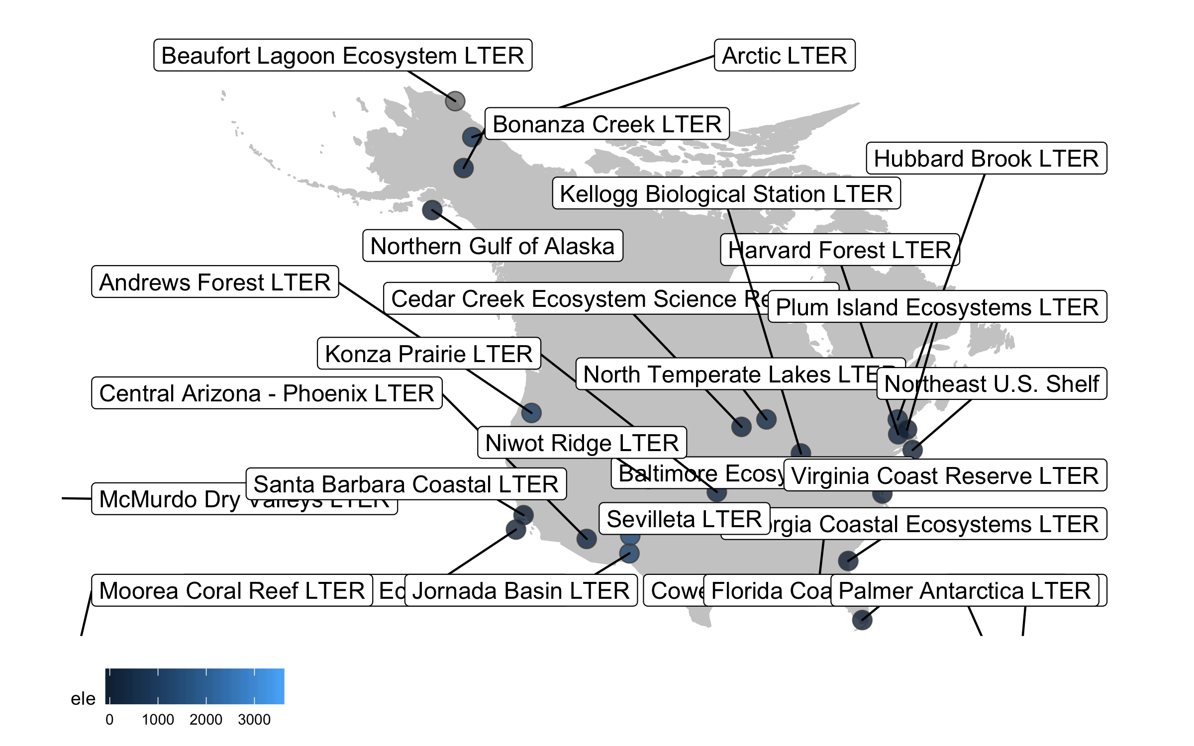
Well, we slightly overdid it with the labels, we have a lot of sites and it’s definitely an eye sore to look at all of their names at once. But where annotations really shine is in drawing attention to a specific point or data record. So we can add a label just for one of the sites, Niwot Ridge, from where the plant data for the rest of the tutorial comes.
(lter_map7 <- ggplot() +
    geom_map(map = north_america, data = north_america,
             aes(long, lat, map_id = region),
             color = "gray80", fill = "gray80", size = 0.3) +
    coord_proj(paste0("+proj=aea +lat_1=29.5 +lat_2=45.5 +lat_0=37.5 +lon_0=-96",
                      " +x_0=0 +y_0=0 +ellps=GRS80 +datum=NAD83 +units=m +no_defs"),
               ylim = c(25, 80), xlim = c(-175, -50)) +
    geom_point(data = lter,
               aes(x = long, y = lat, fill = ele),
               alpha = 0.8, size = 4, colour = "grey30",
               shape = 21) +
    theme_map() +
    theme(legend.position = "bottom") +
    geom_label_repel(data = subset(lter, ele > 2000),
                     aes(x = long, y = lat,
                         label = site),
                     box.padding = 1, size = 4, nudge_x = 1, nudge_y = 12))

ggsave(lter_map7, filename = "map7.png",
       height = 5, width = 8)
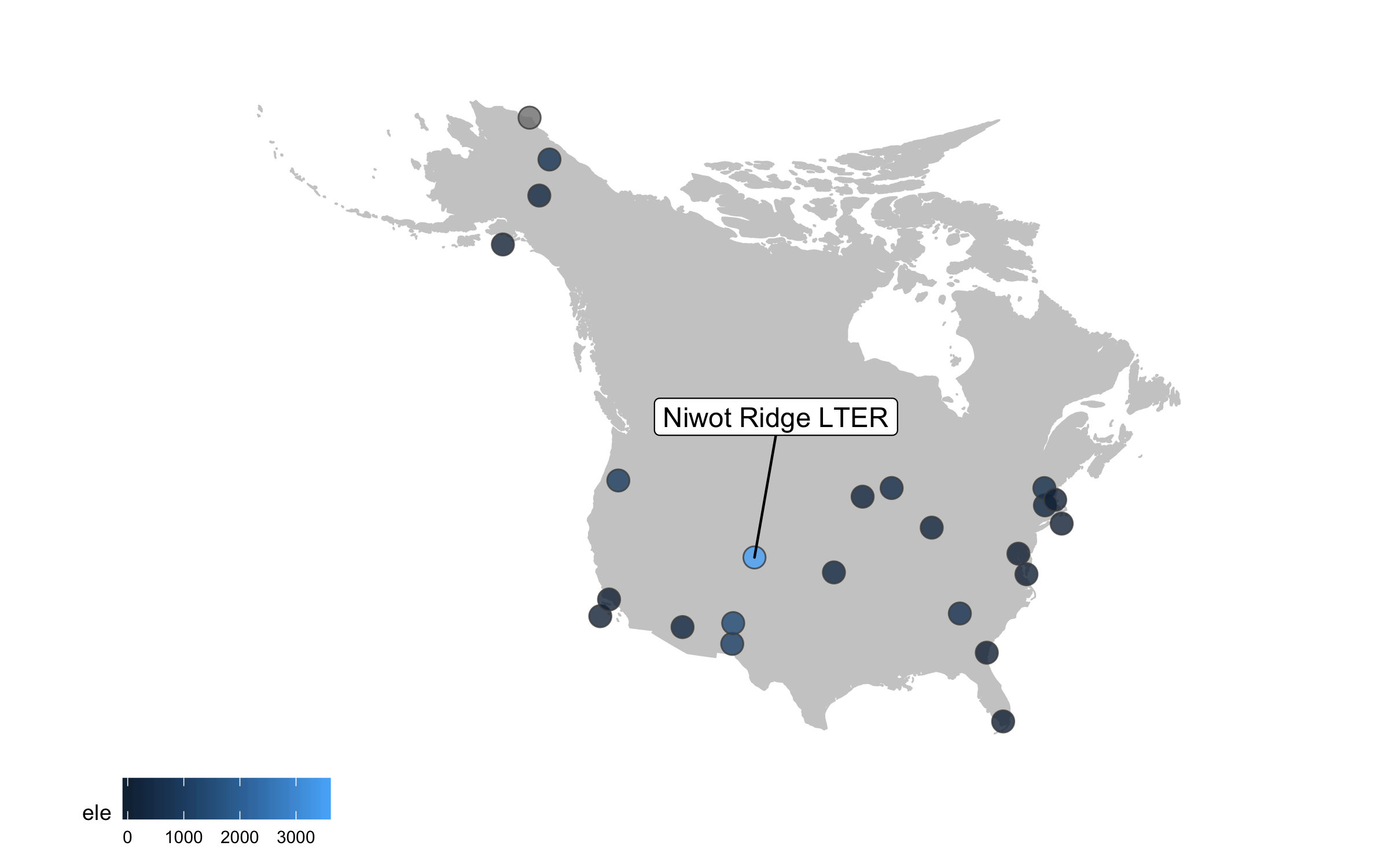
This is looking better, but the colours are not very exciting. Depending on the purpose of the map and where it’s going (e.g., presentation, manuscript, a science communication piece), we can also add some text with an interesting fact about the site.
(lter_map8 <- ggplot() +
    geom_map(map = north_america, data = north_america,
             aes(long, lat, map_id = region),
             color = "gray80", fill = "gray80", size = 0.3) +
    coord_proj(paste0("+proj=aea +lat_1=29.5 +lat_2=45.5 +lat_0=37.5 +lon_0=-96",
                      " +x_0=0 +y_0=0 +ellps=GRS80 +datum=NAD83 +units=m +no_defs"),
               ylim = c(25, 80), xlim = c(-175, -50)) +
    geom_point(data = lter,
               aes(x = long, y = lat, fill = ele),
               alpha = 0.8, size = 4, colour = "grey30",
               shape = 21) +
    theme_map() +
    theme(legend.position = "bottom") +
    geom_label_repel(data = subset(lter, ele > 2000),
                     aes(x = long, y = lat,
                         label = site),
                     box.padding = 1, size = 4, nudge_x = 1, nudge_y = 12) +
    labs(fill = "Elevation (m)") +
    annotate("text", x = -150, y = 35, colour = "#553c7f",
             label = "At 3528 m above sea level,\nNiwot Ridge is\nthe highest LTER site.",
             size = 4.5, fontface = "bold") +
    scale_fill_viridis(option = "magma", direction = -1, begin = 0.2))

ggsave(lter_map8, filename = "map8.png",
       height = 5, width = 8)
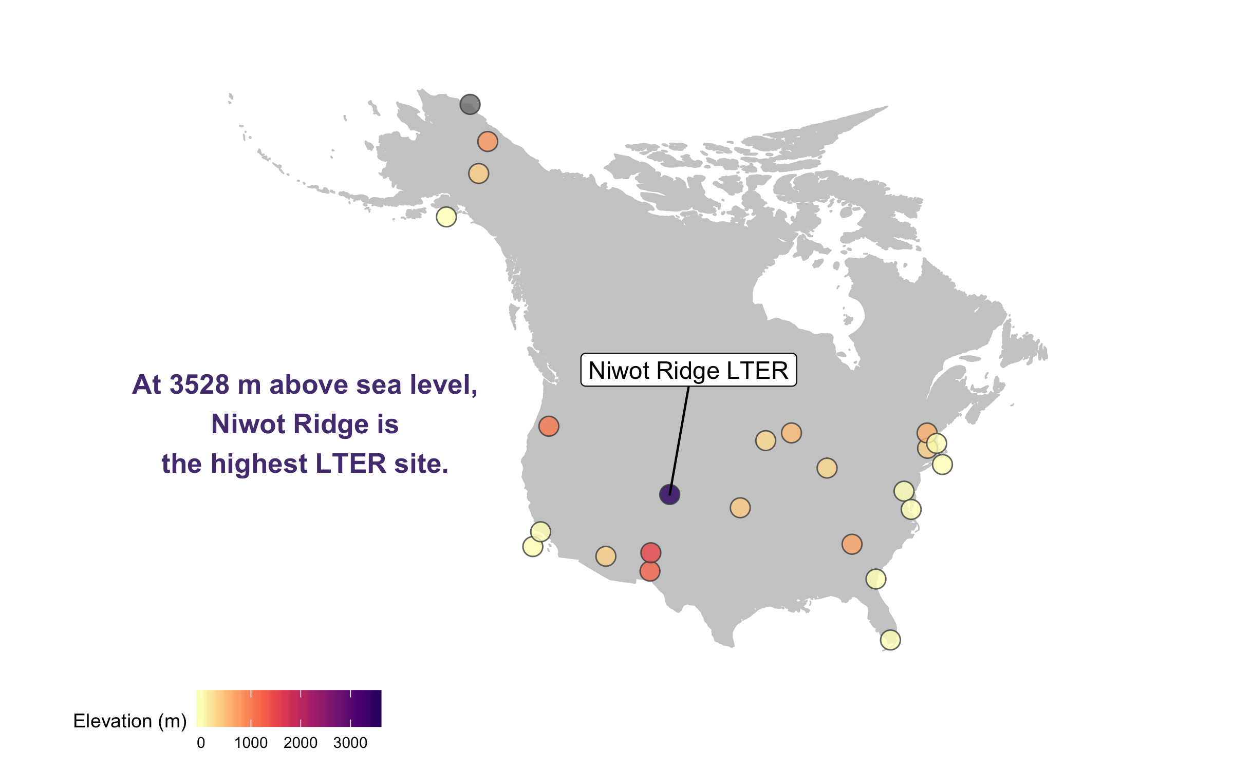
There goes our map! Hard to say our “finished” map, because figures evolve a lot, but for now we’ll leave the map here and move onto distributions - a great way to communicate the whole spectrum of variance in your dataset!
Visualise distributions (and make them rain data with raincloud plots)
Behind every mean, there is a distribution, and that distribution has a story tell, if only we let it! Visualising distributions is a very useful way to communicate patterns in your data in a more transparent way than just a mean and its error.
Violin plots (the fatter the violin at a given value, the more data points there) are pretty and sound poetic, but we can customise them to make their messages pop out more. Thus the beautification journey begins again.
If you’ve ever tried to perfect your ggplot2 graphs, you might have noticed that the lines starting with theme() quickly pile up: you adjust the font size of the axes and the labels, the position of the title, the background colour of the plot, you remove the grid lines in the background, etc. And then you have to do the same for the next plot, which really increases the amount of code you use. Here is a simple solution: create a customised theme that combines all the theme() elements you want and apply it to your graphs to make things easier and increase consistency. You can include as many elements in your theme as you want, as long as they don’t contradict one another and then when you apply your theme to a graph, only the relevant elements will be considered.
# DISTRIBUTIONS ----
# Setting a custom ggplot2 function
# This function makes a pretty ggplot theme
# This function takes no arguments
# meaning that you always have just niwot_theme() and not niwot_theme(something else here)

theme_niwot <- function(){
  theme_bw() +
    theme(text = element_text(family = "Helvetica Light"),
          axis.text = element_text(size = 16),
          axis.title = element_text(size = 18),
          axis.line.x = element_line(color="black"),
          axis.line.y = element_line(color="black"),
          panel.border = element_blank(),
          panel.grid.major.x = element_blank(),
          panel.grid.minor.x = element_blank(),
          panel.grid.minor.y = element_blank(),
          panel.grid.major.y = element_blank(),
          plot.margin = unit(c(1, 1, 1, 1), units = , "cm"),
          plot.title = element_text(size = 18, vjust = 1, hjust = 0),
          legend.text = element_text(size = 12),
          legend.title = element_blank(),
          legend.position = c(0.95, 0.15),
          legend.key = element_blank(),
          legend.background = element_rect(color = "black",
                                           fill = "transparent",
                                           size = 2, linetype = "blank"))
}
First up, we should decide on a variable whose distribution we will show. The data we are working with represent plant species and how often they were recorded at a fertilisation experiment at the Niwot Ridge LTER site. There are multiple plots per fertilisation treatment and they were monitored in several years, so one thing we can calculate from these data is the number of species per plot per year.
A data manipulation tip: Pipes (%>%) are great for streamlining data analysis. If you haven’t used them before, you can find an intro in our tutorial here. A useful way to familiriase yourself with what the pipe does at each step is to “break” the pipe and check out what the resulting object looks like if you’ve only ran the code up to a certain point. You can do that by just select the relevant bit of code and running only that, but remember you have to exclude the piping operator at the end of the line, so e.g. you select up to niwot_richness <- niwot_plant_exp %>% group_by(plot_num, year) and not the whole niwot_richness <- niwot_plant_exp %>% group_by(plot_num, year) %>%.
Running pipes sequentially line by line also comes in handy when there is an error in your pipe and you don’t know which part exactly introduces the error.
Grouping by a certain variable is probably one of the most commonly used functions from the tidyverse (e.g., in our case we group by year and plot to calculate species richness for every combo of those two grouping variables), but remember to ungroup afterwards as if you forget, the grouping remains even if you don’t “see” it and that might later on lead to some unintended consequences.
# Calculate species richness per plot per year
niwot_richness <- niwot_plant_exp %>% group_by(plot_num, year) %>%
  mutate(richness = length(unique(USDA_Scientific_Name))) %>% ungroup()
Now that we have calculated the species richness, we can visualise how it varies across fertilisation treatments.
(distributions1 <- ggplot(niwot_richness, aes(x = fert, y = richness)) +
    geom_violin())

ggsave(distributions1, filename = "distributions1.png",
       height = 5, width = 5)
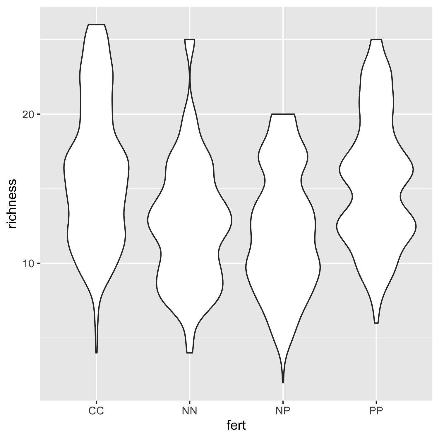
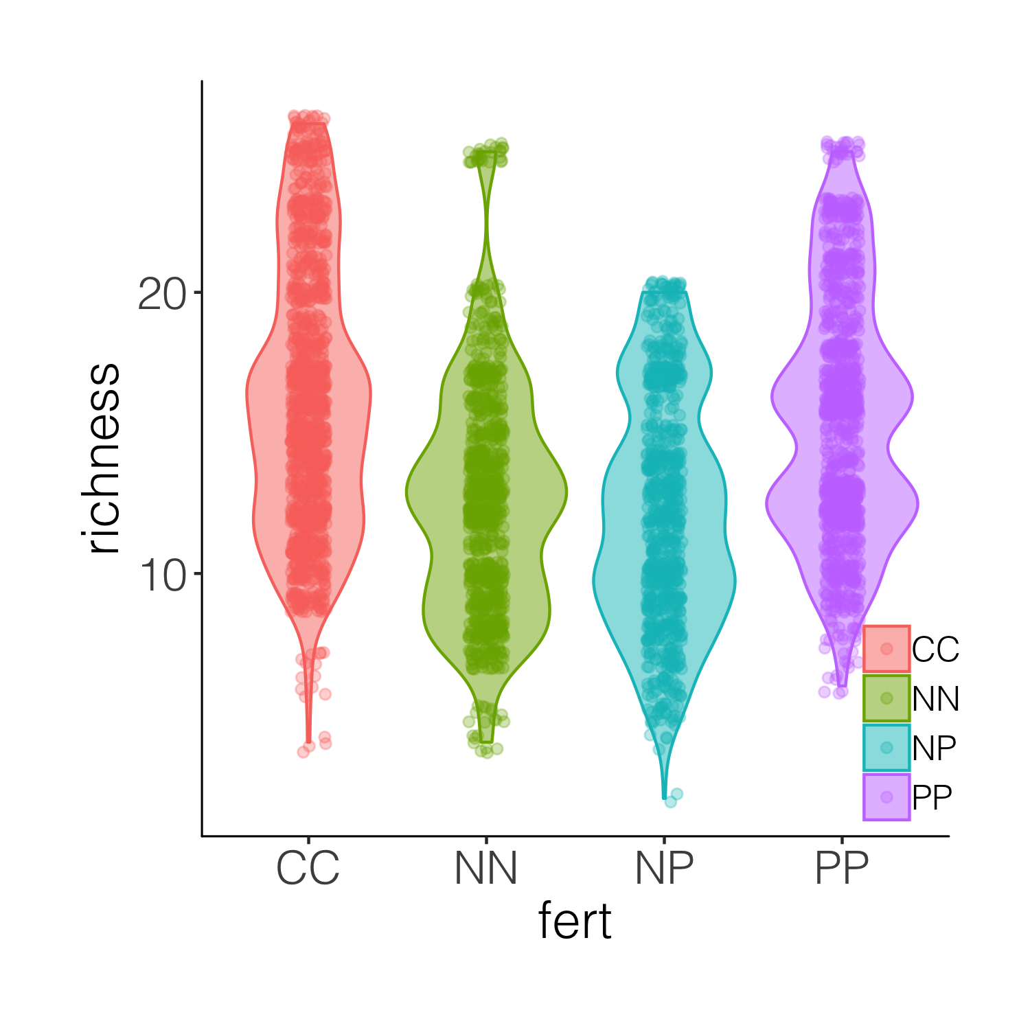
Not that inspiring, but a useful first look at the data distributions. We can bring some colour in to make it more exciting and also add our custom theme so that the plot is clearer.
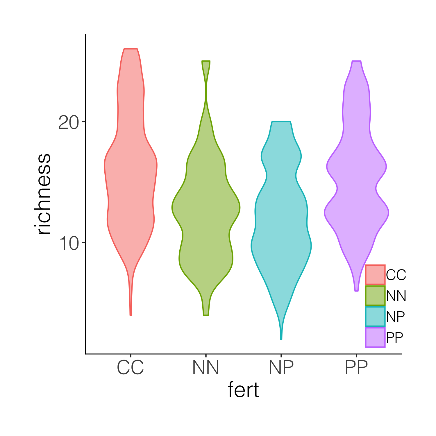
(distributions2 <- ggplot(niwot_richness, aes(x = fert, y = richness)) +
    geom_violin(aes(fill = fert, colour = fert), alpha = 0.5) +
    # alpha controls the opacity
    theme_niwot())

ggsave(distributions2, filename = "distributions2.png",
       height = 5, width = 5)
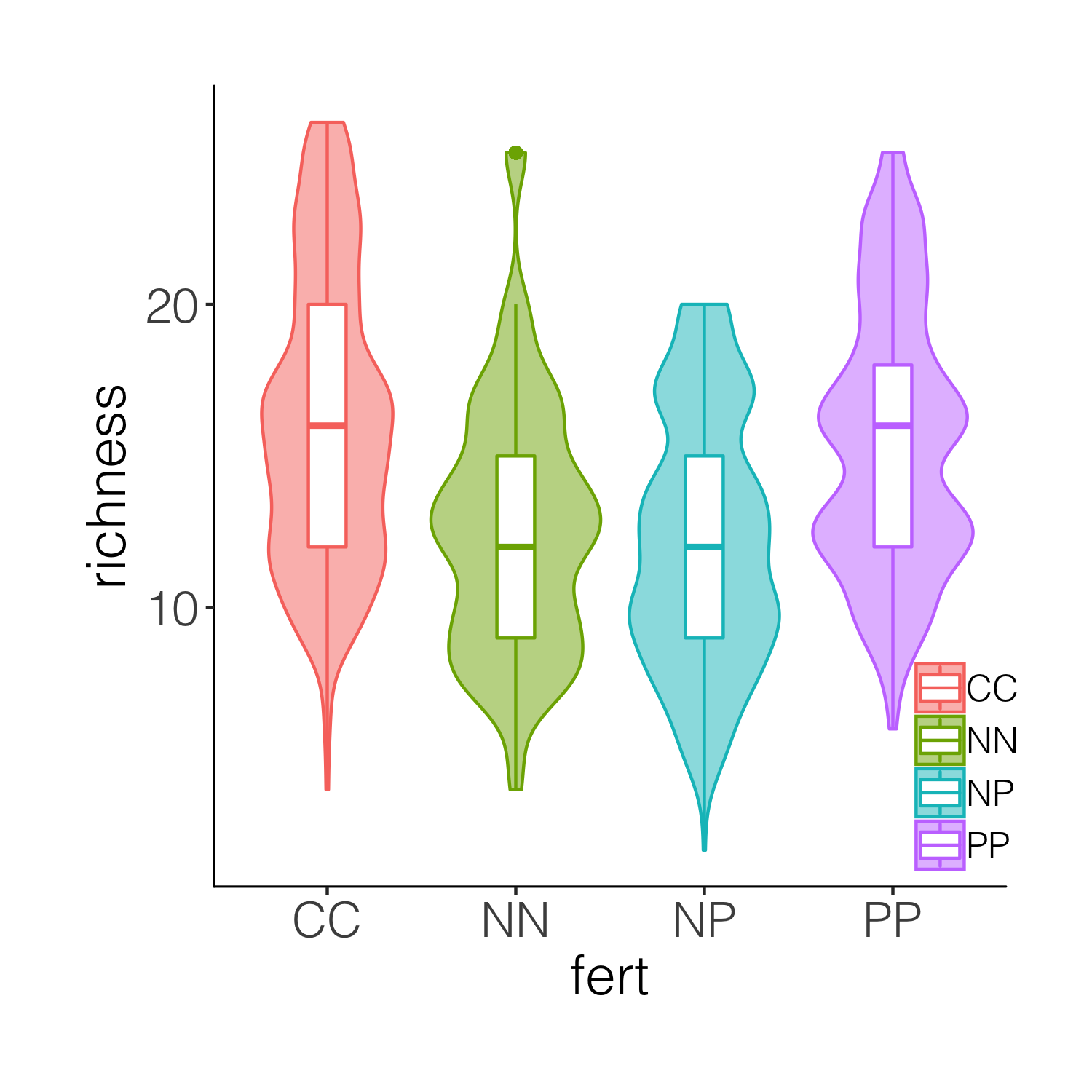
This is better, but it’s still taxing on a reader or observer of the graph to figure out, for example, where is the mean in each cateogry. Thus we can overlay the violins with box plots.
(distributions3 <- ggplot(niwot_richness, aes(x = fert, y = richness)) +
    geom_violin(aes(fill = fert, colour = fert), alpha = 0.5) +
    geom_boxplot(aes(colour = fert), width = 0.2) +
    theme_niwot())

ggsave(distributions3, filename = "distributions3.png",
       height = 5, width = 5)
While the boxplots do add some more information on the plot, we still don’t know exactly where the data points are, and the smoothing function for violins can sometimes hide the real value of a given variable. So intead of a boxplot, we can add the actual data points.
(distributions4 <- ggplot(niwot_richness, aes(x = fert, y = richness)) +
    geom_violin(aes(fill = fert, colour = fert), alpha = 0.5) +
    geom_jitter(aes(colour = fert), position = position_jitter(0.1),
                alpha = 0.3) +
    theme_niwot())

ggsave(distributions4, filename = "distributions4.png",
       height = 5, width = 5)
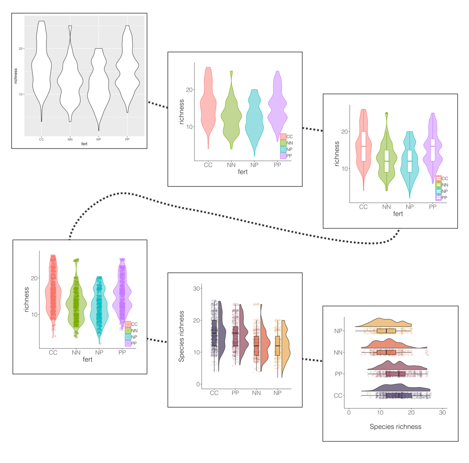
A bit busy! While it’s nice to see the real data, the points are rather hard to tell apart when they are on top of the violins. And this is where raincloud plots come in! They combine a distribution with the real data points as well as a boxplot.
# We will use a function by Ben Marwick
# This code loads the function in the working environment
source("https://gist.githubusercontent.com/benmarwick/2a1bb0133ff568cbe28d/raw/fb53bd97121f7f9ce947837ef1a4c65a73bffb3f/geom_flat_violin.R")

# Now we can make the plot!
(distributions5 <-
    ggplot(data = niwot_richness,
           aes(x = reorder(fert, desc(richness)), y = richness, fill = fert)) +
    # The half violins
    geom_flat_violin(position = position_nudge(x = 0.2, y = 0), alpha = 0.8) +
    # The points
    geom_point(aes(y = richness, color = fert),
               position = position_jitter(width = 0.15), size = 1, alpha = 0.1) +
    # The boxplots
    geom_boxplot(width = 0.2, outlier.shape = NA, alpha = 0.8) +
    # \n adds a new line which creates some space between the axis and axis title
    labs(y = "Species richness\n", x = NULL) +
    # Removing legends
    guides(fill = FALSE, color = FALSE) +
    # Setting the limits of the y axis
    scale_y_continuous(limits = c(0, 30)) +
    # Picking nicer colours
    scale_fill_manual(values = c("#5A4A6F", "#E47250",  "#EBB261", "#9D5A6C")) +
    scale_colour_manual(values = c("#5A4A6F", "#E47250",  "#EBB261", "#9D5A6C")) +
    theme_niwot())

ggsave(distributions5, filename = "distributions5.png",
       height = 5, width = 5)
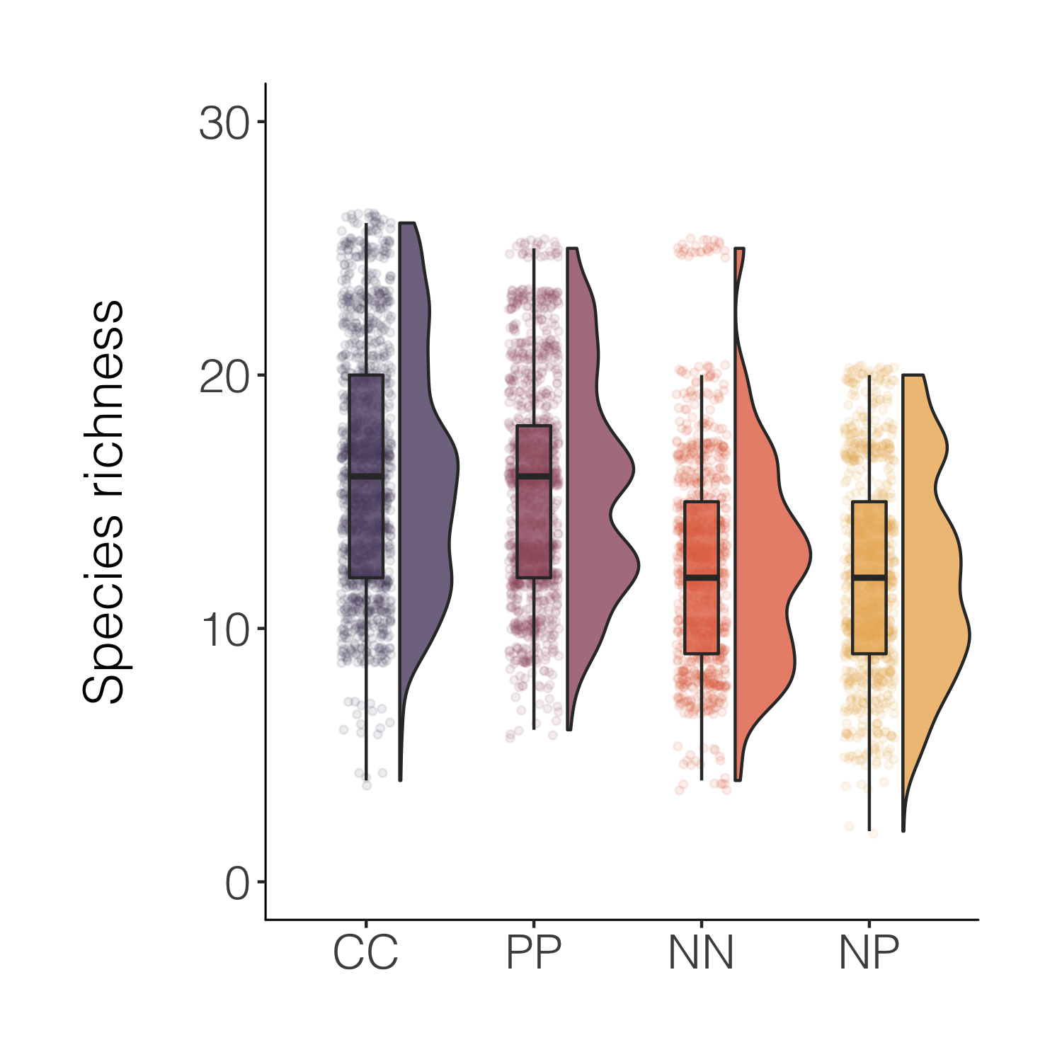
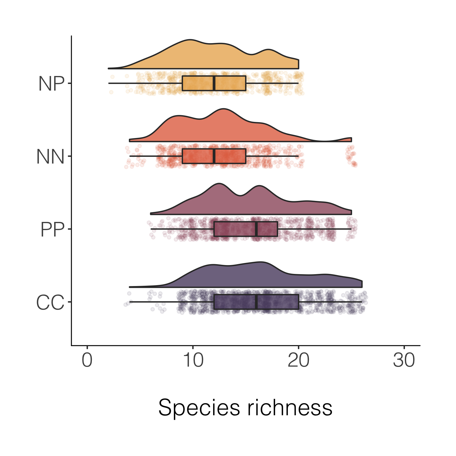
That’s nicer and the combo of the different kinds of plots makes it easy to see both the distribution as well as things like the mean. For a full raincloud plot experience, we can flip the x and y axis.
(distributions6 <-
    ggplot(data = niwot_richness,
           aes(x = reorder(fert, desc(richness)), y = richness, fill = fert)) +
    geom_flat_violin(position = position_nudge(x = 0.2, y = 0), alpha = 0.8) +
    geom_point(aes(y = richness, color = fert),
               position = position_jitter(width = 0.15), size = 1, alpha = 0.1) +
    geom_boxplot(width = 0.2, outlier.shape = NA, alpha = 0.8) +
    labs(y = "\nSpecies richness", x = NULL) +
    guides(fill = FALSE, color = FALSE) +
    scale_y_continuous(limits = c(0, 30)) +
    scale_fill_manual(values = c("#5A4A6F", "#E47250",  "#EBB261", "#9D5A6C")) +
    scale_colour_manual(values = c("#5A4A6F", "#E47250",  "#EBB261", "#9D5A6C")) +
    coord_flip() +
    theme_niwot())

ggsave(distributions6, filename = "distributions6.png",
       height = 5, width = 5)
Final stop along this specific beautification journey, for now at least! But before we move onto histograms, a note about another useful tidyverse feature - being able to quickly create a new variable based on conditions from more than one of the existing variables.
A data manipulation tip: Using case_when(), combined with mutate, is a great way to create new variables based on one or more conditions from other variables.
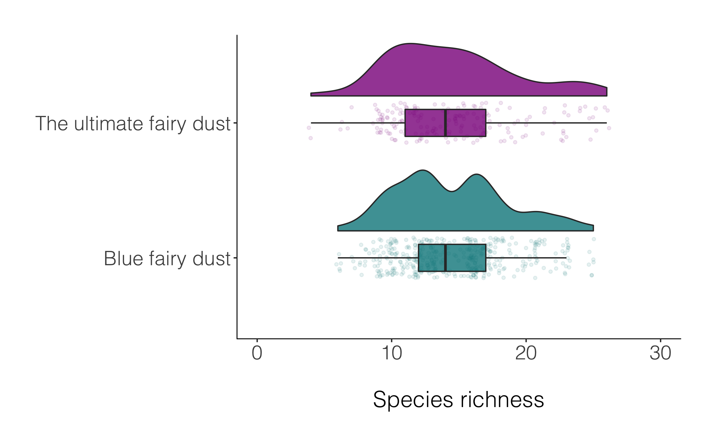
# Create new columns based on a combo of conditions using case_when()
# A fictional example
alpine_magic <- niwot_richness %>% mutate(fairy_dust = case_when(fert == "PP" & hits > 5 ~ "Blue fairy dust",
                                                                 fert == "CC" & hits > 15 ~ "The ultimate fairy dust"))

(distributions_magic <-
    ggplot(data = alpine_magic,
           aes(x = reorder(fairy_dust, desc(richness)), y = richness, fill = fairy_dust)) +
    geom_flat_violin(position = position_nudge(x = 0.2, y = 0), alpha = 0.8) +
    geom_point(aes(y = richness, color = fairy_dust),
               position = position_jitter(width = 0.15), size = 1, alpha = 0.1) +
    geom_boxplot(width = 0.2, outlier.shape = NA, alpha = 0.8) +
    labs(y = "\nSpecies richness", x = NULL) +
    guides(fill = FALSE, color = FALSE) +
    scale_y_continuous(limits = c(0, 30)) +
    scale_fill_manual(values = c("turquoise4", "magenta4")) +
    scale_colour_manual(values = c("turquoise4", "magenta4")) +
    coord_flip() +
    theme_niwot())
A data manipulation tip: Often we have missing values, or not everything has a category, for example in the magic plot above, many of the species are classified as NA. If we want to drop those records, we can use drop_na() and in the brackets specify which specific column(s) should be the evaluator.
alpine_magic_only <- alpine_magic %>% drop_na(fairy_dust)

(distributions_magic2 <-
    ggplot(data = alpine_magic_only,
           aes(x = reorder(fairy_dust, desc(richness)), y = richness, fill = fairy_dust)) +
    geom_flat_violin(position = position_nudge(x = 0.2, y = 0), alpha = 0.8) +
    geom_point(aes(y = richness, color = fairy_dust),
               position = position_jitter(width = 0.15), size = 1, alpha = 0.1) +
    geom_boxplot(width = 0.2, outlier.shape = NA, alpha = 0.8) +
    labs(y = "\nSpecies richness", x = NULL) +
    guides(fill = FALSE, color = FALSE) +
    scale_y_continuous(limits = c(0, 30)) +
    scale_fill_manual(values = c("turquoise4", "magenta4")) +
    scale_colour_manual(values = c("turquoise4", "magenta4")) +
    coord_flip() +
    theme_niwot())

ggsave(distributions_magic2, filename = "distributions_magic2.png",
       height = 5, width = 5)
Raining or not, both versions of the raincloud plot look alright, so like many things in data viz, a matter of personal preferenece.
Make, customise and annotate histograms
A histogram is a simple but mighty plot and for the times when violins and rainclouds are a bit too busy, they can be an excellent way to communicate patterns in your data. Here’s the journey (one of the many possible journeys) of a histogram.
A data manipulation tip: Whenever we go about doing our science, it’s important to be transparent and aware of our sample size and any limitations and strengths that come with it. A very useful function to count the number of observations (rows in your data frame) is tally(), which combined with group_by() creates a nice and quick summary of how many observations there are in the different categories in your data.
# Calculate number of data records per plot per year
# Using the tally() function

observations <- niwot_plant_exp %>% group_by(USDA_Scientific_Name) %>%
  tally() %>% arrange(desc(n))  # rearanging the data frame so that the most common species are first
A data manipulation tip: Filtering and selecting just certain parts of our data is a task we do often, and thanks to the tidyverse, there are efficient ways to filter based on a certain pattern. For example, let’s imagine we want just the records for plant species from the Carex family - we don’t really want to spell them all out, and we might miss some if we do. So we can just filter for anything that contains the word Carex.
# Filtering out just Carex species
carex <- niwot_plant_exp %>%
  filter(str_detect(USDA_Scientific_Name, pattern = "Carex"))
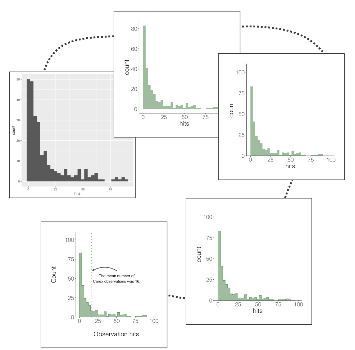
Now that we have a data frame with just Carex plant observations, we can visualise the distribution of how frequently these species are observed across the plots. In these data, that means plotting a histogram of the number of “hits” - how many times during the field data collection the pin used for observations “hit” a Carex species.
(histogram1 <- ggplot(carex, aes(x = hits)) +
  geom_histogram())

ggsave(histogram1, filename = "histogram1.png",
       height = 5, width = 5)
This does the job, but it’s not particularly beautiful and everything is rather on the grey side.
With the growing popularity of ggplot2, oen thing that stands out is that here we have used all of the default ggplot2 options. Similarly, when we use the default ggplot2 colours like in the violin plots earlier on, most people now recognise those, so you risk people immediately thinking “I know those colours, ggplot!” versus pausing to actually take in your scientific message. So making a graph as “yours” as possible can make your work more memorable!
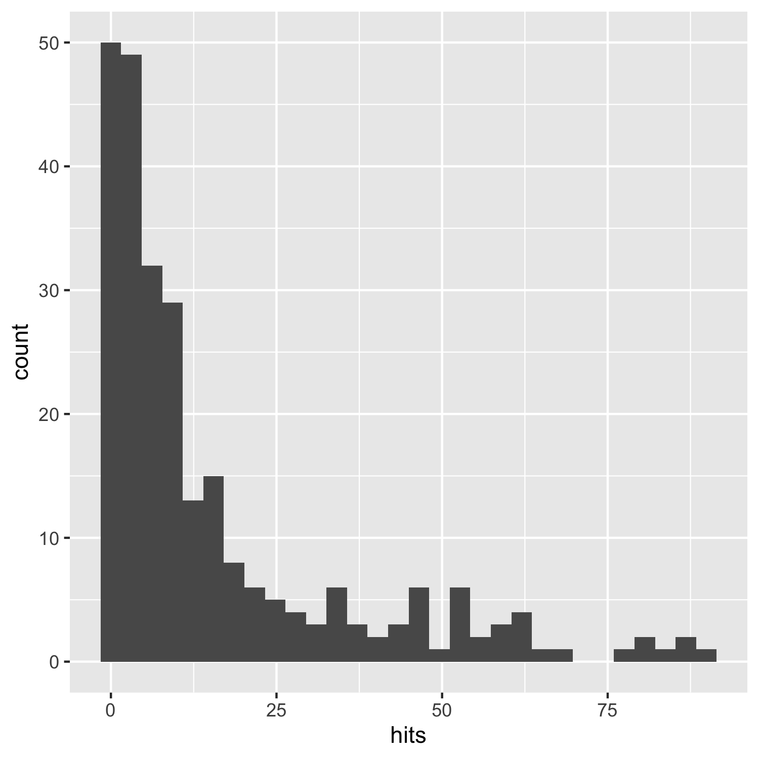
(histogram2 <- ggplot(carex, aes(x = hits)) +
    geom_histogram(alpha = 0.6,
                   breaks = seq(0, 100, by = 3),
		   # Choosing a Carex-like colour
                   fill = "palegreen4") +
    theme_niwot())

ggsave(histogram2, filename = "histogram2.png",
       height = 5, width = 5)
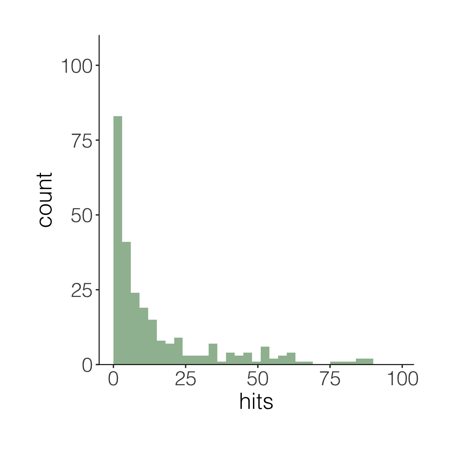
This one is definitely nicer to look at, but our histogram is floating in space. We can easily remove the empty space.
(histogram3 <- ggplot(carex, aes(x = hits)) +
    geom_histogram(alpha = 0.6,
                   breaks = seq(0, 100, by = 3),
                   fill = "palegreen4") +
    theme_niwot() +
    scale_y_continuous(limits = c(0, 100), expand = expand_scale(mult = c(0, 0.1))))
# the final line of code removes the empty blank space below the bars)

ggsave(histogram3, filename = "histogram3.png",
       height = 5, width = 5)
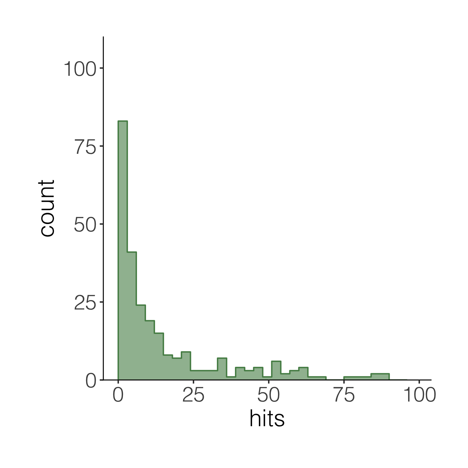
Now imagine you want to have a darker green outline around the whole histogram - not around each individual bin, but the whole shape. It’s the little things that add up to make nice graphs! We can use geom_step() to create the histogram outline, but we have to put the steps in a data frame first. The three lines of code below are a bit of a cheat to create the histogram outline effect. Check out the object d1 to see what we’ve made.
# Adding an outline around the whole histogram
h <- hist(carex$hits, breaks = seq(0, 100, by = 3), plot = FALSE)
d1 <- data.frame(x = h$breaks, y = c(h$counts, NA))
d1 <- rbind(c(0, 0), d1)
When we want to plot data from different data frames in the same graph, we have to move the data frame from the main ggplot() call to the specific part of the graph where we want to use each dataset. Compare the code below with the code for the previous versions of the histograms to spot the difference.
(histogram4 <- ggplot(carex, aes(x = hits)) +
    geom_histogram(alpha = 0.6,
                   breaks = seq(0, 100, by = 3),
                   fill = "palegreen4") +
    theme_niwot() +
    scale_y_continuous(limits = c(0, 100), expand = expand_scale(mult = c(0, 0.1))) +
    # Adding the outline
    geom_step(data = d1, aes(x = x, y = y),
              stat = "identity", colour = "palegreen4"))

summary(d1) # it's fine, you can ignore the warning message
# it's because some values don't have bars
# thus there are missing "steps" along the geom_step path

ggsave(histogram4, filename = "histogram4.png",
       height = 5, width = 5)
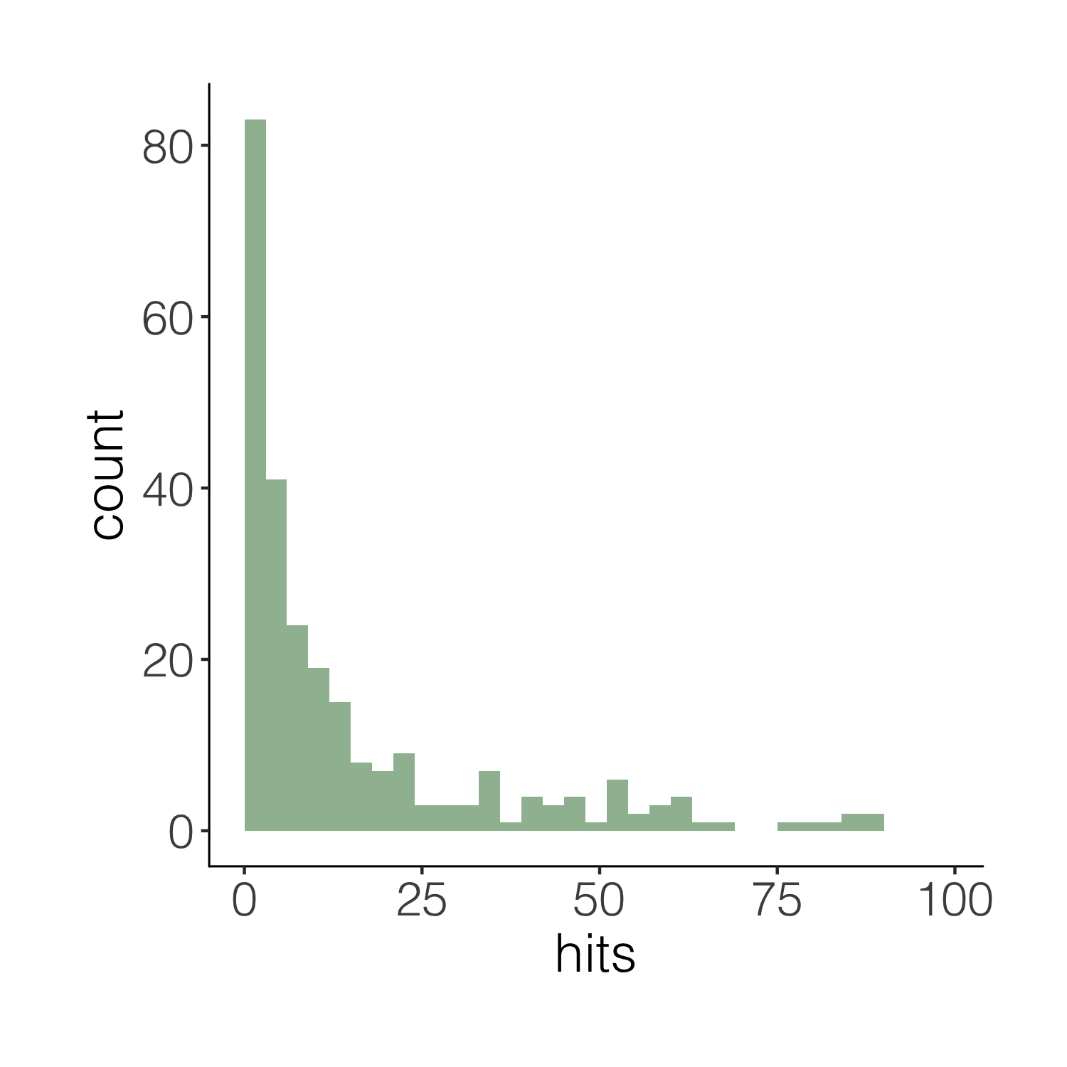
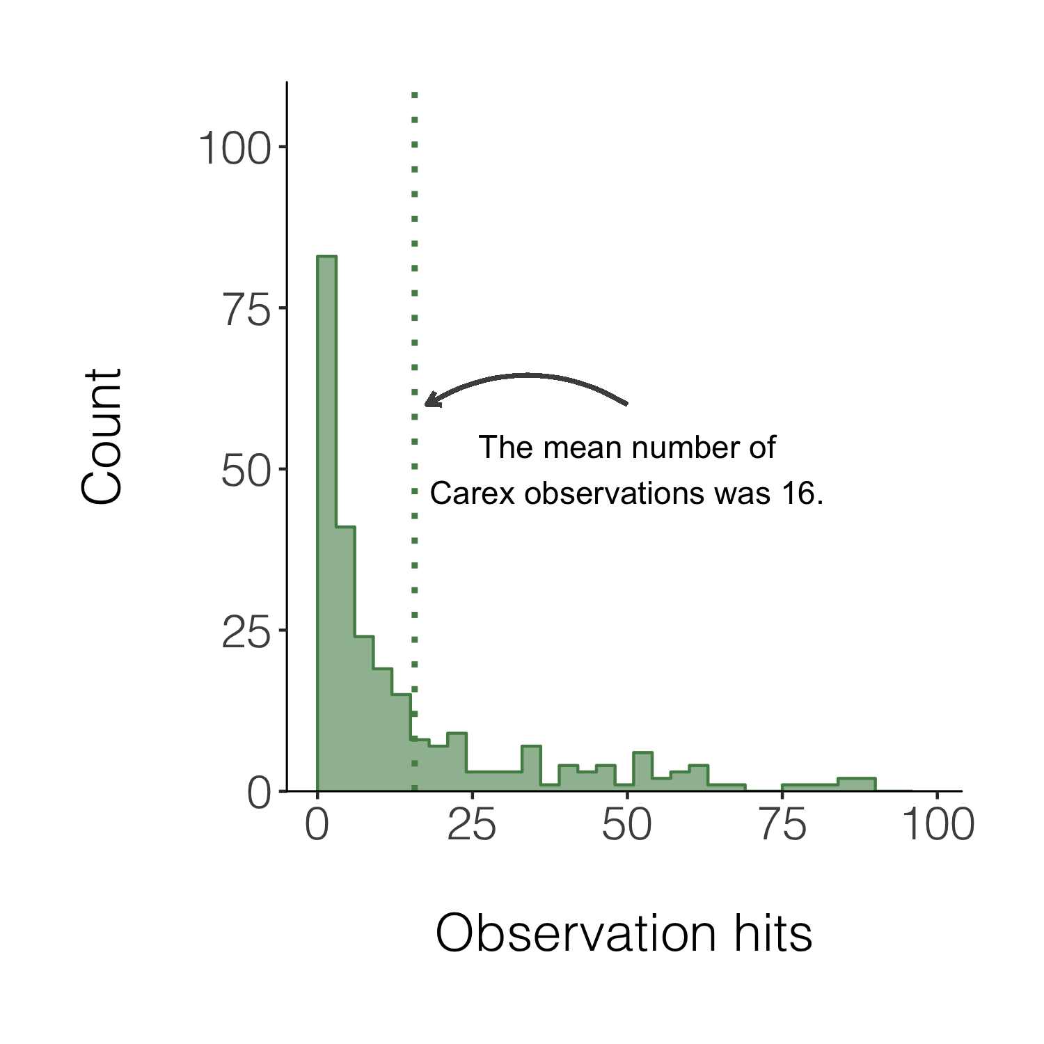
We can also add a line for the mean number of hits and add an annotation on the graph so that people can quickly see what the line means.
(histogram5 <- ggplot(carex, aes(x = hits)) +
    geom_histogram(alpha = 0.6,
                   breaks = seq(0, 100, by = 3),
                   fill = "palegreen4") +
    theme_niwot() +
    scale_y_continuous(limits = c(0, 100), expand = expand_scale(mult = c(0, 0.1))) +
    geom_step(data = d1, aes(x = x, y = y),
              stat = "identity", colour = "palegreen4") +
    geom_vline(xintercept = mean(carex$hits), linetype = "dotted",
             colour = "palegreen4", size = 1) +
    # Adding in a text allocation - the coordinates are based on the x and y axes
    annotate("text", x = 50, y = 50, label = "The mean number of\nCarex observations was 16.") +
    # "\n" creates a line break
    geom_curve(aes(x = 50, y = 60, xend = mean(carex$hits) + 2, yend = 60),
               arrow = arrow(length = unit(0.07, "inch")), size = 0.7,
               color = "grey30", curvature = 0.3) +
    labs(x = "\nObservation hits", y = "Count\n"))
# Similarly to the annotation, the curved line follows the plot's coordinates
# Have a go at changing the curve parameters to see what happens

ggsave(histogram5, filename = "histogram5.png",
       height = 5, width = 5)
Congrats on taking three different types of figures on beautification journeys and all the best with the rest of your figure making!
If you’d like more inspiration and tips, check out the materials below!
Extra resources
Check out our new free online course “Data Science for Ecologists and Environmental Scientists”!
To learn more about the power of pipes check out: the tidyverse website and the R for Data Science book.
To learn more about the tidyverse in general, check out Charlotte Wickham’s slides here.
Stay up to date and learn about our newest resources by following us on Twitter!
Contact us with any questions on ourcodingclub@gmail.com
Related tutorials:
- Efficient and beautiful data synthesis
- Efficient and beautiful data synthesis
- Efficient and beautiful data synthesis
- Analysing and visualising population trends and spatial mapping
- Analysing and visualising population trends and spatial mapping
- Analysing and visualising population trends and spatial mapping