Tutorial Aims:
1. Quantify trends over time
2. Tell a story with data
3. Put your story in perspective
The goal of this tutorial is to advance skills in data synthesis, particularly visualisation, manipulation, efficiently handling datasets and customising figures to make them both beautiful and informative. Here, we will focus on using packages from the tidyverse collection and a few extras, which together can streamline data visualisation and make your research pop out more!
All the files you need to complete this tutorial can be downloaded from this repository. Click on Code/Download ZIP and unzip the folder, or clone the repository to your own GitHub account.
R really shines when it comes to data visualisation and with some tweaks, you can make eye-catching plots that make it easier for people to understand your science. The ggplot2 package, part of the tidyverse collection of packages, as well as its many extension packages are a great tool for data visualisation, and that is the world that we will jump into over the course of this tutorial.
The gg in ggplot2 stands for grammar of graphics. Writing the code for your graph is like constructing a sentence made up of different parts that logically follow from one another. In a more visual way, it means adding layers that take care of different elements of the plot. Your plotting workflow will therefore be something like creating an empty plot, adding a layer with your data points, then your measure of uncertainty, the axis labels, and so on.
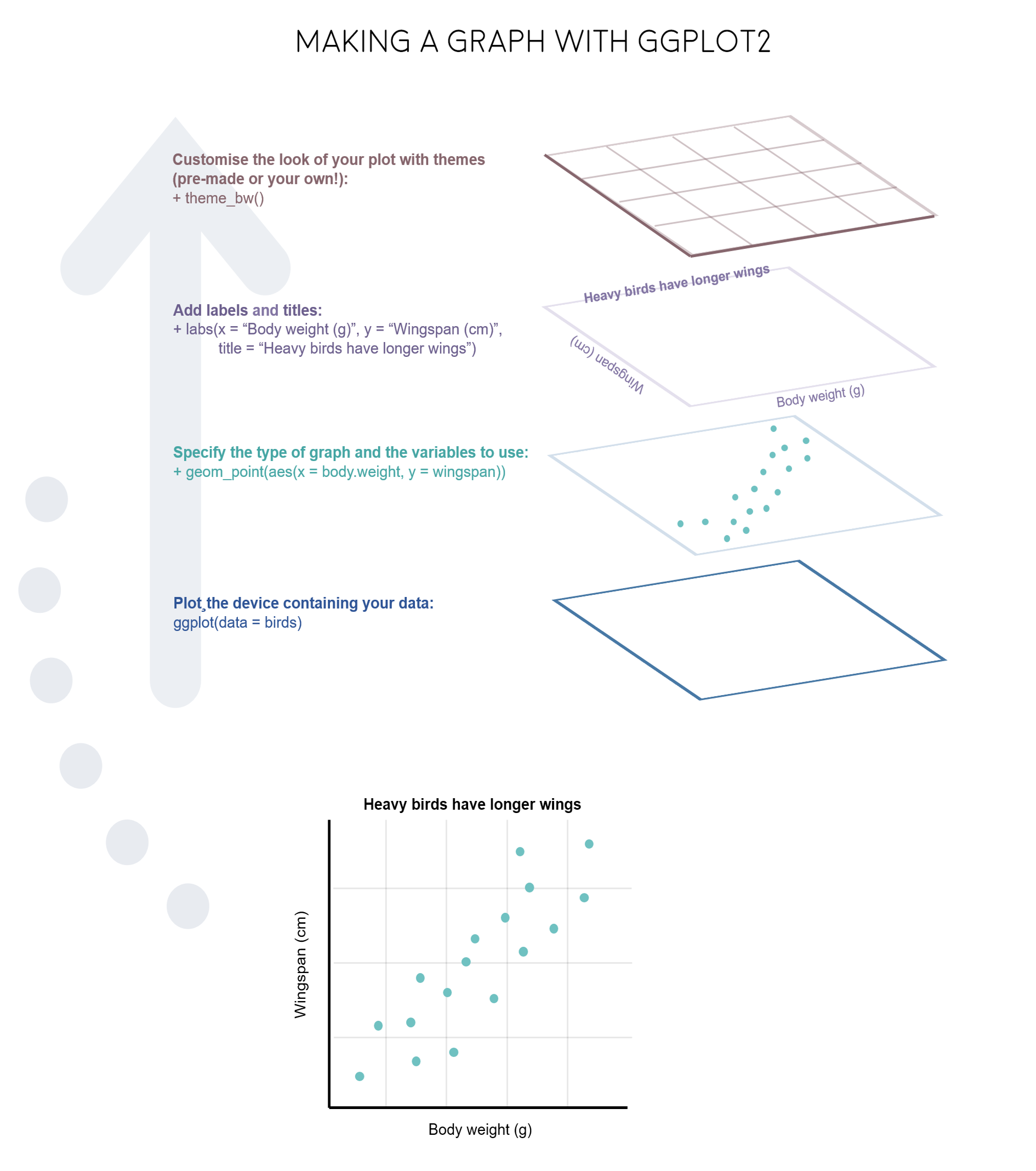
Note: Pressing enter after each “layer” of your plot (i.e. indenting it) prevents the code from being one gigantic line and makes it much easier to read.
Understanding ggplot2’s jargon
Perhaps the trickiest bit when starting out with ggplot2 is understanding what type of elements are responsible for the contents (data) versus the container (general look) of your plot. Let’s de-mystify some of the common words you will encounter.
geom: a geometric object which defines the type of graph you are making. It reads your data in the aesthetics mapping to know which variables to use, and creates the graph accordingly. Some common types are geom_point(), geom_boxplot(), geom_histogram(), geom_col(), etc.
aes: short for aesthetics. Usually placed within a geom_, this is where you specify your data source and variables, AND the properties of the graph which depend on those variables. For instance, if you want all data points to be the same colour, you would define the colour = argument outside the aes() function; if you want the data points to be coloured by a factor’s levels (e.g. by site or species), you specify the colour = argument inside the aes().
stat: a stat layer applies some statistical transformation to the underlying data: for instance, stat_smooth(method = "lm") displays a linear regression line and confidence interval ribbon on top of a scatter plot (defined with geom_point()).
theme: a theme is made of a set of visual parameters that control the background, borders, grid lines, axes, text size, legend position, etc. You can use pre-defined themes, create your own, or use a theme and overwrite only the elements you don’t like. Examples of elements within themes are axis.text, panel.grid, legend.title, and so on. You define their properties with elements_...() functions: element_blank() would return something empty (ideal for removing background colour), while element_text(size = ..., face = ..., angle = ...) lets you control all kinds of text properties.
Also useful to remember is that layers are added on top of each other as you progress into the code, which means that elements written later may hide or overwrite previous elements.
Figures can change a lot the more you work on a project, and often they go on what we call a beautification journey - from a quick plot with boring or no colours to a clear and well-illustrated graph. So now that we have the data needed for the examples in this tutorial, we can start the journey.
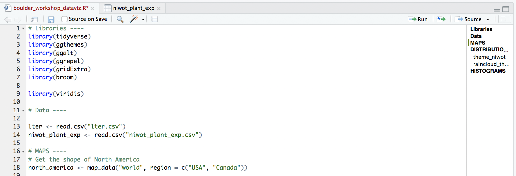
Open RStudio, select File/New File/R script and start writing your script with the help of this tutorial. You might find it easier to have the tutorial open on half of your screen and RStudio on the other half, so that you can go between the two quickly.
# Purpose of the script
# Your name, date and email

# Your working directory, set to the folder you just downloaded from Github, e.g.:
setwd("~/Downloads/CC-trends-dataviz")

# Libraries ----
# if you haven't installed them before, run the code install.packages("package_name")
library(tidyverse)
library(ggthemes)  # for a mapping theme

# if you have a more recent version of ggplot2, it seems to clash with the ggalt package
# installing this version of the ggalt package from GitHub solves it
# You might need to also restart your RStudio session
devtools::install_github("eliocamp/ggalt@new-coord-proj") # for custom map projections
library(ggalt)
library(ggrepel)  # for annotations
library(viridis)  # for nice colours
library(broom)  # for cleaning up models
library(wesanderson)  # for nice colours
library(gridExtra) # to make figure panels
library(png)
Managing long scripts: Lines of code pile up quickly! There is an outline feature in RStudio that makes long scripts more organised and easier to navigate. You can make a subsection by writing out a comment and adding four or more characters after the text, e.g. # Section 1 ----. If you’ve included all of the comments from the tutorial in your own script, you should already have some sections.
An important note about graphs made using ggplot2: you’ll notice that throughout this tutorial, the ggplot2 code is always surrounded by brackets. That way, we both make the graph, assign it to an object, e.g. duration1 and we “call” the graph, so we can see it in the plot tab. If you don’t have the brackets around the code chunk, you’ll make the graph, but you won’t actually see it. Alternatively, you can “call” the graph to the plot tab by running just the line duration1. It’s also best to assign your graphs to objects, especially if you want to save them later, otherwise they just disappear and you’ll have to run the code again to see or save the graph.
1. Format and manipulate large datasets
In the first part of this tutorial, we will focus on how to efficiently format, manipulate and visualise large datasets. We will use the tidyr and dplyr packages to clean up data frames and calculate new variables. We will use the broom and purr packages to make the modelling of thousands of population trends more efficient.
We will be working with bird population data (abundance over time) from the Living Planet Database, bird trait data from the Elton Database, and emu occurrence data from the Global Biodiversity Information Facility, all of which are publicly available datasets.
First, we will format the bird population data, calculate a few summary variables and explore which countries have the most population time-series and what is their average duration.
Here are the packages we need. Note that not all tidyverse packages load automatically with library(tidyverse) - only the core ones do, so you need to load broom separately. If you don’t have some of the packages installed, you can install them using ìnstall.packages("package-name"). One of the packages is only available on GitHub, so you can use install_github() to install it. In general, if you ever have troubles installing packages from CRAN (that’s where packages come from by default when using install.packages()), you can try googling the package name and “github” and installing it from its GitHub repo, sometimes that works!
Load population trend data
Now we’re ready to load in the rest of the data needed for this tutorial!
bird_pops_long <- read.csv("bird_pops_long.csv")
bird_traits <- read.csv("elton_birds.csv")
We can check out what the data look like, either by clicking on the objects name on the right in the list in your working environment, or by running View(bird_pops) in the console. We can tidy up the data a bit more and create a few new columns with useful information. Whenever we are working with datasets that combine multiple studies, it’s useful to know when they each started, what their duration was, etc. Here we’ve combined all of that into one “pipe” (lines of code that use the piping operator %>%). The pipes always take whatever has come out of the previous pipe (or the first object you’ve given the pipe), and at the end of all the piping, out comes a tidy data frame with useful information.
# *** piping from from dplyr
bird_pops_long <- bird_pops_long %>%
  # Remove duplicate rows
  # *** distinct() function from dplyr
  distinct() %>%
  # remove NAs in the population column
  # *** filter() function from dplyr
  filter(is.finite(pop)) %>%
  # Group rows so that each group is one population
  # *** group_by() function from dplyr
  group_by(id) %>%
  # Make some calculations
  # *** mutate() function from dplyr
  mutate(maxyear = max(year), minyear = min(year),
         # Calculate duration
         duration = maxyear - minyear,
         # Scale population trend data
         scalepop = (pop - min(pop))/(max(pop) - min(pop))) %>%
  # Keep populations with >5 years worth of data and calculate length of monitoring
  filter(is.finite(scalepop),
         length(unique(year)) > 5) %>%
  # Remove any groupings you've greated in the pipe
  ungroup()

head(bird_pops_long)
Now we can calculate some finer-scale summary statistics. Though we have the most ecological data we’ve ever had, there are still many remaining data gaps, and a lot of what we know about biodiversity is based on information coming from a small set of countries. Let’s check out which!
# Which countries have the most data
# Using "group_by()" to calculate a "tally"
# for the number of records per country
country_sum <- bird_pops_long %>% group_by(country.list) %>%
  tally() %>%
  arrange(desc(n))

country_sum[1:15,] # the top 15
As we probably all expected, a lot of the data come from Western European and North American countries. Sometimes as we navigate our research questions, we go back and forth between combining (adding in more data) and extracting (filtering to include only what we’re interested in), so to mimic that, this tutorial will similarly take you on a combining and extracting journey, this time through Australia.
To get just the Australian data, we can use the filter() function. To be on the safe side, we can also combine it with str_detect(). The difference is that filter on its own will extract any rows with “Australia”, but it will miss rows that have e.g. “Australia / New Zealand” - occasions when the population study included multiple countries. In this case though, both ways of filtering return the same number of rows, but always good to check.
# Data extraction ----
aus_pops <- bird_pops_long %>%
  filter(country.list == "Australia")

# Giving the object a new name so that you can compare
# and see that in this case they are the same
aus_pops2 <- bird_pops_long %>%
  filter(str_detect(country.list, pattern = "Australia"))
We are now ready to model how each population has changed over time. There are 4331 populations, so with this one code chunk, we will run 4331 models and tidy up their outputs. You can read through the line-by-line comments to get a feel for what each line of code is doing.
One specific thing to note is that when you add the lm() function in a pipe, you have to add data = ., which means use the outcome of the previous step in the pipe for the model.
# Calculate population change for each forest population
# 4331 models in one go!
# Using a pipe
aus_models <- aus_pops %>%
  # Group by the key variables that we want to iterate over
  # note that if we only include e.g. id (the population id), then we only get the
  # id column in the model summary, not e.g. duration, latitude, class...
  group_by(decimal.latitude, decimal.longitude, class,
           species.name, id, duration, minyear, maxyear,
           system, common.name) %>%
  # Create a linear model for each group
  # Extract model coefficients using tidy() from the
  # *** tidy() function from the broom package ***
  do(broom::tidy(lm(scalepop ~ year, .))) %>%
  # Filter out slopes and remove intercept values
  filter(term == "year") %>%
  # Get rid of the column term as we don't need it any more
  #  *** select() function from dplyr in the tidyverse ***
  dplyr::select(-term) %>%
  # Remove any groupings you've greated in the pipe
  ungroup()

head(aus_models)
# Check out the model data frame
Synthesise information from different databases
Answering research questions often requires combining data from different sources. For example, we’ve explored how bird abundance has changed over time across the monitored populations in Australia, but we don’t know whether certain groups of species might be more likely to increase or decrease. To find out, we can integrate the population trend data with information on species traits, in this case species’ diet preferences.
The various joining functions from the dplyr package are really useful for combining data. We will use left_join in this tutorial, but you can find out about all the other options by running ?join() and reading the help file. To join two datasets in a meaningful way, you usually need to have one common column in both data frames and then you join “by” that column.
# Data synthesis - traits! ----

# Tidying up the trait data
# similar to how we did it for the population data
colnames(bird_traits)
bird_traits <- bird_traits %>% dplyr::rename(species.name = Scientific)
# rename is a useful way to change column names
# it goes new name =  old name
# the rename() function sometimes clashes with functions from other packages
# that have the same name, so specifying dplyr::rename helps avoid errors
colnames(bird_traits)

# Select just the species and their diet
bird_diet <- bird_traits %>% dplyr::select(species.name, `Diet.5Cat`) %>%
  distinct() %>% dplyr::rename(diet = `Diet.5Cat`)

# Combine the two datasets
# The second data frame will be added to the first one
# based on the species column
bird_models_traits <- left_join(aus_models, bird_diet, by = "species.name") %>%
  drop_na()
head(bird_models_traits)

# Turn the diet column into a factor
bird_models_traits$diet <- as.factor(bird_models_traits$diet)
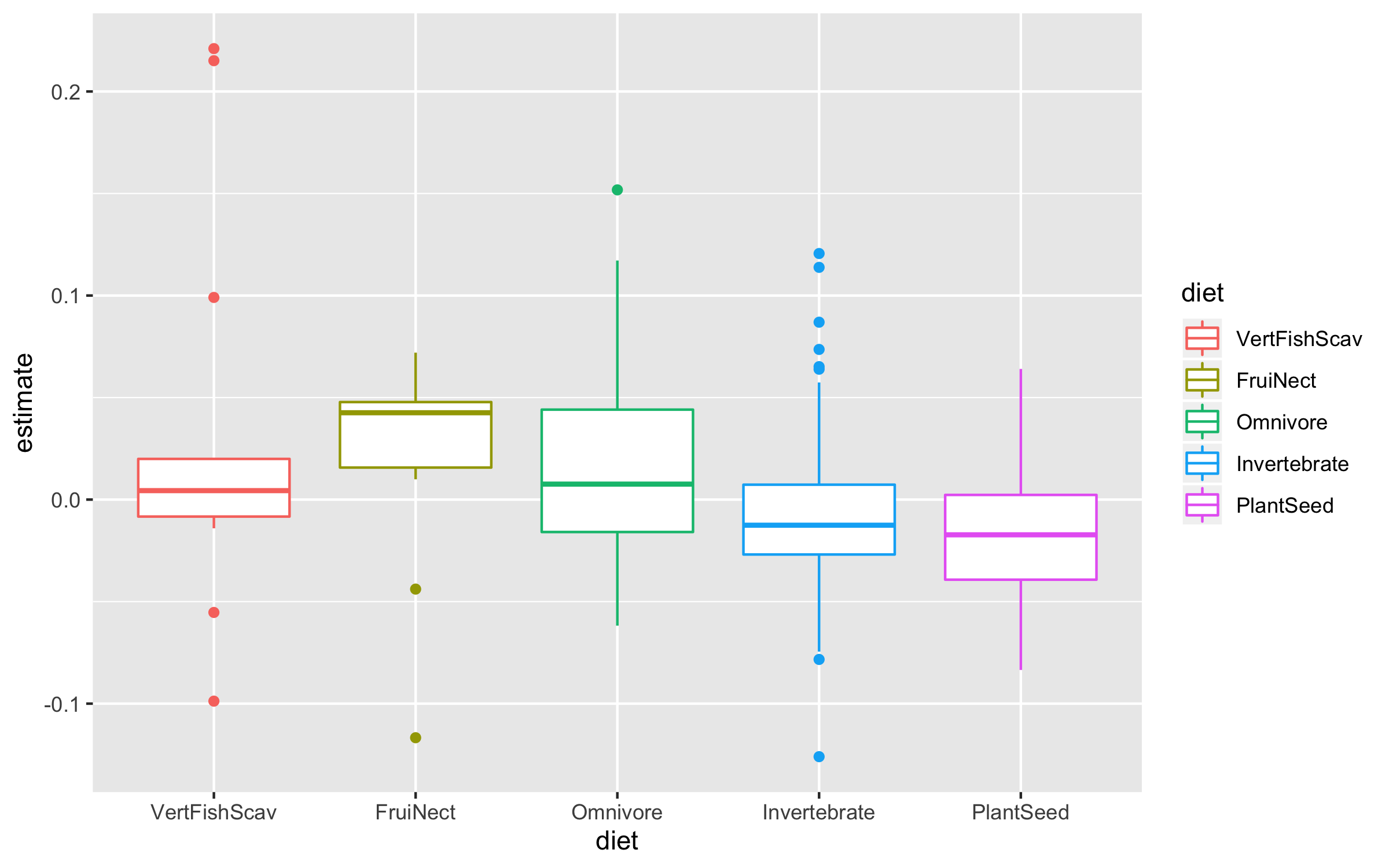
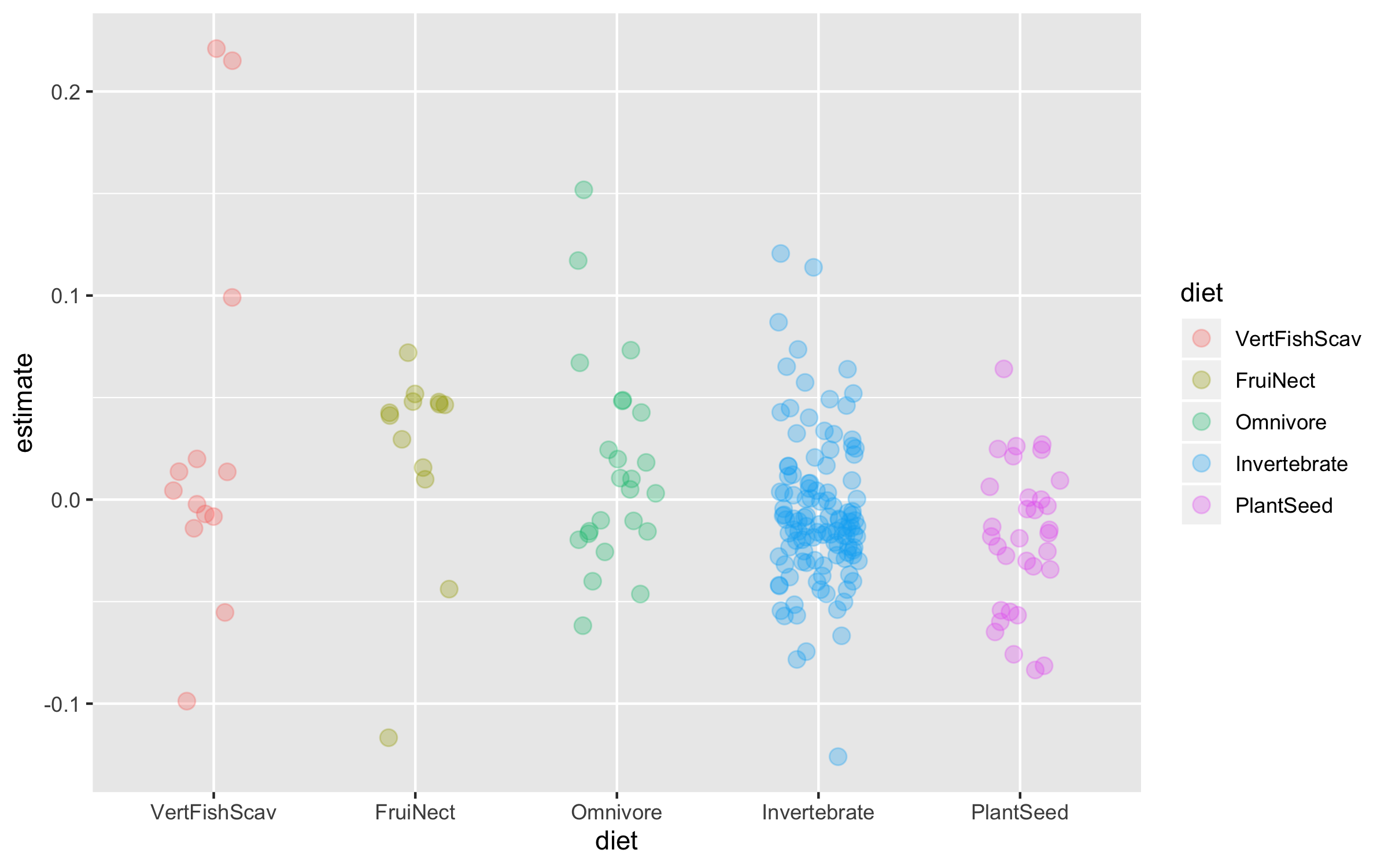
Now we can explore how bird population trends vary across different feeding strategies. The graphs below are all different ways to answer the same question. Have a ponder about which graph you like the most.
(trends_diet <- ggplot(bird_models_traits, aes(x = diet, y = estimate,
                                               colour = diet)) +
    geom_boxplot())

(trends_diet <- ggplot(data = bird_models_traits, aes(x = diet, y = estimate,
                                                      colour = diet)) +
    geom_jitter(size = 3, alpha = 0.3, width = 0.2))
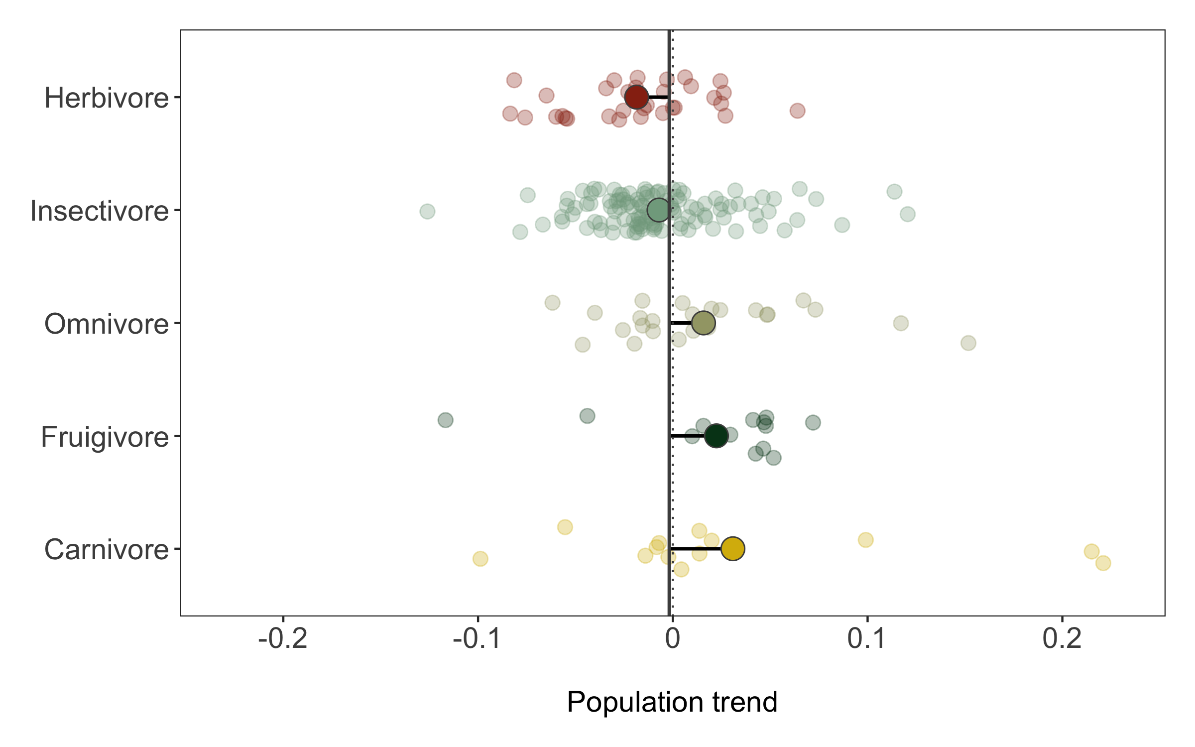
To make the graph more informative, we can add a line for the overall mean population trend, and then we can easily compare how the diet-specific trends compare to the overall mean trend. We can also plot the mean trend per diet category and we can sort the graph so that it goes from declines to increases.
# Calculating mean trends per diet categories
diet_means <- bird_models_traits %>% group_by(diet) %>%
  summarise(mean_trend = mean(estimate)) %>%
  arrange(mean_trend)

# Sorting the whole data frame by the mean trends
bird_models_traits <- bird_models_traits %>%
  group_by(diet) %>%
  mutate(mean_trend = mean(estimate)) %>%
  ungroup() %>%
  mutate(diet = fct_reorder(diet, -mean_trend))
Finally, we can also use geom_segment to connect the points for the mean trends to the line for the overall mean, so we can judge how far off each category is from the mean.
(trends_diet <- ggplot() +
  geom_jitter(data = bird_models_traits, aes(x = diet, y = estimate,
                                                 colour = diet),
              size = 3, alpha = 0.3, width = 0.2) +
  geom_segment(data = diet_means,aes(x = diet, xend = diet,
                   y = mean(bird_models_traits$estimate),
                   yend = mean_trend),
               size = 0.8) +
  geom_point(data = diet_means, aes(x = diet, y = mean_trend,
                                    fill = diet), size = 5,
             colour = "grey30", shape = 21) +
  geom_hline(yintercept = mean(bird_models_traits$estimate),
             size = 0.8, colour = "grey30") +
  geom_hline(yintercept = 0, linetype = "dotted", colour = "grey30") +
  coord_flip() +
  theme_clean() +
  scale_colour_manual(values = wes_palette("Cavalcanti1")) +
  scale_fill_manual(values = wes_palette("Cavalcanti1")) +
  scale_y_continuous(limits = c(-0.23, 0.23),
                     breaks = c(-0.2, -0.1, 0, 0.1, 0.2),
                     labels = c("-0.2", "-0.1", "0", "0.1", "0.2")) +
  scale_x_discrete(labels = c("Carnivore", "Fruigivore", "Omnivore", "Insectivore", "Herbivore")) +
  labs(x = NULL, y = "\nPopulation trend") +
  guides(colour = FALSE, fill = FALSE))
We can save the graph using ggsave.
ggsave(trends_diet, filename = "trends_diet.png",
       height = 5, width = 8)
2. Tell a story with your data
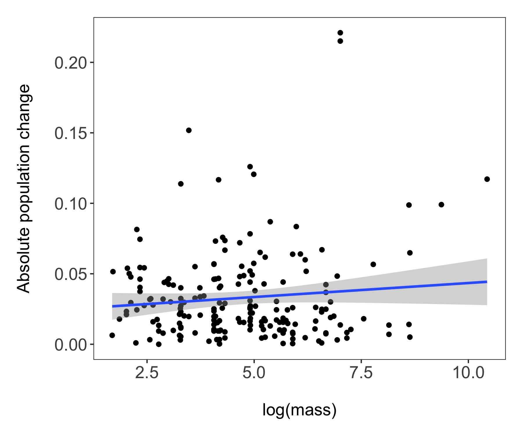
For our second figure using our combined dataset of population trends and species’ traits, we will make a figure classic - the scatterplot. Body mass can sometimes be a good predictor of how population trends and extinction risk vary, so let’s find out if that’s true for the temporal changes in abundance across monitored populations of Australian birds.
# Combining the datasets
mass <- bird_traits %>% dplyr::select(species.name, BodyMass.Value) %>%
  rename(mass = BodyMass.Value)
bird_models_mass <- left_join(aus_models, mass, by = "species.name") %>%
  drop_na(mass)
head(bird_models_mass)
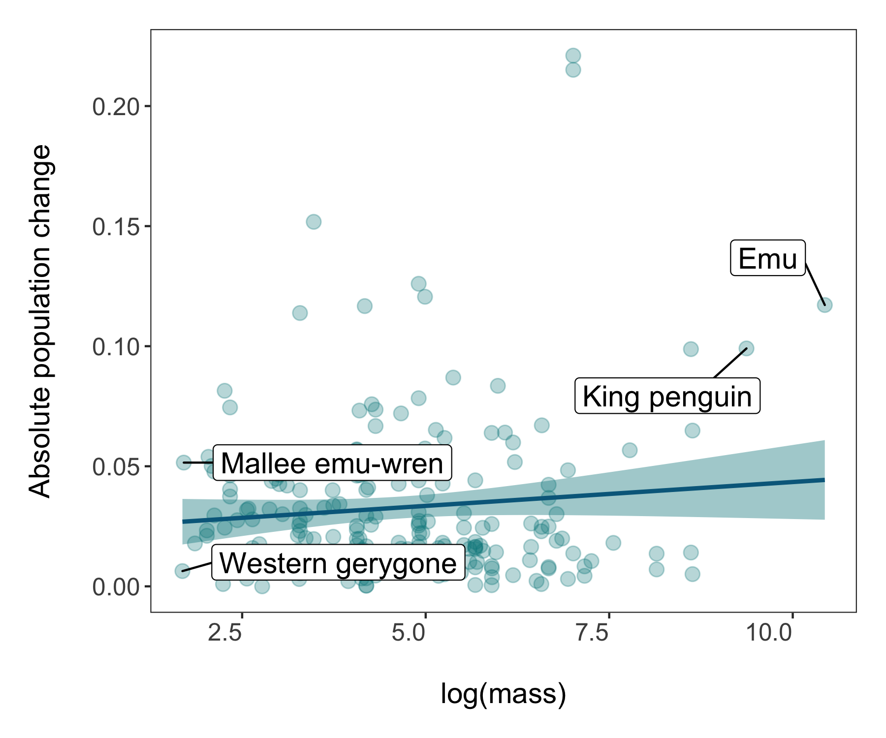
Now we’re ready to unwrap the data present (or if you’ve scrolled down, I guess it’s already unwrapped…). Whenever we are working with many data points, it can also be useful to “put a face (or a species) to the points”. For example, we can label some of the species at the extreme ends of the body mass spectrum.
(trends_mass <- ggplot(bird_models_mass, aes(x = log(mass), y = abs(estimate))) +
    geom_point() +
    geom_smooth(method = "lm") +
    theme_clean() +
    labs(x = "\nlog(mass)", y = "Absolute population change\n"))

# A more beautiful and clear version
(trends_mass <- ggplot(bird_models_mass, aes(x = log(mass), y = abs(estimate))) +
  geom_point(colour = "turquoise4", size = 3, alpha = 0.3) +
  geom_smooth(method = "lm", colour = "deepskyblue4", fill = "turquoise4") +
  geom_label_repel(data = subset(bird_models_mass, log(mass) > 9),
                   aes(x = log(mass), y = abs(estimate),
                                                           label = common.name),
                   box.padding = 1, size = 5, nudge_x = 1,
                   # We are specifying the size of the labels and nudging the points so that they
                   # don't hide data points, along the x axis we are nudging by one
                   min.segment.length = 0, inherit.aes = FALSE) +
  geom_label_repel(data = subset(bird_models_mass, log(mass) < 1.8),
                   aes(x = log(mass), y = abs(estimate),
                       label = common.name),
                   box.padding = 1, size = 5, nudge_x = 1,
                   min.segment.length = 0, inherit.aes = FALSE) +
  theme_clean() +
  labs(x = "\nlog(mass)", y = "Absolute population change\n"))

ggsave(trends_mass, filename = "trends_mass.png",
       height = 5, width = 6)
The world of coding and packages is pretty dynamic and things change - like how since I originally made the graphs above, the theme_clean() function changed and now makes a slightly different type of graph. Perhaps you notice horizontal lines going across the plot. Sometimes they can be useful, other times less so as they can distract people and make the graph look less clean (ironic given the theme name). So for our next step, we will make our own theme.
# Make a new theme
theme_coding <- function(){            # creating a new theme function
  theme_bw()+                          # using a predefined theme as a base
    theme(axis.text.x = element_text(size = 12, vjust = 1, hjust = 1),       # customising lots of things
          axis.text.y = element_text(size = 12),
          axis.title = element_text(size = 14),
          panel.grid = element_blank(),
          plot.margin = unit(c(0.5, 0.5, 0.5, 0.5), units = , "cm"),
          plot.title = element_text(size = 12, vjust = 1, hjust = 0.5),
          legend.text = element_text(size = 12, face = "italic"),
          legend.title = element_blank(),
          legend.position = c(0.9, 0.9))
}
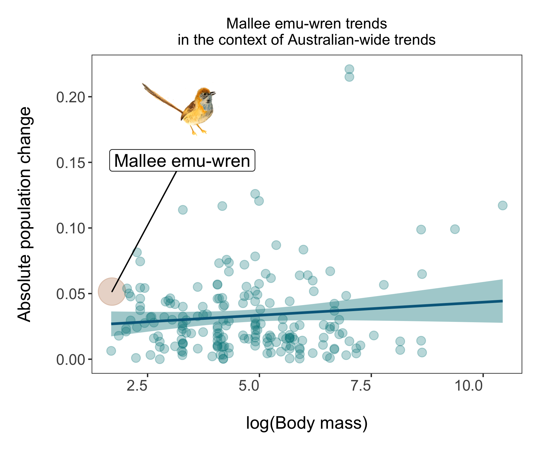
A data storytelling tip: Find something to highlight, is there a story amidst all the points?
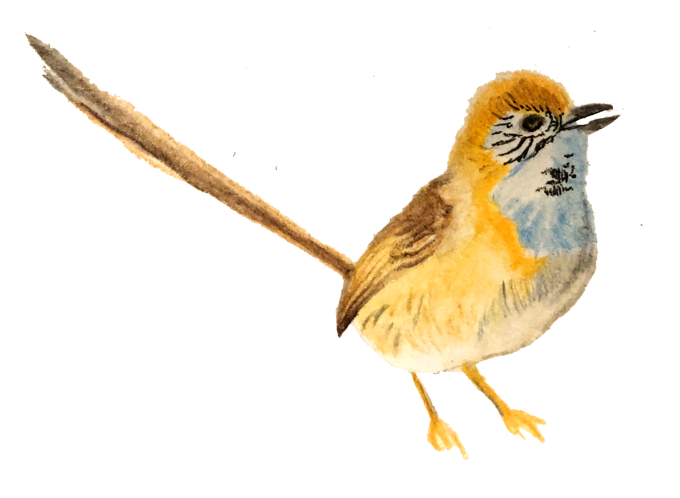
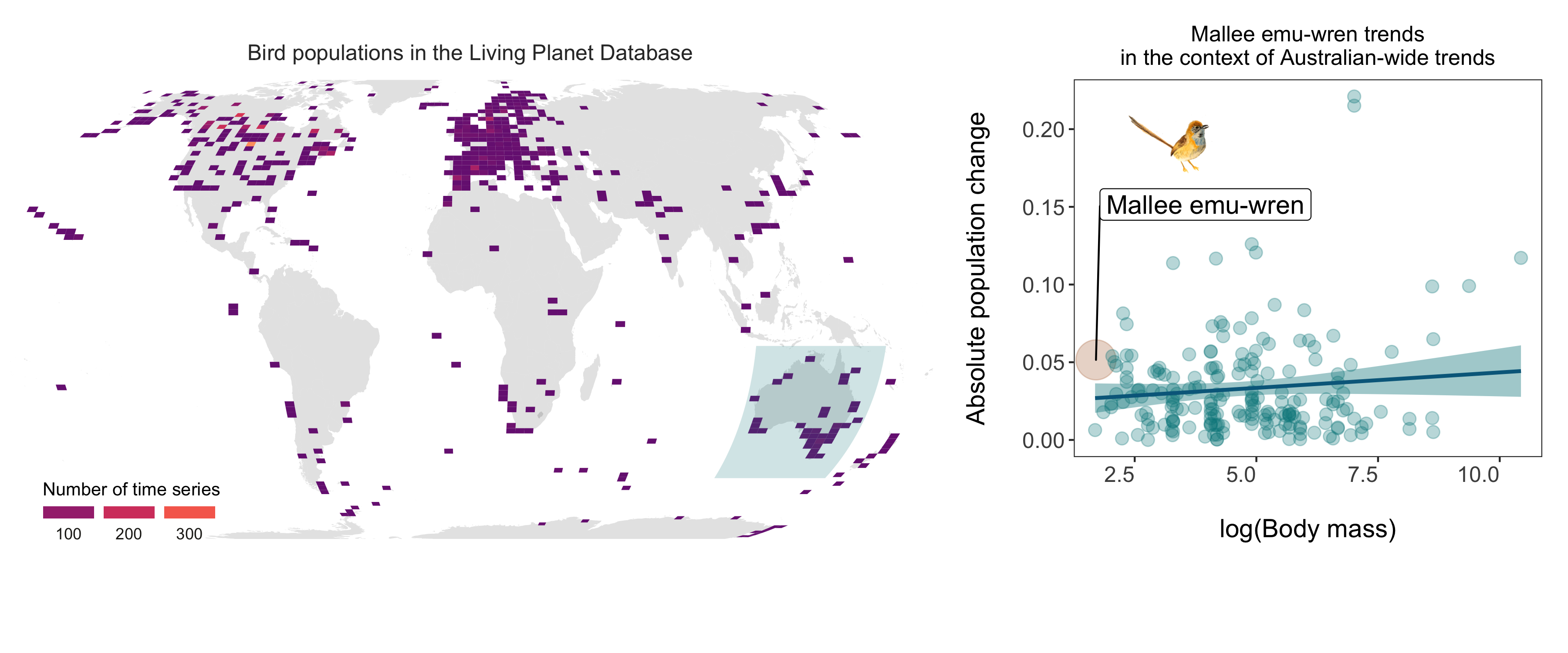
While having lots of data is often impressive, it can also make it hard to actually figure out what the key message of the graph is. In this tutorial we are exploring how bird populations are changing over time. Might be cool to highlight a particular species, like this mallee emu-wren, a small bird that hasn’t experienced particularly dramatic population changes. But in a time of global change, telling apart relatively stable populations is also important!
We could make the mallee emu-wren point bigger and a different colour, for which we essentially need a column that says whether or not a given record is for the mallee emu-wren.
A data manipulation tip: Using case_when(), combined with mutate, is a great way to create new variables based on one or more conditions from other variables.
# Create new columns based on a combo of conditions using case_when()
bird_models_mass <- bird_models_mass %>%
  mutate(wren_or_not = case_when(common.name == "Mallee emu-wren" ~ "Yes",
                                 common.name != "Mallee emu-wren" ~ "No"))
Now we are ready for an even snazzier graph! One thing you might notice is different is that before we added our data frame right at the start in the first line inside the ggplot(), whereas now we are adding the data inside each specific element - geom_point, geom_smooth, etc. This way ggplot gets less confused about what elements of the code apply to which parts of the graph - a useful thing to do when making more complex graphs.
We can also add our mallee emu-wren illustration to the plot!
# Load packages for adding images
packs <- c("png","grid")
lapply(packs, require, character.only = TRUE)

# Load beluga icon
icon <- readPNG("wren.png")
icon <- rasterGrob(icon, interpolate=TRUE)
And onto the figure!
(trends_mass_wren <- ggplot() +
    geom_point(data = bird_models_mass, aes(x = log(mass), y = abs(estimate),
                                     colour = wren_or_not,
                                     size = wren_or_not),
               alpha = 0.3) +
    geom_smooth(data = bird_models_mass, aes(x = log(mass), y = abs(estimate)),
                                             method = "lm", colour = "deepskyblue4", fill = "turquoise4") +
    geom_label_repel(data = subset(bird_models_mass, common.name == "Mallee emu-wren"),
                     aes(x = log(mass), y = abs(estimate),
                         label = common.name),
                     box.padding = 1, size = 5, nudge_x = 1, nudge_y = 0.1,
                     # We are specifying the size of the labels and nudging the points so that they
                     # don't hide data points, along the x axis we are nudging by one
                     min.segment.length = 0, inherit.aes = FALSE) +
    annotation_custom(icon, xmin = 2.3, xmax = 4.2, ymin = 0.16, ymax = 0.22) +
    # Adding the icon
    scale_colour_manual(values = c("turquoise4", "#b7784d")) +
    # Adding custom colours
    scale_size_manual(values= c(3, 10)) +
    # Adding a custom scale for the size of the points
    theme_coding() +
    # Adding our new theme
    guides(size = F, colour = F) +
    # An easy way to hide the legends which are not very useful here
    ggtitle("Mallee emu-wren trends\nin the context of Australian-wide trends") +
    # Adding a title
    labs(x = "\nlog(Body mass)", y = "Absolute population change\n"))
You can save it using ggsave() - you could use either png or pdf depending on your needs - png files are raster files and if you keep zooming, they will become blurry and are not great for publications or printed items. pdf files are vectorised so you can keep zooming to your delight and they look better in print but are larger files, not as easy to embed online or in presentations. So think of where your story is going and that can help you decide of the file format.
ggsave(trends_mass_wren, filename = "trends_mass_wren.png",
       height = 5, width = 6)
3. Put your story in perspective
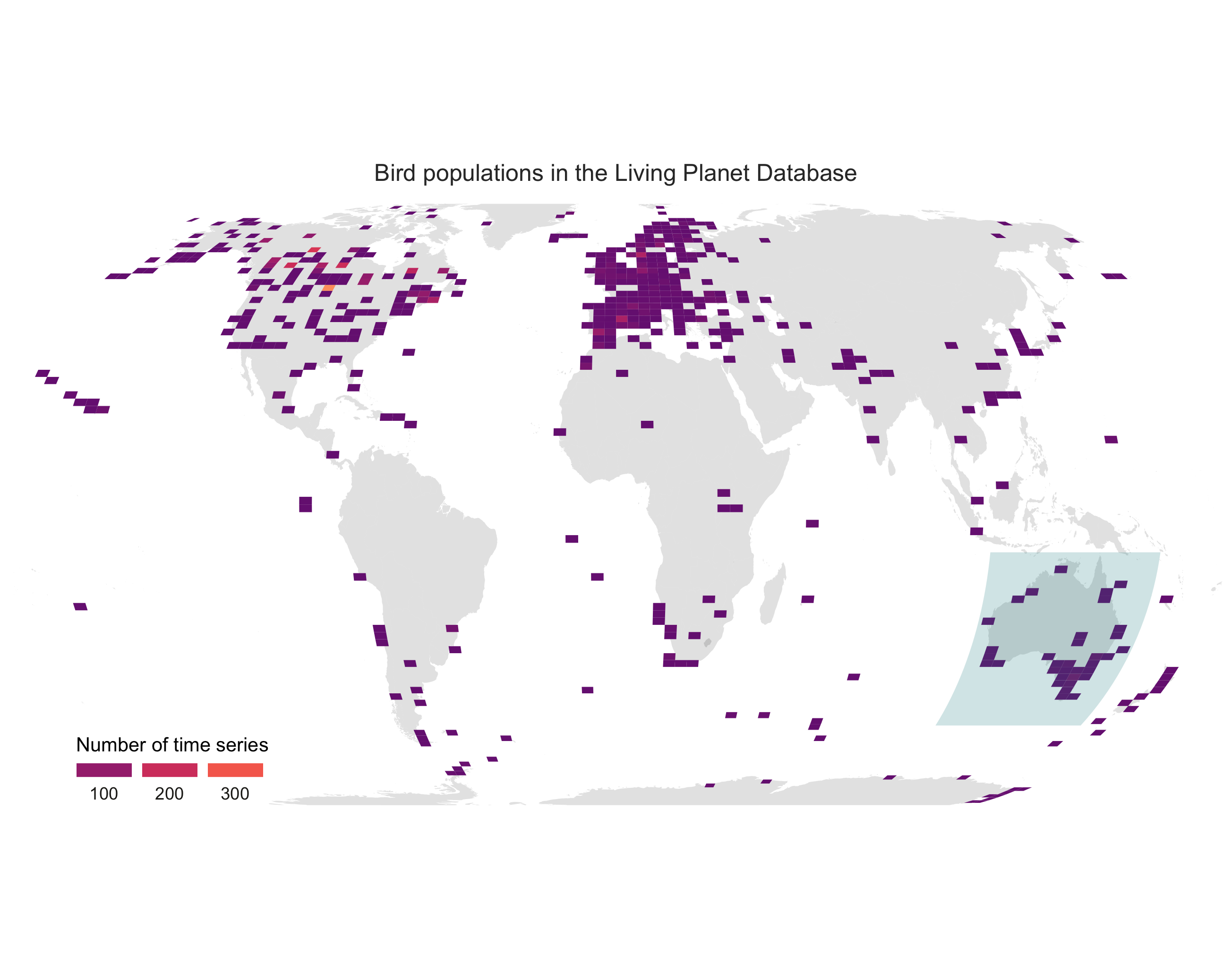
We have highlighted the mallee emu-wren - a great thing to do if we are say a scientist working on this species, or a conservation organisation focusing on its protection, or we just really like this cute little Australian bird. When trying to tell a story with data though, it’s always nice to put things in perspective and maps are a very handy way of doing that. We could tell the story of bird monitoring around the world, highlight a region of interest (Australia) and then give the story an anchor - the mallee emu-wren!
First, we will create the map - here is how to make an object with the world in it.
world <- map_data("world")
Next up, we can extract the coordinates of the different bird populations monitored around the world.
bird_coords <- bird_pops_long %>%
  dplyr::select(3:27) %>%
  distinct()
And now we are ready for our map! One way to learn what each line does is to have a go at commenting it out using a # and then spotting what changes - or you can check out the comments below each line.
(pop_map <- ggplot(bird_coords, aes(x = decimal.longitude, y = decimal.latitude)) +
    geom_polygon(data = world, aes(x = long, y = lat, group = group), fill = "grey", alpha = 0.4) +
    # Adding the world
    geom_bin2d(bins = 100) +
    # Adding density squares - they will show how many data points there are in each square
    theme_void() +
    # Adding a clean theme
    coord_proj("+proj=eck4") +
    # A custom projection
    ylim(-80, 80) +
    # Setting some limits to the graphs coordinates
    scale_fill_viridis(option = "magma",
                       direction = -1,
                       end = 0.35, begin = 0.8,
                       name = "Number of time series",
                       #breaks = c(50, 150, 250),
                       guide = guide_legend(keyheight = unit(2.5, units = "mm"),
                                            keywidth = unit(10, units = "mm"),
                                            label.position = "bottom",
                                            title.position = 'top', nrow = 1))  +
    # Adding a nice colour theme plus a custom legend
    ggtitle("Bird populations in the Living Planet Database") +
    annotate("rect", xmin = 110, xmax = 160, ymin = -10,
             ymax = -50, alpha = 0.2, fill = "turquoise4") +
    # Adding a semi-transparent polygon to highlight Australia
    theme(legend.position = c(0.14, 0.07),
          legend.title=element_text(color = "black", size = 10),
          text = element_text(color = "#22211d"),
          plot.title = element_text(size = 12, hjust = 0.5,
                                    color = "grey20",
                                    margin = margin(b = 0.2,
                                                    t = 0.4, l = 2,
                                                    unit = "cm"))))

ggsave(pop_map, filename = "bird_map.png")
Here is our map!
Finally, lets put our story together by making a panel! The widths and heights arguments help get the proportions right.
bird_panel <- grid.arrange(pop_map, trends_mass_wren, ncol = 2,
                           widths = c(0.6, 0.4),
                           heights = c(1, 0.15))

ggsave(bird_panel, filename = "bird_map_panel.png",
       height = 5, width = 12)
Congrats on taking three different types of figures on beautification journeys and all the best with the rest of your data syntheses!
If you’d like more inspiration and tips, check out the materials below!
Extra resources
Check out our new free online course “Data Science for Ecologists and Environmental Scientists”!
You can also check out the package patchwork for making multi-figure panels from ggplot2 figures here.
To learn more about the power of pipes check out: the tidyverse website and the R for Data Science book.
To learn more about the tidyverse in general, check out Charlotte Wickham’s slides here.
Stay up to date and learn about our newest resources by following us on Twitter!
Contact us with any questions on ourcodingclub@gmail.com
Related tutorials:
- Efficient and beautiful data visualisation
- Efficient and beautiful data visualisation
- Efficient and beautiful data visualisation
- Efficient and beautiful data synthesis
- Efficient and beautiful data synthesis
- Efficient and beautiful data synthesis