Bayesian modelling using the brms package
From research question to final report, unleashing the full potential of brms
Have you ever thought frequentist statistics were confusing? Have you ever felt like your mind was getting lost between p-values, random 0.05 thresholds, and confidence intervals that had little to do with confidence? But do you still need to use statistics for your degree and are looking for more straightforward methods? Then you are in the right place! These are questions and topics that I have also struggled with, and I found Bayesian models to be easier to deal with. Hopefully, you will too after completing this tutorial.
The following tutorial is an introduction to Bayesian modelling but it assumes a prior understanding of modelling and data distribution. If you are just getting started with R coding, you should check out this introduction tutorial from the Coding Club. To make sure everything is clear in your mind, you can also check out these tutorials as well beforehand.
- Meta-analysis for biologists using MCMCglmm (an introduction to the MCMCglmm package) available here
- Generalised linear models in Stan (using the Rstanarm and brms packages to run Stan models) available here
This tutorial should teach you how to create, assess, present and troubleshoot a brm model.
All the files you need to complete this tutorial can be downloaded from this repository. Click on Code/Download ZIP and unzip the folder, or clone the repository to your own GitHub account.

Tutorial Structure:
- All you need to know about Bayesian stats
- Building a simple model
- Extracting results and assessing the model
- Building up the complexity
- Presenting your results
- Potential issues and how to solve them
All you need to know about Bayesian stats
Lets start with a little theoretical explanation of Bayesian statistics. This method was invented by Reverend Bayes in the 1770s and published after his death. The Bayes theorem was revolutionary in that it introduced the possibility to calculate conditional probabilities, basically the probability of an event happening while knowing that another event already happened. Say you are taking part in a raffle where they pick out numbers between 0 and 100. Let’s say you want to know the probability of getting a number below 50. Now, we could calculate that probability, but I don’t want to confuse you with math formulas (and it’s not necessary to understand this concept). But we would get a certain probability of this event happening (the event being picking out a number between 0 and 49). So, now imagine that same situation, but you also get the info that all numbers in the box are bigger than 80. And now your understanding has changed because you acquired prior information, and you can say that there is absolutely no chance of getting a number between 0 and 49. So this is the main idea behind Baye’s theorem: prior knowledge will influence the probability of an event taking place.
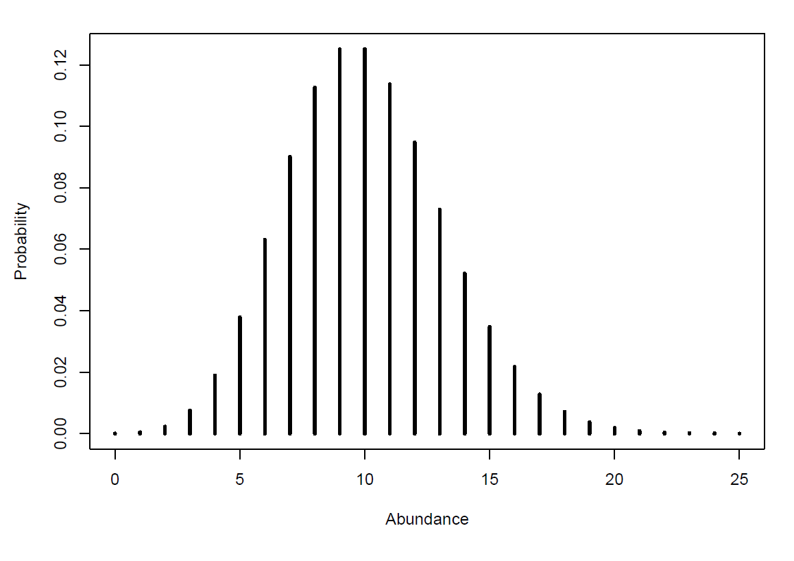
But when we look at Bayesian models, things take place on a bigger scale. The prior information in your model is going to be a distribution of probabilities rather than just one probability. This is because the event turned into multiple events. To make this a little more concrete, we can take an example: if you are looking at the abundance of a species, the “event”” will be that you find a specific value of abundance for that species on a specific day, so the probability of getting an abundance of 50 for example. And if you measure abundance every month for 5 years, you get 60 values of abundance for this species, which will represent 60 “events”. So if we plot all those measures of abundance, and the number of times you got those measures, we get a distribution of the probability of getting those measures, which could look like this:
Now this example brought us back to our first situation, where we know nothing about the system (the species and their abundance), apart from what our data tells us. But what if our data is skewed, what if we measured the wrong thing, what if we made mistakes? Just like with the raffle, prior understanding of the system can help us make a more informed guess, and hopefully overcome those weaknesses.
The main idea behind prior distributions, is that the data you have collected, the abundance of our species around the world, is biased by your sampling methods or any other issue you might have encountered. Maybe, you weren’t able to sample younger individuals, or you sampled a proxy for abundance instead of actual counts. Therefore, the data that you have can be considered incomplete compared to the reality. However, if somebody before you sampled this species in a different way, and found that the population has a specific distribution (for example a large birth rate but very few individuals that reach adulthood) you can add this information into your model, and fill the gap in your data. The model is going to take your data, take this additional information (called prior distribution), and create a new spread of data that should reflect the distribution of your species’ population in the real world (called posterior distribution).
So if we look at this in a graph, it would look like this:
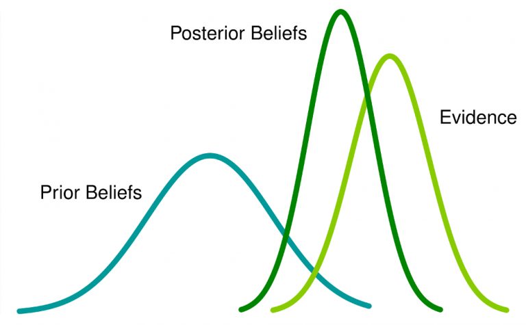
The light green line represent the data you sampled, the blue line represents the prior distribution, and the dark green line represents the posterior distribution that your model created. If you are very keen, you can check out the math behind the theory explained here but it is not necessary to understand and carry out this tutorial.
The important bit, is that the model is going to create a posterior distribution for your whole abundance data, and then a specific distribution of all the possible values for each of your variables (time and abundance and any other one you want to look at). These posterior distributions all have a mean and a standard error. And the mean value of the distribution of your explanatory variable (time in our example) can be used to represent the slope of the effect of time on you response variable (abundance in our example).
So, compared to other statistical methods (like a linear model for example), where the model finds the best fit line between two variables using only your data, the Bayseian model is going to find the “real” distribution of your data, and give you the most probable value of the estimate of the effect of one variable on another.
Hopefully, you understand this bit of theory, but if you don’t that’s also fine! You can come back to this later and check out the references at the end to get a different explanation as well.
Building a simple model
Let’s start our analysis!
Start by opening Rstudio and setting the working directory with the file path leading to the folder you just downloaded, and load a first package.
# Set the working directory
setwd("your_filepath")
# Load initial packages
library(tidyverse)
We can now load the data. This dataset is a subset of the LPI dataset available in its entirety here. Today, we’ll be looking at red knot counts from a study carried out in France, on the Atlantic coast and the Channel coast.
# Load the data
France <- read_csv("Data/red_knot.csv")
And we can start by checking out what our data look like .
head(France)  # to get the first observations in each column
str(France)  # what type of variables do we have
As for every modelling exercise, we first need a research question to focus on. For this tutorial, we’ll look at a simple one: Has the red knot population in France increased over time?
In other words, we will be looking at the effect of time, our explanatory variable or fixed effect, on the abundance of red knots, our response variable. These will be the parameters we include in our model.
Data distribution
Now that we know what variables to look at, another important information to include in the model is the type of distribution of the data. To find out which it is, we can plot our data as a histogram.
(hist_france <- ggplot(France, aes(x = pop)) +
    geom_histogram(colour = "#8B5A00", fill = "#CD8500") +
    theme_bw() +
    ylab("Count\n") +
    xlab("\nCalidris canutus abundance") +  # latin name for red knot
    theme(axis.text = element_text(size = 12),
          axis.title = element_text(size = 14, face = "plain")))
This histogram should look something like this:
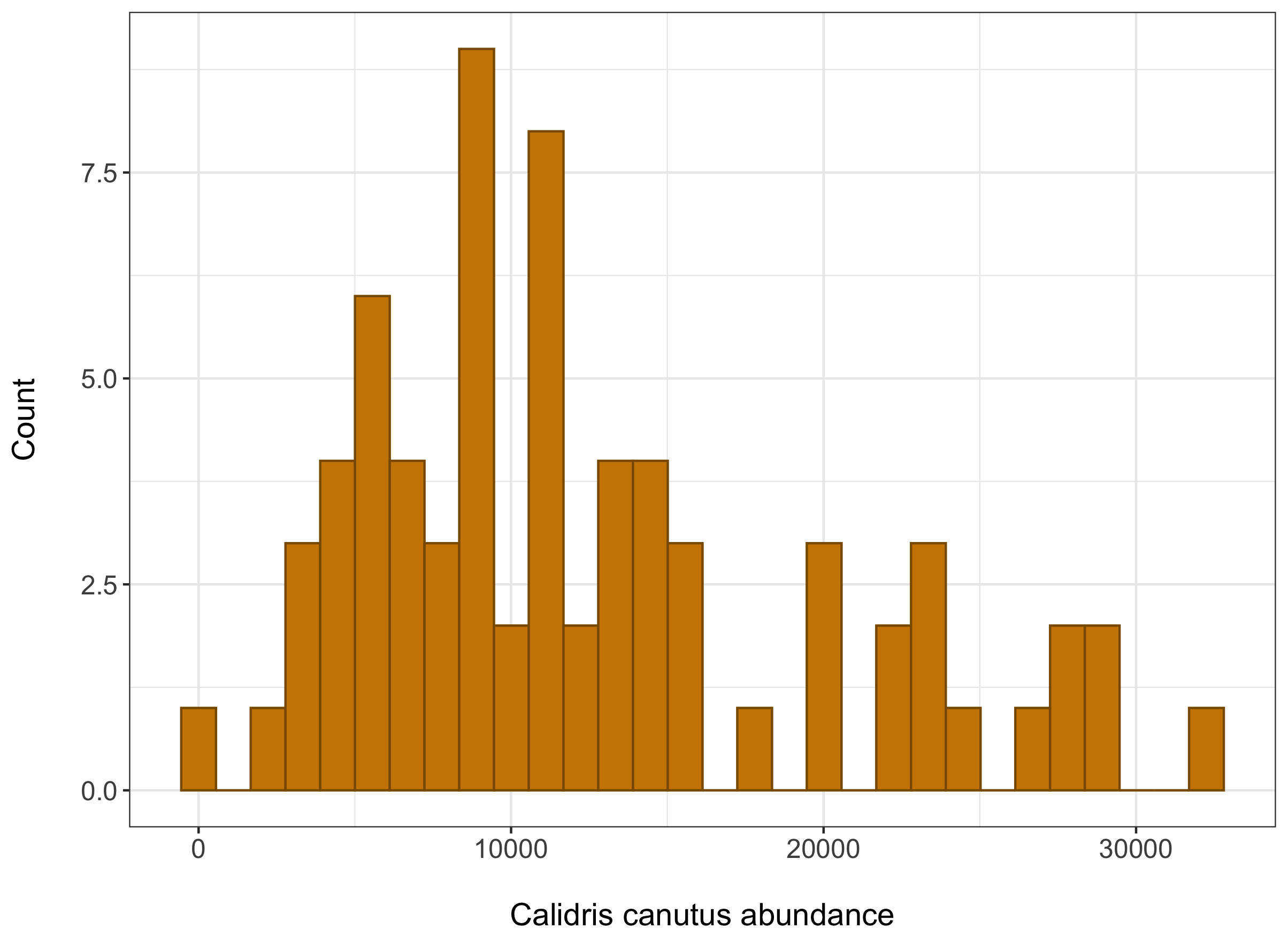
The data we have is abundance data also known as count data. This means the numbers we will include in the models are restricted in some way, they can’t be negative and they are full numbers as well. We can see that our data follows a poisson distribution, and this is one of the things we’ll have to tell our model.
Now looking at our variables,
unique(France$year)
We can see here that our data starts in 1976, and ends in 2010. This is something we will have to include in the model as well. If we just include year, the model will start at 1976, but really we want the model to read this as Year 1. See the next part for the exact syntax to avoid this.
First model
To answer our research question, we will create a Bayesian model, using the brms package. If you don’t have this package already installed, uncomment the first line.
# install.packages("brms")
library(brms)
We can now write our model. The brms package sometimes gets hidden by the stats package, so it’s always better to include brms::brm to call the modelling function.
The first argument in the brackets is the response variable (red knot abundance or pop for us) and the variables placed after the ~ sign are the fixed and random effects, our explanatory variables (time or year for us).
As explained earlier, we want to change the year variable to start at one. We can do that in the model by using: I(year - 1975) . “I” specifying integer, and “year-1975” to make the year variable start at 1.
NB: Another way to do this is to make a new column with year the way you want it to be read in the model, instead of specifying it during the model.
France <- France %>%
  mutate(year_2 = I(year - 1975))
The family argument corresponds to the distribution of our data, and as we saw earlier, that should be poisson. You can look at the brmsfamily R Documentation page to find the other family options and their characteristics.
N.B: Setting the family argument to poisson log-transforms our data (just something to keep in mind for later).
The iter argument defines how many times you want the model to run. The Bayesian model runs many times by picking random values and assessing how the distribution changes and fits the data, before deciding on a perfect fit of the posterior distribution (which should end up bring a mix your data and the prior distribution). The higher the number of iterations, the longer it will take for the model to run.
The warmup argument refers to the number of first iterations that the model should disregard (or chuck out) before creating the posterior distribution. This is done to make sure that the first random number that the model choses doesn’t influence the final convergence of the model.
The chains argument defines the number of independent times the model will run the iterations. Again, this is done to insure thorough exploration of all the possible values for our posterior distribution.
Additionally, you should note that we haven’t added a prior distribution in this model. This doesn’t mean that the model doesn’t use any. The brm function has a default prior that is very uninformative (pretty much flat so it won’t change you data a lot). This is useful if you don’t have any prior information to give to the model, and this means that your posterior distribution will be very close to the distribution of your data. We will be using this default prior for now to understand how the model works.
france1_mbrms <- brms::brm(pop ~ I(year - 1975),
                         data = France, family = poisson(), chains = 3,
                         iter = 3000, warmup = 1000)

# saveRDS(france1_mbrms, "france1_mbrms.RDS")
# you can save the model as an RDS (Rdata) that way you don't need to run the model again if you come back to this code
BE AWARE, a brms model always takes a while to run, and these two messages will often appear before it starts sampling, “Compiling Stan program…recompiling to avoid crashing R session”, but everything is still okay!
Extracting results and assessing your model
Summary of the model
By running this line of code, we can extract the summary of the model, just like you would get the results of an ANOVA for example.
summary(france1_mbrms)
# fixef(france1_mbrms) # to get more detailed values for estimates
# coef(model_name) # if you have group-level effects (hierarchical data)
The Console should look something like this. Now this may seem a little confusing for now, but just wait, you should be able to understand all of it in a bit.
Important note: Because of the stochastic nature of Bayesian statistics, every time you (re)run a model, your output will be slightly different, so even if you use the same effects in your model, it would always be slightly different to whatever was printed here. TLDR; Do not worry if your results do not exactly match the below image!
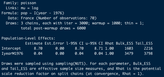
The top of the summary output is simply a recap of the model we ran (you can look at it if you don’t remember which model this was, but we are going to skip this).
The interesting part is what is written under Population-Level Effects.
The model gives us an Estimate aka the mean of our posterior distribution for each variable. As explained earlier, these estimates can be used as the intercept and slope for the relationship between our two variables. Est.Error is the error associated with those means (the standard error).
The other important part of that summary is the 95% Credibility Interval (CI), which tells us the interval in which 95% of the values of our posterior distribution fall.
The thing to look for is the interval between the values of l-95% CI and u-95% CI. If this interval is strictly positive or negative, we can assume that the effect is significant (and positive or negative respectively).
However, if the interval encompasses 0, then we can’t be sure that the effect isn’t 0, aka non-significant. In addition, the narrower the interval, the more precise the estimate of the effect.
In our case, the slope 95% CI does not encompass 0 and it is strictly positive, so we can say that time has a significantly positive effect on red knot abundance.
Assessing model fit
Now that we have our results, we should assess how our model converged and if it fits the data well.
If we just look at our summary from earlier, we already get a bit of information about this.
The Bulk_ESS a,d Tail_ESS are the effective sample size measures for each parameter. These should be high (>1000) to be correct (which is the case for our model). Secondly, the Rhat values for each effect should be equal to 1 if the model converged well. For now, everything looks good in our model.
Another way to assess convergence is to use the plot function.
plot(france1_mbrms)
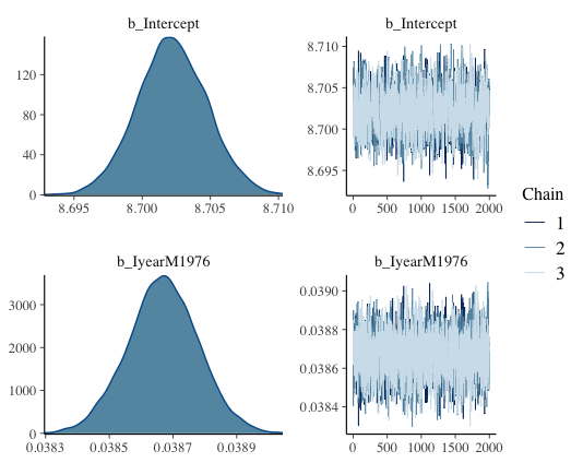
This should show up like this. We call this the trace or caterpillar plots. If you focus on the right hand plots, you want to see a sort of fuzzy caterpillar, or a festive tinsel. If this is the case, it means your model explored all the possible values it could look at, so it converged well. On the x-axis of those trace plots, we have the iterations done after the warmup (so 3000-1000 = 2000 in our case). And on the y-axis are all the values of the mean of the posterior distribution that have been assessed by our model.
On the left side, the density plots shows all of those mean values again, plotted by the amount of times the model got this value (so the distribution of means basically). And if you look closely, the mean of this density plot is going to be the mean value that has been found by the model most often, so probably the most “correct” one. And that value should be very close to the actual estimate that the summary function gave us. In our case, the top plot is the intercept and that density plot seems to be centered around 8.70, which is the estimate value that we got in the summary!
The second plot you want to look at is the pp_check plot. The main use of this function is to check if you model predicts your data accurately (using the estimates). If it does, then you can use that model to generate new data and make accurate predictions.
pp_check(france1_mbrms) # posterior predictive checks
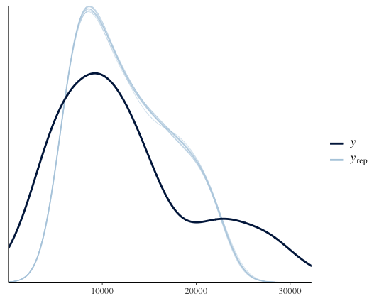
The thin light blue lines on this plot represent 10 random draws or distributions created by the model (you can increase this by including ndraws = 100 in the code).
The dark blue line represent the posterior distribution (which is considered to fit our data well so it can be used to compare model predictions with reality). As you can see here, the two distributions look similar so everything is good.
Building up the complexity
Now that we know how to make a very basic model, we can start adding complexity little by little.
Adding random effects
We know that our red knot population grows over the years, but it could be that each year, the previous population level has an effect on the next year. This means that the population could be growing due to random variations every year, rather than throughout a whole time period. In the brms package, you can include random effects very easily by adding ` + (1| random variable)`. Here we can just use the variable “year” because random effects will automatically become factors.
france2_mbrms <- brms::brm(pop ~ I(year - 1975) + (1|year),
                         data = France, family = poisson(), chains = 3,
                         iter = 3000, warmup = 1000)

summary(france2_mbrms)
plot(france2_mbrms)
As we can see in the plot, the model converged well. The summary doesn’t show an estimate of the effect for random variables, but it accounts for it during the sampling. We can still see that there is no effect of year as a random variable because our estimates have not changed compared to the first model.
Adding mutliple fixed effects
If we look at the data further in detail…
unique(France$Location.of.population) # observations come from 2 locations
…we can see that the observations come from two different locations: the Atlantic coast and the Channel coast, this is something that we will have to account for in our model.
Whenever your data distribution is grouped or separated into categories, you should include that information in your model to check if the groups are significantly different. In our case, those two locations correspond to two different bodies of water, which may support different numbers of red knot individuals.
If we check this by plotting the data…
(boxplot_location <- ggplot(France, aes(Location.of.population, pop)) +
  geom_boxplot() +  # could be a significant effect between locations so should look at that
  theme_bw() +
  xlab("Location\n") +
  ylab("\nCalidris canutus abundance") +
  theme(axis.text = element_text(size = 12),
        axis.title = element_text(size = 14, face = "plain")))
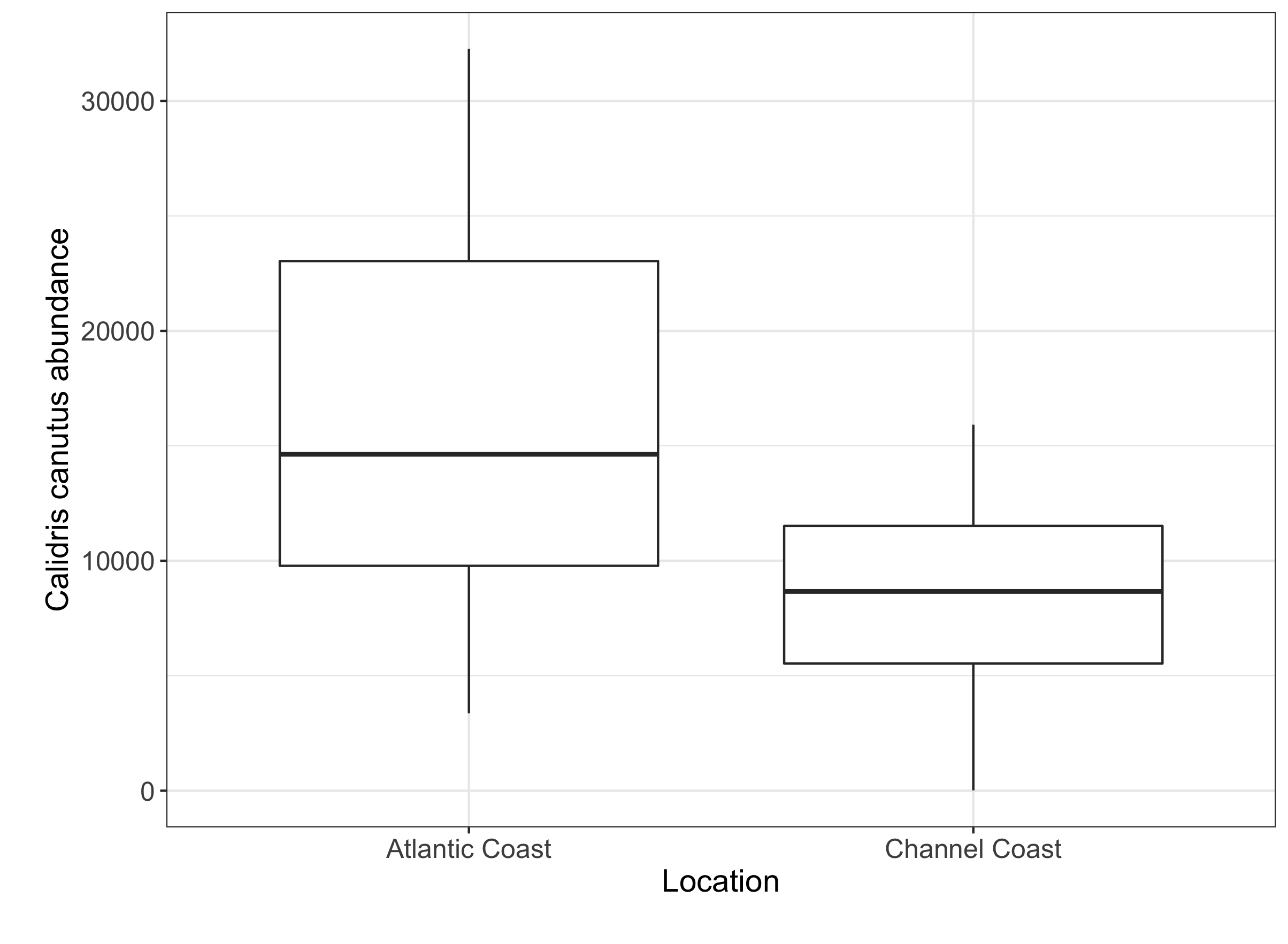
Your boxplot should look something like this, and you can see that there is a difference between our two sampling sites. By including this categorical variable into our model, we can check if this difference is significant.
As a side note, we will be including location as a fixed effect because we only have 2 locations. If you want to include it as a random effect, your variable should have at least 5 “levels” or categories.
The code for the model would look like this.
france3_mbrms <- brms::brm(pop ~ I(year - 1975) + Location.of.population,
                         data = France, family = poisson(), chains = 3,
                         iter = 3000, warmup = 1000)
summary(france3_mbrms)
plot(france3_mbrms)
pp_check(france3_mbrms)
Now if we look at our model plots we can see it converged well and it fits the data even more than the previous models.
The summary also tells us that the effect of location is significant! The estimate is -0.06 for Location.of.populationChannelCoast. This means that the Channel coast population has a significantly lower abundance than the Atlantic coast population.
The LOO method to assess fit
Another assessment you can do for your model is to look at the leave-one-out cross validation (LOO) method.
The LOO assesses the predictive ability of posterior distributions (a little like the pp_check function). It is a good way to assess the fit of your model. You should look at the elpd estimate for each model, the higher value the better the fit. By adding compare = TRUE, we get a comparison already done for us at the bottom of the summary. The value with an elpd of 0 should appear, that’s the model that shows the best fit to our data.
loo(france1_mbrms,france2_mbrms, france3_mbrms, compare = TRUE)
Since the third model shows the best fit, this is the one we will focus on. And now, we can move on to presenting our results in a report!
Presenting your results
Although the code for the model and the summary output are interesting on their own, they might be little hard to understand. A good graph and figure legend can present your findings in a much clearer way.
Plotting the model
The main plot we would want to present in a report is the relationship between our two main variables (abundance and time), basically the line created with the intercept and slope values from our summary output. In addition to that line, we can also add the credibility interval, because that shows the confidence that we have in that estimate. And finally, adding the raw data points (abundance counts every year), we can show how well the model fits the original data.
In this long and seemingly complex piece of code, we are using our original data and adding the posterior distribution through a pipe. Once this is done, we can plot the raw data, add the regression line and the credibility interval. The rest is just making it pretty.
library(tidybayes)

(model_fit <- France %>%
    add_predicted_draws(france3_mbrms) %>%  # adding the posterior distribution
    ggplot(aes(x = year, y = pop)) +
    stat_lineribbon(aes(y = .prediction), .width = c(.95, .80, .50),  # regression line and CI
                    alpha = 0.5, colour = "black") +
    geom_point(data = France, colour = "darkseagreen4", size = 3) +   # raw data
    scale_fill_brewer(palette = "Greys") +
    ylab("Calidris canutus abundance\n") +  # latin name for red knot
    xlab("\nYear") +
    theme_bw() +
    theme(legend.title = element_blank(),
          legend.position = c(0.15, 0.85)))
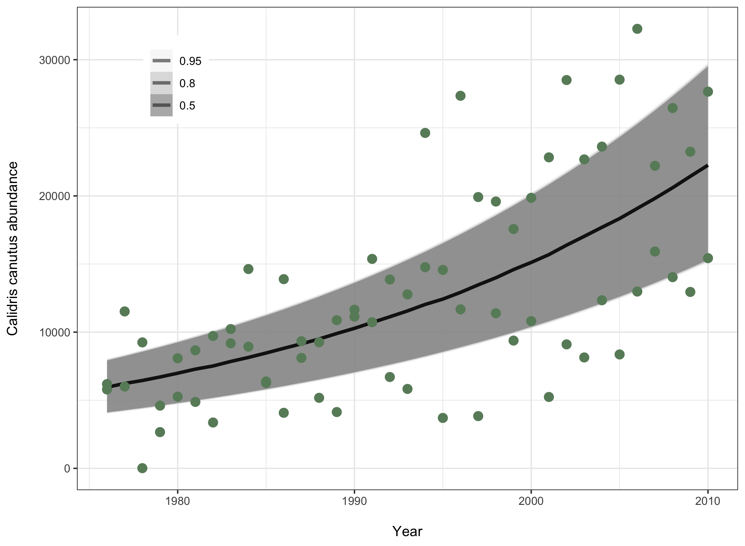
Now that you have your plot, you can save it and add it in your report, with an informative figure caption (for example Fig 1: The abundance of red knot birds in France significantly increased between 1976 and 2012 (β=0.04, 95% CI=0.04-0.04)).
# ggsave(filename = "france3_fit.png", model_fit, device = "png")
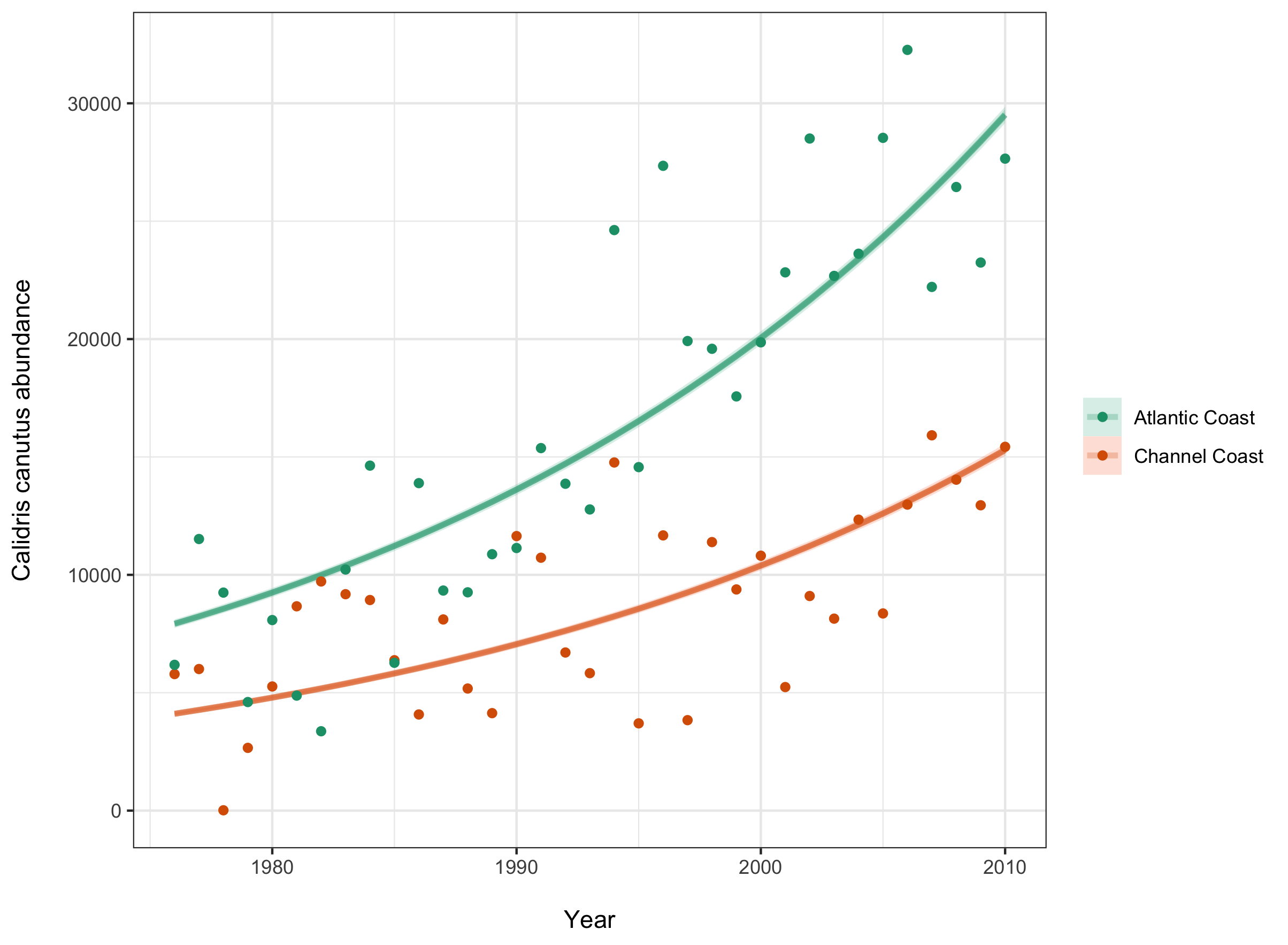
Another useful plot would be one showing the trendline in each location, since we saw there was a significant difference between the two.
 (location_fit <- France %>%
  group_by(Location.of.population) %>%
  add_predicted_draws(france3_mbrms) %>%
  ggplot(aes(x = year, y = pop, color = ordered(Location.of.population), fill = ordered(Location.of.population))) +
  stat_lineribbon(aes(y = .prediction), .width = c(.95, .80, .50), alpha = 1/4) +
  geom_point(data = France) +
  scale_fill_brewer(palette = "Set2") +
  scale_color_brewer(palette = "Dark2") +
  theme_bw() +
  ylab("Calidris canutus abundance\n") +
  xlab("\nYear") +
  theme_bw() +
  theme(legend.title = element_blank()))
Reporting the results in a report
An important thing to remember, is that when you are trying to report the results by going back to the original units (reporting the abundance change in terms of number of bids for example), you might have to transform your estimate a little.
This is because the model transforms your data depending on the distribution of your values. If you used a gaussian (normal) distribution, you won’t need to worry about this. But if you used a poisson distribution like we did, the model will have log-transformed your data. This means you won’t be able to report it in the original units if you don’t back-transform it again.
This isn’t very hard to do. In our case, if we want to report the number of new birds every year, using the estimates of our first model, we just need two small steps:
- First, get the actual value of increase by adding the mean to the intercept estimate (this is necessary because we know our population doesn’t start at 0.04 but rather at 8.70) = 8.74
- Second, get the exponential of that value to undo the log-transformation that our data went through to get an estimate in number of birds = 6247.896
We can now say that there were on average 6247.896 new red knot birds in France every year between 1976 and 2010.
Potential issues and how to solve them
A lot of small thing can cause big problems in the models we are using here. A common warning message about divergent transitions, for example: “There were 132 divergent transitions after warmup. Increasing adapt_delta above 0.8 may help. See http://mc-stan.org/misc/warnings.html#divergent-transitions-after-warmup”
A few divergent transitions can be ignored, but the higher the number the more concerning. Going to the website R suggests will give you more information on what this error means.
They suggest increasing adapt-delta about 0.9 and increasing max_treedepth beyond 12.
#france3_mbrms <- brms::brm(pop ~ I(year - 1975) + Location.of.population,
#                        data = France, family = poisson(), chains = 3,
#                        iter = 3000, warmup = 1000,
#                        control = list(max_treedepth = 15, adapt_delta = 0.99)
However, there are other ways to adjust your model to avoid these issues.
Solution 1: Scaling the variable
Another way of transforming your data to help the model deal with it, is to scale your variables. Scaling changes your data by centering it on 0 (mean = 0) and changing the values to have a standard deviation of 1.
France$year.scaled <- scale(I(France$year - 1975), center = T)  # scaling time
France$pop.scaled <- scale(France$pop, center = T)  # scaling abundance
The other thing that changes here is the distribution of the data, from poisson to normal, which you will have to change in the model as well
hist(France$pop.scaled)  # you can see that the distribution changed

# so will have to change it in the model as well
# france4_mbrms <- brms::brm(pop.scaled ~ year.scaled + (1|location),
#                            data = France, family = gaussian(), chains = 3,
#                            iter = 3000, warmup = 1000)
If you are interested in learning more about scaling data, check out our scaling tutorial.
Solution 2: Changing the units of the variable
A lot of abundance data can have very large numbers. Say if the smallest value of abundance in your data is 50,000. This can cause a problem when the model runs iterations because it will be looking at a whole range of values between 0 and 50,000 even though nothing is interesting there. The model might fail to converge properly or take a very long time to do so.
A way to solve this is to change the units from single counts to thousands of counts for example.
Solution 3: Using more informative priors
As I explained earlier, we used non-informative, default priors in the previous models. However, increasing the information you give to your model will probably help it converge faster. The prior information you give depends highly on the understanding you have of the specific systme you are working on, but here is the way you would include a prior in your model.
First, you would need to define the prior, by including the parameters of a new distribution of your data.
The normal or cauchy arguments describe the shape of that distribution, and the numbers in the brackets describe the width and height of that shape (in this order: (mean, standard deviation)). You can set a prior for each variable that you want to include in your model. And here is a random example of what that would look like for our model:
prior1 <- c(set_prior(prior = 'normal(0,6)', class='b', coef='year'),
            # global slope belongs to a normal distribution centered around 0
            set_prior(prior = 'normal(0,6)', class='Intercept', coef=''))
            # global intercept
             set_prior(prior = 'cauchy(0,2)', class='sd'))
            # if we had group-level intercepts and slopes

# france5_mbrms <- brms::brm(pop ~ year + location, data = France,
#                            family = poisson(), chains = 3, prior = prior1,
#                            iter = 3000, warmup = 1000)

# The intercept here will be very different than your previous models, but that is because we are using the "year" variable and not the adjusted year variable, but you will see that the fixed effects look the same. You could change this by making a new column where the year variable to starts at 1 and using that to specify the priors and in the model.
As you can see in the comments part above, the prior would be included in the model with a prior = prior1 argument.
Solution 4: Increasing iterations
Finally, increasing the number of iterations by a few thousands (and the warmup accordingly) might also help your model converge better by letting it run for longer.
Et voilà! This is the end of the tutorial, I hope you managed to understand everything and increase your knowledge about Bayesian modelling even a little. Take the time to go back to the theory part if you are interested and look at the other Coding Club tutorials on that topic as well to test your understanding.
In this tutorial you learned:
- How a Bayesian model works and what is the theory behind it
- How to create a simple model using the brms package and extract the results
- How to assess the convergence and fit of this model
- How to present your results in a report
- How to build a more complex model using the brms package
- Some solutions in case your model doesn’t converge well
For more information or any questions/feedback, please don’t hesitate to contact us at ourcodingclub@gmail.com