Tutorial Aims:
- Learn about
INLAand why it’s useful - Perform model selection in
INLA - Learn the components of an
INLAmodel - Set up a spatial analysis
- Modify and specify spatial models
- Learn about spatiotemporal analyses
All the files needed to complete this tutorial can be downloaded from this GitHub repository. Click on Clone or Download/Download ZIP and then unzip the files.
1. Learn about INLA and why it’s useful
Welcome to this tutorial on INLA, written by Greg Albery off of the Pemberton Group, Institute of Evolutionary Biology, University of Edinburgh. I wrote this tutorial in the last year of my PhD working on helminth parasites in wild red deer on the Isle of Rum, my email is gfalbery@gmail.com, and my twitter handle is @Gfalbery.
Spatial autocorrelation is a common problem in ecological studies. Googling it, you’ll commonly come across this phrase, Tobler’s first law of geography:
“Everything is related to everything else, but near things are more related than distant things.”
This is true of objects both in space and in time, and is commonly true of both at once. However, spatial analysis is often hard, computationally intensive, and unintuitive. Adding in a temporal element is even more intimidating. INLA is a great way to deal with this. INLA stands for Integrated Nested Laplace Approximation, and we’re about to learn more about what that means!
TWO DISCLAIMERS:
- This tutorial will centre around the beginner-level specifics of
INLAmodels. It will rely on a working knowledge of GLMMs, model selection methods, etc., and won’t include a huge amount of complexities about the inner workings ofINLAitself. I’m not an expert on INLA, but I have a sturdy working knowledge of it, and I’m super enthusiastic about its use. I also believe that a load more systems could do with some more robust spatial and spatiotemporal analyses. - Spatial analysis often seems scary.
INLAand I are here to convince you that it should be less scary and more common. I’m a firm believer that spatial analysis can enrich your results and tell you stuff about your study system, rather than threatening the importance and interesting nature of your results.
Recommended reading for later:
- This GitHub repository from a paper about fisheries (quite complicated code but a great exhaustive example): https://github.com/GodinA/cjfas-bycatch-INLA-SPDE
- Pawley and McArdle, 2018: https://www.biorxiv.org/content/biorxiv/early/2018/08/06/385526.full.pdf
- Zuur et al., 2018: http://www.highstat.com/index.php/beginner-s-guide-to-regression-models-with-spatial-and-temporal-correlation
Basics of INLA
INLA is an increasingly popular analysis package in R.
It uses the Integrated Nested Laplace Approximation, a deterministic Bayesian method.
Bayesian = uses Bayes’s theorem, contrasted with frequentist. Based on inferring the probability of a set of data given the determined parameters (involves setting a prior!). For more details, you can check out our Intro to Bayesian Statistics tutorial.
Deterministic = comes up with the same results every time, contrasted with probabilistic (e.g. MCMC).
INLA allows a wide range of different functions: GLMM, GAMM, spatial autocorrelation, temporal autocorrelation, and spatiotemporal models. Combining this variety with its (eventual) simplicity and computational efficiency, it is becoming increasingly important in ecology. However, it can be unintuitive when you’re starting out and like learning all new things, takes a big of thinking to get your head around it, but it’s definitely achievable!
Tutorial workflow
The tutorial will take you through an analysis step by step. This will involve:
- Model selection in
INLA. - The components of an
INLAmodel (nuts and bolts). - Setting up a spatial analysis.
- Modifications and specifications of spatial models.
- Spatiotemporal analyses (dabbling into them).
This will include a load of functions I’ve written to easily perform simple tasks using INLA, which I’m happy to deconstruct for you if needed. If you do use them in an analysis and find them helpful, or if you find a problem with them, please let me know!
The general setup of an INLA spatial analysis is as follows:
- Plot and explore your data.
- Decide on covariates.
- Carry out model selection using
DICto reduce the number of covariates. - Run a final non-spatial model.
- Decide on a set of spatial dependence structures.
The data
This tutorial is going to use a dataset working on a wild animal, trapped in a Scottish woodland. The experiment used a combination of individual anthelminthic treatment and nutritional supplementation to investigate how they impacted parasite intensity.
The research question
How do different treatments influence parasite activity and is that influenced by spatial patterns?
The researchers trapped Hosts in four grids, two of which were supplemented with high-quality food. Some individuals were treated with antiparasitic compounds, and others were not. At each capture, phenotypic data such as body condition were taken and Parasites were counted.
Import the data
Let’s import the data.
if(!require(ggregplot)) devtools::install_github("gfalbery/ggregplot") # Installing Greg's package for plotting functions!

library(INLA); library(ggplot2); library(ggregplot)
library(tidyverse)
library(RColorBrewer)

Root <- <INSERT FILE PATH HERE> # This should be the path to your working directory

Hosts <- read.csv(paste0(Root, "/HostCaptures.csv"), header = T)
Examine the data, look at the columns.
head(Hosts)

substr(names(Hosts), 1, 1) <- toupper(substr(names(Hosts), 1, 1)) # Giving the host names capital letters

phen <- c("Grid", "ID", "Easting", "Northing") # Base columns with spatial information we'll need

resp <- "Parasite.count" # Response variable

covar <- c("Month", # Julian month of sampling
           "Sex", # Sex
           "Smi", # Body condition
           "Supp.corrected", # Nutrition supplementation
           "Treated") # Treatment

TestHosts <- na.omit(Hosts[, c(phen, resp, covar)]) # Getting rid of NA's, picking adults
# We are using the [] to subset and only extract specific columns

# Turning variables into factors
TestHosts$Month <- as.factor(TestHosts$Month)
TestHosts$Grid <- as.factor(TestHosts$Grid)

TestHosts$Parasite.count <- round(TestHosts$Parasite.count) # Parasite counts should be integers

table(table(TestHosts$ID)) # Enough repeat samples for a mixed model?
We need to make sure that there are enough repeat samples of specific individuals. Table will count up how many of them there are, and using table(table()) is a quick way to show the distribution of repeat sampling. Looks like we have enough repeat samples for a mixed effect model!
INLA works like many other statistical analysis packages, such as lme4 or MCMCglmm. If you run the same simple models in these packages, it should get similar results.
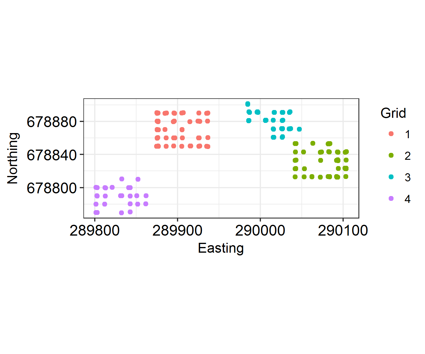
Plot the sampling locations in space. As they are trapped in a grid formation, make sure they are jittered.
# Setting up a custom theme
THEME <- theme(axis.text.x = element_text(size = 12,colour = "black"),
               axis.text.y = element_text(size = 12, colour = "black"),
               axis.title.x = element_text(vjust = -0.35),
               axis.title.y = element_text(vjust = 1.2)) + theme_bw()

(samp_locations <- ggplot(TestHosts, aes(Easting, Northing)) +
	geom_jitter(aes(colour = factor(Grid))) + coord_fixed() +
	THEME +
	labs(colour = "Grid"))
Recall that putting your entire ggplot code in brackets () creates the graph and then shows it in the plot viewer. If you don’t have the brackets, you’ve only created the object, but haven’t visualized it. You would then have to call the object such that it will be displayed by just typing samp_locations after you’ve created the “samp_locations” object.
How often are different individuals trapped on different grids?
length(unique(TestHosts$ID))

table(with(TestHosts, tapply(Grid, ID, function(x) length(unique(x)))))
Not much moving around! Looks like individuals tend to stay on the same grid.
2. Perform model selection in INLA
Model selection is a method that reduces the amount of covariates that are included in the data to stop overfitting. This will increase the generality of your models, and is good practise!
First, we will set up a full analysis using all the covariates that we reckon will influence the data. As I’ve said above, you can use INLA like any other modelling package, but here I’m going to use formula specification before the models.
# First without random effects ####

# Specify the formula
f0.1 <- as.formula(paste0(resp, " ~ ", # Response first
                          paste(covar, collapse = " + ") # Collapse the vector of covariates
))

# Run the model
IM0.1  <- inla(Parasite.count ~ Month + Sex + Smi + Supp.corrected + Treated,
               family = "nbinomial", # Specify the family. Can be a wide range (see r-inla.org).
               data = TestHosts) # Specify the data

# Run the model # (This is the same thing)
IM0.1  <- inla(f0.1,
               family = "nbinomial", # Specify the family. Can be a wide range (see r-inla.org).
               data = TestHosts) # Specify the data

# Then with an ID random effect ####

f0.2 <- as.formula(paste0(resp, " ~ ",
                          paste(covar, collapse = " + "),
                          " +  f(ID, model = 'iid')")) # This is how you include  a typical random effect.

IM0.2  <- inla(f0.2,
               family = "nbinomial",
               data = TestHosts)

summary(IM0.1)
summary(IM0.2)
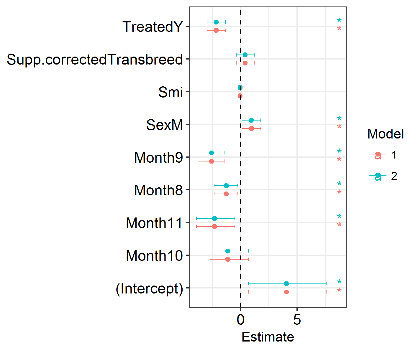
Next, we will visualise the results of our models. We will plot the effect sizes and the credible intervals around them. This uses some functions which I’ve packaged in my ggregplot package!
Efxplot(list(IM0.1, IM0.2))
This shows a load of significant effects: months, sex, treatment. Looks promising!
NB: There are no P values in INLA. Importance or significance of variables can be deduced by examining the overlap of their 2.5% and 97.5% posterior estimates with zero.
It’s likely that this model is overloaded with explanatory variables. Let’s carry out model selection to remove the covariates that are unimportant.
This involves removing covariates one by one and seeing how this changes model fit according to the model’s Deviance Information Criterion (DIC, a Bayesian measure analogous to the Akaike Information Criterion (AIC)). If removing any number of covariates does not increase a model’s DIC by a threshold number (I use 2 DIC) then the covariate with the lowest impact is removed. This process is repeated, using fewer and fewer covariates each time, until eventually you end up with a minimal model where removing any covariates increases the DIC by greater than the threshold value.
Instead of doing this manually, which takes time and a lot of code and is boring, I threw together a function (INLAModelSel in the ggregplot package) which will do it for us.
NB: This is a demonstration not a setup for a perfect analysis. Remember to:
- Explore your data.
- Be careful of outliers.
- Do not include highly-correlated covariates.
If you don’t explore your data thoroughly things can easily go wrong. Do not rely on this function for analysis without thinking about it and checking your data thoroughly!
We can apply the function to our data and see which variables we should include in our models.
# Let's try it on our data ####

HostModelSel <- INLAModelSel(resp, covar, "ID", "iid", "nbinomial", TestHosts)

Finalcovar <- HostModelSel$Removed[[length(HostModelSel$Removed)]]
We ended up removing body condition, and food supplementation, while treatment, sex, and month remained in the final model.
A reminder that there are no P values in INLA. Importance or significance of variables can be deduced by examining the overlap of their 2.5% and 97.5% posterior estimates with zero. This is made easier by plotting them. I prefer using DIC to compare variables’ contributions to model fit rather than looking exclusively at the model estimates.
f1 <- as.formula(paste0(resp, " ~ ",
                        paste(Finalcovar, collapse = " + "),
                        "+ f(ID, model = 'iid')"))

IM1 <- inla(f1,
            family = "nbinomial",
            data = TestHosts,
            control.compute = list(dic = TRUE))

summary(IM1)
Elaborating on our model selection
To examine the importance of spatial autocorrelation, we then look at the DIC of a series of competing models with different random effect structures. I have decided that, given the layout of my sampling locations, there are a few potential ways to code spatial autocorrelation in this dataset.
- Spatial autocorrelation constant across the study period, and across the study area (spatial, 1 mesh).
- Spatial autocorrelation constant across the study area, varying across the study period (spatiotemporal, X meshes).
- Spatial autocorrelation varying within each grid to ignore spatial patterns between grids (spatial, 4 meshes).
We will make these models, compete them with each other, and investigate whether the inclusion of spatial random effects changes our fixed effect estimates (does including spatial variation change whether we think males have higher Parasite counts, for example?)
3. Learn the components of an INLA model
The setup so far has involved using quite simple model formulae. The next step is where people often become frustrated, as it involves model setups which are more unique to INLA and hard to pick apart.
A bit about INLA
INLA is computationally efficient because it uses a SPDE (Stochastic Partial Differentiation Equation) to estimate the spatial autocorrelation of the data. This involves using a “mesh” of discrete sampling locations which are interpolated to estimate a continuous process in space (see very helpful figure).
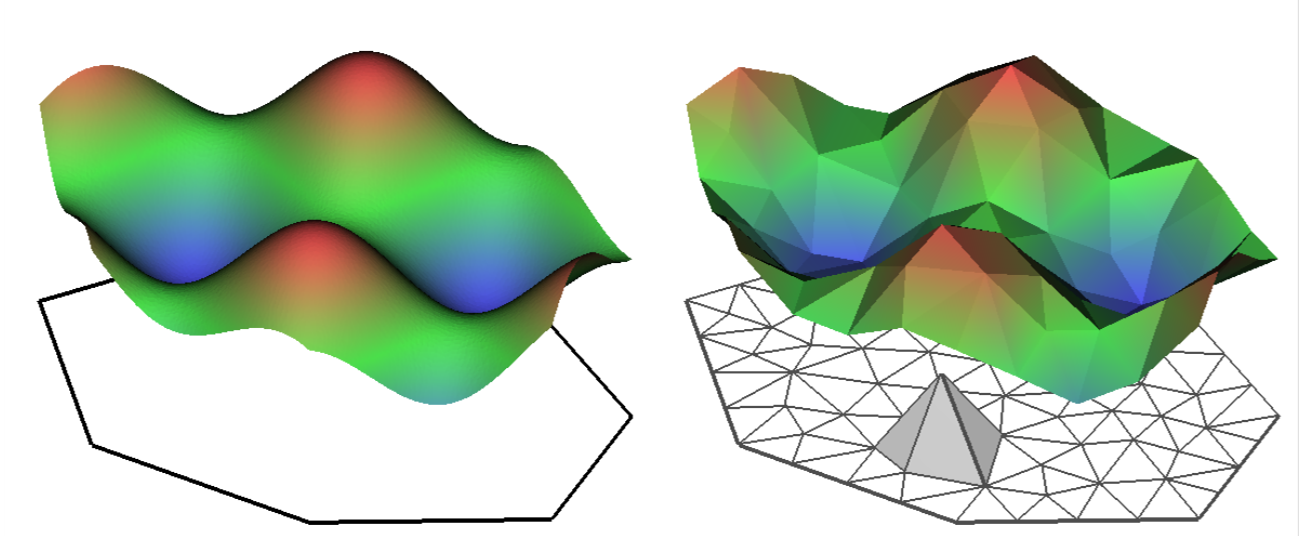
So, you create a mesh using sampling locations and/or the borders of your study system.
There are lots of variations on a mesh, which can be examined by plotting it.
4. Set up a spatial analysis
Setting up a mesh
Locations = cbind(TestHosts$Easting, TestHosts$Northing) # using the sampling locations

MeshA <- inla.mesh.2d(jitter(Locations), max.edge = c(20, 40))
MeshB <- inla.mesh.2d(Locations, max.edge = c(20, 40))
MeshC <- inla.mesh.2d(Locations, max.edge = c(10, 20))

Mesh <- MeshB

plot(MeshA)

plot(MeshB)

plot(MeshC)

points(Locations, col = "red", pch = 2)
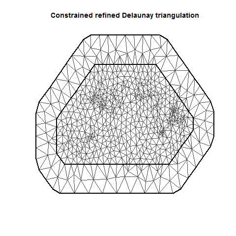
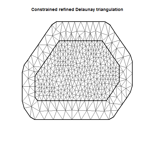
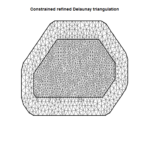
There are several important aspects of a mesh. The triangle size (determined using a combination of max.edge and cutoff) determines how precisely the equations will be tailored by the data. Using smaller triangles increases precision but also exponentially increases computing power. Generally, the mesh function automatically creates a mesh like mesh A, where closer-together sampling locations produce smaller triangles. The sampling locations in this dataset are so evenly spaced that I had to jitter them to show this in mesh A. When exploring/setting up preliminary analyses, use a mesh like mesh B. for analyses to be reported in a paper, use a mesh like mesh C. Be careful of edges, and try to allow some space around your sampling area for INLA to estimate. The edge triangles can be bigger to reduce computing power.
After the mesh has been set up, we need to feed INLA a way to convert this into a model format. This uses an A matrix, which essentially translates spatial locations on the mesh into vectors in the model.
# Making the A matrix

HostsA <- inla.spde.make.A(Mesh, loc = Locations) # Making A matrix
Hosts.spde = inla.spde2.pcmatern(mesh = Mesh, prior.range = c(10, 0.5), prior.sigma = c(.5, .5)) # Making SPDE
w.Host <- inla.spde.make.index('w', n.spde = Hosts.spde$n.spde) # making the w
The A matrix is combined with the model matrix and random effects in a format called a stack.
# Making the model matrix ####

X0 <- model.matrix(as.formula(paste0(" ~ -1 + ", paste(Finalcovar, collapse = " + "))), data = TestHosts) # make the model matrix using the final model selection formula without a response variable.

X <- as.data.frame(X0[,-which(colnames(X0)%in%c("Month7"))]) # convert to a data frame. Eliminate the base level of the first categorical variable if applicable (you will manually specify an intercept below)

head(X)

# Making the stack ####

N <- nrow(TestHosts)

StackHost <- inla.stack(
  data = list(y = TestHosts[,resp]), # specify the response variable

  A = list(1, 1, 1, HostsA), # Vector of Multiplication factors for random and fixed effects

  effects = list(

    Intercept = rep(1, N), # specify the manual intercept!

    X = X, # attach the model matrix

    ID = TestHosts$ID, # insert vectors of any random effects

    w = w.Host)) # attach the w
The stack includes (in this order in my code)….
- The response variable (coded as “y”)
- A vector of multiplication factors. This is generally a series of 1’s (for the intercept, random effects, and fixed effects), followed by the spatial A matrix which you specified earlier.
- The effects. You need to separately specify the intercept, the random effects, the model matrix, and the spde. The thing to remember is that the components of part 2 of the stack (multiplication factors) are related to the components of part 3 (the effects). Adding an effect necessitates adding another 1 to the multiplication factors (in the right place).
Adding a random effect? Whack it in the effects, add a 1 to the A vector.
Say I was trying to add a random effect of grid:
N <- nrow(TestHosts)

BADSTACK <- inla.stack(
  data = list(y = TestHosts[,resp]), # specify the response variable

  A = list(1, 1, 1, HostsA), # Vector of Multiplication factors for random and fixed effects

  effects = list(

    Intercept = rep(1, N), # specify the manual intercept!

    X = X, # attach the model matrix

    ID = TestHosts$ID, # insert vectors of any random effects
    Grid = TestHosts$Grid,

    w = w.Host)) # Leave
What have I done wrong here? Let’s rectify it.
N <- nrow(TestHosts)

GOODSTACK <- inla.stack(
  data = list(y = TestHosts[,resp]), # specify the response variable

  A = list(1, 1, 1, 1, HostsA), # Vector of Multiplication factors for random and fixed effects

  effects = list(

    Intercept = rep(1, N), # specify the manual intercept!

    X = X, # attach the model matrix

    ID = TestHosts$ID, # insert vectors of any random effects
    Grid = TestHosts$Grid,

    w = w.Host)) # Leave
Running the model
So, we have everything set up to conduct a spatial analysis. All we need is to put it into the inla function and see what happens. Fortunately, once you specify the stack you can add it into the data = argument and then changing the formula will run whatever variation you need (as long as it only uses A, W, random and fixed effects that already exist in the stack).
So, for completeness let’s try out three competing models:
- only fixed effects,
- fixed + ID random effects,
- fixed + ID + SPDE random effects.
f1 <- as.formula(paste0("y ~ -1 + Intercept + ", paste0(colnames(X), collapse = " + ")))
f2 <- as.formula(paste0("y ~ -1 + Intercept + ", paste0(colnames(X), collapse = " + "), " +  f(ID, model = 'iid')"))
f3 <- as.formula(paste0("y ~ -1 + Intercept + ", paste0(colnames(X), collapse = " + "), " +  f(ID, model = 'iid') + f(w, model = Hosts.spde)"))


IM1 <- inla(f1, # Base model (no random effects)
            family = "nbinomial",
            data = inla.stack.data(StackHost),
            control.compute = list(dic = TRUE),
            control.predictor = list(A = inla.stack.A(StackHost))
)

IM2 <- inla(f2, # f1 + Year and ID random effects
            family = "nbinomial",
            data = inla.stack.data(StackHost),
            control.compute = list(dic = TRUE),
            control.predictor = list(A = inla.stack.A(StackHost))
)

IM3 <- inla(f3, # f2 + SPDE random effect
            family = "nbinomial",
            data = inla.stack.data(StackHost),
            control.compute = list(dic = TRUE),
            control.predictor = list(A = inla.stack.A(StackHost))
)

SpatialHostList <- list(IM1, IM2, IM3)
Plotting the spatial field
ggField(IM3, Mesh, Groups = 1) +
  scale_fill_brewer(palette = "Blues")

# always use a single-dimension colour palette if you can! It's just easier on the eyes,
# better for colourblind people, makes sense in black and white, etc.

# ignore the Groups part of the function for now. That'll come later.
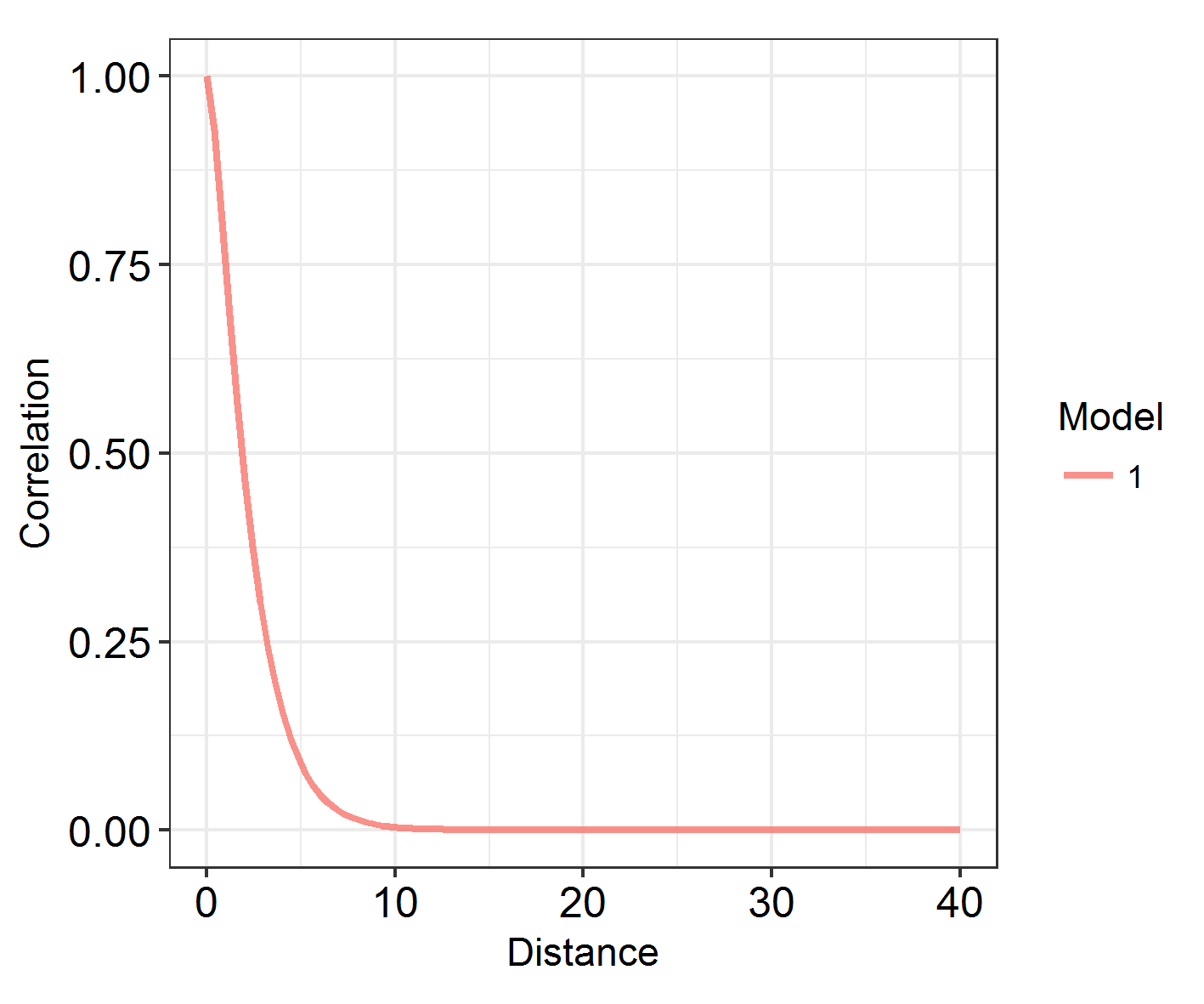
At what range does autocorrelation fade in space? INLA models with a large kappa (inverse range) parameter change very quickly in space. Those with a large range and small kappa parameter have much longer, slower graidents.
Looking at the range
# function takes (a list of) models and plots the decay of spatial autocorrelation across a user-defined range

# let's try it on our model ###

# Define the maximum range as something reasonable: the study area is 80 eastings wide, so lets go for:

Maxrange = 40

INLARange(list(IM3), maxrange = Maxrange)
However, being able to visualise spatial patterns does not necessarily mean that spatial autocorrelation is affecting the model substantially, and range does not correspond to the importance of autocorrelation! In order to investigate that, we have to look at model fit. How does the DIC of these models compare?
sapply(SpatialHostList, function(f) f$dic$dic)
This is quite hard to visualise, so: another function in the package!
# Let's try it on our data ####
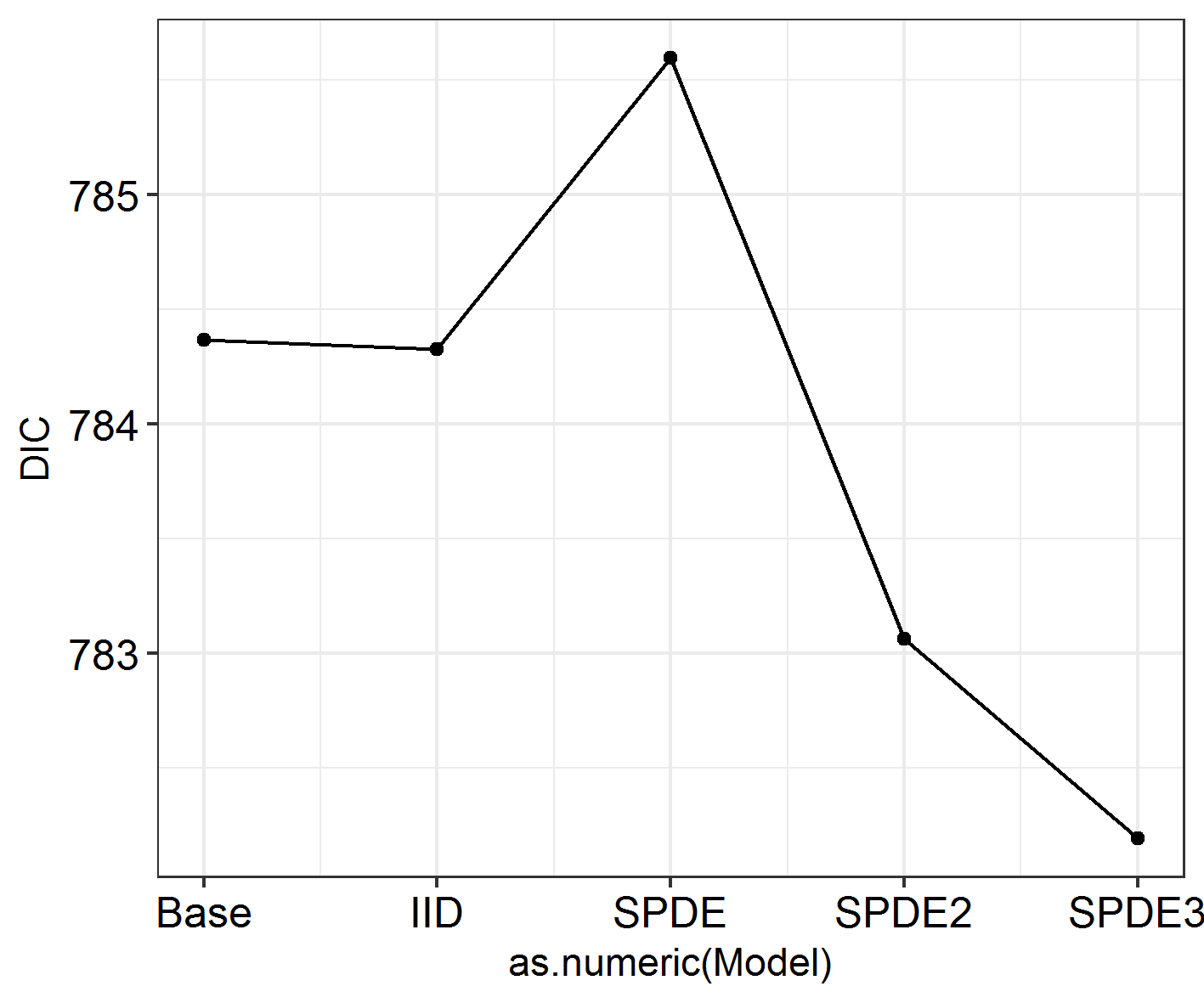
INLADICFig(SpatialHostList, ModelNames = c("Base", "IID", "SPDE"))
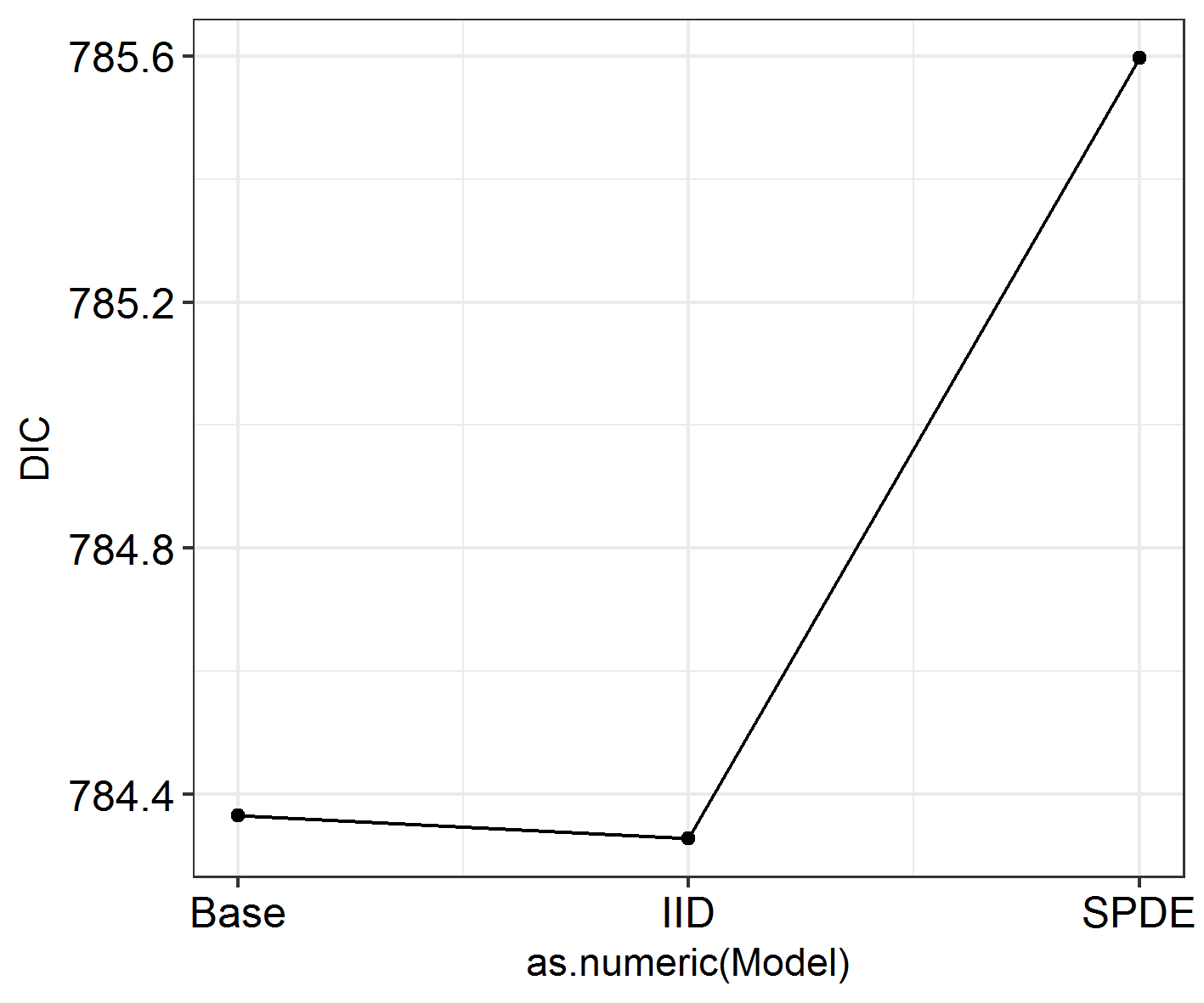
Seems like spatial autocorrelation doesn’t affect these data the way we’ve coded it! Whoever carried out this study could keep going as they were and not worry any more about spatial autocorrelation. Except we had some expectations that there might be other varieties of spatial autocorrelation at work here.
If I had had no more ###a priori### expectations for this study, I would stop here. Don’t keep analysing different variables or combinations of variables until eventually you find a variety of spatial autocorrelation that affects your data.
5. Modify and specify spatial INLA models
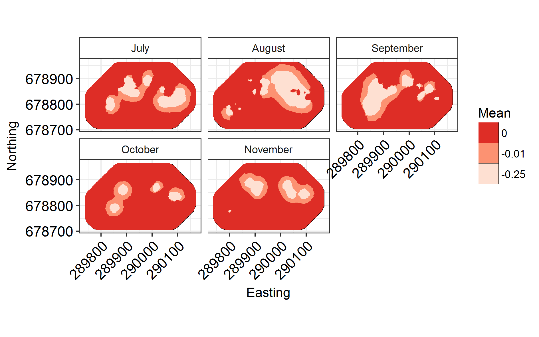
Seasonal model
Now: what if the spatial field varied seasonally? We specify the A matrix, SPDE and model differently to produce several different groups.
# Specifying a new set of SPDE components ####

Groups = "Month"

NGroups <- length(unique(TestHosts[,Groups]))

HostA2 <- inla.spde.make.A(Mesh, # Leave
                           loc = Locations, # Leave
                           group = as.numeric(as.factor(TestHosts[,Groups])),# this must be a numeric value counting from 1. If the groups variable is a factor, this will happen by default.
                           n.group = NGroups)

w.Host2 <- inla.spde.make.index(
  name    = 'w',
  n.spde  = Hosts.spde$n.spde,
  n.group = NGroups)

StackHost2 <- inla.stack(
  data = list(y = TestHosts[,resp]), # Leave

  A = list(1, 1, 1, HostA2), # Change the A matrix to the new one

  effects = list(
    Intercept = rep(1, N), # Leave
    X = X, # Leave
    ID = TestHosts$ID, # Leave

    w = w.Host2)) # CHANGE
Now that this is specified, let’s run the model.
f4 = as.formula(paste0("y ~ -1 + Intercept + ", paste0(colnames(X), collapse = " + "),
                       " +  f(ID, model = 'iid') +  f(w, model = Hosts.spde,
group = w.group,                           # This bit is new!
control.group = list(model = 'iid'))"))

inla.setOption(num.threads = 8)

IM4 <- inla(f4,
            family = "nbinomial",
            data = inla.stack.data(StackHost2), # Don't forget to change the stack!
            control.compute = list(dic = TRUE),
            control.predictor = list(A = inla.stack.A(StackHost2)) # Twice!
)

SpatialHostList[[4]] <- IM4
Now that that’s run, let’s plot it!
Labels = c("July", "August", "September", "October", "November")
names(Labels) <- c(1:NGroups)
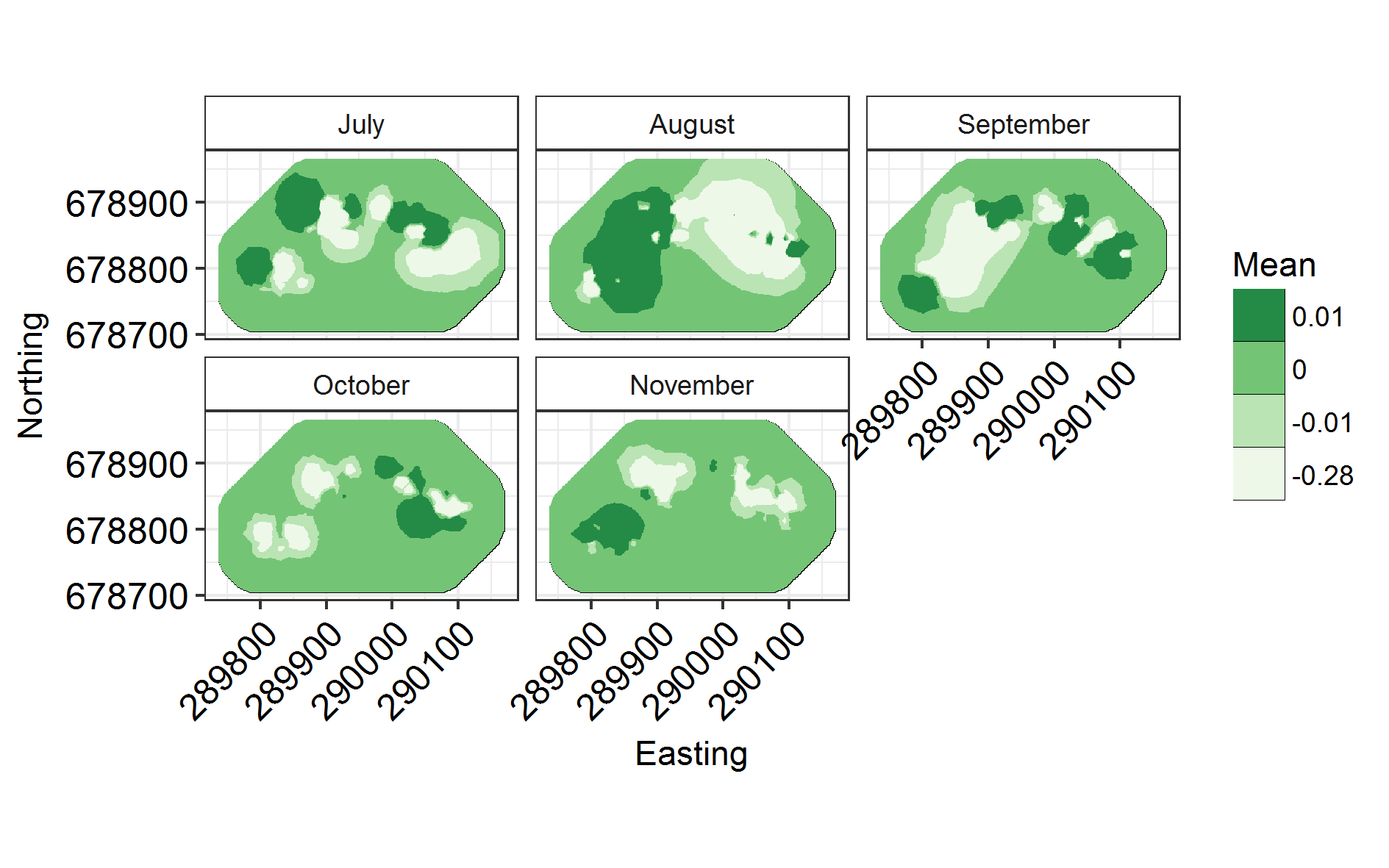
ggField(IM4, Mesh, Groups = NGroups) + # Notice the groups argument, using the number of unique months.
scale_fill_brewer(palette = "Reds") +
facet_wrap( ~ Group, labeller = labeller(Group = Labels), ncol = 3) # Doing this manually changes the facet labels
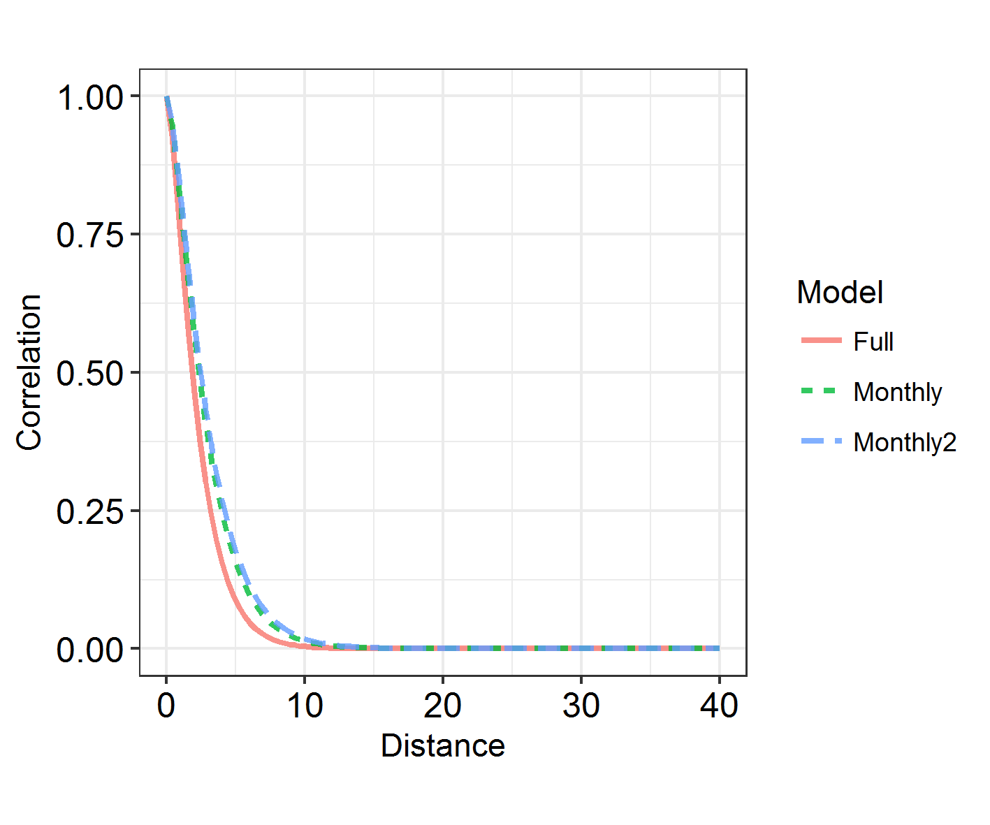
INLARange(SpatialHostList[3:4], maxrange = Maxrange, mesh = Mesh, ModelNames = c("Full", "Monthly"))
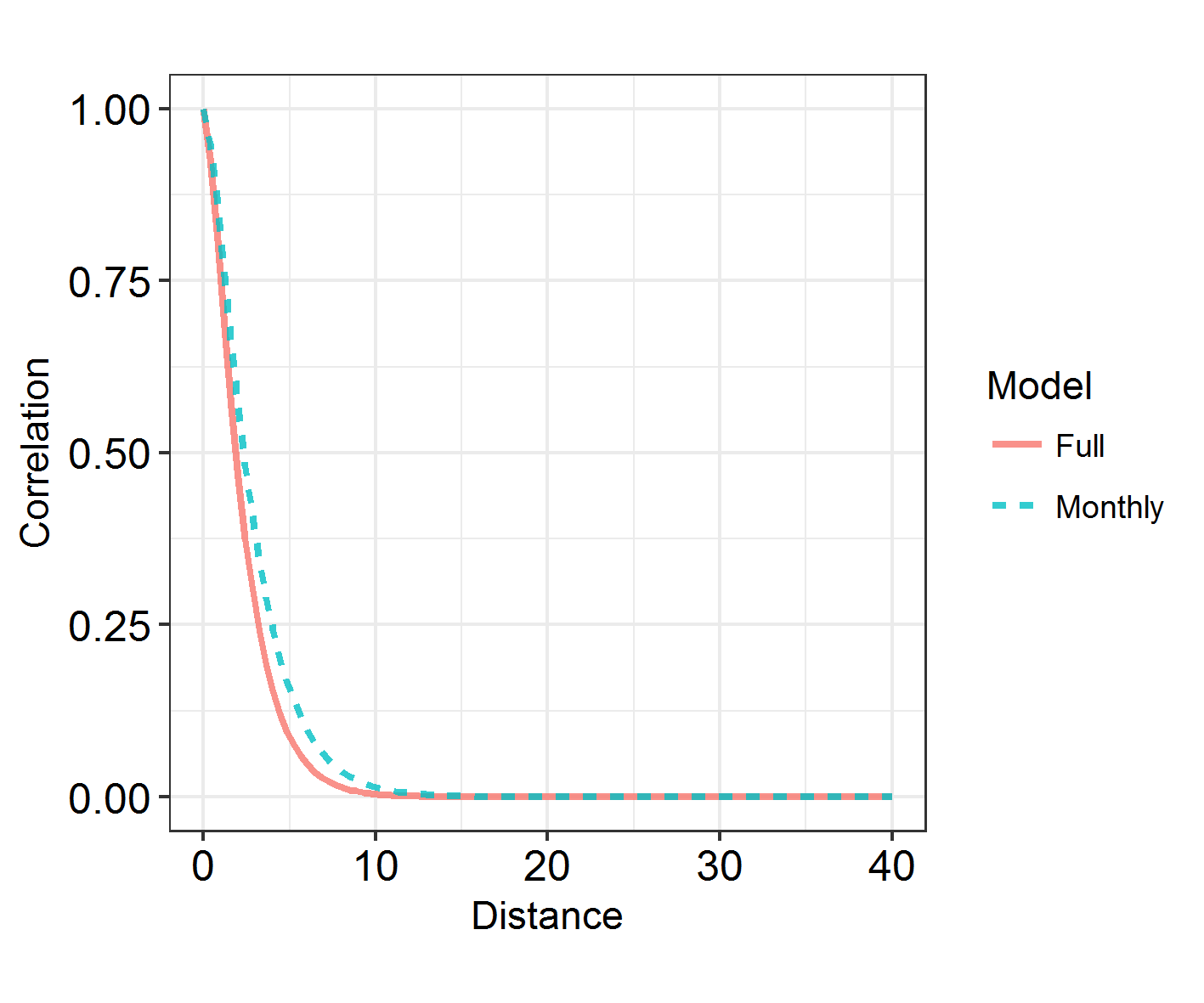
6. Learn about spatiotemporal analyses
There is a faster way to split spatial fields into groups, using repl instead of splitting it into groups and connecting them via iid models. However, I’m showing you this method as it’s a way into spatiotemporal models. In the above model, we have assumed that monthly spatial fields are totally unrelated to each other. However, we can use an “exchangeable” model to force a correlation between them, and to derive a rho correlation between the fields.
f5 = as.formula(paste0("y ~ -1 + Intercept + ", paste0(colnames(X), collapse = " + "),
                       "+ f(ID, model = 'iid') +  f(w, model = Hosts.spde,
                       group = w.group, # This bit is new!
                       control.group = list(model='exchangeable'))"))

#inla.setOption(num.threads = 8)

IM5 <- inla(f5,
         family="nbinomial",
         data = inla.stack.data(StackHost2),
         control.compute = list(dic = TRUE),
         control.predictor = list(A = inla.stack.A(StackHost2))
)

SpatialHostList[[5]] <- IM5
NB: with Exchangeable, all fields are correlated to the same extent. If we used AR1 (a typical temporal autocorrelation model used to link spatial fields), fields closer to each other in time would be more highly correlated than those further apart. It takes more time than we have to run, and requires more data than I have to converge. So try that out on your own data if you’re keen and you think it’ll work. I’m happy to help!
# Same functions as above!

INLADICFig(SpatialHostList, ModelNames = c("Base", "IID", "SPDE", "SPDE2", "SPDE3"))
ggField(IM5, Mesh, Groups = NGroups) + # Notice the groups argument, using the number of unique months.
  scale_fill_brewer(palette = "Greens")
INLARange(SpatialHostList[3:5], maxrange = Maxrange, ModelNames = c("Full", "Monthly", "Monthly2"))
Within-grid model
Let’s try using repl instead of group, just for completeness’s sake. Just to recap: this is slightly quicker, but can only be used when you’re not specifying a link between the fields.
We’re going to see if restricting the study area to four identically-shaped grid meshes will improve fit, rather than having a lot of empty space in the countryside where no Hosts were ever caught.
In order to do this, we have to recode the data slightly.
Group2 = "Grid"

TestHosts$Easting2 <- TestHosts$Easting - with(TestHosts, tapply(Easting, Grid, min))[TestHosts$Grid]
TestHosts$Northing2 <- TestHosts$Northing - with(TestHosts, tapply(Northing, Grid, min))[TestHosts$Grid]

Locations2 = cbind(TestHosts$Easting2, TestHosts$Northing2)

Mesh2 <- inla.mesh.2d(Locations2, max.edge = c(20, 40))#, cutoff = 0.8)

NGroup2 <- length(unique(TestHosts[,Group2]))

Hosts.spde2 = inla.spde2.pcmatern(mesh = Mesh2, prior.range = c(10, 0.5), prior.sigma = c(.5, .5)) # Making SPDE

HostA3 <- inla.spde.make.A(Mesh2, loc = Locations2,
                           repl = as.numeric(TestHosts[,Group2]),
                           n.repl = NGroup2)

w.Host3 <- inla.spde.make.index(
  name    = 'w',
  n.spde  = Hosts.spde2$n.spde,
  n.repl = NGroup2)

StackHost3 <- inla.stack(
  data = list(y = TestHosts[,resp]),
  A = list(1, 1, 1, HostA3), # Change A matrix
  effects = list(

    Intercept = rep(1, N), # Leave

    X = X, # Leave

    ID = TestHosts$ID, # Leave

    w = w.Host3)) # Change

f6 = as.formula(paste0("y ~ -1 + Intercept + ", paste0(colnames(X), collapse = " + "),
                       " +  f(ID, model = 'iid') +
                       f(w, model = Hosts.spde2, replicate = w.repl)")) # Not necessary to specify a linking model

IM6 <- inla(f6,
           family = "nbinomial",
           data = inla.stack.data(StackHost3),
           control.compute = list(dic = TRUE),
           control.predictor = list(A = inla.stack.A(StackHost3))
)

SpatialHostList[[6]] <- IM6
Has this fit the data better?
INLADICFig(SpatialHostList, ModelNames = c("Base", "IID", "SPDE", "SPDE2", "SPDE3", "GridSPDE"))
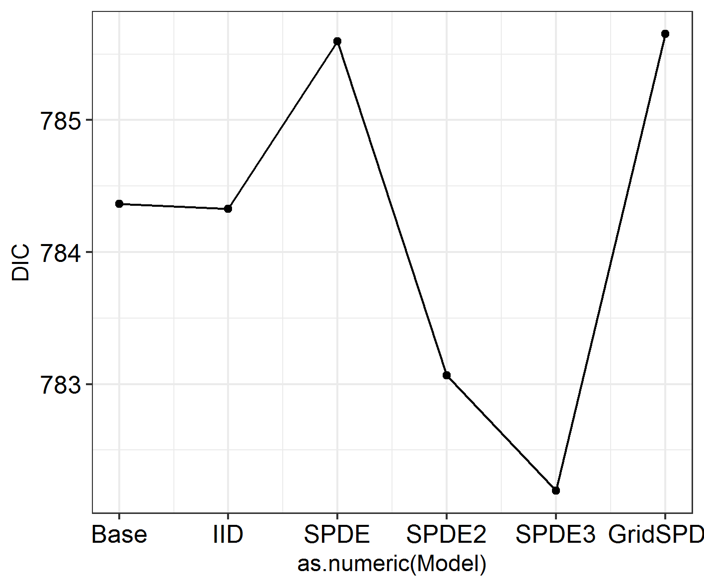
Nope!
TestHosts$Group <- TestHosts$Grid
Labels2 <- paste0("Grid ", 1:4)
names(Labels2) <- 1:4
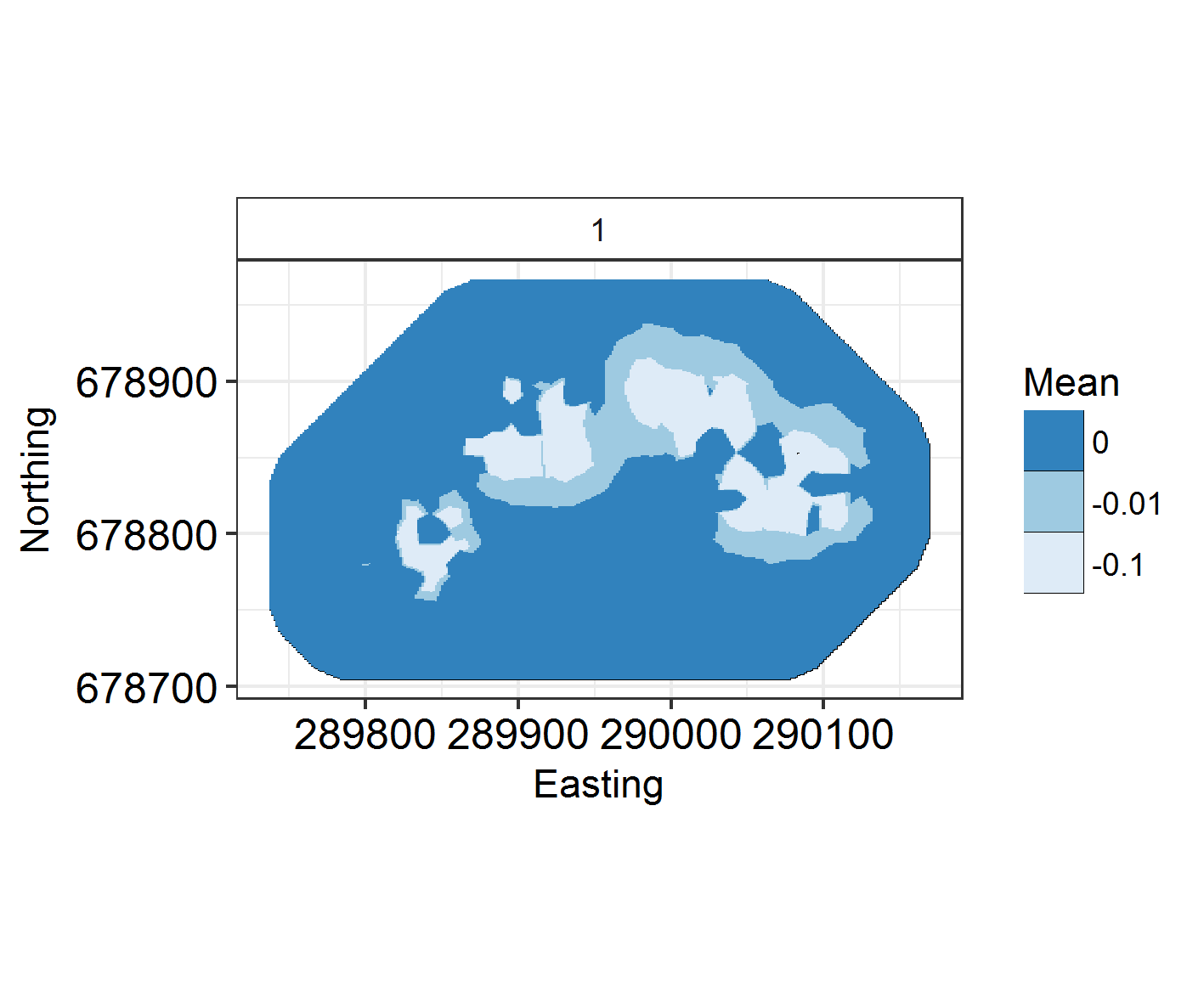
ggField(I6, Mesh2, Groups = NGroup2) +
facet_wrap(~Group, labeller = labeller(Group = Labels2)) + scale_fill_brewer(palette = "Oranges") +
ggsave("Fields6.png", units = "mm", width = 120, height = 100, dpi = 300)
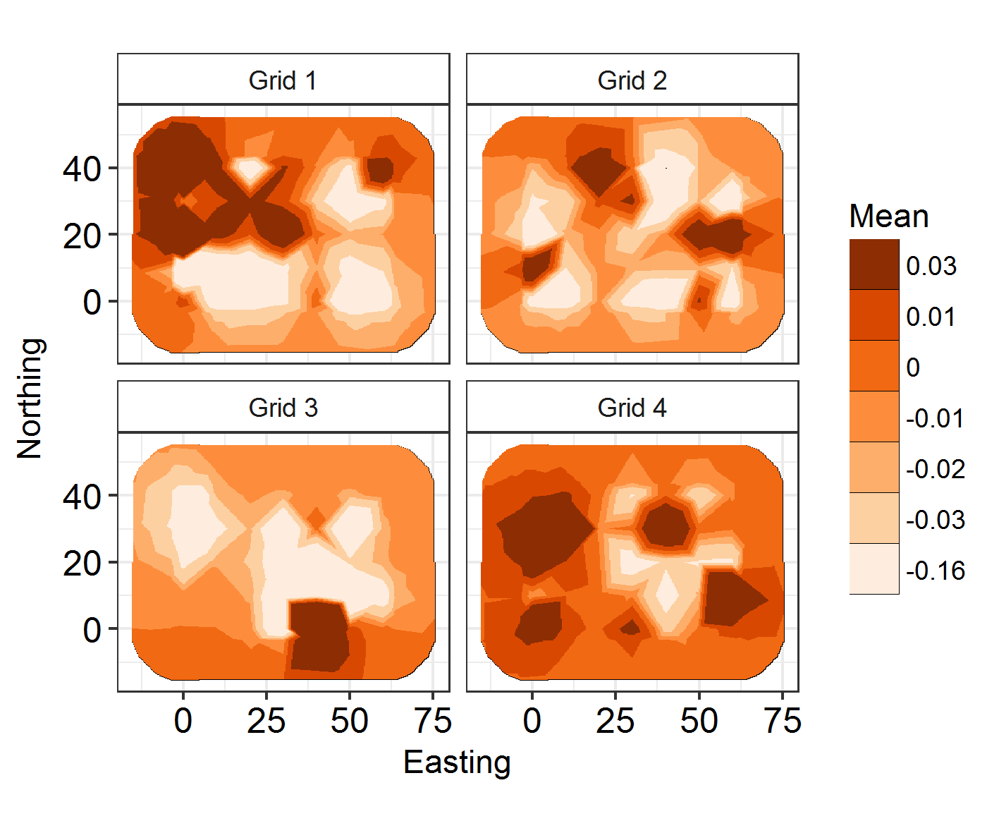
But the fields look cool!
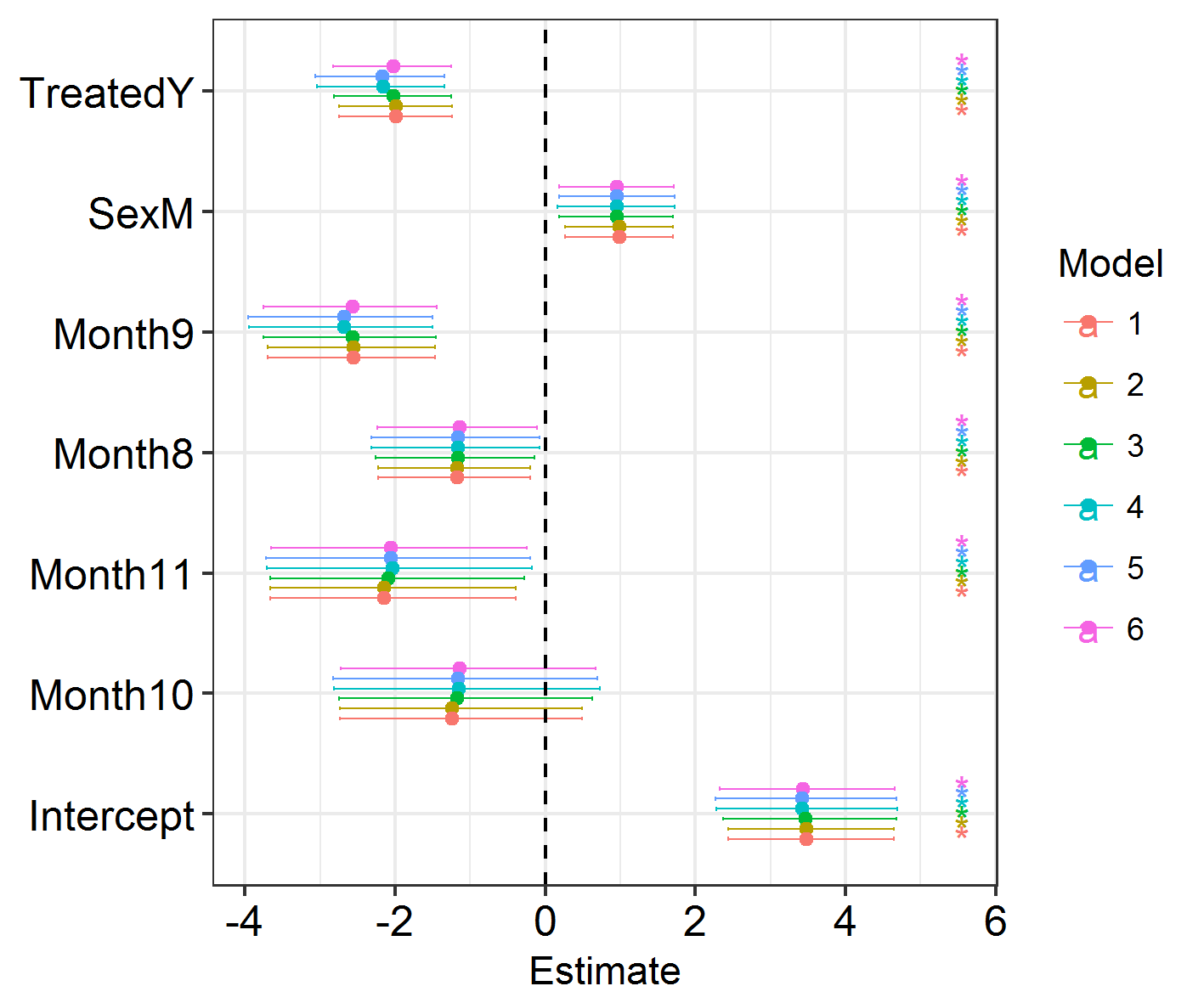
Final summary
The best-fitting model is SPDE 3 (model 5). This features different spatial fields for each month, with correlation between the fields. However, this formulation only slightly improves model fit over the non-spatial models, so we shouldn’t worry too much about the spatial effects we’re seeing! Good news. Also, if you run the code below, you will see that the effect estimates barely differ between these models. So, even though space has an effect, the effect is small and doesn’t modify our previous conclusions! Congratulations, your system is robust to spatial dependence effects!
Efxplot(SpatialHostList, ModelNames = c("Base", "IID", "SPDE", "SPDE2", "SPDE3", "GridSPDE"))
Added extras
- Adding interactions: You can’t have colons in the column names of the X matrix. Replace them with “_” using gsub or similar.
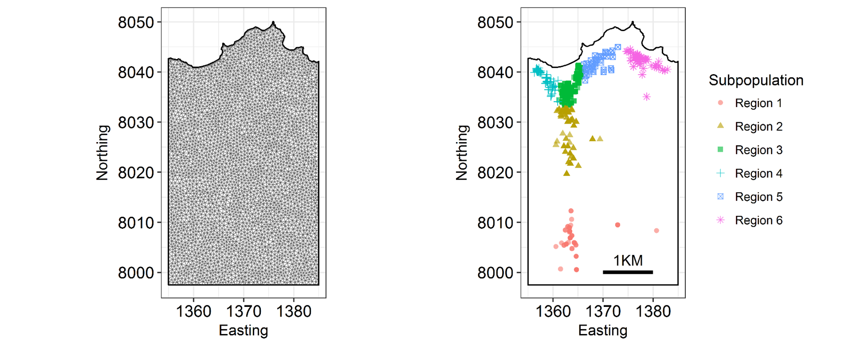
- You can add a boundary to your mesh using INLA to better represent your study system. Here’s an example with the Isle of Rum system I work on, portraying the coastline:
- You can also remove areas of the mesh where e.g. your organism can’t live, using the barrier functions.