Tutorial Aims:
- What is ANOVA and why is it important?
- Setting a research question
- Formulating a hypothesis
- Data manipulation
- Visualising distribution with a histogram
- Visualising means with a boxplot
- Running a simple one-way ANOVA
- BONUS
Many of the questions we ask in science are about differences. Are the observed differences between our experimental groups due to chance or not? For instance, “how does soil pH vary with depth?”, “how does egg hatching time vary with temperature?” Questions like these can be answered using an analysis of variance (ANOVA). Whether you have never used R before but want to learn how to run a simple ANOVA, or you are an R user that wants to understand ANOVA more in depth, this is the tutorial for you! We will go through how to run an ANOVA from start to finish, in a complete and comprehensive tutorial that will guide you step-by-step.
Please note that this tutorial is not a data visualisation tutorial, so don’t worry if you don’t understand all the code in detail: I will also share links to data visualisation tutorials if you want to get up to grips with that too!
All the files you need to complete this tutorial can be downloaded from this repository. Click on Code/Download ZIP and unzip the folder, or clone the repository to your own GitHub account.
What is ANOVA and why is it important?
If you have never used R before, do not despair! We’ve all been there. If you need to download R and RStudio on your personal devices, check out the Coding Club tutorial Getting Started with R and R studio. I also recommend the Troubleshooting and how to find help tutorial and the Coding Etiquette tutorial to familiarise yourself with the coding world! But do not worry, you don’t need to be coding geeks to learn how to run a simple ANOVA!
Let’s set things up.
Open RStudio, create a new script by clicking on File/New File/R Script.
A script is a text file which will contain all your code. This can be saved and your commands can be re-executed and/or modified later.
It is good practice to title your script appropriately. Essential information includes your name and contact details, date, content of the script and data source (and other sources such as image sources and licences). You can also specify your workflow: the main sections of your script, and what each will contain, to make navigation easier. See the script header below, which you can use as reference:
# Title: ANOVA for absolute beginners tutorial
# Script purpose: ANOVA to investigate how frogspawn hatching time varies with temperature.
# Author - contact details
# Date

# Sources and Licences:
# Data created by @ericazaja and licenced under the MIT agreement
# (https://github.com/EdDataScienceEES/tutorial-ericazaja/tree/master/LICENSE.md).
# Icons from website phylopic (http://phylopic.org/),
# distributed under the Creative Commons license (https://creativecommons.org/)
# Photos from Getty Images (https://www.gettyimages.co.uk/eula)
# made available for use (https://www.gettyimages.co.uk/eula)

### WORKFLOW: main sections ----
# 1. Setting up: working directory, loading libraries, importing data
# 2. Data formatting: tidying and exploring data
# 3. Data visualisation: histogram and boxplot
# 4. One-way ANOVA: model, table, assumptions
# 5. Communicating results: barplot
# 6. BONUS: adding phylopic and making panel
The # are used to add comments to your script. This tells R that what you’re writing is NOT a line of code to run, but an informative comment.
N.B. adding 4 or more “-“ after the headings creates an outline i.e. creates sections. To view your outline use Edit/Folding/Collapse all to collapse all sections and navigate to whichever section you need by clicking on the section header. To view all your code, Expand all sections.
Now, save your script using File/Save as. Remember to give your script an informative name, including your initials, the date and a little hint to the script’s purpose. The standard file format for scripts is .R e.g. “ANOVA_tutorial_EZ_2020.R”.
Save your script in a folder that will be your working directory: the folder in your computer where all your work (scripts, data, image outputs etc.) will be saved. N.B. multiple folders may be within your working directory. I recommend creating a folder named data in your working directory folder.
To set your working directory, you can click on Session in the top menu in RStudio and then on Set Working Directory/Choose directory and browse your folders.
### SETTING UP ----

# Set your working directory
setwd("/Users/ericazaja/Desktop/Data_Science/tutorial-ericazaja")
# N.B. Enter your own filepath.

getwd()  # Run this to check where your working directory is
To run your code, highlight the line you want to run and press Command and Enter if you’re using a Mac or Ctrl and R on Windows PC.
N.B. Working directories can be a bit confusing. If you don’t know where your work is being saved, run getwd() to see your working directory filepath. Run setwd() and type in your working directory filepath to set your working directory (alternatively to what we did above with Session). Filepaths have a different format if on a Mac vs a Windows PC: for a Mac, your working directory filepath will look something like this: setwd("~/Desktop/ANOVA") vs for a Windows PC it will look like this setwd("C:/Users/Name/Desktop/ANOVA"). For an example of setting a working directory, see this tutorial.
Have a look at this tutorial to learn how to create Git repositories and make your life easier using relative filepaths so that you never have to set your working directory again!
Next, we need to load the libraries we will use for the tutorial. Libraries are a cluster of commands used for a certain purpose (e.g. formatting data, making maps, making tables etc.). Before loading libraries, you must install the packages (the cluster of commands) that libraries load. You will only need to install packages once, while you will need to load libraries every time you close and reopen your script or restart your Rstudio. Make sure to install packages only once, since doing so multiple times can create problems.
# Loading Libraries
library(tidyverse)  # For data wrangling and data visualisation

# If you don't have the packages installed already, do so by uncommenting the code below
# install.packages("tidyverse")
tidyverse includes many packages that we will use throughout the tutorial, including dplyr (for data wrangling) and ggplot2 (for data visualisation).
1. What is ANOVA and why is it important?
ANOVA is one of the most used statistical analyses in the domain of ecological and environmental sciences.
It is also widely used in many social science disciplines such as sociology, psychology, communication and media studies.
In order to understand ANOVA, let’s remind ourselves of a few important definitions…
- Categorical variables contain a finite number of categories or distinct groups e.g. treatments, material type, payment method.
- Continuous variables are measurements along a continuous scale, numeric variables that have an infinite number of values between any two values eg. time, height.
- An explanatory variable (also called independent variable, factor, treatment or predictor variable) is a variable that is being manipulated in an experiment in order to observe its effect on a response variable (also called dependent variable or outcome variable).
The explanatory variable is the CAUSE and the response variable is the EFFECT.
Now, can you guess what ANOVA stands for? ….
ANOVA is used to assess variation of a continuous dependent variable (y) across levels of one or more categorical independent variables (x). As explained above, the latter are often referred to as “factors”. Each factor may have different categories within it, called levels.
You probably guessed it by now: ANOVA = Analysis of Variance!
![]()
In this tutorial, we will focus on a single factor design (i.e. the simplest) and we will learn how to run and interpret a ONE-WAY ANOVA. The basic logic of ANOVA is simple: it compares variation between groups to variation within groups to determine whether the observed differences are due to chance or not. A ONE-way ANOVA only considers ONE factor.
How do you know if ANOVA is the appropriate test for your data?
If your goal is to compare the means of 3 or more independent groups and you have one continuous response variable and ONE categorical explanatory variable with a number of levels, one-way ANOVA is the test for you!
See the path to your stats choice summarised in the diagram below:
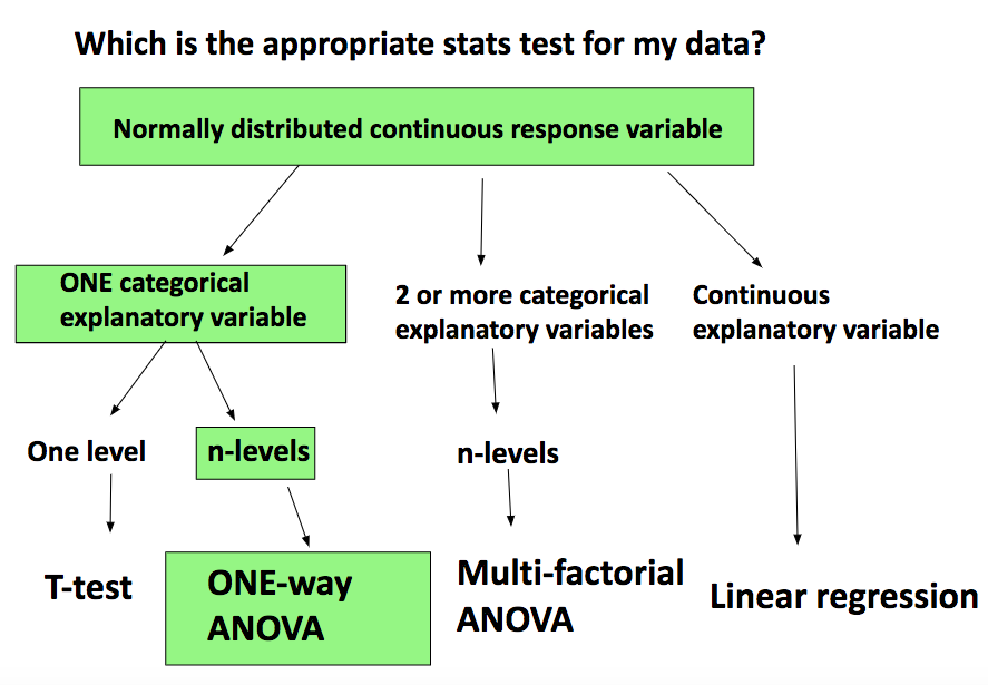
- If you want to compare 2 group means only, an independent t-test is appropriate.
- If you had 2 explanatory variables, a two-way ANOVA would be the appropriate test.
- If you had more than 2 explanatory variables, you’d need a multi-factorial ANOVA.
- If both variables are continuous, a linear regression to describe the relationship between them is appropriate. With a linear regression (or model) you obtain a slope that allows you to predict the response variable from any value of the explanatory variable.
N.B. ANOVA is a linear regression BUT the predictor variables are categorical rather than continuous. Moreover, instead of a slope, with ANOVA you obtain an estimate of the response variable for each explanatory variable category.
Note that you can run a linear regression with categorical variables (as we will do below).
If you are keen to learn how to build a simple linear model check out this tutorial.
2. Setting a research question
Always set your research question before you start thinking about which is the most appropriate statistical test to use on your data.
A research question is an answerable enquiry related to your topic of interest. It should be clear and concise and it should contain both your response and your explanatory variables.
In this tutorial, our research question is:
How does frogspawn hatching time vary with temperature?
Imagine we ran a manipulative experiment.
A manipulative study is one in which the experimenter changes something about the experimental study system and studies the effect of this change.
We collected newly-layed frogspawn from a pond in the Italian Alps and we brought them back to the lab, where we divided them into 60 water containers. 20 of the containers’ water temperature was kept to 13°C, 20 containers were kept to 18°C and the remaining 20 containers were kept to 25°C. Having a high number of replicates increases our confidence that the expected difference between groups is due to the factor we are interested in. Here, temperature.
We monitored each water container and we recorded hatching times (days until hatching of eggs) in a spreadsheet (here called frogs_messy_data.csv).
- Our response variable is
Hatching_time. - Our explanatory variable is
Temperature, with 3 levels: 13°C, 18°C and 25°C.
We want to compare the means of 3 independent groups (13°C, 18°C and 25°C temperature groups) and we have one continuous response variable (Hatching time) and one categorical explanatory variable (Temperature). One-way ANOVA is the appropriate analysis!
3. Formulating a hypothesis
Always make a hypothesis and prediction, before you delve into the data analysis.
A hypothesis is a tentative answer to a well-framed question, referring to a mechanistic explanation of the expected pattern. It can be verified via predictions, which can be tested by making additional observations and performing experiments.
This should be backed up by some level of knowledge about your study system.
In our case, knowing that frogspawn takes around 2-3 weeks to hatch under optimal temperatures (15-20°C), we can hypothesize that the lowest the temperature, the longer it will take for frogspawn to hatch. Our hypothesis can therefore be: mean frogspawn hatching time will vary with temperature level. We can predict that given our temperature range, at the highest temperature (25°C) hatching time will be reduced.
4. Data manipulation
Importing data
Now that we’ve set our research question, hypothesis and prediction, let’s load the datasheet (in R jargon, data frame) into R. I recommend saving your data in your working directory folder: it’s easier to import it, it’s more logical and you are less likely to wonder where the file went later on! Find the dataset in your working directory (data folder) on the bottom right panel of RStudio, then import it by using Import Dataset/Import.
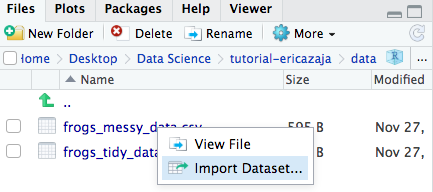
The code below will appear in your console (the bottom left panel of RStudio). The content of the console cannot be saved, so make sure to copy the code below into your script (top right panel) so when you run the script again in the future, the data will load automatically.
# Loading data
frogs_messy_data <- read_csv("data/frogs_messy_data.csv")  # Load the messy dataset

head(frogs_messy_data)  # Check that your data imported correctly
The dataset is in .csv (comma separated values) format. This is usually a good format to read into R, being a highly transferrable format, available for use across multiple platforms.
The head() function allows you to view the first few rows and columns of your dataset, to make sure the dataset has been correctly imported. It is important to do this because sometimes R can get confused with row and column names. Make sure to doublecheck!
Notice how we have chosen the name of the data frame object that our frogs_messy_data.csv will be imported as into R. We assign frogs_messy_data.csv to the object name frogs_messy_data via a little arrow <-.
R is in fact an object-oriented statistical programming language.
Find all the basics about R in the Intro to R tutorial.
Tidying data
Let’s take a closer look at our dataset. As you can see from a first glance, this data frame has Temperature13, Temperature18 and Temperature25 (the 3 levels of our explanatory variable) as separate columns within which the hatching time has been recorded for each frogspawn sample. This is our dataset in wide format.
However, for analysing data, we need to re-order the datasheet into long format: this means tidying the data so that each variable is a column and each observation is a row. See below the basic data wrangling code and learn more about data wrangling here.
### DATA FORMATTING ----

# Tidying the dataset
frogs_tidy_data <- gather(frogs_messy_data, Temperature, Hatching_time, c(2:4)) %>%
                   # Hatching times (value) to be gathered by Temperature (key)
                   mutate(Temperature = parse_number(Temperature)) %>%
                   # To get rid of the non-numerical part
                   select("Hatching_time", "Temperature") %>%
                   # Keeping only the columns we need for the analysis
                   na.omit()
                   # To get rid of missing values (NAs)

write.csv(frogs_tidy_data, file = "data/frogs_tidy_data.csv")
# Saving cleaned data frame (frogs_tidy.csv) file in the data folder in your working directory
# The write.csv() function will only work if you have created the tidy data frame before
The %>% used above is a pipe. This prevents the use of un-necessary intermediate objects, and makes the code shorter and more efficient. Learn more about pipes trying the Efficient Data Manipulation tutorial.
Tip:
If you wanted to rename your temperature levels to “Low”, “Medium”, “High”, you could create a new column called Temp_level using mutate() function:
# mutate(Temp_level = case_when(Temperature == 13 ~ 'Low', Temperature == 18 ~ 'Medium', Temperature == 25 ~ 'High'))
# When temperature is equal to ("==") "..." , return (~) "...".
Always explore the dataset you’re working with. To check out what kind of data we are dealing with we can use the str() function.
str(frogs_tidy_data) # Exploring data
You can see that Hatching_time and Temperature are both numerical variables. Is this right?
Now is a good time to think about what you want to achieve with your dataset. Remember the research question: How does frogspawn hatching time vary with temperature?
We want to model hatching time as a function of temperature.
Temperature is our explanatory variable and it is here coded as numerical variable, when it should be coded as factor (categorical variable) with 3 levels (“13”, “18”, “25”). The numbers represent the different categories of our explanatory variable, not actual count data. We therefore need to transform Temperature from numeric to factor variable.
frogs_tidy_data$Temperature <- as.factor(as.character(frogs_tidy_data$Temperature))
# Makes temperature into factor variable
The dollar sign $ isolates the column Temperature from the data frame frogs_tidy_data. Temperature is therefore a vector: an ordered sequence of values of the same type.
A data frame is 2 dimensional (rows and columns) whereas a vector is 1 dimensional.
5. Visualising distribution with a histogram
Always have a look at the distribution of your response variable before delving into the statistical analysis. This is because many parametric statistical tests (within which ANOVA) assume that continuous dependent variables are normally distributed, so we must check that assumptions are met to trust our model’s output.
Note that data can be log-transformed to meet normality assumptions. Alternatively, non-parametric tests are available for non-normally distributed data. Have a look at this tutorial for examples of non-parametric testing in R.
We can plot a histogram to have a look at the frequency distribution of our response variable.
First, we can make sure that all the figures we make will be consistent and beautiful using this theme. A theme is like a template: it will make all the figures you apply it to have similar features (e.g. font size, line width, colour palette…). For now, just copy the code below, since data visualization is not the focus of this tutorial. But if you want to learn more about customising your plots, check out this tutorial.
# Data visualisation ----

theme_frogs <- function(){  # Creating a function
  theme_classic() +  # Using pre-defined theme as base
  theme(axis.text.x = element_text(size = 12, face = "bold"),  # Customizing axes text
        axis.text.y = element_text(size = 12, face = "bold"),
        axis.title = element_text(size = 14, face = "bold"),  # Customizing axis title
        panel.grid = element_blank(),  # Taking off the default grid
        plot.margin = unit(c(0.5, 0.5, 0.5, 0.5), units = , "cm"),
        legend.text = element_text(size = 12, face = "italic"),  # Customizing legend text
        legend.title = element_text(size = 12, face = "bold"),  # Customizing legend title
        legend.position = "right",  # Customizing legend position
        plot.caption = element_text(size = 12))  # Customizing plot caption
}
Next, let’s build the histogram with ggplot, a package with which you can make beautiful figures. Think of ggplot as an empty room, to which you gradually add more and more furniture, to make it look pretty, until it’s tidy, useful and beautiful! We add elements to our ggplot with +. Again, don’t worry if you don’t understand all the elements of the code below, copy the content and keep the goal in mind: ANOVA!
# Creating a histogram with ggplot
(frog_histogram <- ggplot(frogs_tidy_data, aes(x = Hatching_time, fill = Temperature)) +
# Plotting from the tidy data frame and colouring bars by Temperature
                   geom_histogram(stat = "count") +
                   # Makes height of bars proportional to number of cases in each group
                   geom_vline(aes(xintercept = mean(Hatching_time)),
                              colour = "red", linetype = "dashed", size = 1) +
                              # Adding a line for mean abundance
                   scale_fill_manual(values = c("#97F7C5", "#4ED973", "#08873D")) +
                   # Adding custom colours
                   labs(x = "\n Hatching time (days)", y = "Frequency \n",
                   # Adding x and y axis labels.
                   # "\n" adds space before x and after y axis text
                         caption = "\n Fig.1 Response variable (hatching time) is normally
                         distributed in each treatment group (temperature levels). Red dashed
                         line shows mean hatching time. n = 60.") +
                         # Adding informative figure caption
                         # caption = "\n Fig.1") +  # Adding caption for figure in panel
                   theme_frogs() +  # Adding our personalised theme
                   guides(fill = guide_legend(title = "Temperature level (°C)")))
                   # Adding an informative legend title
N.B adding () around the whole plotting code allows you to visualise the plot on the bottom right panel of R (Plots window) simultaneously as running the code. Without (), you would need to run the frog_histogram object by itself (adding a line of code to your script that says only frog_histogram), after running the plotting code above, in order to actually see your plot.

Always include informative figure captions. These must include a sentence with the main take-home message from the figure, explanation of the graph’s elements (e.g. raw data points, dashed line for mean, S.E. bars…), the data source and your sample size (n = …).
You can save your graphs with ggsave, saving the figure in the appropriate folder (assets/img/), with the appropriate file name (frogs_histogram). Make sure you change the code below to your specific filepath. Make sure names are concise but informative.
ggsave(frog_histogram, file = "assets/img/frog_histogram.png", width = 9, height = 7)
You can customise length and width that the picture is saved in with width = "" and height = "". Make sure nothing gets cropped or figures are too squished. You can save pictures in different formats but usually .pdf (figures don’t decrease in quality when you zoom in or out) or .png (easily inserted in text documents) are the best way.
From the histogram above we can assume that the data is normally distributed for all of our 3 Temperature groups (each histogram peaks in the middle and is roughly symmetrical about the mean). If you are unsure about data distributions, check out tutorial From distributions to linear models.
6. Visualising means with a boxplot
Let’s keep exploring our dataset, using a boxplot.
A boxplot allows you to look at the variation in a continuous variable across categories, at the spread of your data and it gives you an idea of what you might find with ANOVA in terms of differences between groups. If boxes do not overlap, you probably have significant differences between groups, but you must verify this via statistical analysis.
You can use ggplot (see below) or you can create a boxplot with: boxplot(Hatching_time ~ Temperature, data = frogs_tidy_data).
# Creating a boxplot with ggplot
(frog_boxplot <- ggplot(frogs_tidy_data, aes(x = Temperature, y = Hatching_time,
                                            fill = Temperature)) +
                 geom_boxplot() +
                 scale_fill_manual(values = c("#97F7C5", "#4ED973", "#08873D")) +
                 labs(x = "\nTemperature level (°C)", y = "Hatching time (days)",
                      caption = "\n Fig.2 Forgspawn exposed to lowest temperature (13°C) was
                       the slowest to hatch. n = 60.") +
                      # caption = "\nFig.2") +  # Caption for figure in panel
                 theme_frogs() +
                 theme(legend.position = "none"))  # Over-writing our theme() to get rid of legend

# Saving boxplot
ggsave(frog_boxplot, file = "assets/img/frog_boxplot.png", width = 9, height = 7)
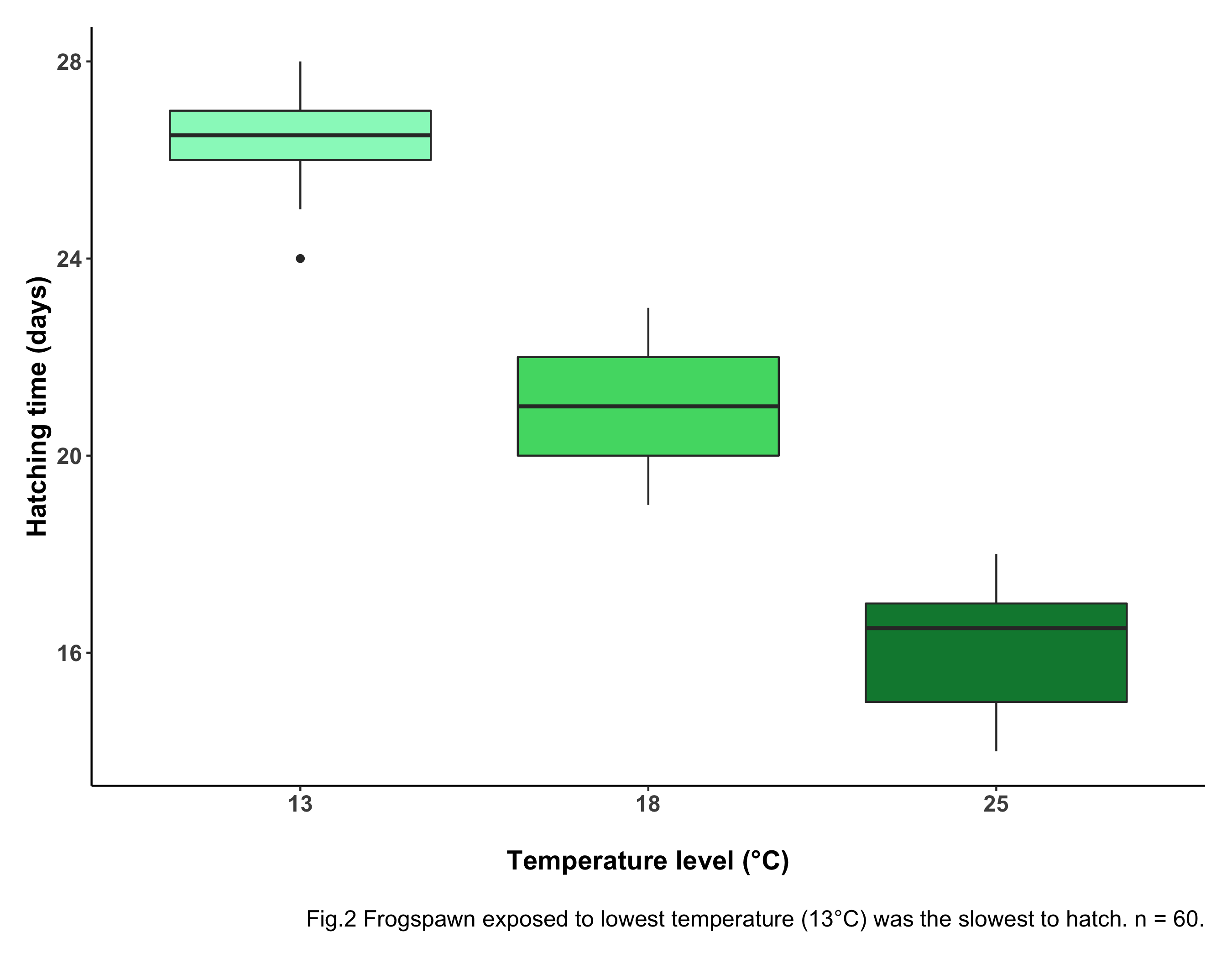
Boxes give a measure of variability. Boxes encompass 50% of each group’s values: 25% of values are above the range and 25% below the range. This is therefore useful to know where most of the datapoints fall. The horizontal black lines at the center of each box represent the median. The whiskers (vertical black lines at the top and bottom of each box) are a measure of variability: the wider the whiskers, the more variable the data.
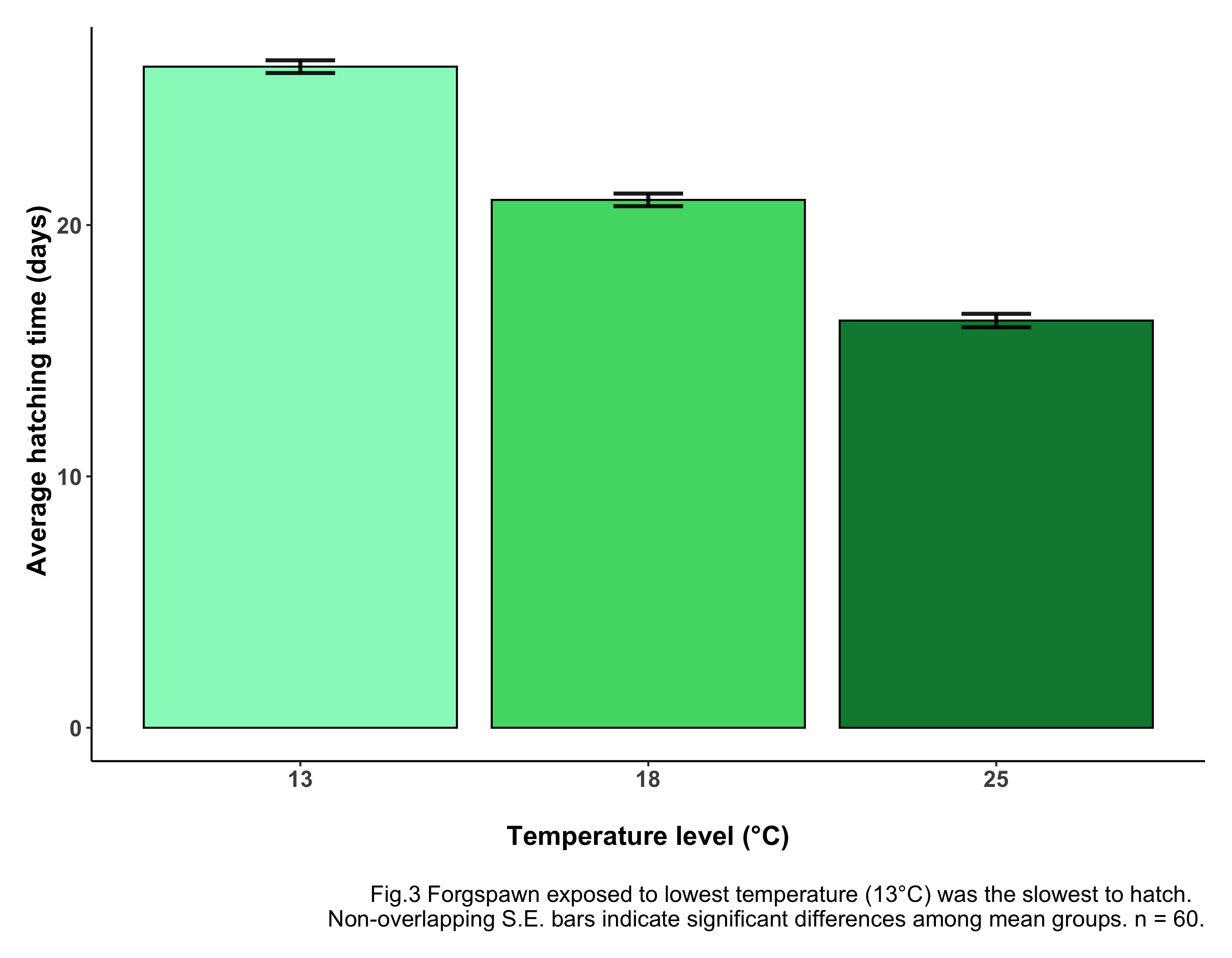
Having a look at our boxplot, you can see something is going on here: the frogspawn exposed to the lowest temperature take the longest to hatch. The eggs exposed to the highest temperature take the least time to hatch, as predicted! The boxes don’t overlap, meaning there is likely a statistically significant difference between groups. To check this (you guessed it) we need ANOVA!
7. Running a simple one-way ANOVA
We’re all set. We can now code the ANOVA!
Keep the goal in mind: analysing hatching time as a function of temperature level.
### ONE-WAY ANOVA -----

frogs_anova <- aov(Hatching_time ~ Temperature, data = frogs_tidy_data)
summary(frogs_anova)
You can read your modelling code as if it was a sentence: the code above runs the ANOVA test (aov), analysing hatching time (Hatching_time) as a function of (~) temperature level (Temperature), getting data (data = ...) from the data frame frogs_tidy_data.
Visualising model output table and interpreting it
The summary() function shows you the summary output of your ANOVA, also known as your ANOVA table, with degrees of freedom, F value and p value (all the info we need!).
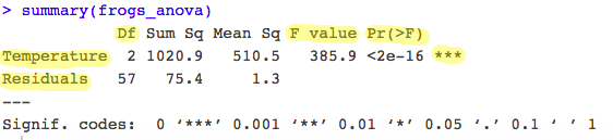
See highlighted in the table above the most important information from the model output.
- ANOVA partitions the total variance into: a) A component that can be explained by the predictor variable (variance between levels of the treatment i.e. Temperature groups): the first row of your table. b) A component that cannot be explained by the predictor variable (variance within levels, the residual variance): the second row of your table.
- The test statistic, F, is the ratio of these two sources of variation:
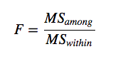 with MS (mean squares) being a measure of variation.
 - The probability of obtaining the observed value of F is calculated from the known probability distribution of F, with two degrees of freedom: one for the numerator (the number of levels -1) and one for the denominator (number of replicates – 1 x number of levels). Hence in our case
Df between levels = 3-1 = 2andDf within levels = 60 - 3 = 57. This represents how many values involved in the calculation have the freedom to vary. - The ANOVA shows the associated p value to the F statistic. The p-value is the probability of the observed F value from the F distribution (with the given degrees of freedom). The p-value is our threshold of significance.
A p-value is the probability of seeing a test statistic as big or bigger than the one we actually observed if the null hypothesis is true. If p < 0.05 we reject the null hypothesis. However, the test should be repeated multiple times to be able to confidently accept or reject the null hypothesis.
Here, p is highly significant (p < 2e-16 ***). This means there is a significant difference between hatching times under different temperature levels. Our predictor variable has had a significant effect on your response variable.
N.B. p is an arbitrary value. So beware of it! It’s not a universal measure and it can be misleading, resulting in false positives. Read more about p values and their drawbacks in this blog post on the Methods in Ecology and Evolution: blog “There is Madness in our methods”.
If you want more details about your analysis, you can run the same code but using a lm linear model function. As mentioned above, ANOVA is in itself a linear model.
## LM

frogs_lm <- lm(Hatching_time ~ Temperature, data = frogs_tidy_data)
summary(frogs_lm)
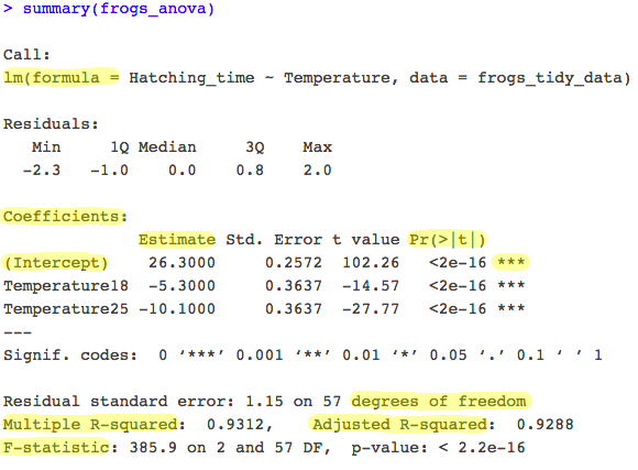
- The output table includes the formula you used. Remember that ANOVA gives you an estimate of the response variable for each explanatory variable category.
- R takes the first category in alphabetical order (the first factor level) and makes it the intercept: the estimates of other categories are presented relative to this reference level (
Temperature13). - The output therefore shows that at temperature of 13°C, frogspawn hatched after an average of 26.3 days (the intercept in the model).
- The other parameter estimates (
Temperature18andTemperature25) are differences between each level of temperature and the intercept. For example, at 18°C frogspawn hatched 5.3 days faster (i.e., themean hatching time for 18°C = 26.3 - 5.3 = 21 days). - The
lmoutput table also shows you your R-squared value: the amount of variation in the response variable explained by the explanatory variable. Here you see our R-squared is 0.93. This means 93% (it’s HUGE!) of the variation seen is given by Temperature level, and the remaining 7% is given by confounding factors (other factors affecting our response variable outside of the explanatory variable we are monitoring). The adjusted R-squared takes into account how many terms your model has and how many datapoints are available in the response variable. It is generally better to report the adjusted R-squared value.
If you don’t understand everything in detail right now, don’t worry! Take it slow. Statistics can be a difficult subject, especially if you’re new to them! You might want to pause the tutorial here, make a cup of tea and go back to it later.
But if you feel like going ahead…
You are almost there! We now need to check ANOVA assumptions and visualise our results.
Checking assumptions
ANOVA makes 3 fundamental assumptions:
a. Data are normally distributed.
b. Variances are homogeneous.
c. Observations are independent.
We need to check that model assumptions are met, in order to trust ANOVA outputs. Let’s check these one by one with specific plots:
a. Residuals histogram and Normal Q-Q plot: Normality can be checked via a frequency histogram of the residuals and a quantile plot where the residuals are plotted against the values expected from a normal distribution.
Residuals are the deviation of individually measured samples from the mean.
What to look for: The histogram of residuals should follow a normal (gaussian) distribution and the points in the Q-Q plot should lie mostly on the straight line.
# Checking normality
par(mfrow = c(1,2))  # This code put two plots in the same window
hist(frogs_anova$residuals)   # Makes histogram of residuals
plot(frogs_anova, which = 2)   # Makes Q-Q plot
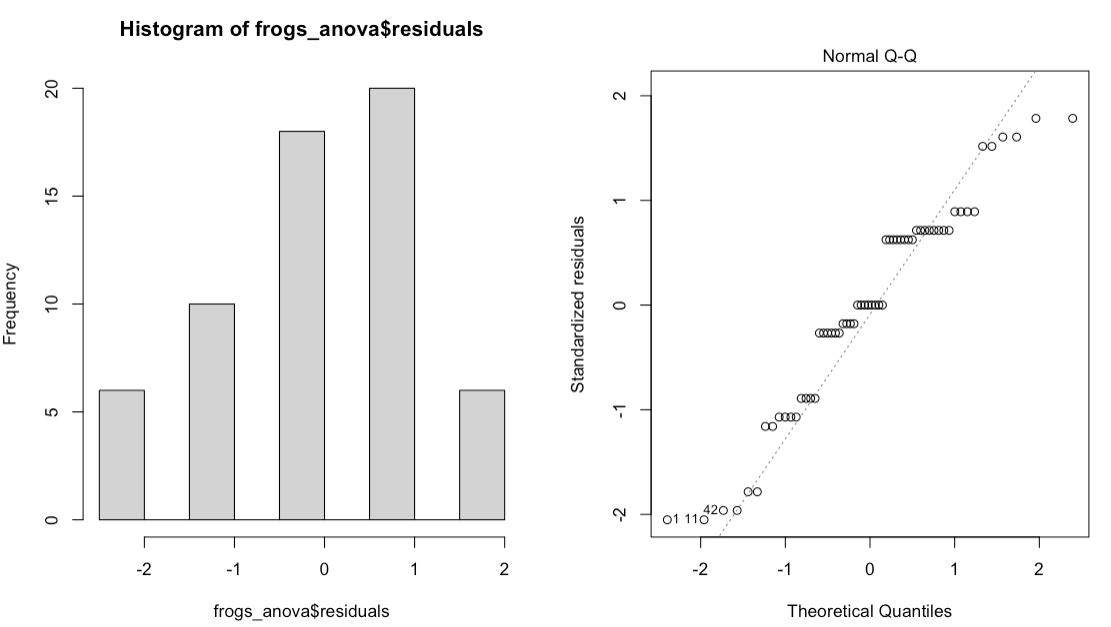
If the normality asumption is not met, you can log-transform your data into becoming normally distributed or run the non-parametric alternative to ANOVA: Kruskal-Wallis H Test.
b. Residuals VS Fitted plot: To check that the variation in the residuals is approximately equal across the range of the predictor variable (i.e. check for homoscedasticity) we can plot the residuals against the fitted values from the aov model object.
Fitted values are what the model predicts for the response variable.
What to look for: We want to see a straight red line centered around zero! This means residuals do NOT systematically differ across different groups.
# Checking homoscedasticity (Homogeneity of variances)
plot(frogs_anova, which = 1)  # Makes residuals VS fitted plot
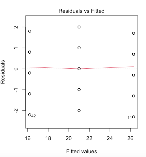
If the homogeneity of variances assumption is violated, run a Welch F test and add into your results section that this assumption was violated.
c. ANOVA assumes that all replicate measures are independent of each other:
Two measures are independent if the measurement from one individual gives no indication as to which value the measurement from another individual will produce.
Replicate measures must be equally likely to be sampled from the population of possible values for each level. This issue needs to be considered at the experimental design stage. If data are grouped in any way, then more complex designs are needed to account for additional factors. A mixed model approach is advised for hierarchical data. Have a look at the Linear mixed models tutorial for more info.
Our data does not violate any of the ANOVA assumptions: we can therefore trust our model output! If assumptions are not 1000% met, no panic! Most of the time it is enough for assumptions to be roughly met.
Now we need to communicate our results.
Communicating model results with a barplot
We can comminucate our findings in a few ways:
- Verbally: “Frogspawn mean hatching time significantly varied with temperature (ANOVA, F = 385.9, df = 2, 57, p = 2.2e-16)” OR “Temperature level had a statistically significant effect on frogspawn mean hatching time (ANOVA, F = 385.9, df = 2, 57, p = 2.2e-16)”.
After running an ANOVA, always report at least your F value, degrees of freedom and p value.
- Visually: We can visualise our results with a boxplot, as we did above, and with a barplot of group means with standard error bars.
Firstly, let’s create a new data frame with the summarise() function, which allows you to calculate summary statistics including our sample size (n), mean hatching time per temperature level, standard deviation and standard error values.
summary_stats <- frogs_tidy_data %>%
                 group_by(Temperature) %>%
                 summarise(n = n(),  # Calculating sample size n
                           average_hatch = mean(Hatching_time),
                           # Calculating mean hatching time
                           SD = sd(Hatching_time))%>%  # Calculating standard deviation
                 mutate(SE = SD / sqrt(n))  # Calculating standard error
Standard deviation is a measure of the spread of values around the mean. Standard error is a measure of the statistical accuracy of an estimate.
If you don’t fully grasp the code above, check out the Efficient Data Manipulation tutorial. Also, have a look here for how to calculate standard deviation and standard error.
Now, let’s plot our graph. Don’t worry if you are unclear about some of the elements below. If you’re keen, learn how to make your figures extra pretty with the Data Visualisation tutorial.
# Making a barplot
(frog_barplot_1 <- ggplot(data = summary_stats) +
                   geom_bar(aes(x = Temperature, y = average_hatch,
                               fill = Temperature),
                               stat = "identity", colour = "black") +
                   geom_errorbar(aes(x = Temperature, ymin = average_hatch - SE,
                                     ymax = average_hatch + SE), width = 0.2,
                                     colour="black", alpha=0.9,size=1) +
                                     # Adding standard error bars
                   scale_fill_manual(values = c("#97F7C5", "#4ED973", "#08873D")) +
                   labs(x = "\nTemperature level (°C)", y = " Average hatching time (days)",
                       caption = "\nFig.3 Forgspawn exposed to lowest temperature (13°C) was
                       the slowest to hatch. Non-overlapping S.E. bars indicate significant
                       differences among mean groups. n = 60.") +
                       # caption = "\nFig.3") +  # Adding caption for figure in panel
                   theme_frogs() +
                   theme(legend.position = "none"))
There you go! Well done for making it this far! You have accomplished a lot, you should be proud of yourself! Now, you can stop here (by all means!) or, if you’re keen, scroll down for some extra data visualisation tips that will make your figures look super professional! You won’t regret it!
Conclusion
Well done for getting through the tutorial! Here’s a summary of what you have learned:
- How to formulate a clear research question
- How to tidy your data
- How to run a simple one-way ANOVA with
aovandlm - How to read and interpret ANOVA outputs
- How to communicate and visualise your results
If you are keen to see a few cool data visualisation tricks, keep scrolling…
8. BONUS:
Adding icons with phylopic
Click here to view
Do you want your figure to look 100 times better, with just a few extra lines of code?
Add an icon to your plot with just a few clicks! Believe me, once you start, you’ll get addicted and you’ll put animal or plant icons wherever you can! See code below:
# Extra Libraries
library(RCurl)  # For loading icons
library(rphylopic)  # For using pictures from website phylopic
library(png)  # For loading pictures in png format

# If you don't have the libraries, uncomment code below:
# install.packages("RCurl")
# install.packages("rphylopic")
# install.packages("png")

# Animal icon: loading frog logo
frog <- "http://phylopic.org/assets/images/submissions/c07ce7b7-5fb5-484f-83a0-567bb0795e18.256.png"
# Link of icon, from phylopic website
frog_logo <- readPNG(getURLContent(frog))  # Loading the logo into R
Now re-run the code for the barplot, adding the add_phylopic() function:
(frog_barplot <-  ggplot(data = summary_stats) +
                  geom_bar(aes(x = Temperature, y = average_hatch,
                               fill = Temperature),
                               stat = "identity", colour = "black") +
                  geom_errorbar(aes(x = Temperature, ymin = average_hatch - SE,
                                    ymax = average_hatch + SE), width = 0.2,
                                    colour="black", alpha=0.9, size=1) +
                  scale_fill_manual(values = c("#97F7C5", "#4ED973", "#08873D")) +
                  add_phylopic(frog_logo, alpha = 1, x = 3, y = 23, ysize = 4) +
                  # Adding frog logo to the plot
                  labs(x = "\nTemperature level (°C)", y = " Average hatching time (days)",
                       caption = "\nFig.4 Forgspawn exposed to lowest temperature (13°C) was
                       the slowest to hatch. Non-overlapping S.E. bars indicate
                       significant differences among mean groups. n = 60.") +
                       # caption = "\nFig.3") +  # Adding caption for figure in panel
                  theme_frogs() +
                  theme(legend.position = "none"))

ggsave(frog_barplot, file = "assets/img/frog_barplot.png", width = 9, height = 7)
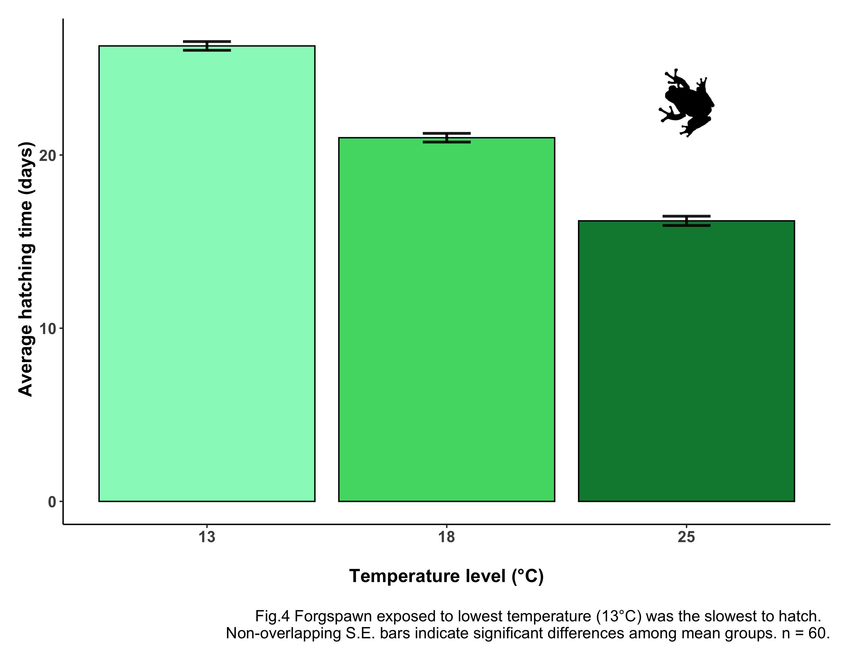
Oh, look! A frog just jumped on your screen! How much more professional does that look now? Just with a few clicks, your figure is now more communicative, more effective and much prettier!
If you can’t find the icon straight away, no panic! I promise you, it’s there! It’s just hidden. Maybe the x and y values (where the icon’s center will be) are a bit off. Maybe the icon is way too big or way too small. All you need to do is adjust the icon’s settings. Now, the way I see it is as a game: can you find the frog?
You can find many more animal and plant icons on the phylopic website!
Find out more about how to insert a phylopic here.
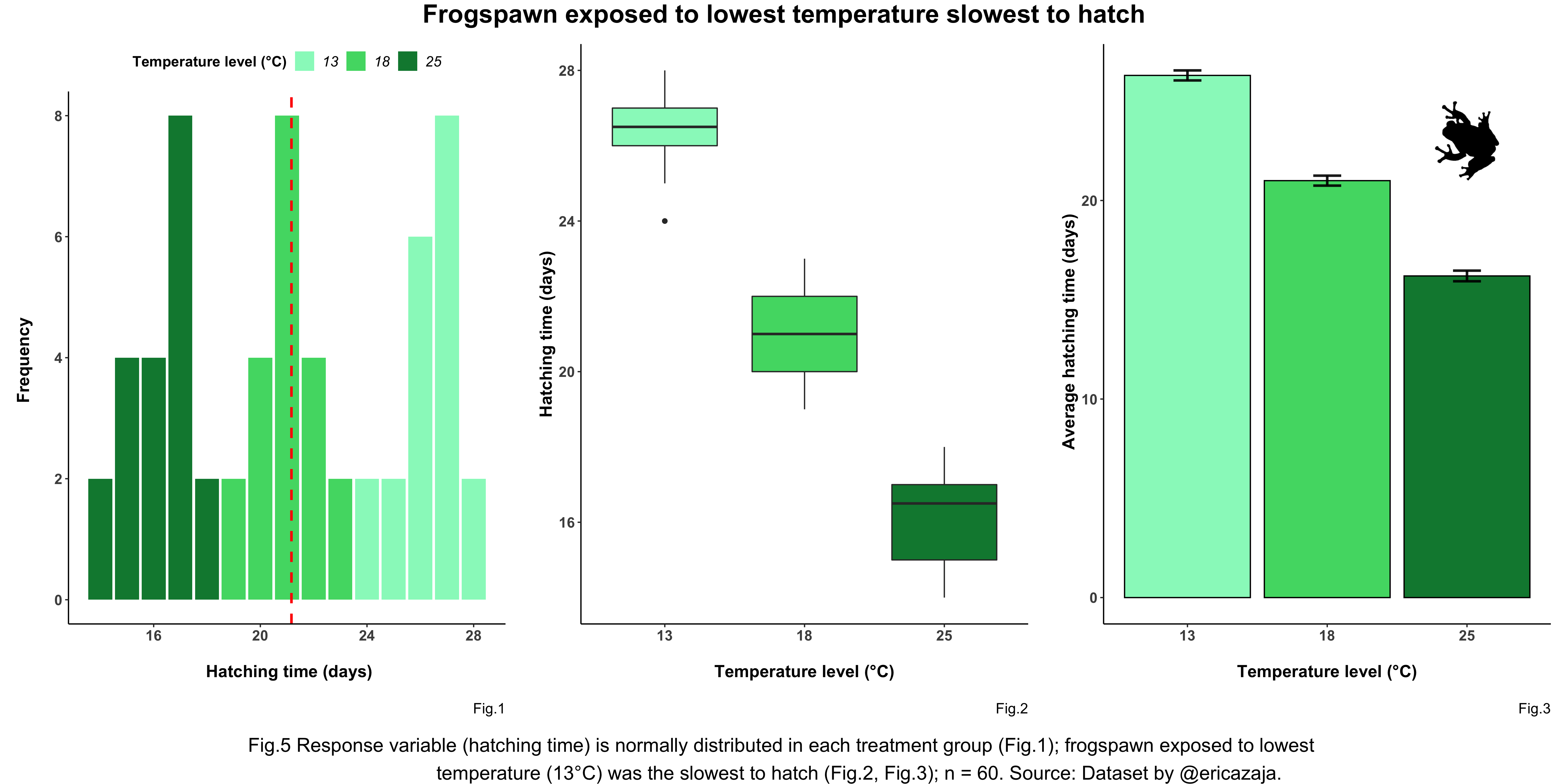
Making a panel with gridExtra
Click here to view
To visualise all your main output figures together, you can put them all into a panel. This may be useful in a paper, if you want to display all your outputs in one place so that they clearly convey the main message of your ANOVA.
Remember you will need to make changes to your figures, when putting them in a panel. You might want to simplify the individual captions of the figures, and make a caption for the whole panel. In this tutorial I have created shorter captions for individual figures to be put into the panel (see code above and uncomment the lines with short captions).
Make sure you can see all plots clearly, and that nothing gets squished! Add an informative title at the top of your plot, clearly communicating your message/main finding.
We will need a few extra libraries.
# Extra Libraries
library(gridExtra)  # For making panels
library(ggpubr)  # For data visualisation formatting

panel_title <- text_grob("Frogspawn exposed to lowest temperature slowest to hatch",
                          size = 21, face = "bold")  # Customising panel title

panel_caption <- text_grob("Fig.5 Response variable (hatching time) is normally distributed in
                            each treatment group (Fig.1); frogspawn exposed to lowest
                            temperature (13°C) was the slowest to hatch (Fig.2, Fig.3);
                            Source: Dataset by @ericazaja.", size = 16)   # Customising panel caption

# Making the panel
(frog_panel <- grid.arrange(arrangeGrob(frog_histogram, frog_boxplot,
                            frog_barplot, ncol = 3),  # Sets number of panel columns
                            top = panel_title,  # Adding panel title
                            bottom = panel_caption))  # Adding panel caption

ggsave(frog_panel, file = "assets/img/frog_panel.png", width = 18, height = 9)
Pre-registrations
Click here to view
A little tip for science good-practice..
When carrying out research, before you delve into data collection and analysis, it is important to write a pre-registeration.
Writing a pre-registration means specifying your research plan in advance of your study and submitting it to a registry, such as the Center for Open Science.
You should pre-register the following:
- Your study aims and research question
- Your hypothesis and prediction
- Your sample size and any spatio-temporal structures data may have
- Your planned statistical analysis
- Your expected results
…so that they are “set in stone”.
This is done in order to prevent what is known as p-hacking i.e. conducting multiple forms of the analysis and reporting only the one with the lowest p value (i.e. the strongest relationship) hence “more surprising” and - most of all - “more publishable” result.
This is bad practice and should be discouraged! Pre-registrations are a good way to be more transparent and encourage data sharing and honest research. Plus, thinking before acting is always a good idea! In coding and in life!
There are many platforms where you can make a pre-registration, for example the Open Science Framework. Find out more about Transparency in Ecology and Evolution here.
Extras
If you enjoyed the tutorial and you’re keen to learn more about statistics, Coding Club has got you covered! Ecological data often has a hierarchical structure, best analysed via linear mixed models: check out this tutorial to learn more! Interested to explore how to use Bayesian modelling? Click here!
# Need a motivational boost?
library(praise)
praise()