Tutorial Aims:
- Formatting time series data
- Visualising time series data
- Statistically analysing time series data
- Challenge yourself with new data
In this tutorial, we will explore and analyse time series data in R. Time series analysis is a powerful technique that can be used to understand the various temporal patterns in our data by decomposing data into different cyclic trends. Time series analysis can also be used to predict how levels of a variable will change in the future, taking into account what has happened in the past. By completing this workshop, you will learn not only how to do some simple time series analysis, but also how to prepare temporal data so that R understands that the data points occur in a distinct sequence, which is an art in itself.
All the resources for this tutorial, including the data and some helpful cheatsheets can be downloaded from this github repository. Before we start, clone and download the repo as a zipfile, then unzip it.
Alternatively, you can fork the repository to your own GitHub account and then add it as a new RStudio project by copying the HTTPS/SSH link. For more details on how to register on GitHub, download git, sync RStudio and GitHub and use version control, please check out our git and version control tutorial.
First up, open RStudio, make a new script by clicking File/ New File/ R Script and we are all set to learn about time series analysis!
Set your working directory to the location of the folder you just downloaded from the GitHub repository. Use the code below as a guide, but remember that the location of the folder on your computer will be different:
setwd("~/Downloads/CC-time-series-master")
Next, load (library()) the packages needed for this tutorial. If this the first time you’re using these packages, you’ll need to install them first (e.g. by running install.packages("ggplot2) and afterwards you can load them using library(). You only need to install packages once, but you have to load them in every new RStudio session.
library(ggplot2)
library(forecast)
library(dplyr)
library(colortools)
Next up, load the .csv files we will be using for this workshop - those are the sample time series data we will be analysing, but you can also have a go using your own data.
monthly_milk <- read.csv("monthly_milk.csv")  # Milk production per cow per month
daily_milk <- read.csv("daily_milk.csv")  # Milk production per cow per milking
1. Formatting time series data
The most common issue when using time series data in R is getting it into a format that is easily readable by R and any extra packages you are using. A common format for time series data puts the largest chunk of time first (e.g. year) and gets progressively smaller, like this:
2017-02-25 18:30:45
This can be generalised to YYYY-MM-DD HH:MM:SS. If you can record your data in this format to begin with, analysis will be much easier. If time isn’t important for your measurements, you can drop the HH:MM:SS bit from your records.
The data in monthly_milk shows the monthly milk production by a herd of cattle between 1962 and 1975. First, we should check the form of the data set:
head(monthly_milk)

class(monthly_milk)

class(monthly_milk$month)
head(monthly_milk) shows us that the month column is in a sensible format (YYYY-MM-DD) and contains no time data. class(monthly_milk) shows us that the data is in the form of a data frame, which is ideal. However, class(monthly_milk$month) shows us that the data in the month is currently being interpreted as a character, which means it is simply treated as text. If we tried to analyse this data in its current form, R wouldn’t understand that 1962-01-01 represents a point in time and comes a month before 1962-02-01. Luckily, R also has a Date class, which is much easier to work with. So let’s coerce the data to the Date class:
# Coerce to `Date` class
monthly_milk$month_date <- as.Date(monthly_milk$month, format = "%Y-%m-%d")

# Check it worked
class(monthly_milk$month_date)
Data in the Date class in the conventional YYYY-MM-DD format are easier to use in ggplot2 and various time series analysis packages. In the code above, format = tells as.Date() what form the original data is in. The symbols %Y, %m, %d etc. are codes understood by many programming languages to define date class data. Note that as.Date() requires a year, month, and day somewhere in the original data. So if the original data doesn’t have one of those, you can add them manually using paste(). You will see an example of using paste() to add date information later on when we run some forecast models. Here is an expanded table of date codes, which you can use for reference:
| Name | Code | Example |
|---|---|---|
| Long year | %Y | 2017 |
| Short year | %y | 17 |
| Numeric month | %m | 02 |
| Abbreviated month | %b | Feb |
| Full month | %B | February |
| Day of the month | %d | 25 |
| Abbreviated weekday | %a | Sat |
| Full weekday | %A | Monday |
| Day of the week (1-7) | %u | 6 |
| Day of the year | %j | 56 |
To transform a Date class object into a character format with an alternative layout, you can use format() in conjunction with any of the date codes in the table above. For example you could transform 2017-02-25 into February - Saturday 25 - 2017. But note that this new character format won’t be interpreted as a date by R in analyses. Try a few different combinations of date codes from the table above, using the code below as an example (which will not assign the results to an object but rather just print them out in the console):
format(monthly_milk$month_date, format = "%Y-%B-%u")
class(format(monthly_milk$month_date, format = "%Y-%B-%u"))  # class is no longer `Date`
Dates and times
Sometimes, both the date and time of observation are important. The best way to format time information is to append it after the date in the same column like this:
2017-02-25 18:30:45
The most appropriate and useable class for this data is the POSIXct POSIXt double. To explore this data class, let’s look at another milk production dataset, this time with higher resolution, showing morning and evening milking times over the course of a few months:
head(daily_milk)

class(daily_milk$date_time)
Again, the date and time are in a sensible format (YYYY-MM-DD HH:MM:SS), but are interpreted by R as being in the character class. Let’s change this to POSIXct POSIXt using as.POSIXct():
daily_milk$date_time_posix <- as.POSIXct(daily_milk$date_time, format = "%Y-%m-%d %H:%M:%S")

class(daily_milk$date_time_posix)
Below is an expanded table of time codes which you can use for reference:
| Name | Code | Example |
|---|---|---|
| Hour (24 hour) | %H | 18 |
| Hour (12 hour) | %I | 06 |
| Minute | %M | 30 |
| AM/PM (only with %I) | %p | AM |
| Second | %S | 45 |
Correcting badly formatted date data
If your data are not already nicely formatted, not to worry, it’s easy to transform it back into a useable format using format(), before you transform it to Date class. First, let’s create some badly formatted date data to look similar to 01/Dec/1975-1, the day of the month, abbreviated month, year and day of the week:
monthly_milk$bad_date <- format(monthly_milk$month_date, format = "%d/%b/%Y-%u")
head(monthly_milk$bad_date)  # Awful...
class(monthly_milk$bad_date)  # Not in `Date` class
Then to transform it back to the useful YYYY-MM-DD Date format, just use as.Date(), specifying the format that the badly formatted data is in:
monthly_milk$good_date <- as.Date(monthly_milk$bad_date, format = "%d/%b/%Y-%u")
head(monthly_milk$good_date)
class(monthly_milk$good_date)
Now we know how to transform data in to the Date class, and how to create character class data from Date data.
2. Visualising time series data
Plotting time series data with ggplot2 requires the use of scale_x_date() to correctly build axis labels and allow easy customisation of axis ticks:
(time_plot <- ggplot(monthly_milk, aes(x = month_date, y = milk_prod_per_cow_kg)) +
	geom_line() +
	scale_x_date(date_labels = "%Y", date_breaks = "1 year") +
	theme_classic())
Note that putting your entire ggplot code in brackets () creates the graph and then shows it in the plot viewer. If you don’t have the brackets, you’ve only created the object, but haven’t visualized it. You would then have to call the object such that it will be displayed by just typing time_plot after you’ve created the “time_plot” object.
Using theme_classic() produces a plot that is a little more aesthetically pleasing than the default options. If you want to learn more about customising themes and building your own, look at our tutorial on making your own, and if you want to learn more about the basics of ggplot2, we have a workshop on that as well!
Play around with date_labels, replacing "%Y" with some other date marks from the table above (e.g. %m-%Y). date_breaks can also be customised to change the axis label frequency. Other options include month, week and day (e.g. "5 weeks")
Plotting date and time data is done similarly using scale_x_datetime():
(time_plot_2 <- ggplot(daily_milk, aes(x = date_time_posix, y = milk_prod_per_cow_kg)) +
	geom_line() +
	scale_x_datetime(date_labels = "%p-%d", date_breaks = "36 hour") +
	theme_classic())
3. Statistical analysis of time series data
Decomposition
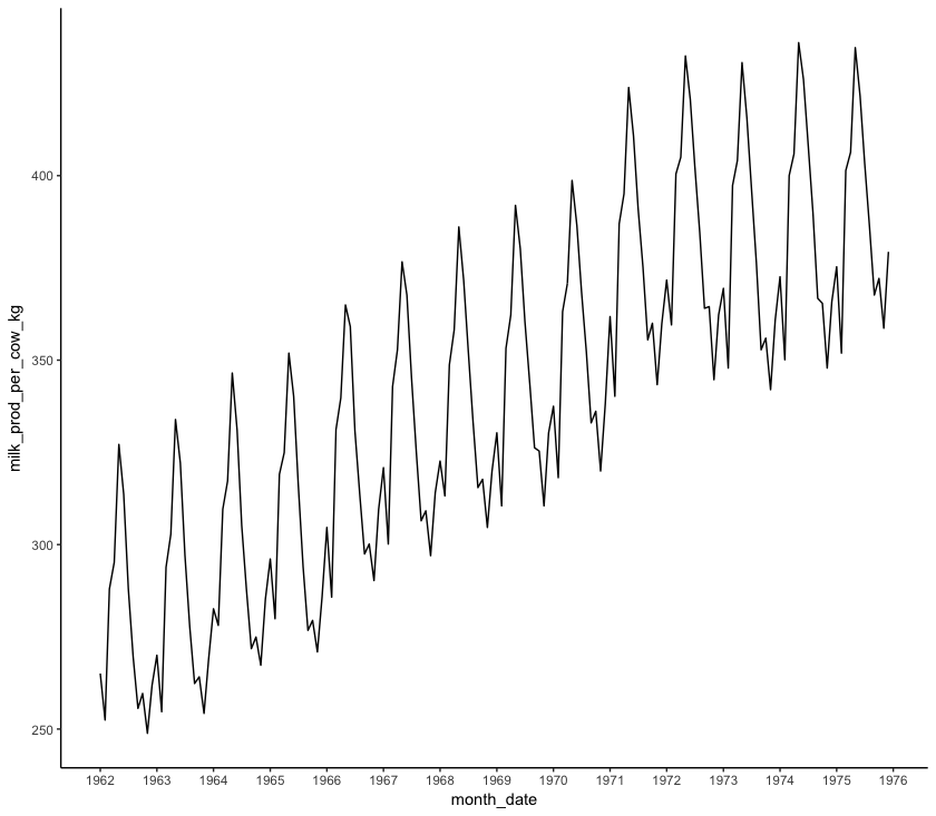
Time series data can contain multiple patterns acting at different temporal scales. The process of isolating each of these patterns is known as decomposition. Have a look at a simple plot of monthly_milk like the one we saw earlier:
(decomp_1 <- ggplot(monthly_milk, aes(x = month_date, y = milk_prod_per_cow_kg)) +
	geom_line() +
	scale_x_date(date_labels = "%Y", date_breaks = "1 year") +
	theme_classic())
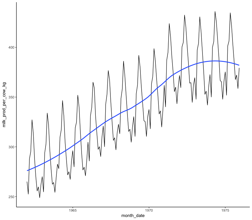
Firstly, it looks like there is a general upward trend: more milk is being produced in 1975 than in 1962. This is known as a “smooth” pattern, one that increases or decreases regularly (monotonically) over the course of the time series. We can see this pattern more clearly by plotting a loess regression through the data. A loess regression fits a smooth curve between two variables.
(decomp_2 <- ggplot(monthly_milk, aes(x = month_date, y = milk_prod_per_cow_kg)) +
	geom_line() +
	geom_smooth(method = "loess", se = FALSE, span = 0.6) +
	theme_classic())
span sets the number of points used to plot each local regression in the curve: the smaller the number, the more points are used and the more closely the curve will fit the original data.
Next, it looks like there are some peaks and troughs that occur regularly in each year. This is a “seasonal” pattern. We can investigate this pattern more by plotting each year as it’s own line and comparing the different years:
# Extract month and year and store in separate columns
monthly_milk$year <- format(monthly_milk$month_date, format = "%Y")
monthly_milk$month_num <- format(monthly_milk$month_date, format = "%m")

# Create a colour palette using the `colortools` package
year_pal <- sequential(color = "darkturquoise", percentage = 5, what = "value")

# Make the plot
(seasonal <- ggplot(monthly_milk, aes(x = month_num, y = milk_prod_per_cow_kg, group = year)) +
	geom_line(aes(colour = year)) +
	theme_classic() +
	scale_color_manual(values = year_pal))
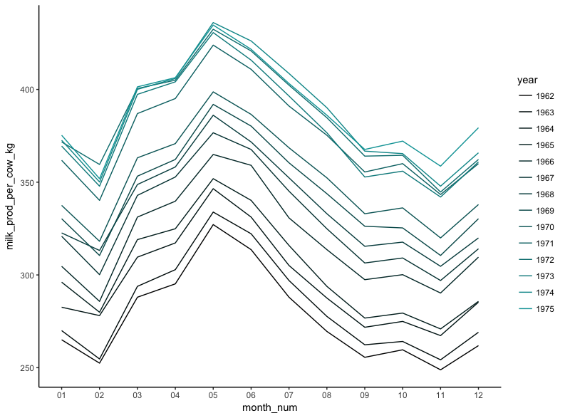
It’s clear from the plot that while milk production is steadily getting higher, the same pattern occurs throughout each year, with a peak in May and a trough in November.
“Cyclic” trends are similar to seasonal trends in that they recur over time, but occur over longer time scales. It may be that the general upward trend and plateau seen with the loess regression may be part of a longer decadal cycle related to sunspot activity, but this is impossible to test without a longer time series.
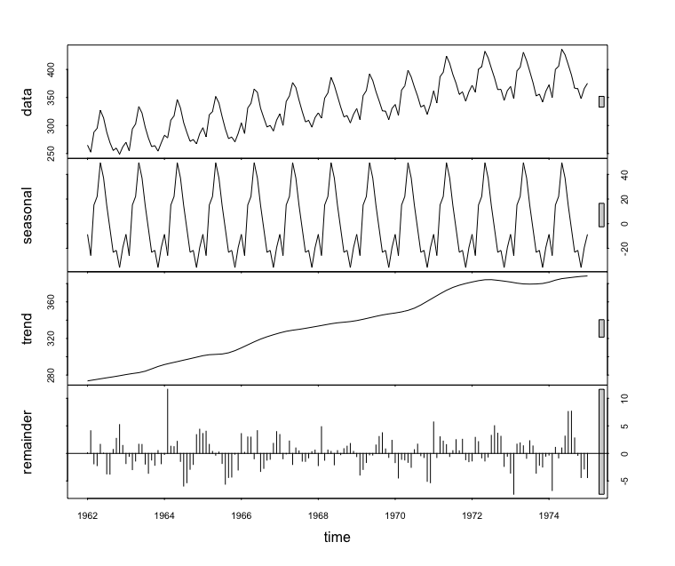
An alternative method to generating these plots in ggplot2 is to convert the time series data frame to a ts class object and decompose it using stl() from the stats package. This reduces the ability to customise the plots, but is arguably quicker:
# Transform to `ts` class
monthly_milk_ts <- ts(monthly_milk$milk_prod, start = 1962, end = 1975, freq = 12)  # Specify start and end year, measurement frequency (monthly = 12)

# Decompose using `stl()`
monthly_milk_stl <- stl(monthly_milk_ts, s.window = "period")

# Generate plots
plot(monthly_milk_stl)  # top=original data, second=estimated seasonal, third=estimated smooth trend, bottom=estimated irregular element i.e. unaccounted for variation
monthplot(monthly_milk_ts)  # variation in milk production for each month
seasonplot(monthly_milk_ts)
Forecasting
Often time series data are used to predict what might happen in the future, given the patterns seen in the data. This is known as forecasting. There are many methods used to forecast time series data, and they vary widely in complexity, but this should serve as a brief introduction to the most commonly used methods.
All the models used in this workshop are known as ETS models. ETS stands for Error, Trend, Seasonality. ETS models are also known as Exponential Smoothing State Space models. ETS models are used for modelling how a single variable will change over time by identifying its underlying trends, not taking into account any other variables. ETS models differ from a simple moving average by weighting the influence of previous points on future time points based on how much time is between the two points. i.e. over a longer period of time it is more likely that some unmeasured condition has changed, resulting in different behaviour of the variable that has been measured. Another important group of forecast models are the ARIMA models, autoregressive models which describe autocorrelations in the data rather than trends and seasonality. Unfortunately there isn’t a lot of time to get into ARIMA models during this workshop, but Rob Hyndman and George Athanasopoulos have a great book that is freely available online which covers ARIMA models and a lot more.
ETS models are normally denoted by three letters, e.g. ETS_AMZ. The first letter (A) refers to the error type, the second letter (M) is the trend type and the third letter (Z) is the season type. Possible letters are:
N = None
A = Additive
M = Multiplicative
Z = Automatically selected
I wouldn’t worry too much about the implications of these model types for now. For this tutorial we will just pick some basic model types and compare them. If you want to read more about ETS model types, I recommend this book.
Choosing which model to use to forecast your data can be difficult and requires using your own intuition, as well as looking at test statistics. To test the accuracy of a model, we have to compare it to data that has not been used to generate the forecast, so let’s create some data subsets from the monthly_milk_ts time series object - one for generating the model (monthly_milk_model) and one for testing the model’s accuracy (monthly_milk_test). window() is a function similar to subset() or filter(), subsetting an object based on arguments, but it is used especially for time series (ts) objects. window() takes the original time series object (x) and the start and end points of the subset. If end is not included, the subset extends to the end of the time series:
monthly_milk_model <- window(x = monthly_milk_ts, start = c(1962), end = c(1970))
monthly_milk_test <- window(x = monthly_milk_ts, start = c(1970))
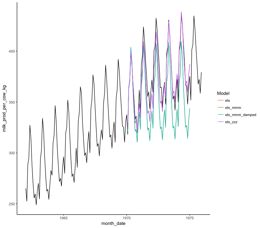
Let’s first compare model forecasts of different ETS models visually by extracting forecast data from forecast objects and plotting it using ggplot() against the test data. The code below is quite long and could be made more concise by using pipes, or apply() functions but writing it long-hand like this allows you to investigate all the intermediate objects for yourself so you understand how they are structured and what they show:
# Creating model objects of each type of ets model
milk_ets_auto <- ets(monthly_milk_model)
milk_ets_mmm <- ets(monthly_milk_model, model = "MMM")
milk_ets_zzz<- ets(monthly_milk_model, model = "ZZZ")
milk_ets_mmm_damped <- ets(monthly_milk_model, model = "MMM", damped = TRUE)

# Creating forecast objects from the model objects
milk_ets_fc <- forecast(milk_ets_auto, h = 60)  # `h = 60` means that the forecast will be 60 time periods long, in our case a time period is one month
milk_ets_mmm_fc <- forecast(milk_ets_mmm, h = 60)
milk_ets_zzz_fc <- forecast(milk_ets_zzz, h = 60)
milk_ets_mmm_damped_fc <- forecast(milk_ets_mmm_damped, h = 60)

# Convert forecasts to data frames
milk_ets_fc_df <- cbind("Month" = rownames(as.data.frame(milk_ets_fc)), as.data.frame(milk_ets_fc))  # Creating a data frame
names(milk_ets_fc_df) <- gsub(" ", "_", names(milk_ets_fc_df))  # Removing whitespace from column names
milk_ets_fc_df$Date <- as.Date(paste("01-", milk_ets_fc_df$Month, sep = ""), format = "%d-%b %Y")  # prepending day of month to date
milk_ets_fc_df$Model <- rep("ets")  # Adding column of model type

milk_ets_mmm_fc_df <- cbind("Month" = rownames(as.data.frame(milk_ets_mmm_fc)), as.data.frame(milk_ets_mmm_fc))
names(milk_ets_mmm_fc_df) <- gsub(" ", "_", names(milk_ets_mmm_fc_df))
milk_ets_mmm_fc_df$Date <- as.Date(paste("01-", milk_ets_mmm_fc_df$Month, sep = ""), format = "%d-%b %Y")
milk_ets_mmm_fc_df$Model <- rep("ets_mmm")

milk_ets_zzz_fc_df <- cbind("Month" = rownames(as.data.frame(milk_ets_zzz_fc)), as.data.frame(milk_ets_zzz_fc))
names(milk_ets_zzz_fc_df) <- gsub(" ", "_", names(milk_ets_zzz_fc_df))
milk_ets_zzz_fc_df$Date <- as.Date(paste("01-", milk_ets_zzz_fc_df$Month, sep = ""), format = "%d-%b %Y")
milk_ets_zzz_fc_df$Model <- rep("ets_zzz")

milk_ets_mmm_damped_fc_df <- cbind("Month" = rownames(as.data.frame(milk_ets_mmm_damped_fc)), as.data.frame(milk_ets_mmm_damped_fc))
names(milk_ets_mmm_damped_fc_df) <- gsub(" ", "_", names(milk_ets_mmm_damped_fc_df))
milk_ets_mmm_damped_fc_df$Date <- as.Date(paste("01-", milk_ets_mmm_damped_fc_df$Month, sep = ""), format = "%d-%b %Y")
milk_ets_mmm_damped_fc_df$Model <- rep("ets_mmm_damped")

# Combining into one data frame
forecast_all <- rbind(milk_ets_fc_df, milk_ets_mmm_fc_df, milk_ets_zzz_fc_df, milk_ets_mmm_damped_fc_df)
Now that we have all the information for the forecasts, we are ready to make our plot!
# Plotting with ggplot
(forecast_plot <- ggplot() +
	geom_line(data = monthly_milk, aes(x = month_date, y = milk_prod_per_cow_kg)) +  # Plotting original data
	geom_line(data = forecast_all, aes(x = Date, y = Point_Forecast, colour = Model)) +  # Plotting model forecasts
	theme_classic())
You can also numerically compare the accuracy of different models to the data we excluded from the model (monthly_milk_test) using accuracy():
accuracy(milk_ets_fc, monthly_milk_test)
accuracy(milk_ets_mmm_fc, monthly_milk_test)
accuracy(milk_ets_zzz_fc, monthly_milk_test)
accuracy(milk_ets_mmm_damped_fc, monthly_milk_test)
This outputs a whole load of different statistics in tables like the one below:
                      ME      RMSE      MAE         MPE      MAPE      MASE       ACF1 Theil's U
Training set -0.06896592  2.723633 2.087071 -0.02713133 0.6737187 0.2182860 0.02707694        NA
Test set      6.12353156 10.633503 8.693532  1.58893810 2.3165456 0.9092534 0.82174403 0.4583252
Let’s pick apart those statistics:
ME: Mean Error: the mean difference between modelled and observed values
RMSE: Root Mean Squared Error. Take each difference between the model and the observed values, square it, take the mean, then square root it.
MAE: Mean Absolute Error. The same as ME, but all errors are transformed to positive values so positive and negative errors don’t cancel each other out.
MPE: Mean Percentage Error. Similar to ME, but each error is expressed as a percentage of the forecast estimate. Percentage Errors are not scale dependent so they can be used to compare forecast accuracy between datasets.
MAPE: Mean Absolute Percentage Error. The same as MPE, but all errors are transformed to positive values so positive and negative errors don’t cancel each other out.
MASE: Mean Absolute Scaled Error. Compares the MAE of the forecast with the MAE produced by a naive forecast. A naive forecast is one which simply projects a straight line into the future, the value of which is the final value of the time series used to construct the model. A MASE>1 tells us that the naive forecast fit the observed data better than the model, while a MASE<1 tells us that the model was better than the naive model.
ACF1: Auto-Correlation Function at lag 1. How correlated are data points with data points directly after them, where ACF = 1 means points are fully correlated and ACF = 0 means points are not at all correlated.
Theil's U: Compares the forecast with results from a model using minimal data. Errors are squared to give more weight to large errors. A U<1 means the forecast is better than guessing, while a U>1 means the forecast is worse than guessing.
MAPE is the most commonly used measure of forecast accuracy, probably due to it being easy to understand conceptually. However, MAPE becomes highly skewed when observed values in the time series are close to zero and infinite when observations equal zero, making it unsuitable for some time series that have low report values. MAPE also gives a heavier penalty to positive deviations than negative deviations, which makes it useful for some analyses, e.g. economic forecasts which don’t want to run the risk of over-estimating the value of a commodity. MASE is suggested here as an alternative which avoids the shortcomings of MAPE while remaining interpretable. If you’re really keen, have a read of Hyndman & Koehler 2006 for more on MASE and the potential shortcomings of all these proxies for model accuracy.
Training set denotes values that were gathered from comparing the forecast to the data that was used to generate the forecast (notice how the Mean Error (ME) is very small).
Test set denotes values that were gathered from comparing the forecast to the test data which we deliberately excluded when training the forecast.
By comparing the MAPE and MASE statistics of the four models in the Test set row, we can see that the monthly_milk_ets_fc and monthly_milk_ets_zzz_fc models have the lowest values. Looking at the graphs for this forecast and comparing it visually to the test data, we can see that this is the forecast which best matches the test data. So we can use that forecast to project into the future.
Extracting values from a forecast
Now that we have identified the best forecast model(s), we can use these models to find out what milk production will be like in the year 1975! Use the code below to extract a predicted value for a given year from our forecasts. This is as simple as subsetting the forecast data frame to extract the correct value. I’m using functions from the dplyr package, with pipes (%>%), but you could use any other method of subsetting such as the [] square bracket method using base R:
milk_ets_fc_df %>%
	filter(Month == "Jan 1975") %>%
	select(Month, Point_Forecast)

milk_ets_zzz_fc_df %>%
	filter(Month == "Jan 1975") %>%
	select(Month, Point_Forecast)
4. Coding challenge
Now that you have worked through the tutorial, use what you have learnt to make some model forecasts and plot some graphs to investigate temporal patterns for our data on CO2 concentrations on Mauna Loa, Hawaii. See if you can predict the CO2 concentration for June 2050. You can find the data in co2_loa.csv in the folder you downloaded from the the GitHub repository for this tutorial.