Tutorial Aims:
- Learn what a statistical model is
- Come up with a research question
- Think about our data
- Think about our experimental design
- Turn a question into a model
- Learn about the different types of models
- General linear models
- Hierarchical models using
lme4 - Random slopes versus random intercepts
lme4 - Hierarchical models using
MCMCglmm
All the files you need to complete this tutorial can be downloaded from this repository. Click on Code -> Download ZIP and unzip the folder, or clone the repository to your own GitHub account.
Introduction
Ecological data can throw up complex challenges for statistical models and designing the appropriate model to answer your research question can be one of the trickiest parts of ecological research (and research in other fields). Learning how to design statistical models can take time, but developing rigorous statistical approaches as early as possible will help you in your future research career. If you put the time in, soon you will realise that statistics aren’t a total pain and continuous frustration, but something pretty fun that really engages your brain in diverse ways. So to start off, I like to put the computer coding aside, make myself a hot drink or get a fancy latte at a coffee shop, get out my pen or pencil and paper and put on my thinking cap.
1. Learn what a statistical model is
In order to answer research questions, we require statistical tests of the relationships in our data. In modern ecology and other fields, models are designed to fit the structure of data and to appropriately test the questions that we have as researchers. Thus, the first step to any data analysis is figuring out what your research question is. Without a research question, there is no point in trying to conduct a statistical test. So let’s pause here and figure out the research question for our tutorial today.
2. The research question
In this tutorial, we will work with part of the long-term plant cover dataset from the Toolik Lake Field Station. These data (remember the word data is plural, thus data are … not data is …!) are plant composition data collected over four years across five sites over time in Arctic tundra in Northern Alaska. A simple question we might ask with these data is: how has the species richness changed in these plots over time?
Question 1: How has plant species richness changed over time at Toolik Lake?
Once we have figured out our research question, we next need to figure out our hypothesis. To come up with a hypothesis, we need to learn something about this system. To start us off today, we will suggest a hypothesis for you: plant species richness is increasing over time. We might expect this as these tundra plots might be undergoing warming and warming might lead to increased plant species richness in tundra plant communities (see this paper for more on this topic).
Hypothesis 1: Plant species richness has increased over time at Toolik Lake. (Remember to phrase your hypothesis in the past tense, as these data represent changes that have already occurred and remember that results are always written in the past tense.)
Now that we have a hypothesis, it is good practice to also write a null hypothesis. What are the hypotheses that we are testing between here? For example, a null hypothesis for these data and this question might be:
Null Hypothesis: Plant species richness has not changed over time at Toolik Lake.
We might also have an alternative hypothesis:
Hypothesis 2: Plant species richness has decreased over time at Toolik Lake.
Toolik Lake Station is in Alaska, a place that has been warming at rates higher than the rest of the world, so we might also wonder how temperature influences the plant communities there, in particular, their richness. So, we pose a second question:
Question 2: How does mean annual temperature influence plant species richness?
Hypothesis 1: Higher temperatures correspond with higher species richness.
How are questions 1 and 2 different?
Detection models When we ask how plant species richness has changed over time, we are interested in detecting change. We want to know what happened to plant communities in Toolik Lake, but we are not testing anything regarding why such changes in species richness occurred (and maybe there were no changes over time).
Attribution models When we ask how temperature influences plant species richness, we are looking to attribute the changes we’ve seen to a specific driver, in this case, temperature. Attribution models often are the next step from a detection model. First, you want to know what happened, then you try to figure out why it happened. For example, if we find a strong positive relationship between temperature and species richness (e.g., as temperature goes up, so does species richness), then temperature is likely to be one of the drivers of local-scale changes in species richness.
For now, this should be enough set-up for us to progress ahead with our models, but remember to always start with the question first when conducting any research project and statistical analysis.
3. Thinking about our data
There are different statistical tests that we could use to conduct our analyses and what sort of statistical test we use depends on the question and the type of data that we have to test our research question. Since we have already thought about our question for a bit, let’s now think about our data. What kind of data are we dealing with here?
Our data consists of plant species cover measured across four years in plots that were within blocks, which were then within sites. We have the variables: Year, Site, Treatment, Block, Plot, Species, Relative.Cover, Mean.Temp and SD.Temp in our dataframe. Let’s look at the dataframe now.
# Load libraries ----
library(tidyverse)  # for data manipulation (tidyr, dplyr), visualization, (ggplot2), ...
library(lme4)  # for hierarchical models
library(sjPlot)  # to visualise model outputs
library(ggeffects)  # to visualise model predictions
library(MCMCglmm)  # for Bayesian models
library(MCMCvis)  # to visualise Bayesian model outputs
library(stargazer)  # for tables of model outputs

# Load data ----
# Remember to set your working directory to the folder
# where you saved the workshop files
toolik_plants <- read.csv("toolik_plants.csv")

# Inspect data
head(toolik_plants)
To check out what class of data we are dealing with we can use the str() function.
str(toolik_plants)
Site and Species are of the character type (text, composed of letters) - they are names, and we will treat them as categorical variables. Year, Cover, Mean.Temp and SD.Temp are numeric and continuous data - they are numbers. Cover shows the relative cover (out of 1) for different plant species, Mean.Temp is the mean annual temperature at Toolik Lake Station and SD.Temp is the standard deviation of the mean annual temperature. Then, we have Treatment, another categorical variable that refers to different chemical treatments, e.g. some plots received extra nitrogen, others extra phosphorus. Finally, we have Block and Plot, which give more detailed information about where the measurements were taken.
The plot numbers are currently coded as numbers (num) - 1, 2,…8, making it a numerical variable. We should make them a categorical variable, since just like Site and Block, the numbers represent the different categories, not actual count data.
In R, we can use the factor type to denote a vector/column as categorical data. With the following code, we can convert multiple columns to factors:
# We can use mutate() from dplyr to modify columns
# and combine it with across() from dplyr to apply the same
# function (as.factor()) to the selected columns
toolik_plants <-
  toolik_plants %>%
  mutate(across(c(Site, Block, Plot), as.factor))

str(toolik_plants)
Now, let’s think about the distributions of the data. Our data structure is a bit like a Russian doll, so let’s start looking into that layer by layer.
# Get the unique site names
unique(toolik_plants$Site)
length(unique(toolik_plants$Site))
First, we have five sites (06MAT, DH, MAT, MNT and SAG).
# Group the dataframe by Site to see the number of blocks per site
toolik_plants %>% group_by(Site) %>%
  summarise(block.n = length(unique(Block)))
Within each site, there are different numbers of blocks: some sites have three sample blocks, others have four or five.
toolik_plants %>% group_by(Block) %>%
  summarise(plot.n = length(unique(Plot)))
Within each block, there are eight smaller plots.
unique(toolik_plants$Year)
There are four years of data from 2008 to 2012.
How many species are represented in this data set? Let’s use some code to figure this out. Using the unique and length functions, we can count how many species are in the dataset as a whole.
length(unique(toolik_plants$Species))
There are 129 different species, but are they all actually species? It’s always a good idea to see what hides behind the numbers, so we can print the species to see what kind of species they are.
unique(toolik_plants$Species)
Some plant categories are in as just moss and lichen and they might be different species or more than one species, but for the purposes of the tutorial, we can count them as one species. There are other records that are definitely not species though: litter, bare (referring to bare ground), Woody cover, Tube, Hole, Vole trail, removed, vole turds, Mushrooms, Water, Caribou poop, Rocks, mushroom, caribou poop, animal litter, vole poop, Vole poop, Unk?.
You might wonder why people are recording vole poop. This relates to how the data were collected: each plot is 1m^2 and there are 100 points within it. When people survey the plots, they drop a pin from each point and then record everything that touches the pin, be it a plant, or vole poop!
The non-species records in the species column are a good opportunity for us to practice data manipulation (you can check out our data manipulation tutorial here later). We will filter out the records we don’t need using the filter function from the dplyr package.
# We use ! to say that we want to exclude
# all records that meet the criteria

# We use %in% as a shortcut - we are filtering by many criteria
# but they all refer to the same column: Species
toolik_plants <- toolik_plants %>%
  filter(!Species %in% c("Woody cover", "Tube",
                         "Hole", "Vole trail",
                         "removed", "vole turds",
                         "Mushrooms", "Water",
                         "Caribou poop", "Rocks",
                         "mushroom", "caribou poop",
                         "animal litter", "vole poop",
                         "Vole poop", "Unk?"))

# A much longer way to achieve the same purpose is:
# toolik_plants <- toolik_plants %>%
#  filter(Species != "Woody cover" &
#	       Species != "Tube" &
#         Species != "Hole"&
#				 Species != "Vole trail"....))
# But you can see how that involves unnecessary repetition.
Let’s see how many species we have now:
length(unique(toolik_plants$Species))
115 species! Next, we can calculate how many species were recorded in each plot in each survey year.
# Calculate species richness
toolik_plants <- toolik_plants %>%
  group_by(Year, Site, Block, Plot) %>%
  mutate(Richness = length(unique(Species))) %>%
  ungroup()
To explore the data further, we can make a histogram of species richness.
(hist <- ggplot(toolik_plants, aes(x = Richness)) +
    geom_histogram() +
    theme_classic())
Note that putting your entire ggplot code in brackets () creates the graph and then shows it in the plot viewer. If you don’t have the brackets, you’ve only created the object, but haven’t visualised it. You would then have to call the object such that it will be displayed by just typing hist after you’ve created the hist object.
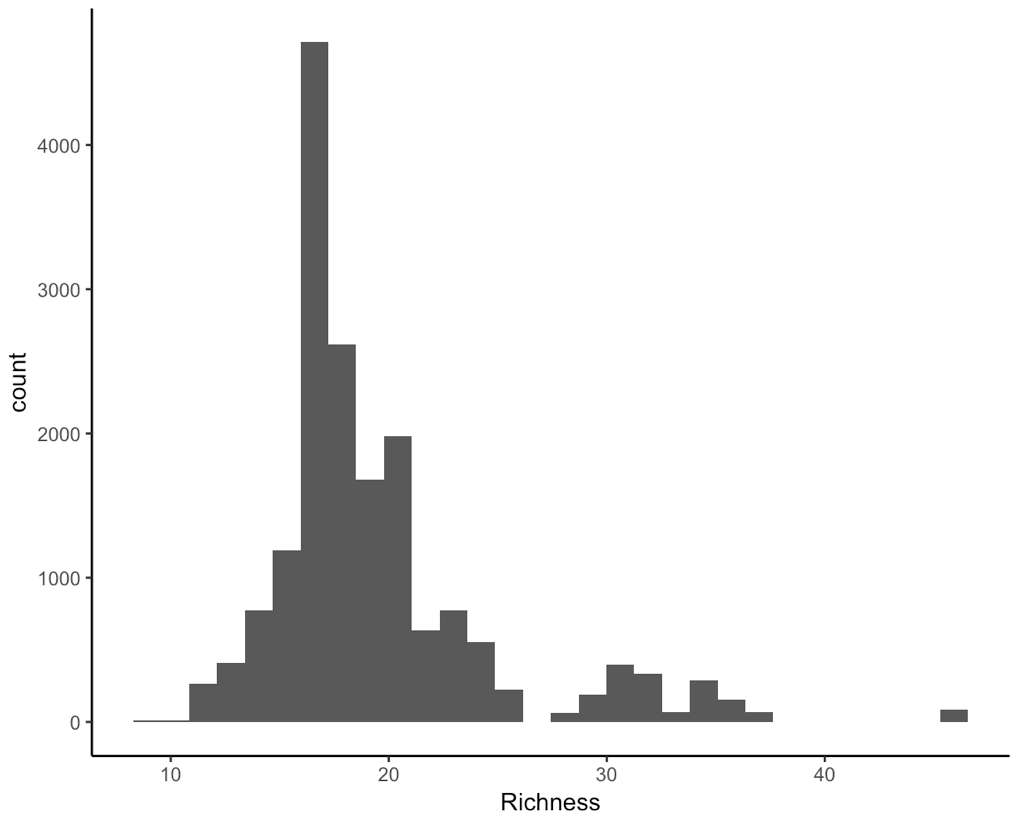
There are some other things we should think about. There are different types of numeric data here. For example, the years are whole numbers: we can’t have the year 2000.5.
The plant cover can be any value that is positive, it is therefore bounded at 0 and must be between 0 and 1. We can see this when we make a histogram of the data:
(hist2 <- ggplot(toolik_plants, aes(x = Relative.Cover)) +
    geom_histogram() +
    theme_classic())
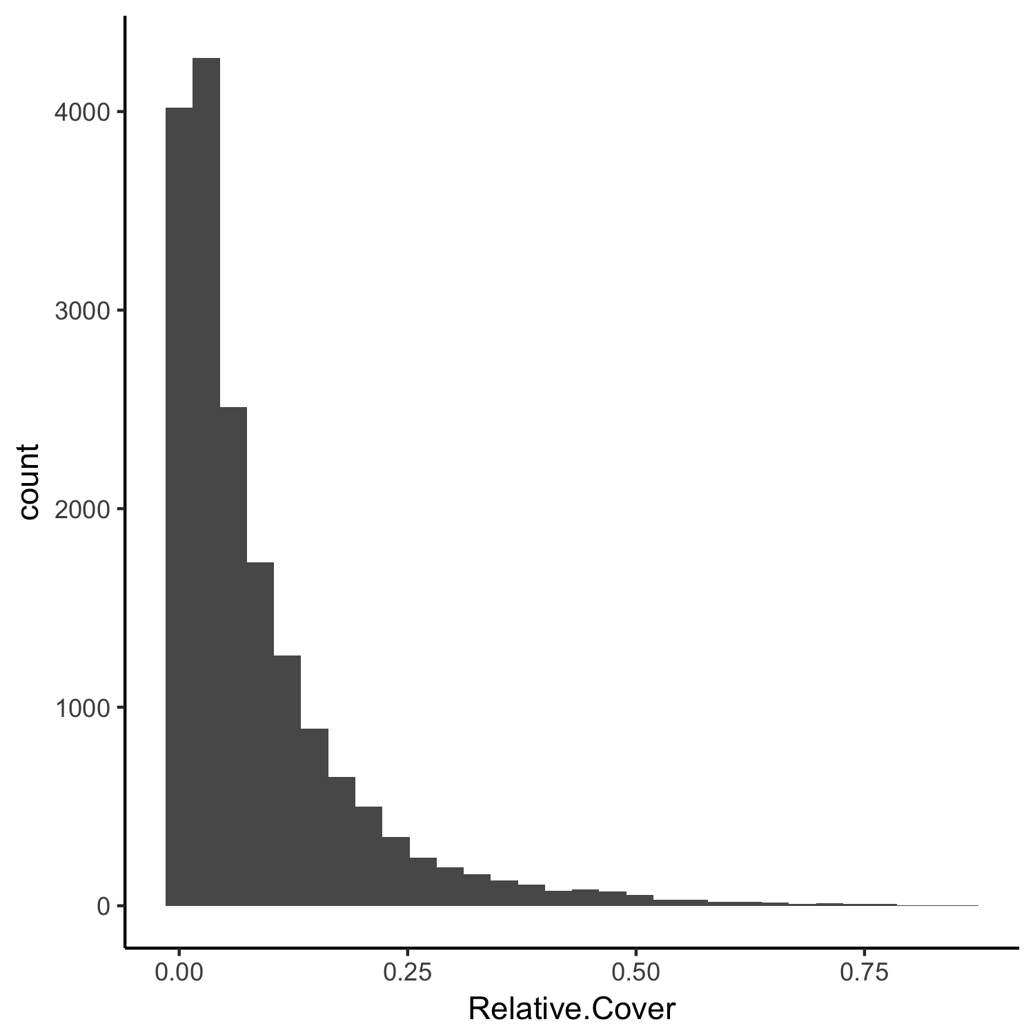
The plant cover data are skewed to the left, i.e., most of the records in the Relative.Cover column have small values. These distributions and characteristics of the data need to be taken into account when we design our model.
4. Thinking about our experimental design
In the Toolik dataset of plant cover, we have both spatial and temporal replication. The spatial replication is on three different levels: there are multiple sites, which have multiple blocks within them and each block has eight plots. The temporal replication refers to the different years in which plant cover was recorded: four years.
What other types of issues might we need to consider?
Spatial autocorrelation
One of the assumptions of a model is that the data points are independent. In reality, that is very rarely the case. For example, plots that are closer to one another might be more similar, which may or may not be related to some of the drivers we’re testing, e.g. temperature.
Temporal autocorrelation
Similarly, it’s possible that the data points in one year are not independent from those in the year before. For example, if a species was more abundant in the year 2000, that’s going to influence it’s abundance in 2001 as well.
5. Turn a question into a model
Let’s go back to our original question:
Question 1: How has plant species richness changed over time at Toolik Lake?
What is our dependent and independent variable here? We could write out our base model in words:
Richness is a function of time.
In R, this turns into the code: richness ~ time.
Richness is our dependent (response) variable and time is our independent (predictor) variable ( see here for more details). This is our base model, but what other things do we need to account for? What would happen if we just modelled richness as a function of time without dealing with the other structure in our data? Let’s find out in the rest of the tutorial.
6. Learn about the different types of models
Before we get back to our dataset that we are designing a model for, let’s revisit some statistics basics.
Here are some questions to consider.
- What is the difference between a continuous and a categorical variable in a linear model?
- How many variables can you have in a model?
- Is it better to have one model with five variables or one model per variable? When do we choose variables?
- What is a fixed effect? What is a random effect?
- What is the most important result from a model output?
- Why does it matter which type of models we use?
7. General linear models
Model without any random effects:
plant_m <- lm(Richness ~ I(Year-2007), data = toolik_plants)
summary(plant_m)
Notice how we have transformed the Year column - I(Year - 2007) means that the year 2008 will become Year 1 - then your model is estimating richness across the first, second, etc., year from your survey period. Otherwise, if we had kept the years just as 2008, 2009,…, the model would have estimated richness really far back into the past, starting from Year 1, Year 2… Year 1550 up until 2012. This would make the magnitude of the estimates we get wrong. You can experiment to see what happens if we just add in Year - suddenly the slope of species change goes in the hundreds!
Assumptions made:
- The data are normally distributed.
- The data points are independent of one another.
- The relationship between the variables we are studying is actually linear.
And there are many more - you can check out this useful website for the full list with examples and how to check if those are assumptions are met later.
Do you think the assumptions of a general linear model are met for our questions and data? Probably not!
From the histograms, we can see that the data are not normally distributed, and furthermore, if we think about what the data are, they are integer counts (number of species), probably a bit skewed to the left, as most plots might not have a crazy amount of species. For these reasons, a Poisson distribution might be suitable, not a normal one. You can check out the Models and Distributions Coding Club tutorial for more about different data distributions.
We know that because of how the experimental design was set up (remember the Russian doll of plots within blocks within sites), the data points are not independent from one another. If we don’t account for the plot, block and site-level effects, we are completely ignoring the hierarchical structure of our data, which might then lead to wrong inferences based on the wrong model outputs.
What is model convergence?
Model convergence is whether or not the model has worked, whether it has estimated your response variable (and random effects, see below) - basically whether the underlying mathematics have worked or have “broken” in some way. When we fit more complicated models, then we are pushing the limits of the underlying mathematics and things can go wrong, so it is important to check that your model did indeed work and that the estimates that you are making do make sense in the context of your raw data and the question you are asking/hypotheses that you are testing.
Checking model convergence can be done at different levels. With parametric models, good practice is to check the residual versus predicted plots. Using Bayesian approaches, there are a number of plots and statistics that can be assessed to determine model convergence. See below and in the Coding Club MCMCglmm tutorial. For an advanced discussion of model convergence, check out model convergence in lme4.
For now, let’s check the residual versus predicted plot for our linear model. By using the ‘plot()’ function, we can plot the residuals versus fitted values, a Q-Q plot of standardised residuals, a scale-location plot (square roots of standardiaed residuals versus fitted values) and a plot of residuals versus leverage that adds bands corresponding to Cook’s distances of 0.5 and 1. Looking at these plots can help you identify any outliers that have huge leverage and confirm that your model has indeed run e.g. you want the data points on the Q-Q plot to follow the one-to-one line.
plot(plant_m)
8. Hierarchical models using lme4
Now that we have explored the idea of a hierarchical model, let’s see how our analysis changes if we do or do not incorporate elements of the experimental design to the hierarchy of our model.
First, let’s model with only site as a random effect. This model does not incorporate the temporal replication in the data or the fact that there are plots within blocks within those sites.
plant_m_plot <- lmer(Richness ~ I(Year-2007) + (1|Site), data = toolik_plants)
summary(plant_m_plot)
From the summary() outputs, you can see the effect sizes (under the column “Estimate” in the “Fixed effects” part of the summary), a key element of the model outputs. Effect sizes tell us about the strengths of the relationships we are testing. In this model, the “Year” variable has an effect of about -0.7 on “Richness”, which can be interpreted as an annual decrease of 0.7 species.
We are still not accounting for the different plots and blocks though, so let’s gradually add those and see how the results change.
plant_m_plot2 <- lmer(Richness ~ I(Year-2007) + (1|Site/Block), data = toolik_plants)
summary(plant_m_plot2)
Have the estimates for the effect sizes changed?
plant_m_plot3 <- lmer(Richness ~ I(Year-2007) + (1|Site/Block/Plot), data = toolik_plants)
summary(plant_m_plot3)
This final model answers our question about how plant species richness has changed over time, whilst also accounting for the hierarchical structure of the data.
Let’s check our model’s “fitted vs residuals” plot.
plot(plant_m_plot3) # Checking residuals
The points on this graph are evenly distributed on both sides of the horizontal line, which is a good sign that the model residuals do not violate the assumptions of the linear models.
Let’s visualise the results using the sjPlot package!
# Set a clean theme for the graphs
set_theme(base = theme_bw() +
theme(panel.grid.major.x = element_blank(),
panel.grid.minor.x = element_blank(),
panel.grid.minor.y = element_blank(),
panel.grid.major.y = element_blank(),
plot.margin = unit(c(0.5, 0.5, 0.5, 0.5), units = , "cm")))
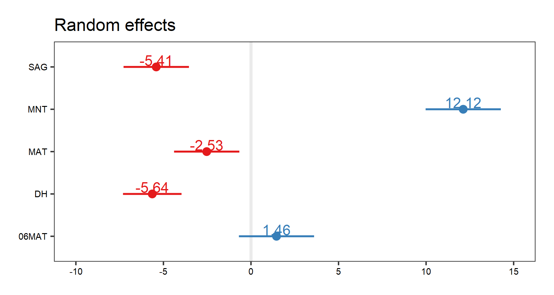
# Visualises random effects
(re.effects <- plot_model(plant_m_plot3, type = "re", show.values = TRUE))
save_plot(filename = "model_re.png",
height = 8, width = 15) # Save the graph if you wish
Note how when we visualise our random effects, three different plots come up (use the arrow buttons in the “plots” window to scroll through the plots). The first two show the interaction effects. Here, we are only interested in the plot that shows us the random effects of site, i.e. the figure we see below:
Let’s visualise our fixed effects:
# To see the estimate for our fixed effect (default): Year
(fe.effects <- plot_model(plant_m_plot3, show.values = TRUE))

save_plot(filename = "model_fe.png",
          height = 8, width = 15)  # Save the graph if you wish
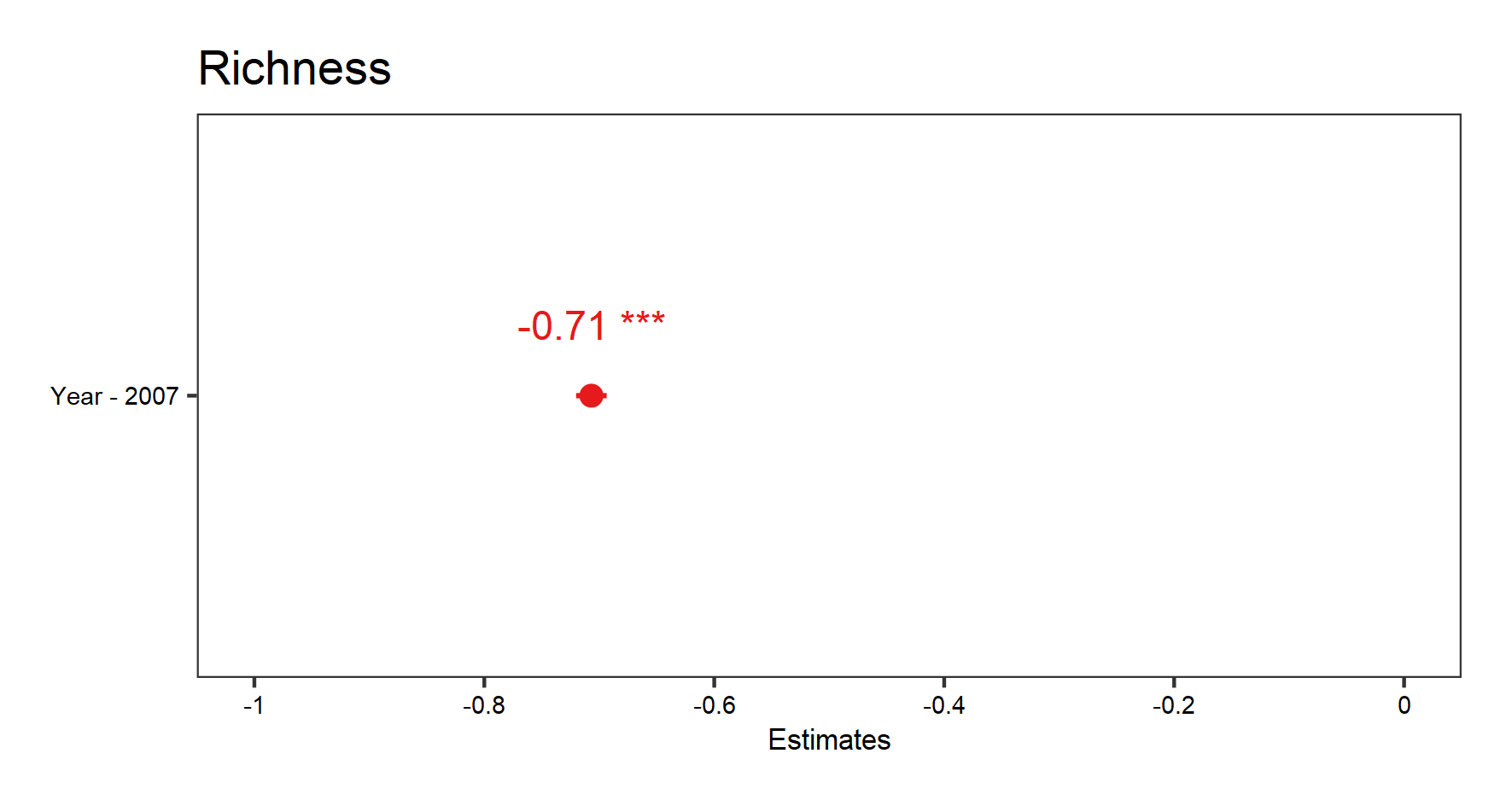
Since we only have one fixed effect in this model (Year), the graph produced shows the estimate for that effect size (the point) and the confidence interval (line around the point).
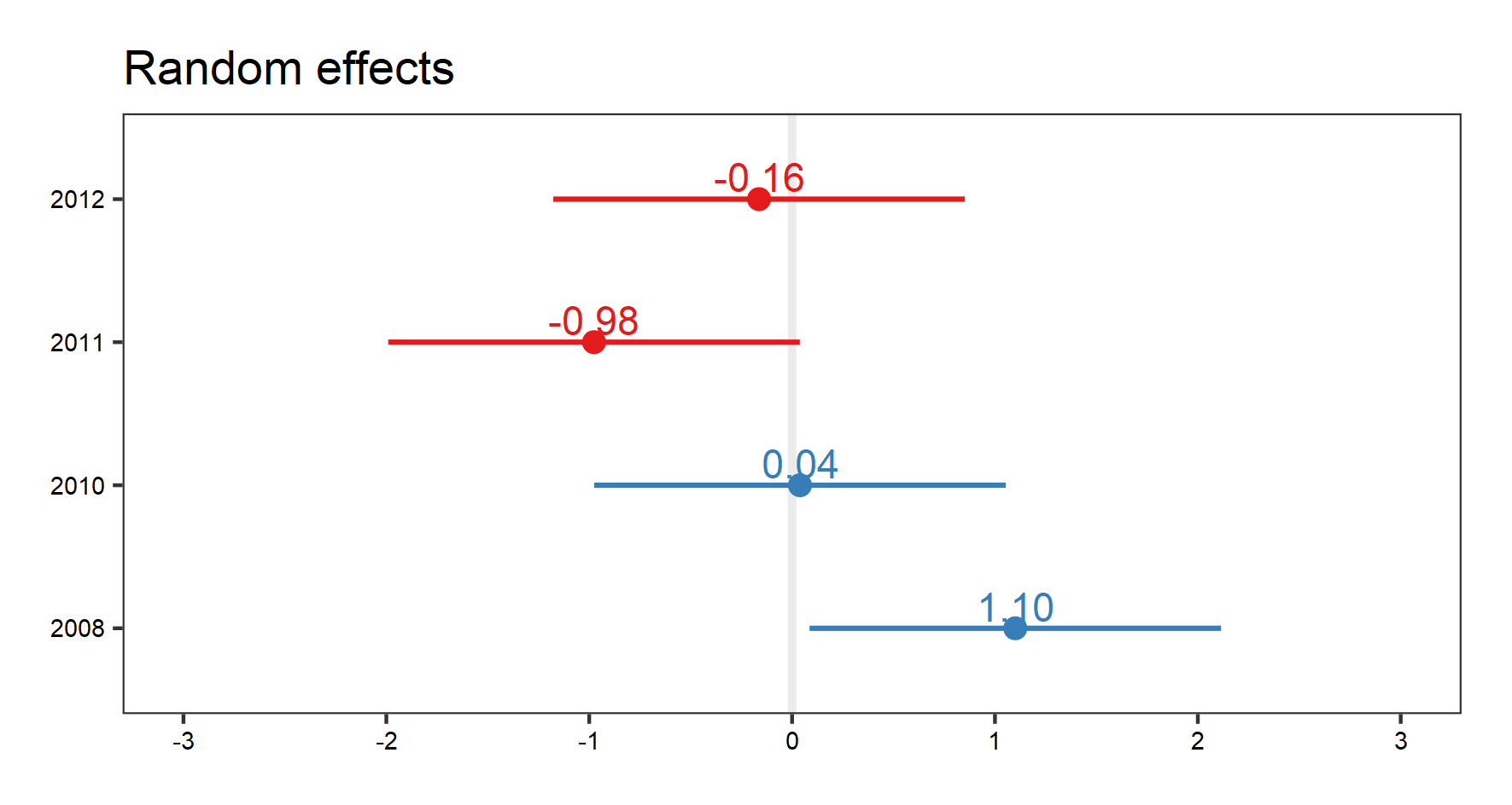
Now, let’s look at the effect of mean temperature on richness. We will use the same hierarchical structure for site/block/plot random effects. We will also add year as random effect this time.
plant_m_temp <- lmer(Richness ~ Mean.Temp + (1|Site/Block/Plot) + (1|Year),
                      data = toolik_plants)
summary(plant_m_temp)
Let’s look at the fixed effect first this time:
# Visualise the fixed effect
(temp.fe.effects <- plot_model(plant_m_temp, show.values = TRUE))
save_plot(filename = "model_temp_fe.png",
          height = 8, width = 15)
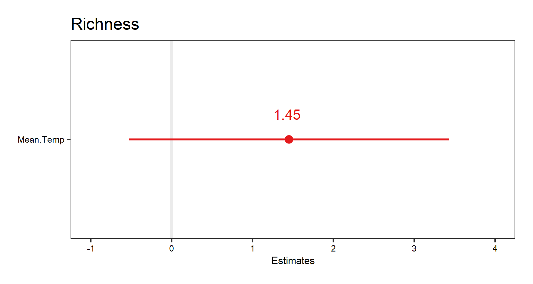
The very wide confidence interval this time suggest high uncertainty about the effect of temperature on richness.
And the random effects:
# Visualise the random effect terms
(temp.re.effects <- plot_model(plant_m_temp, type = "re", show.values = TRUE))
save_plot(filename = "model_temp_re.png",
          height = 8, width = 15)
Again, with the random effect terms, we can see the random effects of interactions, as well as for site, and year. Use your arrow buttons in the plots window to navigate between the plots. The figure you see below is the random effect of year.
Assumptions made:
- The data are normally distributed.
- The data points are independent of one another.
- The relationship between the variables we are studying is actually linear.
- Plots represent the spatial replication and years represent the temporal replication in our data.
Assumptions not accounted for:
- We have not accounted for spatial autocorrelation in the data - whether more closely located plots are more likely to show similar responses than farther away plots.
- We have not accounted for temporal autocorrelation in the data - whether the influence of prior years of data are influencing the data in a given year.
9. Random slopes versus random intercepts lme4
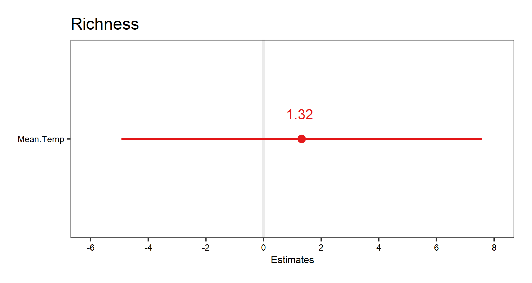
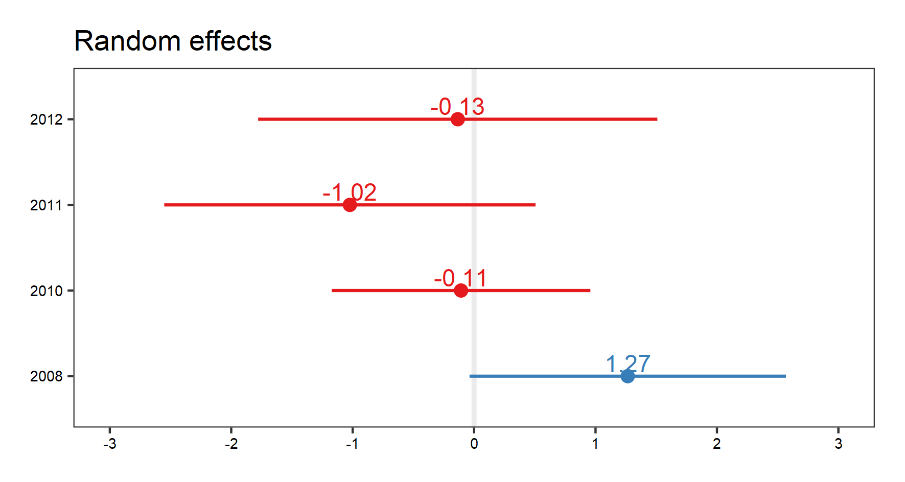
We can now think about having random slopes and random intercepts. For our question, how does temperature influence species richness, we can allow each plot to have it’s own relationship with temperature.
plant_m_rs <- lmer(Richness ~ Mean.Temp + (Mean.Temp|Site/Block/Plot) + (1|Year),
                 data = toolik_plants)
summary(plant_m_rs)
Check out the summary outputs and the messages we get. This model is not converging and we shouldn’t trust its outputs: the model structure is too complicated for the underlying data, so now we can simplify it.
If the code is running for a while, feel free to click on the “Stop” button and continue with the tutorial, as the model is not going to converge.
plant_m_rs <- lmer(Richness ~ Mean.Temp + (Mean.Temp|Site) + (1|Year),
                 data = toolik_plants)
summary(plant_m_rs)
This time the model converges, but keep in mind that we are ignoring the hierarchical structure below “Site”, and therefore violating about assumption about independent data points (data below the “Site” level are actually grouped). But we will use it to show you what random-slopes models look like.
We can visualise the results:
(plant.fe.effects <- plot_model(plant_m_rs, show.values = TRUE))
save_plot(filename = "model_plant_fe.png",
          height = 8, width = 15)
(plant.re.effects <- plot_model(plant_m_rs, type = "re", show.values = TRUE))
save_plot(filename = "model_plant_re.png",
          height = 8, width = 15)
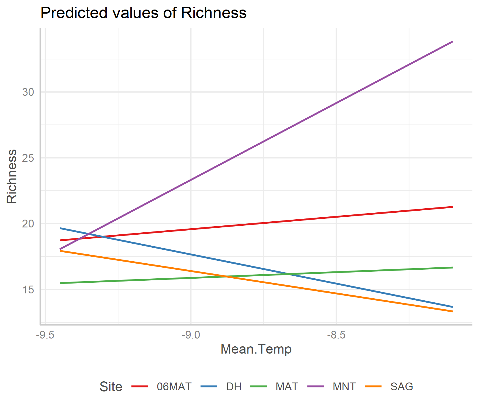
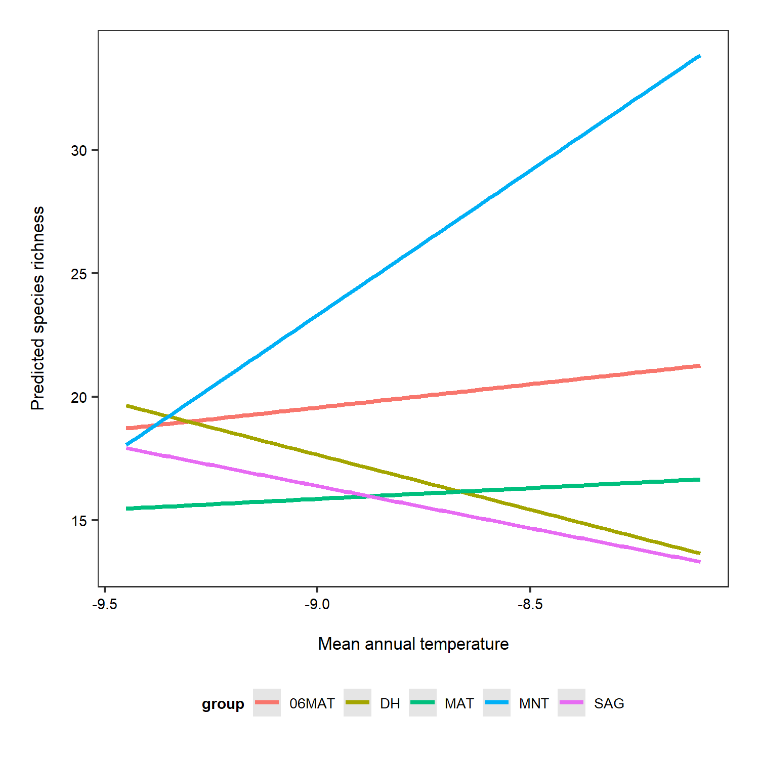
To get a better idea of what the random slopes and intercepts are doing, we can visualise your model predictions. We will use the ggeffects package to calculate model predictions and plot them. First, we calculate the overall predictions for the relationship between species richness and temperature. Then, we calculate the predictions for each plot, thus visualising the among-plot variation. Note that the second graph has both freely varying slopes and intercepts (i.e., they’re different for each plot).
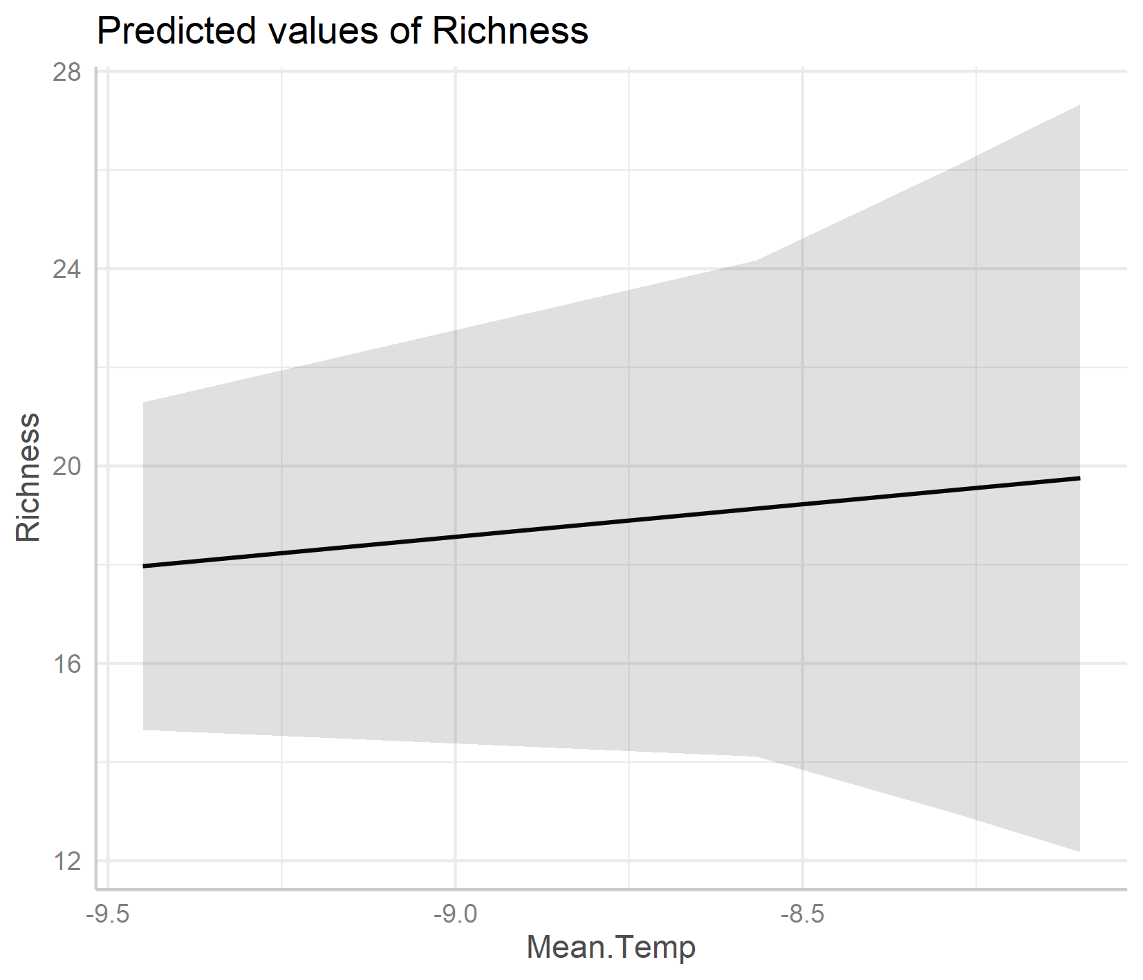
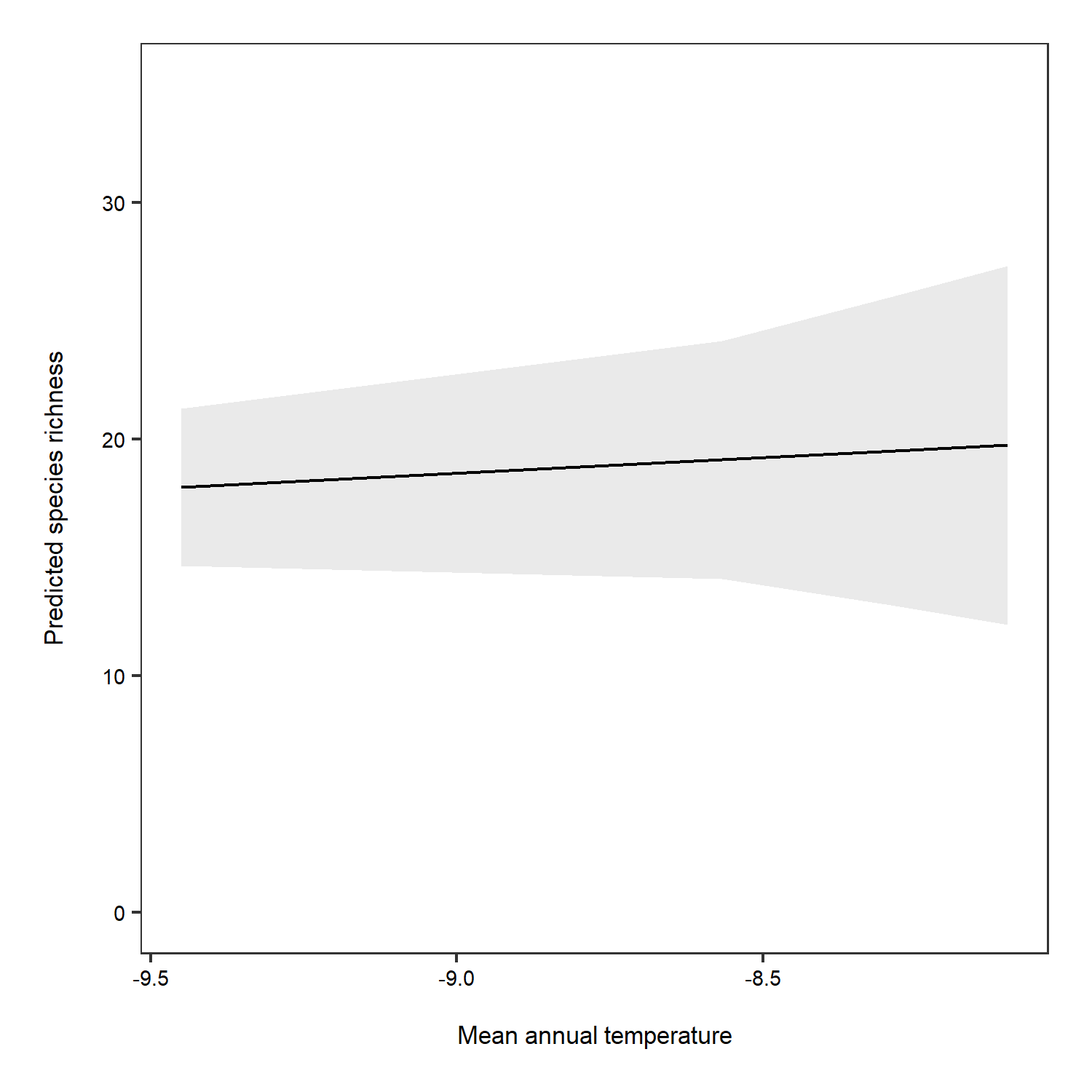
ggpredict(plant_m_rs, terms = c("Mean.Temp")) %>% plot()
save_plot(filename = "model_temp_richness.png",
          height = 12, width = 14)
ggpredict(plant_m_rs, terms = c("Mean.Temp", "Site"), type = "re") %>% plot() +
  theme(legend.position = "bottom")
save_plot(filename = "model_temp_richness_rs_ri.png",
          height = 12, width = 14)
An important note about honest graphs!
Interestingly, the default options from the ggpredict() function set the scale differently for the y axes on the two plots. If you just see the first plot, at a first glance you’d think that species richness is increasing a lot as temperature increases! But take note of the y axis: it doesn’t actually start at zero, thus the relationship is shown to be way stronger than it actually is.
We can manually plot the predictions to overcome this problem.
# Overall predictions - note that we have specified just mean temperature as a term
predictions <- ggpredict(plant_m_rs, terms = c("Mean.Temp"))

(pred_plot1 <- ggplot(predictions, aes(x, predicted)) +
    geom_line() +
    geom_ribbon(aes(ymin = conf.low, ymax = conf.high), alpha = .1) +
    scale_y_continuous(limits = c(0, 35)) +
    labs(x = "\nMean annual temperature", y = "Predicted species richness\n"))

ggsave(pred_plot1, filename = "overall_predictions.png",
       height = 5, width = 5)
The relationship between temperature and species richness doesn’t look that strong anymore! In fact, we see pretty small increases in species richness as temperature increases. What does that tell you about our hypothesis?
Now we can do the same, but this time taking into account the random effect.
# Predictions for each grouping level (here plot which is a random effect)
# re stands for random effect
predictions_rs_ri <- ggpredict(plant_m_rs, terms = c("Mean.Temp", "Site"), type = "re")

(pred_plot2 <- ggplot(predictions_rs_ri, aes(x = x, y = predicted, colour = group)) +
    stat_smooth(method = "lm", se = FALSE)  +
    scale_y_continuous(limits = c(0, 35)) +
    theme(legend.position = "bottom") +
    labs(x = "\nMean annual temperature", y = "Predicted species richness\n"))

ggsave(pred_plot2, filename = "ri_rs_predictions.png",
       height = 5, width = 5)
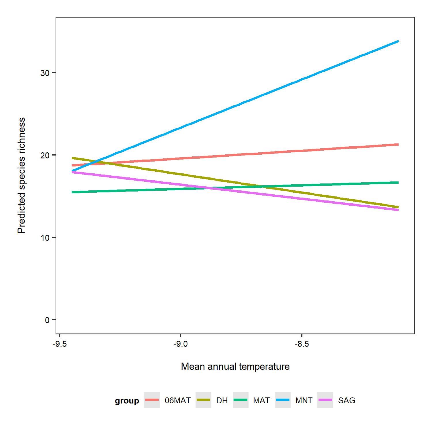
Just for the sake of really seeing the random intercepts and random slopes, here is a zoomed in version), but note that when preparing graphs for reports or publications, your axes should start at zero to properly visualise the magnitude of the shown relationship.
(pred_plot3 <- ggplot(predictions_rs_ri, aes(x = x, y = predicted, colour = group)) +
    stat_smooth(method = "lm", se = FALSE)  +
    theme(legend.position = "bottom") +
    labs(x = "\nMean annual temperature", y = "Predicted species richness\n"))

ggsave(pred_plot3, filename = "ri_rs_predictions_zoom.png",
       height = 5, width = 5)
10. Hierarchical models using MCMCglmm
Let’s take our lme4 model and explore what that model structure looks like in MCMCglmm. MCMCglmm fits Generalised Linear Mixed-effects Models using a Markov chain Monte Carlo approach under a Bayesian statistical framework.
To learn more about hierarchical models using MCMCglmm, you can check out our tutorial here, which has more details on the different model structures you can have and also provides an explanation of what priors are and how to set them in MCMCglmm.
For now, we can proceed knowing that just like in lme4, in MCMCglmm, we can add random and fixed effects to account for the structure of the data we are modelling. In MCMCglmm, there is greater flexibility in terms of specifying priors - that is, you can give your model additional information that is then taken into account when the model runs. For example, there might be some lower and upper bound limit for our response variable - e.g. we probably won’t find more than 1000 species in one small plant plot and zero is the lowest species richness can ever be.
MCMCglmm models are also suitable when you are working with zero-inflated data e.g., when you are modelling population abundance through time, often the data either have a lot of zeros (meaning that you didn’t see your target species) or they are skewed towards the left (there are more low numbers, like one skylark, two skylarks, then there are high numbers, 40 skylarks). If a model won’t converge (i.e. you get error messages about convergence or the model outputs are very questionable), first of course revisit your question, your explanatory and response variables, fixed and random effects and once you’re sure all of those are sound, you can explore fitting the model using MCMCglmm. Because of the behind the scenes action (the thousands MCMC iterations that the model runs) and the statistics behind MCMCglmm, these types of models might be able to handle data that models using lme4 can’t.
Let’s explore how to answer our questions using models in MCMCglmm! We can gradually build a more complex model, starting with a Site random effect.
plant_mcmc <- MCMCglmm(Richness ~ I(Year - 2007), random = ~Site,
                       family = "poisson",  data = toolik_plants)
But we have a different problem: the model doesn’t converge.
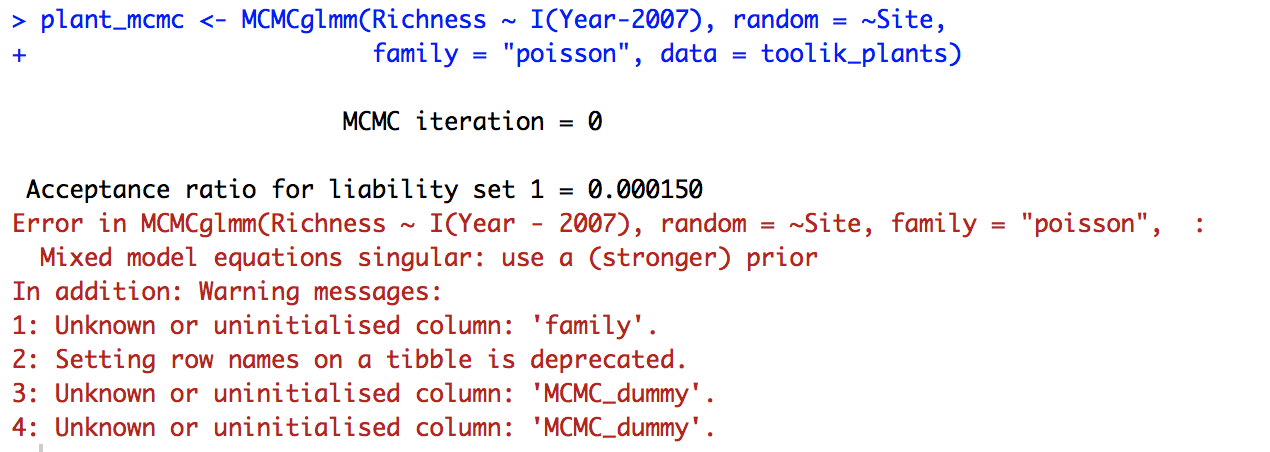
The MCMC_dummy warning message is just referring to the fact that the data, toolik_plants, has the characteristics of a tibble, a data format for objects that come out of a dplyr pipe. So that’s not something to worry about now, the real problem is that the model can’t converge when Site is a random effect. We might not have enough sites or enough variation in the data.
Let’s explore how the model looks if we include Block and Plot as random effects (here they are random intercepts).
plant_mcmc <- MCMCglmm(Richness ~ I(Year-2007), random = ~Block + Plot,
                       family = "poisson", data = toolik_plants)
The model has ran, we have seen the many iterations roll down the screen, but what are the results and has the model really worked? Just like with other models, we can use summary() to see a summary of the model outputs.
summary(plant_mcmc)
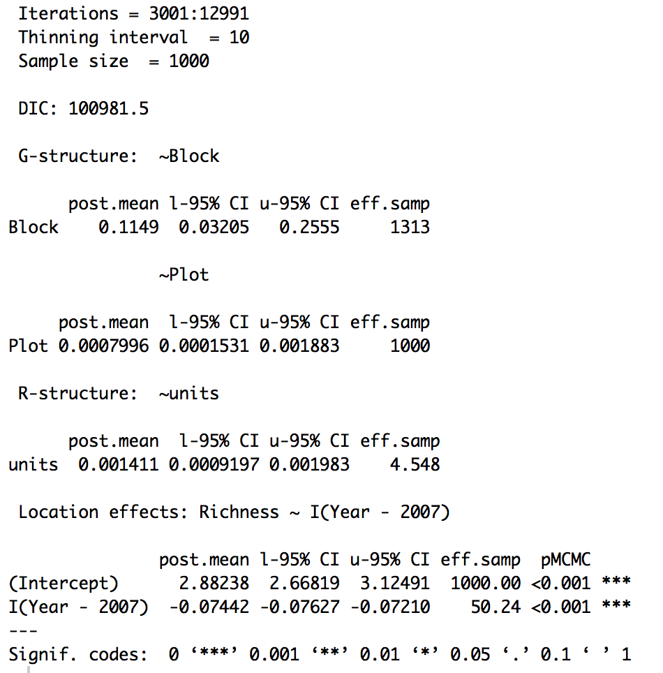
The posterior mean (i.e., the slope) for the Year term is -0.07 (remember that this is on the logarithmic scale, because we have used a Poisson distribution). So in general, based on this model, species richness has declined over time.
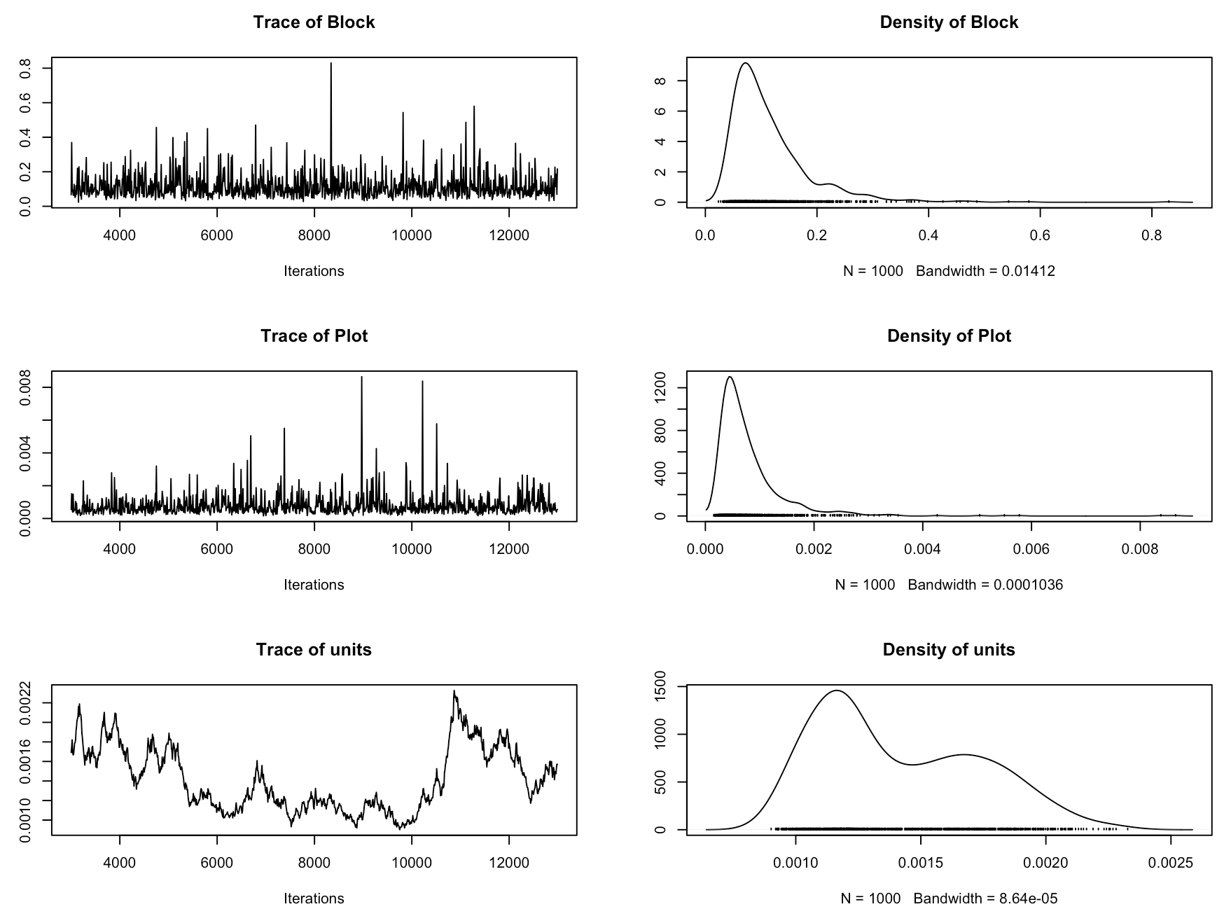
Now we should check if the model has converged. In MCMCglmm, we assess that using trace plots. You want them to look like a fuzzy caterpillar. Sol refers to the fixed effects and VCV to the random effects. Ours really don’t give off that fuzzy caterpillar vibe! So in this case, even though the model ran and we got our estimates, we wouldn’t really trust this model. This model is therefore not really the best model to answer our research question, because we are not accounting for the site effects, or for the fact that the plots are within blocks within sites.
plot(plant_mcmc$VCV)
plot(plant_mcmc$Sol)
Let’s see what the MCMCglmm models are like when we estimate changes in the cover of one species - Betula nana, dwarf birch. We can also use a Poisson distribution here, as we can think about plant cover as proportion data, e.g., Betula nana cover say 42% of our sample plot. There might be other suitable distributions like a beta binomial distribution, which we will explore in the sequel to this tutorial, coming to you soon!
We have added code for parameter-expanded priors. You don’t need to worry about the details of those, as in this tutorial we are thinking about the design of the model. These priors will improve model convergence and if you want to find out more about them, you can check out the MCMCglmm tutorial here.
# Set weakly informative priors
prior2 <- list(R = list(V = 1, nu = 0.002),
               G = list(G1 = list(V = 1, nu = 1, alpha.mu = 0, alpha.v = 10000),
                        G2 = list(V = 1, nu = 1, alpha.mu = 0, alpha.v = 10000),
                        G3 = list(V = 1, nu = 1, alpha.mu = 0, alpha.v = 10000)))

# Extract just the Betula nana data
betula <- filter(toolik_plants, Species == "Bet nan")

betula_m <- MCMCglmm(round(Relative.Cover*100) ~ Year, random = ~Site + Block + Plot,
                     family = "poisson", prior = prior2, data = betula)

summary(betula_m)
plot(betula_m$VCV)
plot(betula_m$Sol)
From the summary, we can see that the effect size for year is very small: it doesn’t look like the cover of Betula nana has changed much over the 2008-2012 survey period.
The trace plots for this model are a bit better than the previous one and we have included all three levels of our experimental hierarchy as random intercepts. We have ran these models with the default number of iteratations (13000). Increasing the number of iterations can improve convergence, so that’s something you can explore later if you want (you can increase the iterations by adding nitt = 100000 or a different number of your choice inside the MCMClgmm() code).
Visualise model outputs
We can use the package MCMCvis by Casey Youngflesh to plot the results of our Betula nana model.
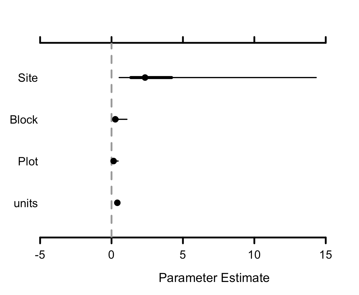
MCMCplot(betula_m$Sol)
MCMCplot(betula_m$VCV)
Sol refers to the fixed effects and VCV to the random effects, so we can see the effect sizes of the different variables we have added to our models. If the credible intervals overlap zero, then those effects are not significant, so we can see here that Betula nana cover hasn’t changed. units refers to the residual variance.
Conclusions
Today we have learned that in order to design a statistical model, we first need to think about our questions, the structure in the data we are working with and the types of assumptions that we want to make. No model will ever be perfect, but we can use hierarchical models to minimize the assumptions that we are making about our data and to better represent the complex data structures that we often have in ecology and other disciplines. Designing a statistical model can at first seem very overwhelming, but it gets easier over time and in the end, can be one of the most fun bits of ecology, believe it or not! And the more tools you build in your statistical toolkit to help you developing appropriate statistical models, the better you will be able to tackle the challenges that ecological data throw your way! Happy modelling!
Extras
If you are keen, you can now try out the brms package and generate the Stan code for this model. This will help us to start to think about how we can implement hierarchical models using the statistical programming language Stan.
You can check out the Stan hierarchical modelling tutorial here!
Keen to take your modelling skills to the next level? If you want to learn hierarchical spatial modelling and accounting for spatial autocorrelation, check out our tutorial on INLA!
Doing this tutorial as part of our Data Science for Ecologists and Environmental Scientists online course?
This tutorial is part of the Stats from Scratch stream from our online course. Go to the stream page to find out about the other tutorials part of this stream!
If you have already signed up for our course and you are ready to take the quiz, go to our quiz centre. Note that you need to sign up first before you can take the quiz. If you haven't heard about the course before and want to learn more about it, check out the course page.