Tutorial Aims & Steps:
- Get familiar with different data distributions
- Choosing your model structure
- Practice linear models (and ANOVAs)
- Write and run the models
- Understand the outputs
- Verify the assumptions
- Practice generalised linear models
- Challenge yourself!
Things get real in this tutorial! As you are setting out to answer your research questions, often you might want to know what the effect of X on Y is, how X changes with Y, etc. The answer to “What statistical analysis are you going to use?” will probably be a model of some sort. A model in its simplest form may look something like:
temp.m <- lm(soil.temp ~ elevation) - i.e. we are trying to determine the effect of elevation (the independent, predictor, or explanatory variable) on soil temperature (the dependent, or response variable). We might hypothesise that as you go up in elevation, the soil temperature decreases, which would give you a negative effect (i.e. a downward slope).
A slightly more complicated model might look like: skylark.m <- lm(abundance ~ treatment + farm.area, family = poisson, data = skylarks). Here you are modelling abundance, the response variable, as a function of treatment (e.g. a categorical variable describing different types of farms) AND of farm.area (i.e. the size of each farm where abundance data were collected), which are both your explanatory variables. The family argument refers to the distribution of the data. In this case, abundance represents count, zero-inflated data (allows for zero-valued observations), for which a Poisson distribution is suitable (but more on this later). The data argument refers to the data frame in which all the variables are stored.
Are your data all nicely formatted and ready for analysis? You can check out our Data formatting and manipulation tutorial if tidying up your data is still on your to-do list, but for now we’ll provide you with some ready-to-go data to get practising!
Go to the Github repository for this tutorial, click on Code, select Download ZIP and then unzip the files to a folder on your computer. If you are registered on GitHub, you can also clone the repository to your computer and start a version-controlled project in RStudio. For more details on how to start a version-controlled project, please check out our Intro to Github for version control tutorial.
1. Get familiar with different data distributions
Here is a brief summary of the data distributions you might encounter most often.
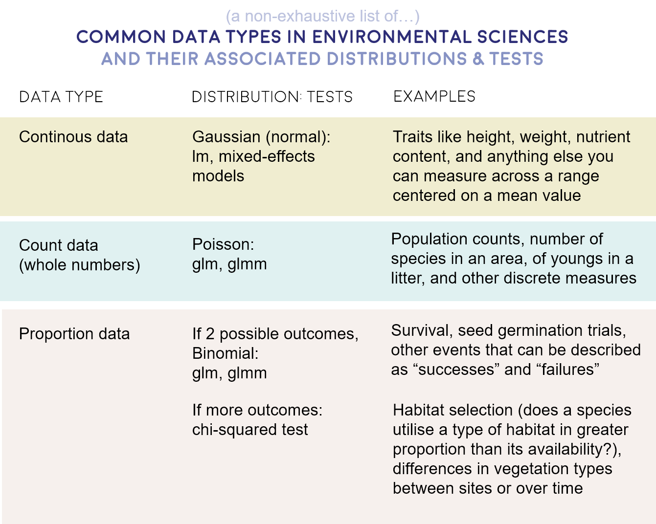
- Gaussian - Continuous data (normal distribution and homoscedasticity assumed)
- Poisson - Count abundance data (integer values, zero-inflated data, left-skewed data)
- Binomial - Binary variables (TRUE/FALSE, 0/1, presence/absence data)
Choosing the right statistical test for your analysis is an important step about which you should think carefully. It could be frustrating to spend tons of time running models, plotting their results and writing them up only to realise that all along you should have used e.g. a Poisson distribution instead of a Gaussian one.
2. Choosing your model structure
Another important aspect of modelling to consider is how many terms, i.e. explanatory variables, you want your model to include. It’s a good idea to draft out your model structure before you even open your R session. Let your hypotheses guide you! Think about what it is you want to examine and what the potential confounding variables are, i.e. what else might influence your response variable, aside from the explanatory variable you are most interested in? Here is an example model structure from before:
skylark.m <- lm(abundance ~ treatment + farm.area)
Here we are chiefly interested in the effect of treatment: does skylark abundance vary between the different farm treatments? This is the research question we might have set out to answer, but we still need to acknowledge that these treatments are probably not the only thing out there influencing bird abundance. Based on our ecological understanding, we can select other variables we may want to control for. For example, skylark abundance will most likely be higher on larger farms, so we need to account for that.
But wait - surely bird abundance on farms also depends on where the species occur to begin with, and the location of the farms within the country might also have an effect. Thus, let’s add latitude + longitude to the model.
skylark.m <- lm(abundance ~ treatment + farm.area + latitude + longitude)
Last, imagine your experimental design didn’t go as planned: you meant to visit all farms three times to collect data, but some farms you managed to visit only twice. Ignoring this would weaken your final results - is abundance different / the same because the treatment has no / an effect, or because there were differences in study effort? To test that, you can include a visits term examining the effect of number of visits on abundance.
skylark.m <- lm(abundance ~ treatment + farm.area + latitude + longitude + visits)
Some might say this model is very complex, and they would be right - there are a lot of terms in it! A simple model is usually prefered to a complex model, but if you have strong reasons for including a term in your model, then it should be there (whether it ends up having an effect or not). Once you have carefully selected the variables whose effects you need to quantify or account for, you can move onto running your models.
Don’t go over the top!
It is important to be aware of the multiple factors that may influence your response variables, but if your model has a lot of variables, you are also in danger of overfitting. This means that there is simply not enough variation in your dataset (often because it is too small) to be accounted by all those variables, and your model will end up being super tailored to this specific dataset, but not necessarily representative of the generalised process or relationship you are trying to describe. Overfitting can cast doubt over your model’s output, so think carefully about the structure of your model, and read more about how to detect and avoid overfitting here.
Another thing to think about is collinearity among your explanatory variables. If two variables in your dataset are very correlated with each other, chances are they will both explain similar amounts of variation in your response variable - but the same variation, not different or complementary aspects of it! Imagine that you measured tree heights as you walked up a mountain, and at each measuring point you recorded your elevation and the air temperature. As you may expect that air temperature goes down with increasing elevation, including both these factors as explanatory variables may be risky.
3. Some practice with linear models
We will now explore a few different types of models. Create a new script and add in your details. We will start by working with a sample dataset about apple yield in relation to different factors. The dataset is part of the agridat package.
install.packages("agridat")
library(agridat)

# Loading the dataset from agridat
apples <- agridat::archbold.apple
head(apples)
summary(apples)
Check out the dataset. Before we run our model, it’s a good idea to visualise the data just to get an idea of what to expect. First, we can define a ggplot2 theme (as we’ve done in our data visualisation tutorial), which we will use throughout the tutorial. This creates nice-looking graphs with consistent formatting.
theme.clean <- function(){
  theme_bw()+
  theme(axis.text.x = element_text(size = 12, angle = 45, vjust = 1, hjust = 1),
        axis.text.y = element_text(size = 12),
        axis.title.x = element_text(size = 14, face = "plain"),
        axis.title.y = element_text(size = 14, face = "plain"),
        panel.grid.major.x = element_blank(),
        panel.grid.minor.x = element_blank(),
        panel.grid.minor.y = element_blank(),
        panel.grid.major.y = element_blank(),
        plot.margin = unit(c(0.5, 0.5, 0.5, 0.5), units = , "cm"),
        plot.title = element_text(size = 20, vjust = 1, hjust = 0.5),
        legend.text = element_text(size = 12, face = "italic"),
        legend.position = "right")
}
We can now make a boxplot to examine our data. We can check out the effect of spacing on apple yield. We can hypothesise that the closer apple trees are to other apple trees, the more they compete for resources, thus reducing their yield. Ideally, we would have sampled yield from many orchards where the trees were planted at different distances from one another - from the summary of the dataset you can see that there are only three spacing categories - 6, 10 and 14 m. It would be a bit of a stretch to count three numbers as a continuous variable, so let’s make them a factor instead. This turns the previously numeric spacing variable into a 3-level categorical variable, with 6, 10 and 14 being the levels.
apples$spacing2 <- as.factor(apples$spacing)

library(ggplot2)

(apples.p <- ggplot(apples, aes(spacing2, yield)) +
    geom_boxplot(fill = "#CD3333", alpha = 0.8, colour = "#8B2323") +
    theme.clean() +
    theme(axis.text.x = element_text(size = 12, angle = 0)) +
  labs(x = "Spacing (m)", y = "Yield (kg)"))
Note that putting your entire ggplot code in brackets () creates the graph and then shows it in the plot viewer. If you don’t have the brackets, you’ve only created the object, but will need to call it to visualise the plot.
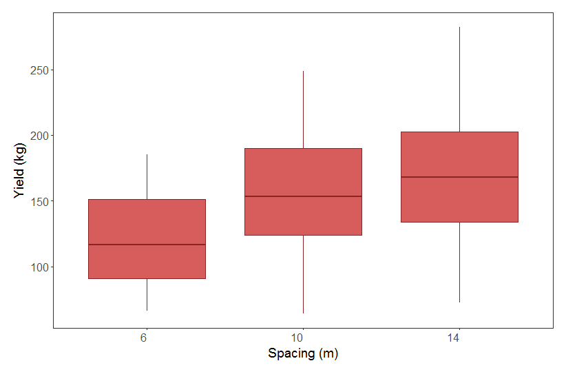
From our boxplot, we can see that yield is pretty similar across the different spacing distances. Even though there is a trend towards higher yield at higher spacing, the range in the data across the categories almost completely overlap. From looking at this boxplot alone, one might think our hypothesis of higher yield at higher spacing is not supported. Let’s run a model to explicitly test this.
apples.m <- lm(yield ~ spacing2, data = apples)
summary(apples.m)
Check out the summary output of our model:
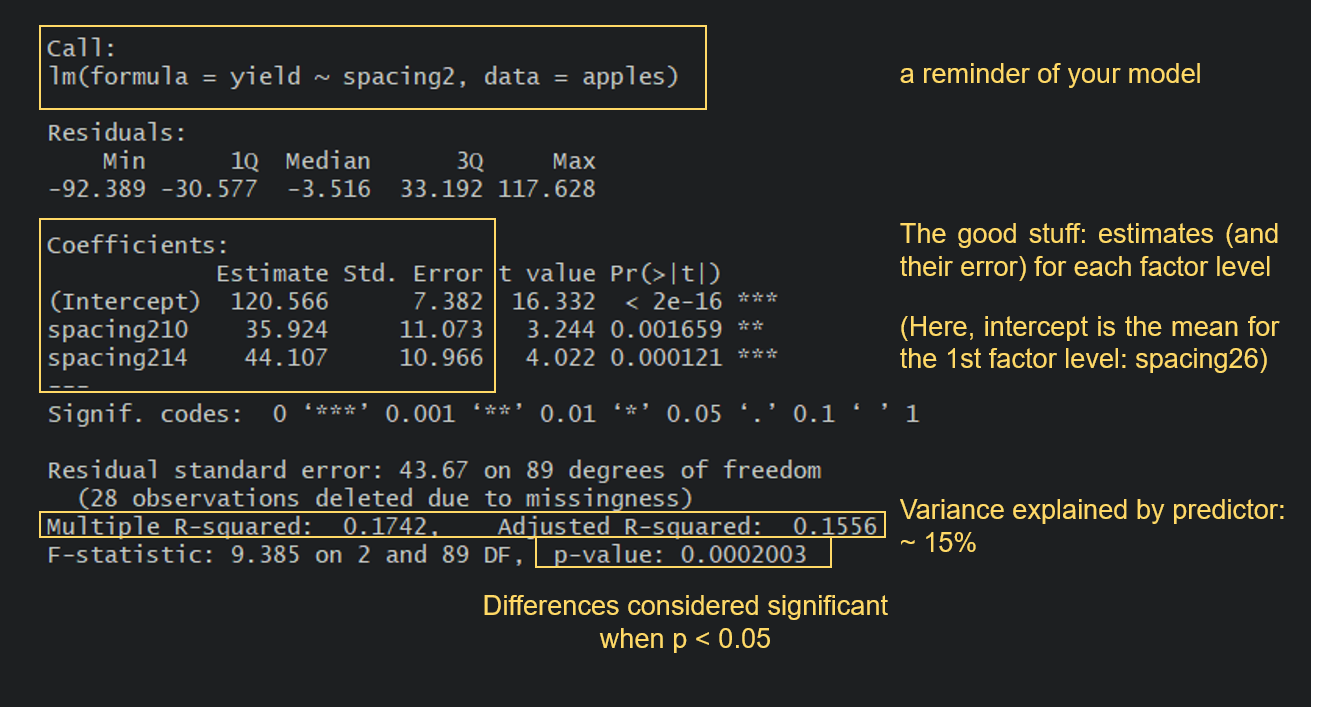
Turns out that yield does significantly differ between the three spacing categories, so we can reject the null hypothesis of no effect of spacing on apple yield. It looks like apple yield is indeed higher when the distance between trees is higher, which is in line with our original ecological thoughts: the further away trees are from one another, the less they are limiting each other’s growth.
But let’s take a look at a few other things from the summary output. Notice how because spacing2 is a factor, you get results for spacing210 and spacing214. If you are looking for the spacing26 category, that is the intercept: R just picks the first category in an alphabetical order and makes that one the intercept. A very important thing to understand is that the estimates for the other categories are presented relative to the reference level. So, for the 10-m spacing category, the estimated value from the model is not 35.9, but 35.9 + 120.6 = 156.5. A look at our boxplot will make this easy to verify.
You also get a Multiple R-squared value and an Adjusted R-squared value. These values refer to how much of the variation in the yield variable is explained by our predictor spacing2. The values go from 0 to 1, with 1 meaning that our model variables explain 100% of the variation in the examined variable. R-squared values tend to increase as you add more terms to your model, but you also need to be wary of overfitting. The Adjusted R-squared value takes into account how many terms your model has and how many data points are available in the response variable.
So now, can we say this is a good model? It certainly tells us that spacing has a significant effect on yield, but maybe not a very important one compared to other possible factors influencing yield, as spacing only explains around 15% of the variation in yield. Imagine all the other things that could have an impact on yield that we have not studied: fertilisation levels, weather conditions, water availability, etc. So, no matter how excited you might be of reporting significant effects of your variables, especially if they confirm your hypotheses, always take the time to assess your model with a critical eye!
More practice: another model
Now that we’ve written a model and understood its output, let’s analyse another dataset and learn to read it’s output, too. We’ll introduce something just a bit different.
We will use the ilri.sheep dataset, also from the agridat package, to answer the question: Is the weight of lambs at weaning a function of their age at weaning?, with the hypothesis that lambs that are weaned later are also heavier.
sheep <- agridat::ilri.sheep   # load the data

library(dplyr)
sheep <- filter(sheep, ewegen == "R")   # there are confounding variables in this dataset that we don't want to take into account. We'll only consider lambs that come from mothers belonging to the breed "R".

head(sheep)  # overview of the data; we'll focus on weanwt (wean weight) and weanage

sheep.m1 <- lm(weanwt ~ weanage, data = sheep)   # run the model
summary(sheep.m1)                                # study the output
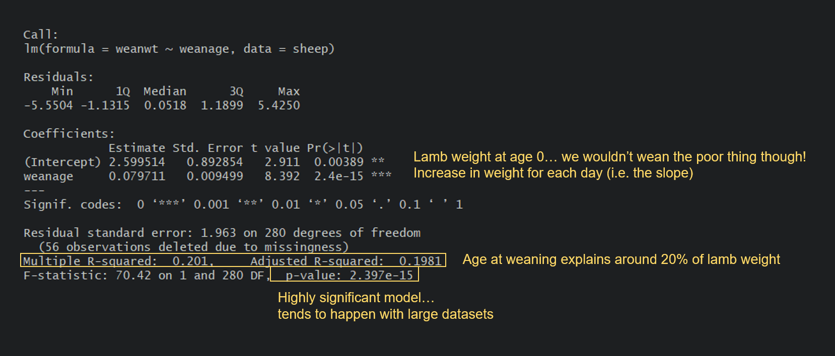
Can you spot the difference between this model and the apple model? In the apple model, our predictor spacing was a categorical variable. Here, our predictor weanage is a continuous variable. For the apple model, the output gave us the yield estimate (mean) for each level of spacing (with Intercept being our reference level).
Here, the intercept is the value of Y when X is 0. In many models this is not of interest and sometimes doesn’t make a ton of sense, but in our case you could potentially argue that it’s the weight of a newborn lamb. Then, the output gives us an estimate, which is the slope of the relationship. In this case, every day you wait to wean a lamb will result in an average increase of 0.08 kg in its weight. You probably remember how to write linear equations from school, so that you could write it thus: lamb weight = 2.60 + 0.08(age).
So far, so good? Let’s read one extra output where things get a little bit more complex. Our model, with weanageas the sole predictor, currently only explains about 20% of the variation in the weight at weaning. What if the sex of the lamb also influences weight gain? Let’s run a new model to test this:
sheep.m2 <- lm(weanwt ~ weanage*sex, data = sheep)
summary(sheep.m2)
Can you make sense of the output? Take a moment to examine yours and try to work it out. For instance, could you calculate the estimated weight of a female sheep at 100 days of weaning age? What about a male?
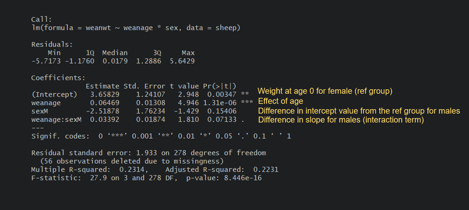
Let’s write the equations. For a female, which happens to be the reference group in the model, it’s fairly simple:
Female weight = 3.66 + 0.06(age) : The weight at 100 days would be 3.66 + 0.06(100) = 9.66 kg.
For a male, it’s a little more complicated as you need to add the differences in intercept and slopes due to the sex level being male:
Male weight = 3.66 + [-2.52] + 0.06(age) + [0.03(age)] : The weight at 100 days would be 3.66 - 2.52 + (0.06+0.03)(100) = 10.14 kg.
It always makes a lot more sense when you can visualise the relationship, too:
(sheep.p <- ggplot(sheep, aes(x = weanage, y = weanwt)) +
      geom_point(aes(colour = sex)) +                                # scatter plot, coloured by sex
      labs(x = "Age at weaning (days)", y = "Wean weight (kg)") +
      stat_smooth(method = "lm", aes(fill = sex, colour = sex)) +    # adding regression lines for each sex
      scale_colour_manual(values = c("#FFC125", "#36648B")) +
      scale_fill_manual(values = c("#FFC125", "#36648B")) +
      theme.clean() )
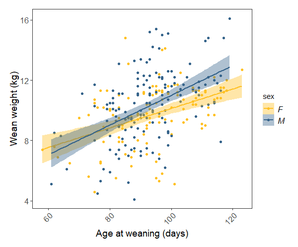 Our model tells us that weight at weaning increases significantly with weaning date, and there is only a marginal difference between the rate of males’ and females’ weight gain. The plot shows all of this pretty clearly.
Model terminology, and the special case of the ANOVA
Confused when hearing the terms linear regression, linear model, and ANOVA? Let’s put an end to this: they’re all fundamentally the same thing!
Linear regression and linear model are complete synonyms, and we usually use these terms when we’re quantifying the effect of a continuous explanatory variable on a continuous response variable: what is the change in Y for a 1 unit change in X? We just did this for the sheep data: what is the weight gain for each extra day pre-weaning?
Now enters the ANOVA, which stands for Analysis of Variance. We usually talk about an ANOVA when we’re quantifying the effect of a discrete, or categorical explanatory variable on a continuous response variable. We just did with the apples: how does the mean yield vary depending on the spacing category? It is also a linear model, but instead of getting a slope that allows us to predict the yield for any value of spacing, we get an estimate of the yield for each category.
So, just to let it sink, repeat after us: ANOVA is a linear regression (and here is a nice article explaining the nitty gritty stuff). You can run the anova function on our linear model object apples.m and see how you get the same p-value:
anova(apples.m)
To learn more about ANOVA, check out our ANOVA tutorial!
Checking assumptions
In addition to checking whether this model makes sense from an ecological perspective, we should check that it actually meets the assumptions of a linear model:
1- are the residuals, which describe the difference between the observed and predicted value of the dependent variable, normally distributed?
2- are the data homoscedastic? (i.e. is the variance in the data around the same at all values of the predictor variable)
3- are the observations independent?
# Checking that the residuals are normally distributed
apples.resid <- resid(apples.m)              # Extracting the residuals
shapiro.test(apples.resid)                   # Using the Shapiro-Wilk test
# The null hypothesis of normal distribution is accepted: there is no significant difference (p > 0.05) from a normal distribution

# Checking for homoscedasticity
bartlett.test(apples$yield, apples$spacing2)
bartlett.test(yield ~ spacing2, data = apples)  # Note that these two ways of writing the code give the same results
# The null hypothesis of homoscedasticity is accepted
The assumptions of a linear model are met (we can imagine that the data points are independent - since we didn’t collect the data, we can’t really know). If your residuals are not normally distributed and/or the data are heteroscedastic (i.e. the variances are not equal), you can consider transforming your data using a logarithmic transformation or a square root transformation.
We can examine the model fit further by looking at a few plots:
plot(apples.m) # you will have to press Enter in the command line to view the plots
This will produce a set of four plots:
- Residuals versus fitted values
- a Q-Q plot of standardized residuals
- a scale-location plot (square roots of standardized residuals versus fitted values)
- a plot of residuals versus leverage that adds bands corresponding to Cook’s distances of 0.5 and 1.
In general, looking at these plots can help you identify any outliers that have a disproportionate influence on the model, and confirm that your model has ran alright e.g. you would want the data points on the Q-Q plot to follow the line. It takes experience to “eyeball” what is acceptable or not, but you can look at this helpful page to get you started.
4. Practicing generalised linear models
The model we used above was a general linear model since it met all the assumptions for one (normal distribution, homoscedasticity, etc.) Quite often in ecology and environmental science that is not the case and then we use different data distributions. Here we will talk about a Poisson and a binomial distribution. To use them, we need to run generalised linear models.
A model with a Poisson distribution
Import the shagLPI.csv dataset and check it’s summary using summary(shagLPI). Notice that for some reason R has decided that year is a character variable, when it should instead be a numeric variable. Let’s fix that so that we don’t run into trouble later. The data represent population trends for European Shags on the Isle of May and are available from the Living Planet Index.
shag <- read.csv("shagLPI.csv", header = TRUE)

shag$year <- as.numeric(shag$year)  # transform year from character into numeric variable

# Making a histogram to assess data distribution
(shag.hist <- ggplot(shag, aes(pop)) + geom_histogram() + theme.clean())
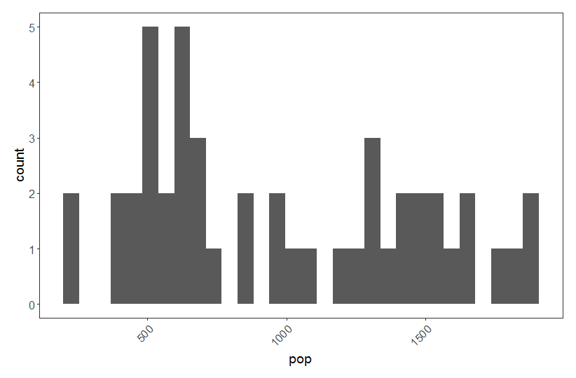
Our pop variable represents count abundance data, i.e. integer values (whole European Shags!) so a Poisson distribution is appropriate here. Often count abundance data are zero-inflated and skewed towards the right. Here our data are not like that, but if they were, a Poisson distribution would still have been appropriate.
shag.m <- glm(pop ~ year, family = poisson, data = shag)
summary(shag.m)
From the summary of our model we can see that European Shag abundance varies significantly based on the predictor year. Let’s visualise how European Shag abundance has changed through the years:
(shag.p <- ggplot(shag, aes(x = year, y = pop)) +
    geom_point(colour = "#483D8B") +
    geom_smooth(method = glm, colour = "#483D8B", fill = "#483D8B", alpha = 0.6) +
    scale_x_continuous(breaks = c(1975, 1980, 1985, 1990, 1995, 2000, 2005)) +
    theme.clean() +
    labs(x = " ", y = "European Shag abundance"))
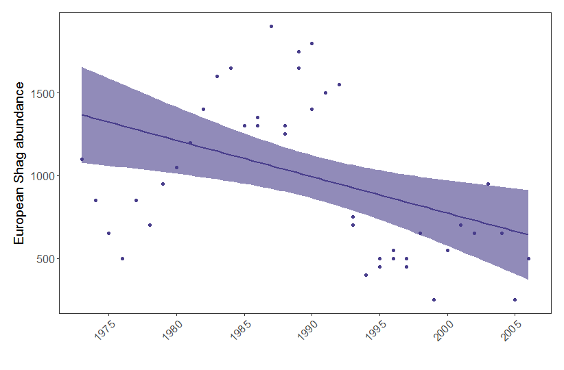
Figure 1. European shag abundance on the Isle of May, Scotland, between 1970 and 2006. Points represent raw data and model fit represents a generalised linear model with 95% confidence intervals.
A model with a binomial distribution
We will now work this the Weevil_damage.csv data that you can import from your project’s directory. We can examine if damage to Scot’s pine by weevils (a binary, TRUE/FALSE variable) varies based on the block in which the trees are located. You can imagine that different blocks represent different Scot’s pine populations, and perhaps some of them will be particularly vulnerable to weevils? Because of the binary nature of the response variable (true or false), a binomial model is appropriate here.
Weevil_damage <- read.csv("Weevil_damage.csv")

# Making block a factor (a categorical variable)
Weevil_damage$block <- as.factor(Weevil_damage$block)

# Running the model
weevil.m <- glm(damage_T_F ~ block, family = binomial, data = Weevil_damage)
summary(weevil.m)
Check out the summary output. It looks like the probability of a pine tree enduring damage from weevils does vary significantly based on the block in which the tree was located. The estimates you see are not as straightforward to interpret as those from linear models, where the estimate represents the change in Y for a change in 1 unit of X, because binomial models are a type of logistic regression which relies on log odd ratios - but we won’t get into details here. Greater estimates still mean bigger influence of your variables, just keep in mind that it’s not a linear relationship! And finally, you won’t get a R squared value to assess the goodness of fit of your model, but you can get at that by looking at the difference between the Null deviance (variability explained by a null model, e.g. glm(damage_T_F ~ 1)) and the Residual deviance, e.g. the amount of variability that remains after you’ve explained some away by your explanatory variable. In short, the bigger the reduction in deviance, the better a job your model is doing at explaining a relationship.
We have now covered the basics of modelling. Next, you can go through our tutorial on mixed effects models, which account for the structure and nestedness of data. You can also check out a couple of other tutorials on modelling to further your knowledge:
- General and generalised linear models, by Germán Rodríguez.
- Regression modelling in R, by Harvard University.
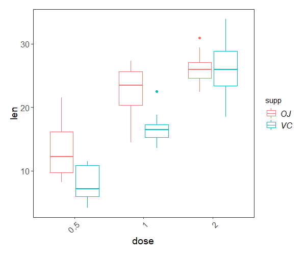
5. Challenge yourself!
Now that you can write and understand linear regressions, why don’t you have a go at modelling another dataset?
Using the ToothGrowth built-in dataset describing tooth growth in guinea pigs under different vitamin C treatments, can you answer the following questions?
ToothGrowth <- datasets::ToothGrowth
- Are higher doses of vitamin C beneficial for tooth growth?
- Does the method of administration (orange juice,
OJ, or ascorbic acid,VC) influence the effect of the dose? - What would be the predicted tooth length of a guinea pig given 1 mg of vitamin C as ascorbic acid?
Click this line to view a solution
First, we need to convert the dose variable into a categorical variable.
ToothGrowth$dose <- as.factor(ToothGrowth$dose)
Now we can run a model (ANOVA) using two interacting terms:
tooth.m <- lm(len ~ dose*supp, data = ToothGrowth)
summary(tooth.m)
The model is highly significant, and together, dose and method explain around 77% of the variation in tooth growth. Not bad! And to answer our questions:
- Higher doses of vitamin C promote tooth growth, but
- the effect of dose on growth depends on the administration method.
- A guinea pig given 1 mg a day as ascorbic acid would have a predicted tooth growth of:
13.23 (growth for dose 0.5, orange juice)
- 9.47 (extra growth for dose 1.0, orange juice)
- -5.25 (difference in growth linked to the ascorbic acid treatment for dose 0.5)
- -0.68 (difference in growth for the interaction between dose 1.0 and ascorbic acid treatment) = 16.77
And you can visualise the differences with a box plot:
ggplot(ToothGrowth, aes(x = dose, y = len))+
   geom_boxplot(aes(colour = supp)) +
   theme.clean()
Interested in conducting ANOVA? Check out our in-depth tutorial ANOVA from A to (XY)Z!

Doing this tutorial as part of our Data Science for Ecologists and Environmental Scientists online course?
This tutorial is part of the Stats from Scratch stream from our online course. Go to the stream page to find out about the other tutorials part of this stream!
If you have already signed up for our course and you are ready to take the quiz, go to our quiz centre. Note that you need to sign up first before you can take the quiz. If you haven't heard about the course before and want to learn more about it, check out the course page.