Tutorial aims:
- Understand the purpose of transformations and scaling in statistical analysis.
- Understand the underlying mathematics and use appropriate syntax and packages in R to apply both common and more advanced transformations and scaling procedures.
- Learn how to reverse transformations and scaling to obtain estimates and predictions in the original units of measure.
- Learn how to change the scales on the plot axes and label them appropriately.
- Learn how to apply these concepts to real problems in ecology and environmental sciences involving data through worked examples.
Steps:
- Introduction
- Part I: Transformations
- Part II: Scaling
- Part III: Scaling for Data Visualization
- Summary
- Challenge
1. Introduction
Data come in a wide variety of shapes and sizes. We use data distributions to study and understand the data and many models are built around assumptions that the data follow a certain distribution, most typically linear models always assume normal distribution of the data. However, real world data rarely perfectly align with the normal distribution and therefore break this assumption. Alternatively, there might be a situation where our data follow a non-linear relationship an our standard plots cannot capture it very well. For dealing with these issues we can use transformations and scaling. They are therefore powerful tools for allowing us to utilize a wide variety of data that would not be available for modelling otherwise and display non-linear relationships between data in more clear and interpretable plots.
This tutorial will teach you how to manipulate data using both common and more advanced transformations and scaling procedures in R. In addition, we will have a quick look at situations when adjusting scales on plot axes is a better decision than transforming or scaling data themselves. Throughout the tutorial we will work with datasets from ecological and environmental sciences in order to demonstrate that scaling data and using transformations are very useful tools when working with real world data.
Prerequisites
This tutorial is suitable for novices and intermediate learners in statistical analysis and depending on your level you should pick and choose which parts of tutorial are useful for you, for example a beginner might learn basic transformations such as logarithmic and square-root transformations while an intermediate learner will extend these concepts by learning about the Box-Cox transformation. However, to get most out of this tutorial you should have a basic knowledge of descriptive statistics and linear models. Knowledge of high school algebra (functions, equation manipulation) will enhance the understanding of the underlying mathematical concepts.
While we will use programming language R throughout the tutorial, the concepts you will learn here are applicable in other programming languages as well! To fully appreciate the code in this tutorial you should have at least a basic knowledge of data manipulation using dplyr, tidyr and visualising data using ggplot2. If you are new to R or need to refresh your memory there are great resources available on the Coding Club website:
Data and Materials
You can find all the data that you require for completing this tutorial on this GitHub repository. We encourage you to download the data to your computer and work through the examples along the tutorial as this reinforces your understanding of the concepts taught in the tutorial.
Now we are ready to dive into the world of transformations and scaling!
2. Part I: Data Transformations

Credits: Matus Seci
Data tranformations represent procedure where a mathematical function is equally applied to all points in the dataset. In this tutorial, we will consider transformations to be mainly describing situation where the mathematical function we apply is non-linear, i.e. the effect of applying the function to a point with a low value is not equal to the effect of applying the function to a point with a large value. As we mentioned in the introduction, probably the main reason to use data transformations is to adjust data distribution to fit into the assumptions of a model we want to use. Since explaining statistical concepts is always easier with examples, let’s jump straight into it!
To start off, open a new R script in RStudio and write down a header with the title of the script (e.g. the tutorial name), your name and contact details and the last date you worked on the script.
In the following parts we will work with the data from the Living Planet Index which is an open-source database containing population data of a large number of species from all around the planet. In each part of the tutorial we will focus on a population of a different species. Let’s load it into our script along with the packages we will use in this part of the tutorial. If you do not have some of these packages installed, use install.packages('package_name') to install them before loading them.
# Coding Club Tutorial - Transforming and scaling data
# Matus Seci, matusseci@gmail.com
# 29/11/2021

library(tidyverse)  # contains dplyr (data manipulation), ggplot2 (data visualization) and other useful packages
library(cowplot)  # making effective plot grids
library(MASS)  # contains boxcox() function
library(ggeffects)  # model predictions
library(broom)  # extracting model summaries

# Import Data
LPI_species <- read.csv('LPI_species.csv', stringsAsFactors = FALSE)  # remember to change the filepath appropriately
Now we can look at the basic structure of the dataframe to get some idea of the different variables it contains.
str(LPI_species)
summary(LPI_species)
We can see that the dataset contains information about 31 species. In this part we will look at the population data of the white stork (Ciconia ciconia ) sampled using the direct counts method. In particular we will attempt to answer the following research question:
How did the population of the white stork change over time?
Throughout the tutorial we will use so called ‘pipe’ operator (%>%) which allows us to connect multiple functions in order to make our code more efficient and streamlined. If you are unfamiliar with this concept you can learn more about it in this tutorial on advanced data manipulation in R. We use dplyr function filter() to extract the white stork data and adjust the year variable to be a numeric variable using mutate() and parse_number().
# Extract the white stork data from the main dataset and adjust the year variable
stork <- LPI_species %>%
  filter(Common.Name == 'White stork' & Sampling.method == 'Direct counts')%>%
  mutate(year = parse_number(as.character(year)))  # convert the year column to character and then parse the numeric part
We will use ggplot2 library for most of our visualizations. However, before we make the first plot and explore the data we will define a custom theme to give our plots a better look and save time not having to repeat code. This part is completely voluntary as it does not affect the main concepts presented, you can create your own theme if you want or even use some of the pre-built themes in ggplot2 such as theme_bw() or theme_classic().
# Define a custom plot theme

plot_theme <- function(...){
  theme_bw() +
  theme(
    # adjust axes
    axis.line = element_blank(),
    axis.text = element_text(size = 14,
                             color = "black"),
    axis.text.x = element_text(margin = margin(5, b = 10)),
    axis.title = element_text(size = 14,
                              color = 'black'),
    axis.ticks = element_blank(),

    # add a subtle grid
    panel.grid.minor = element_blank(),
    panel.grid.major = element_line(color = "#dbdbd9", size = 0.2),

    # adjust background colors
    plot.background = element_rect(fill = "white",
                                   color = NA),
    panel.background = element_rect(fill = "white",
                                    color = NA),
    legend.background = element_rect(fill = NA,
                                     color = NA),
    # adjust titles
    legend.title = element_text(size = 14),
    legend.text = element_text(size = 14, hjust = 0,
                               color = "black"),
    plot.title = element_text(size = 20,
                              color = 'black',
                              margin = margin(10, 10, 10, 10),
                              hjust = 0.5),

    plot.subtitle = element_text(size = 10, hjust = 0.5,
                                 color = "black",
                                 margin = margin(0, 0, 30, 0))
    )

}
Now we are ready to make some beautiful plots. Let’s look at the distribution of the data to get some idea of what the data look like and what model we could use to answer our research question.
# Remember, if you put the whole code in the brackets it will
# display in the plot viewer right away!

# Look at the distribution of the data
(stork_hist <- ggplot(data = stork) +
    geom_histogram(aes(x = pop),
                   alpha = 0.9,
                   fill = '#18a1db') +  # fill the histogram with a nice colour
    labs(x = 'Value',
         y = 'Density',
         title = 'Distribution of the white stork population data') +
    plot_theme())  # apply the custom theme
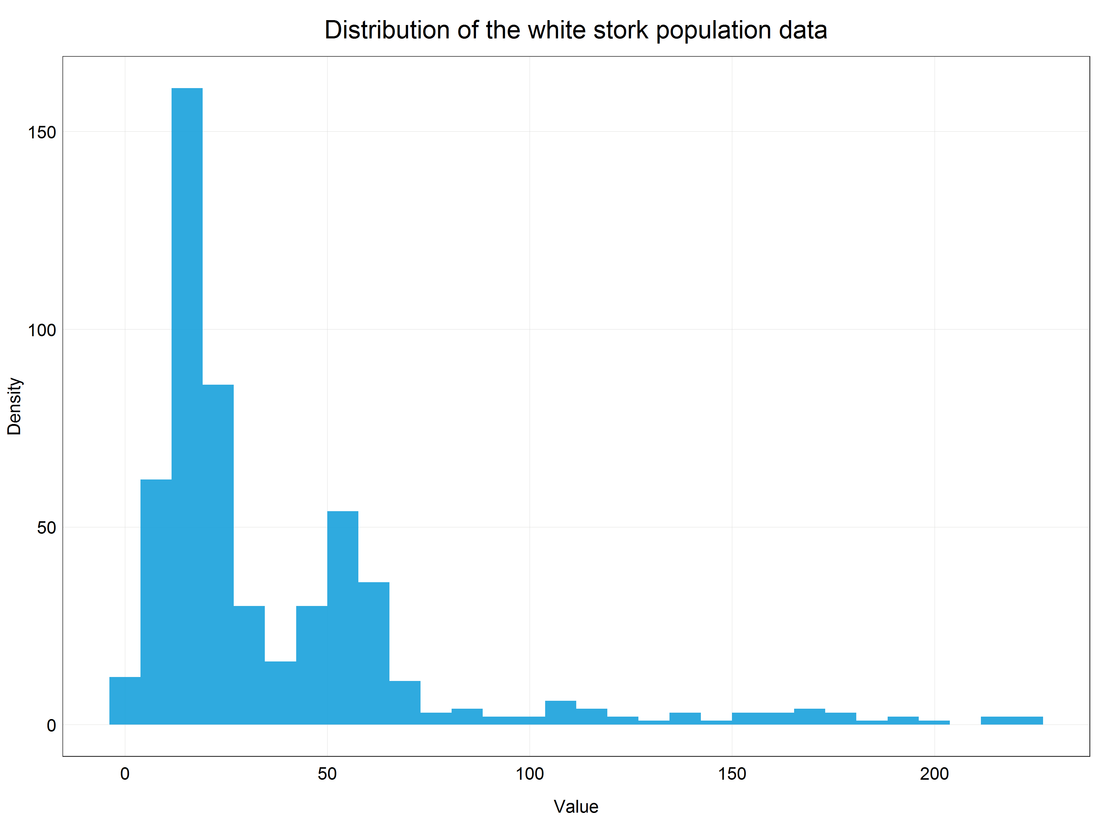
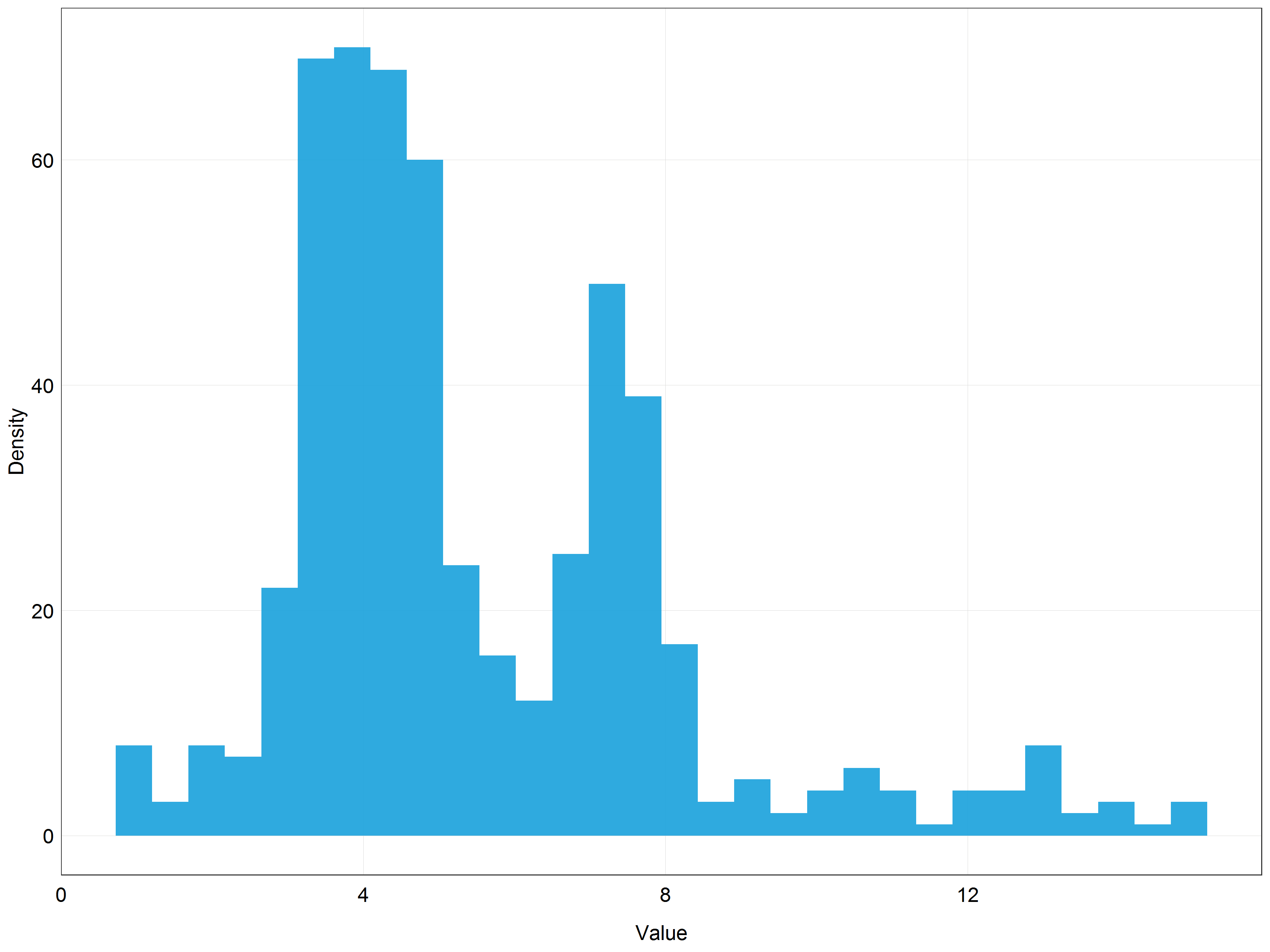
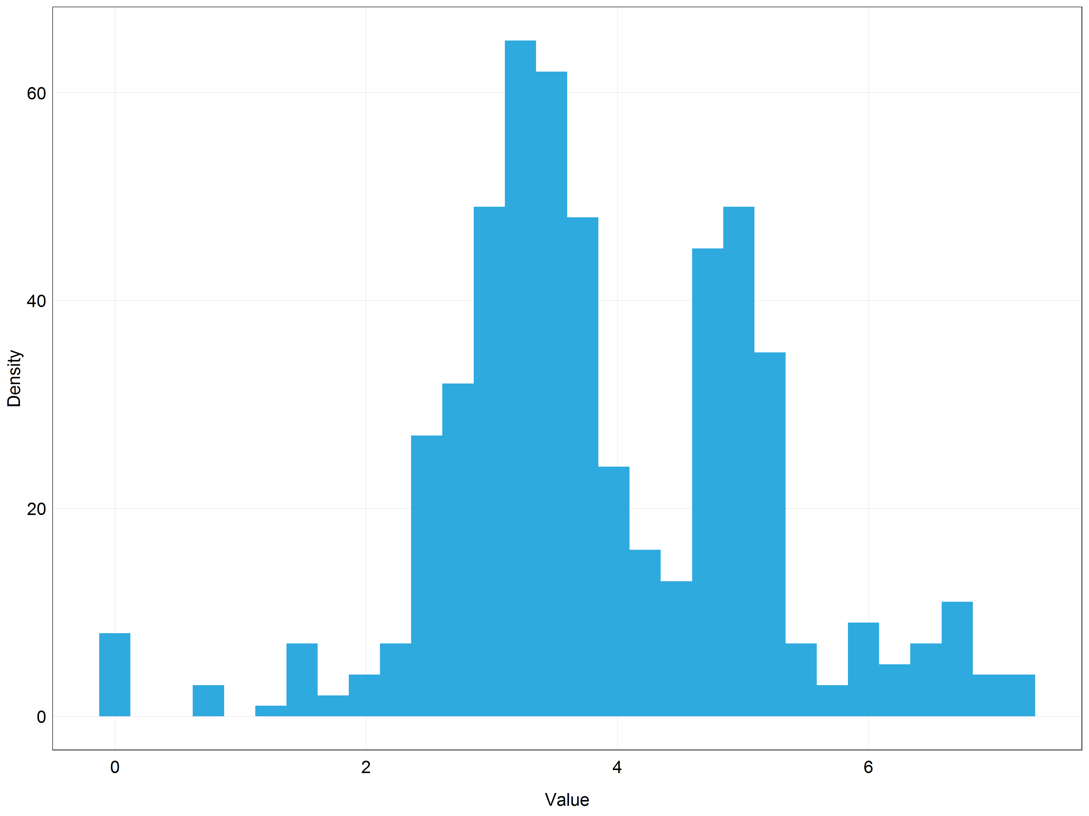
We can see that our data are very right-skewed (i.e. most of the values are relatively small). This data distribution is far from normal and therefore we cannot use the data directly for modelling with linear models which assume normal distribution. This is where transformations come in!
Observant learners will notice that we are dealing here with count data and therefore we could model this dataset using generalized linear model with Poisson distribution. This would be a perfectly correct approach, however, for the sake of this tutorial we will stick with simple linear models to demonstrate how we can use transformations to model non-normally distributed data using simple linear models.
Logarithmic transformation
The histogram above showed that we are dealing with skewed data. We can also plot a simple scatter plot to see that these data would not be very well described by a straight line. An exponential curve would fit the data much better.
# Plot a scatter plot of the data
(stork_scatter <- ggplot(data = stork) +
    geom_point(aes(x = year, y = pop),  # change to geom_point() for scatter plot
                   alpha = 0.9,
                   color = '#18a1db') +
    labs(x = 'Year',
         y = 'Population Abundance',
         title = 'Population abundance of white stork') +
    plot_theme())  # apply the custom theme
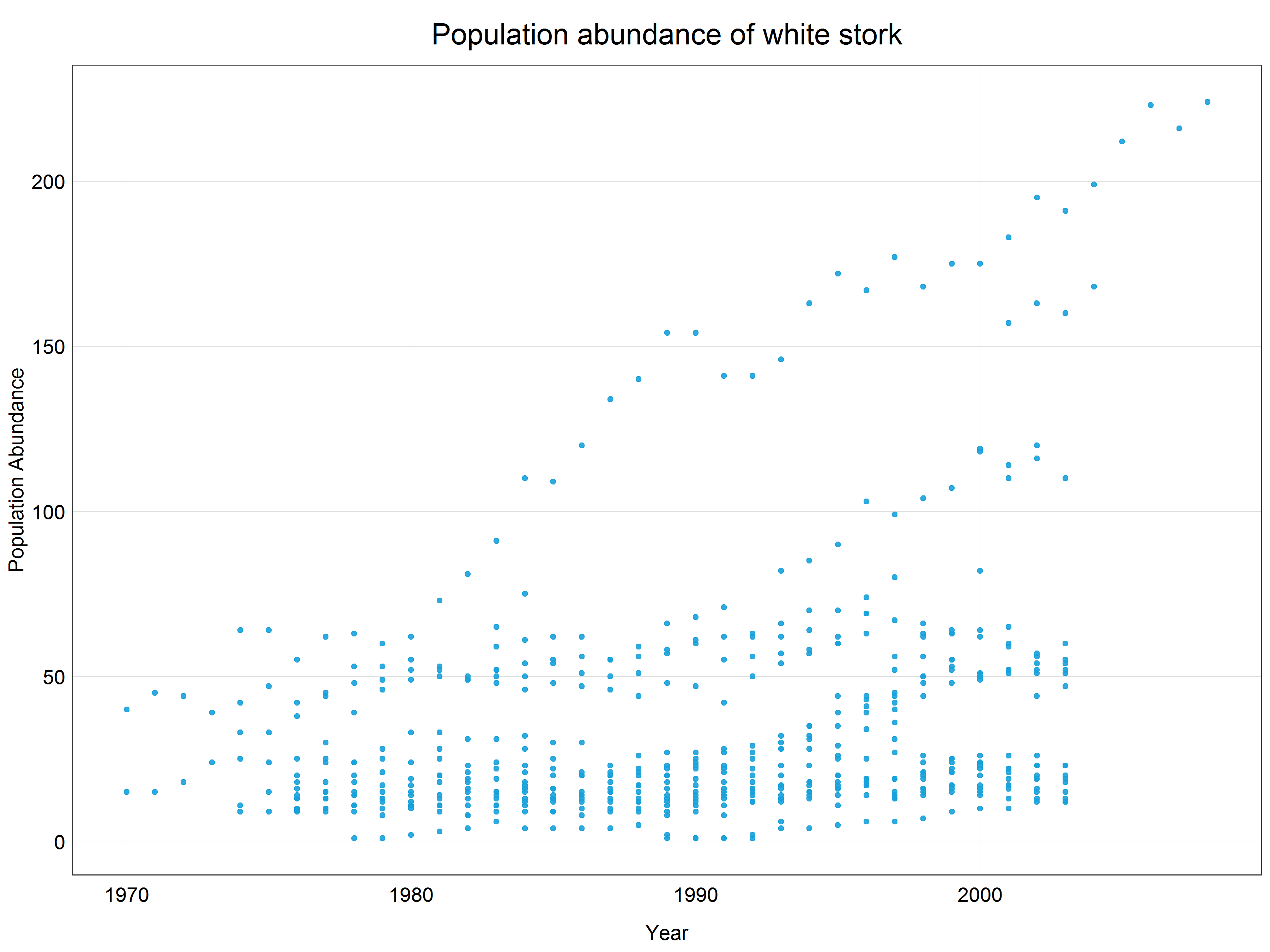
This means that we need to apply a logarithmic transformation which will linearize the data and we will be able to fit a linear model. Luckily, this procedure is very simple in R using a base R function log() which by default uses natural logarithm, i.e. logarithm with base e (Euler’s number). The choice of the base for a logarithm is somewhat arbitrary but it relates to the ‘strength of transformation’ which we will cover a bit later in the tutorial. If you wanted to use a logarithm with a different base you could either define it in the function call like this log(x, base = 10) or for some common types use pre-built functions (e.g. log10(x) or log2(x)). Together with mutate() function we can create a new column with the transformed data so that we do not overwrite the original data in case we want to use them later.
# Log transform the data
stork <- stork %>%
  mutate(logpop = log(pop))

# Plot a scatter plot of the log transformed data
(stork_scatter <- ggplot(data = stork) +
    geom_point(aes(x = year, y = logpop),  # change pop -> logpop
                   alpha = 0.9,
                   color = '#18a1db') +
    labs(x = 'Year',
         y = 'Population Abundance (log transformed data)',
         title = 'Population abundance of white stork') +
    plot_theme())  # apply the custom theme
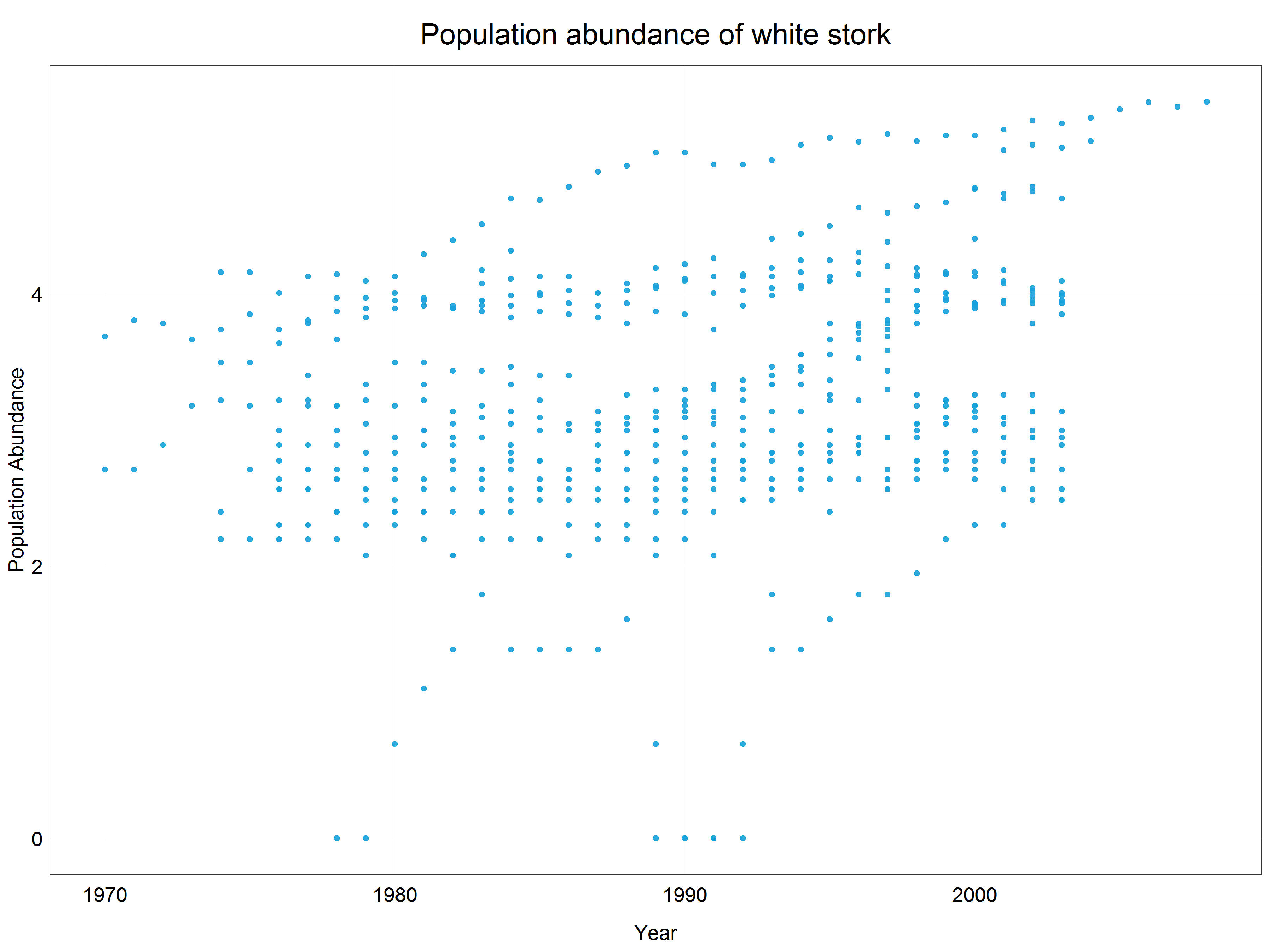
We can see that the data have been constrained to a much narrower range (y-axis) and while there is not a crystal clear linear pattern we could argue that a linear line would fit the best for this scatter plot. Let’s have a look at how the data distribution changed by looking at a histogram of the log transformed data.
# Plot the histogram of log transformed data
(stork_log_hist <- ggplot(data = stork) +
    geom_histogram(aes(x = logpop),
                   alpha = 0.9,
                   fill = '#18a1db') +
    labs(x = 'Value',
         y = 'Density') +
    plot_theme())
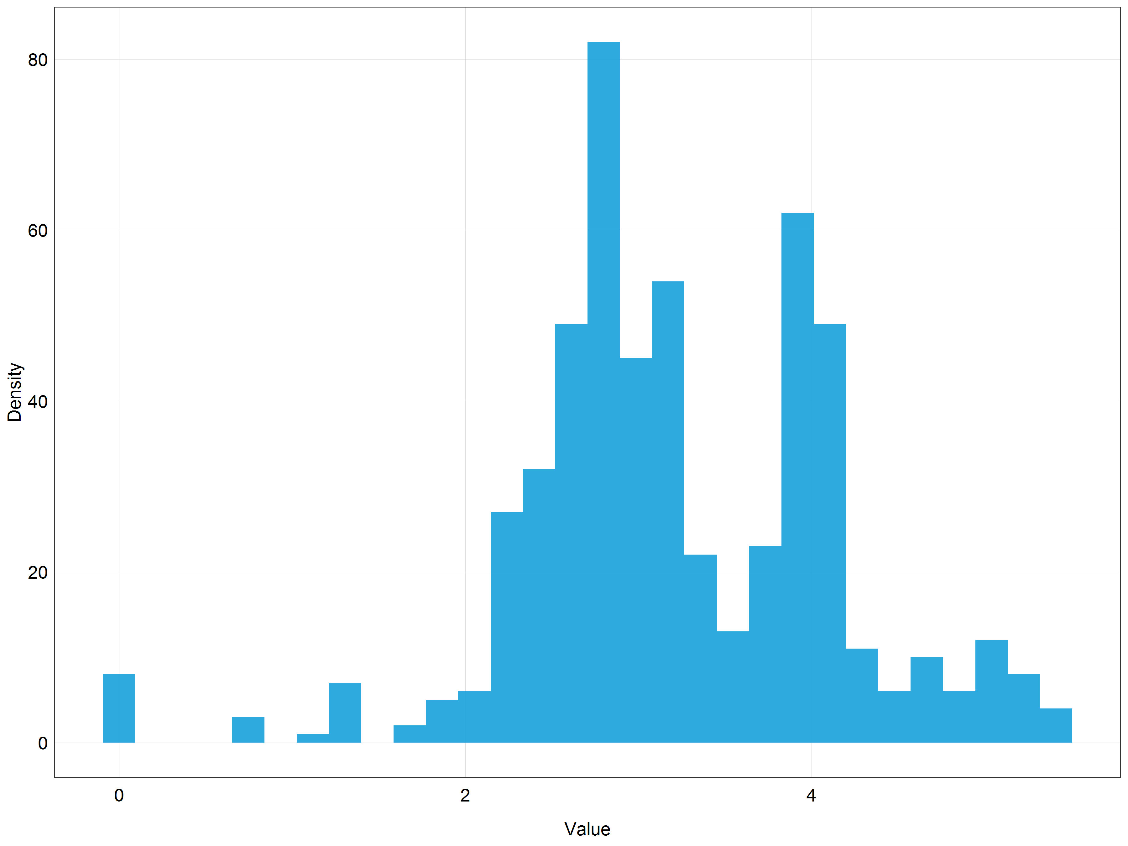
Even though the distribution is not perfectly normal it looks much closer to the normal distribution than the previous histogram!
Log transformations are often used to transform right-skewed data, however, the transformation has a major shortcoming which is that it only works for positive non-zero data. This is due to the mathematical properties of the logarithmic function.
If you find out that your data have a 0 values but you would still like to use log transformation you can add a constant to the variable before performing the transformation, for example log(x + 1) where x is the variable. This way you can get rid of the negative or zero values. You can do this either manually or using log1p() function. However, you should use this method with caution as adding a constant changes the properties of the logartihm and it might not transform the data in a desirable way.
Our data look quite normally distributed now but we might think that a weaker transformation could result in a data more centered than what we have now. We will therefore try to apply such a transformation - square-root transformation.
Square-root transformation
Square root transformation works in a very similar way as logarithmic transformation and is used in similar situations (right-skewed data), however, it is a weaker transformation. What do we mean by weaker? Well, to answer this question it is a good idea to look at the graphs describing log and sqrt functions.
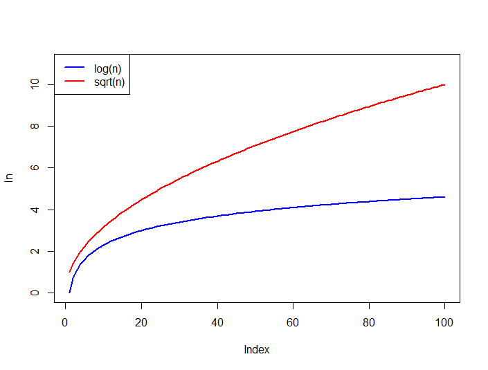
Source: StackOverflow
As you can see the logarithmic function levels off much more quickly which means that it constrains large values much more strongly than square-root. As a result, with log transformation extreme values in the dataset will become less important. The plots also indicate that square-root transformation has the same disadvantage as log transformation - it can only be used on positive non-zero data.
Similar to the log transformation, we can use sqrt() function in base R to make this transformation.
# Create a square-root transformed column
stork <- stork %>%
  mutate(sqrtpop = sqrt(pop))

# Plot the histogram of square root transformed data
(stork_hist_sqrt <- ggplot(data = stork) +
    geom_histogram(aes(x = sqrtpop),  # change pop -> sqrtpop
                   alpha = 0.9,
                   fill = '#18a1db') +
    labs(x = 'Value',
         y = 'Density') +
    plot_theme())
This does not look bad but the data are still quite skewed. This probably means that out of the three options we have seen (original data, log, sqrt) the most normal looking distribution would be achieved with the log transformation.
While it would be completely alright to use log transformed data, we will extend our transformations toolbox with yet another, more advanced, type of transformation, Box-Cox transformation.
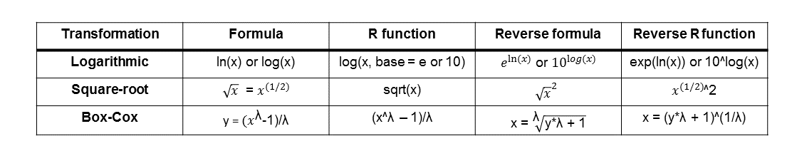
Box-Cox transformation
Box-Cox transformation is a statistical procedure developed by George Box and Sir David Roxbee Cox for transforming non-normally distributed data into a normal distribution. The transformation is not as straightforward as logarithmic or square-root transformations and requires a bit more explanation. We will start by trying to understand the equation that describes the transformation.
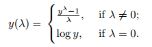
Source: Statistics How To
Looking at the equation we can notice several important properties of the transformation:
- The transformation is determined by a parameter lambda.
- If lambda = 0 the transformation is simply log transformation, otherwise, the transformation is determined by the given equation.
The animation below demonstrates how the different lambda values change the results of the transformation.
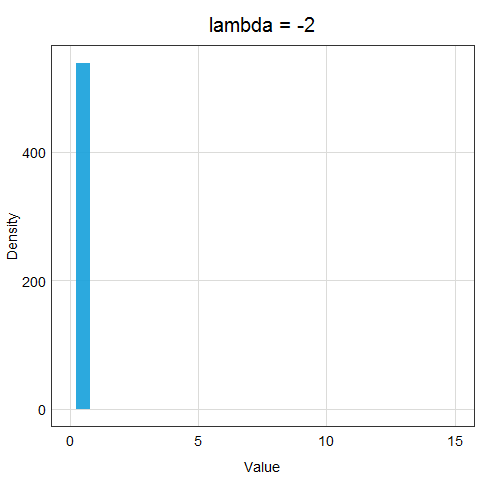
Now, the important question is, how do we determine lambda? In the age of computers, it is very easy - we will just let R try out many different options and evaluate which lambda value makes the transformed data the closest to normal distribution. You can see that this procedure is much more precise than log or sqrt transformations - we are trying many different options and strengths of transformations!
Now let’s try to use Box-Cox transformation on our data. To do this we can use boxcox() function from MASS package which we loaded earlier. boxcox() function takes as an argument either a model object or a model formula so we will start with building a simple linear model from the original data using lm() function looking at how the abundance changed over time (pop ~ year) which is appropriate for our research question. With default settings boxcox() tests values for lambda in the range (-2, 2) with 0.1 steps which is quite a few lambda values!
# Build a model
stork.mod <- lm(pop ~ year, data = stork)

# Find the optimal lambda for Box-Cox
bc <- boxcox(stork.mod)
After you run the boxcox() command a plot like the one below should show up in your plot console.
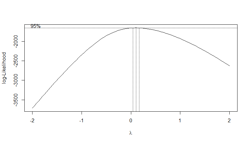
The plot shows the optimal value of the lambda parameter. We can see that for our data it is somewhere around 0.1. To extract the exact optimal value we can use the code below.
# Extract the optimal lambda value
(lambda <- bc$x[which.max(bc$y)])
Now that we have the exact value, we can use it to transform our data by applying the formula from above and the lambda value.
# Transform the data using this lambda value
stork <- stork %>%
  mutate(bcpop = ((pop^lambda-1)/lambda))

# Plot a histogram of the Box-Cox transformed data
(stork_hist_bc <- ggplot(data = stork) +
    geom_histogram(aes(x = bcpop),
                   alpha = 0.9,
                   fill = '#18a1db') +
    labs(x = 'Value',
         y = 'Density') +
    plot_theme())
We can see that the distribution is very similar to the one we got using the log transformation. This is not surprising since the lambda value we used was approximately 0.1 and lambda = 0 would result in log transformation. You can probably now see that in our situation using the log transformation would be a pretty good approximation to the Box-Cox optimal result.
Box-Cox transformation, like log and sqrt transformations, is limited to be used with positive non-zero data only. However, there exists an extension of Box-Cox transformation which is applicable to data containing zero and negative values as well - the Yeo-Johnson transformation.
As you would probably expect the formula for the Yeo-Johnson transformation is more complicated to understand. However, if you want to find out more about it we recommend you read the Wikipedia page for power transformations which describes the mathematics of both Box-Cox and Yeo-Johnson transformations.
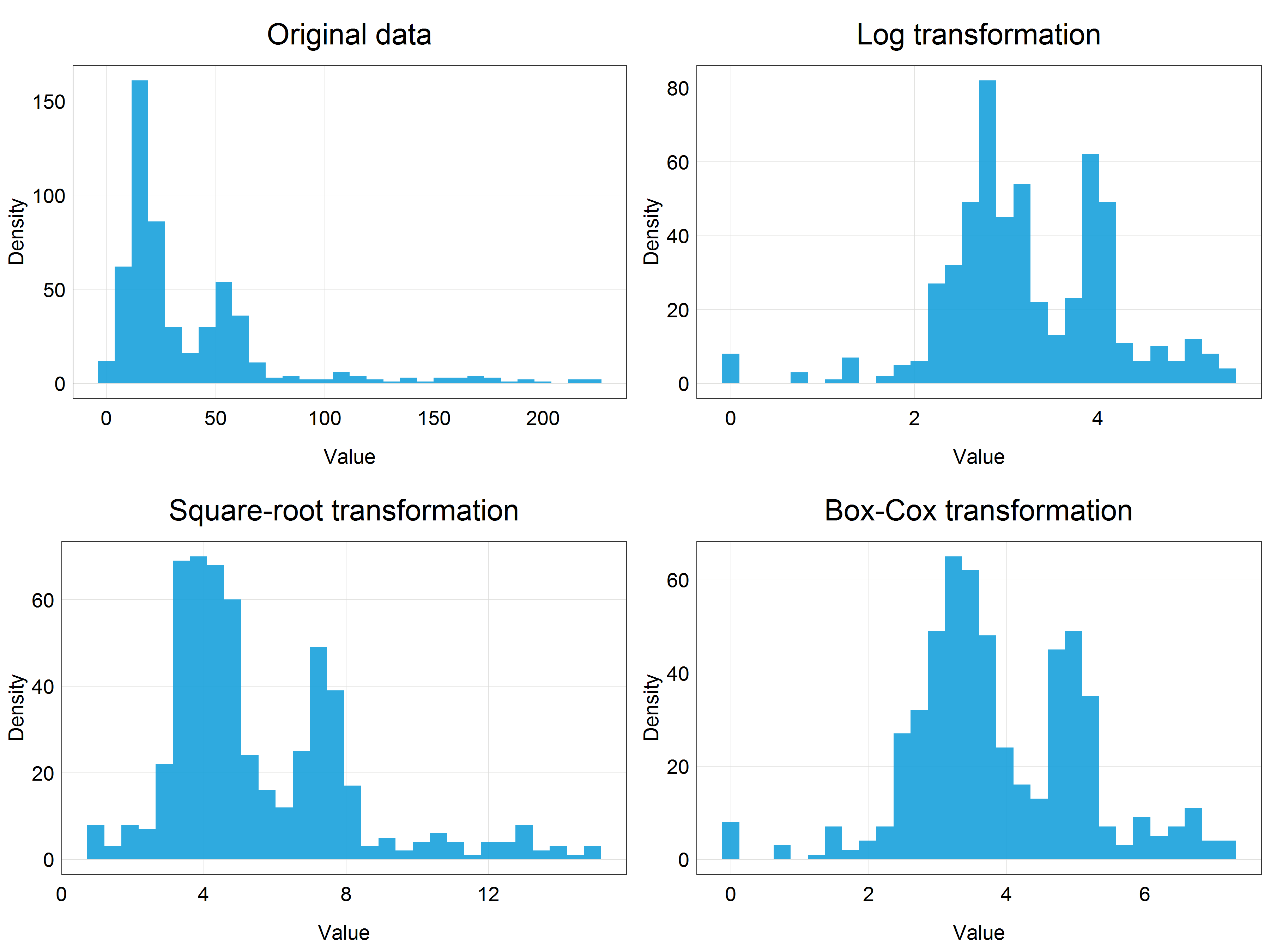
Before proceeding to model the data, we can visually appreciate the differences between the transformations we have learned and applied so far by plotting them in a panel together using cowplot package and plot_grid() function.
# Panel of histograms for different transformations
(stork_dist_panel <- plot_grid(stork_hist + labs(title = 'Original data'),  # original data
                        stork_log_hist + labs(title = 'Log transformation'),  # logarithmic transformation
                        stork_hist_sqrt + labs(title = 'Square-root transformation'),  # square-root transformation
                        stork_hist_bc + labs(title = 'Box-Cox transformation'),  # Box-Cox transformation
                        nrow = 2,  # number of row in the panel
                        ncol = 2))  # number of columns in the panel
Building models using transformed data and reversing transformations
We will now continue to build a model using the transformed data and answer our research question. We will use the Box-Cox transformed data but feel free to use the log transformed data if you want to keep things simpler!
# Fit new model using the Box-Cox transformed data
stork.bc.mod <- lm(bcpop ~ year, data = stork)

# Show the summary of the model outputs
summary(stork.bc.mod)
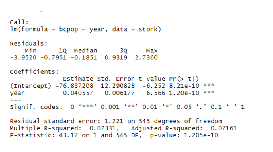
We can see that our results are highly significant with the effect size = 0.04 and standard error = 0.006. But what exactly does this mean?
Since we have transformed our data we are getting the estimate (effect size) and standard error on the transformed scale, not on the original scale! This might be quite confusing when we present our results. We will therefore back-transform our data into the original scale.
However, before that let’s have a quick look at the model assumption of normality to see how well our transformed data did compared with the model that would use the original data. We will use so called Q-Q plots for this. If the data are normally distributed, the points in the Q-Q plot should lie on the line.
# Tell R to display two plots next to each other
par(mfrow = c(1, 2))

# Q-Q plot for the original data model
qqnorm(stork.mod$residuals, main = 'Q-Q Plot Original Data')
qqline(stork.mod$residuals)

# Q-Q plot for the Box-Cox transformed data model
qqnorm(stork.bc.mod$residuals, main = 'Q-Q Plot Box-Cox Transformed Data')
qqline(stork.bc.mod$residuals)

# Reset the plot display settings
par(mfrow = c(1, 1))
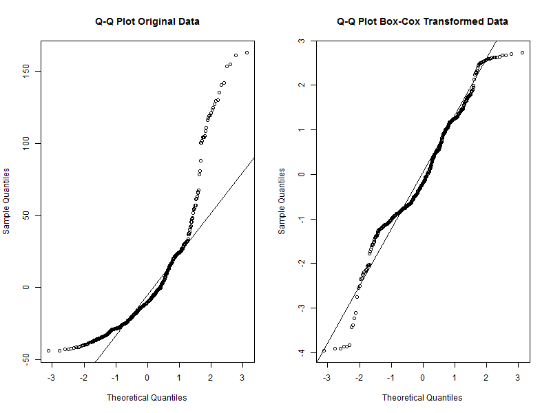
We can see that while the transformed data are not perfectly aligned with the line, they deviate much less than the original data. We can therefore conclude that the transformed data are a good fit for the normality assumption. We can move to the back-transformations now.
We do not present here the other assumptions and diagnostic plots for linear models since they are not the focus of the tutorial. However, if you want to check them you can simply use plot(stork.bc.mod) and press ‘Enter’ in the console, you should then see the plots pop up in the plot viewer window. You can read more about the other assumptions and their diagnostic plots on this blog.
Reversing transformations is essentially applying a function to the transformed data which is the inverse of the operation that was used to do the transformation. The reverse transformations for the procedures we used in this tutorial are listed in the table below together with their functions in R.
We can verify whether these reverse transformations work by simply applying them on the columns we created earlier and then comparing them with the original pop column.
# Verify reverse transformations by creating new columns that should match the original
stork <- stork %>%
  mutate(back_log = exp(logpop),
         back_sqrt = sqrtpop^2,
         back_bc = (bcpop*lambda + 1)^(1/lambda)) %>%
  glimpse()  # displays a couple of observations from each column
We can see that the values in these columns and the pop column match which is great. Therefore, we can use these back-transformations to obtain predictions of our results on a relevant scale.
We will use ggpredict() function from ggeffects package to get predictions and then convert them into the original scale by applying a relevant reverse transformation.
# Get the predictions of our model
stork.pred <- ggpredict(stork.bc.mod, terms = c('year'))

# View the predictions dataframe
View(stork.pred)
If we look at the predictions dataframe we can see that it has several predicted values which we will use to plot the prediction line as well as standard error for each prediction and confidence interval values. However, we need to apply the reverse transformation to the relevant columns first.
You can probably guess that we will apply it to the predicted column which contains the predicted values from our model. But we also need to obtain correct error/confidence intervals. Here, we could easily make a mistake if we chose the std.error column. This is because due to the non-linearity of our transformations the error will not be the same on both sides of the line, for example if our effect size in log scale was 0.5 and standard error 0.2 the correct reverse transformation would be exp(0.5) for the effect size and exp(0.7) and exp(0.3) for the confidence intervals, not exp(0.5) + exp(0.2) and exp(0.5) - exp(0.2). These would produce different results (feel free to try typing the expressions in the console and verify for yourself). Therefore, we need to adjust columns conf.low and conf.high (not std.error) to get the correct confidence intervals.
# Apply the reverse transformation on the relevant columns
stork.pred$predicted <- (stork.pred$predicted*lambda + 1)^(1/lambda)
stork.pred$conf.low <- (stork.pred$conf.low*lambda + 1)^(1/lambda)
stork.pred$conf.high <- (stork.pred$conf.high*lambda + 1)^(1/lambda)
And we can also convert the slope and and confidence intervals from the model summary to include as an annotation in our final prediction plot. To make this easier we will first convert the model summary we got into a dataframe using tidy() function from the broom package. Then, we will extract the slope and standard error and use them to calculate the values in the original scale using back-transformations.
# Convert the summary table into a dataframe
mod.summary <- tidy(stork.bc.mod)

# slope
slope <- (mod.summary$estimate[2]*lambda + 1)^(1/lambda)
slope <- round(slope, 3)

# conf. intervals

# upper
# we extract the slope and add the standard error to get the upper CI
upper_ci <- ((mod.summary$estimate[2]+mod.summary$std.error[2])*lambda + 1)^(1/lambda)
upper_ci <- round(upper_ci, 3)

# lower
# we extract the slope and subtract the standard error to get the upper CI
lower_ci <- ((mod.summary$estimate[2]-mod.summary$std.error[2])*lambda + 1)^(1/lambda)
lower_ci <- round(lower_ci, 3)
Now that we have everything ready we can combine the back-transformed predictions, original data and slope estimates to produce a beautiful figure showing the results of our analysis.
# Plot the predictions
(stork_plot <- ggplot(stork.pred) +
   geom_line(aes(x = x, y = predicted), color = '#db1818') +  # add the prediction line
   geom_ribbon(aes(x = x, ymin = conf.low, ymax = conf.high),  # add the ribbon
               fill = "#fc7777", alpha = 0.5) +
   geom_point(data = stork,  # add the original data
              aes(y = pop, x = year)) +
   annotate("text", x = 1975, y = 180,  # annotate the plot with slope and CI info
            label = paste0('Slope = ', as.character(slope),
                           '\nUpper CI = ', as.character(upper_ci),
                           '\nLower CI = ', as.character(lower_ci))) +
   labs(x = '',
        y = 'Population Abundance',
        title = "Global white stork population increased between 1970-2008",
        caption = 'Data Source: Living Planet Index') +
   plot_theme()  +
   xlim(c(1970, 2008))  # we set a limit to the x-axis to show only the relevant years
)

# Save the figure
ggsave(plot = stork_plot,
       filename = 'figures/stork_plot.png',
       width = 12, height = 9, units = 'in')
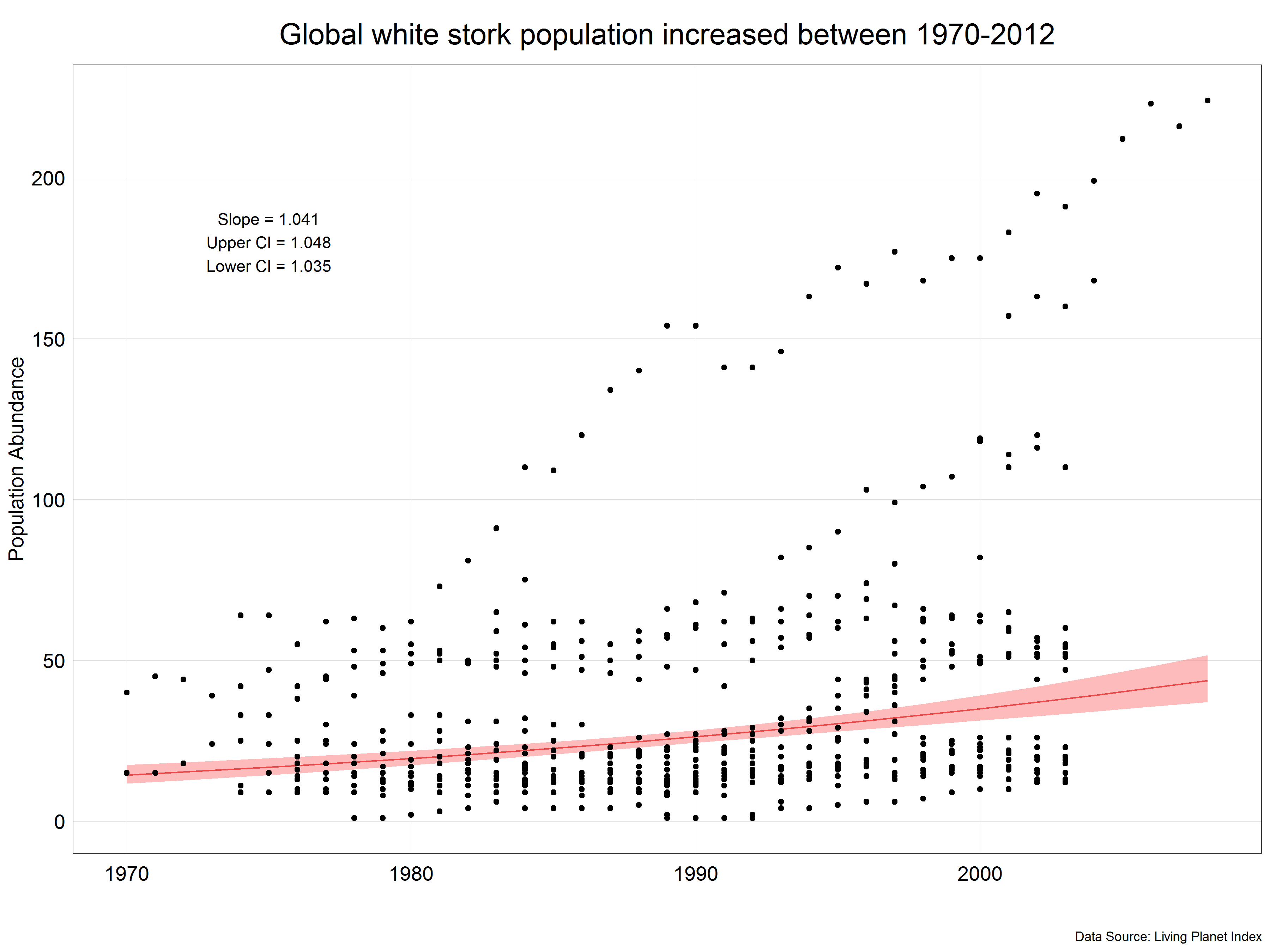
We can see that the prediction line is not straight but is more of a curve which reflects the fact that we have used transformed data. We have also corrected the slope and confidence intervals from the model to correct values and displayed them in the figure. Now, we have a final figure which we could present in a report.
This is the end of the first part of the tutorial. You should now be comfortable using transformations to convert non-normal data into a normal distribution, use them in a model and then reverse the transformation to present results in the original units. If you would like to explore other transformations which you could use, you can have a look at this Wikipedia page or this article.
Next we will look at a different type of data manipulation - scaling.
3. Part II: Scaling

Credits: Hans-Petter Fjeld (CC BY-SA)
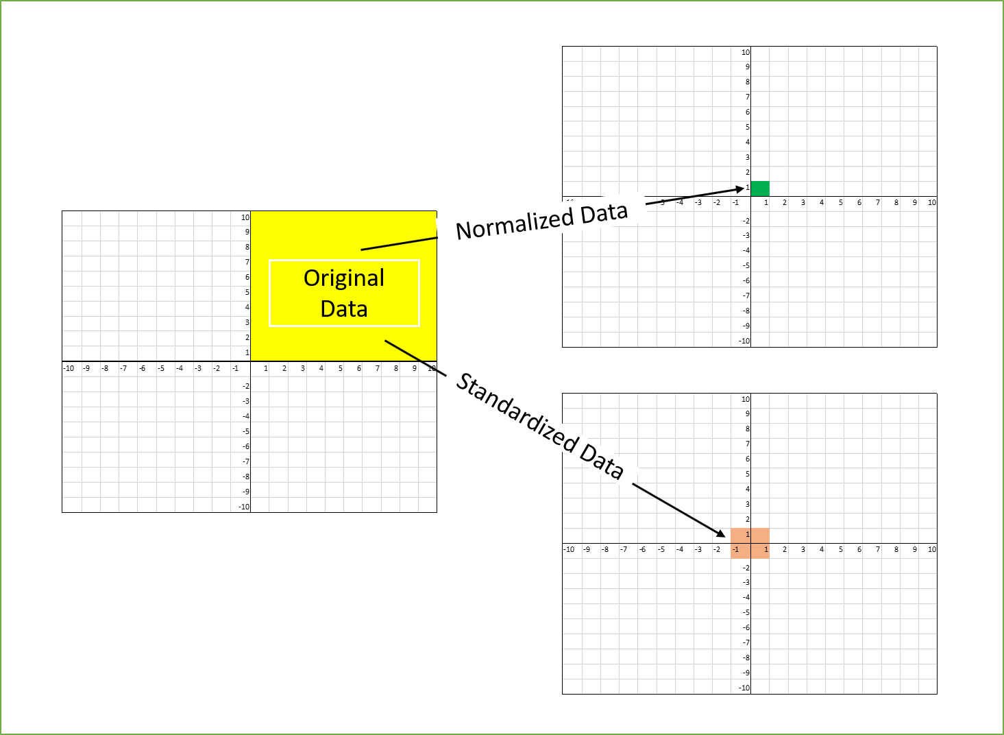
Scaling describes a set of procedures used to adjust the distribution of data, particularly the range, through linear transformations. Linear transformation in this context means that it uses only basic arithmetic operations (addition, subtraction, multiplication, division) and not exponentiating or logarithms.
You might now ask the question, in what situations we would not use transformations like log and sqrt but use scaling? Imagine that you have a dataset of species abundance measurements where some data were obtained by counts (units = individuals) and others using a population index (no units). The former might be in a range of 1000s while the other will have values from 0 - 1! Is it possible to directly compare the two? Of course not. This is where scaling comes in. It allows us to put two variables on the same scale and remove units and thus make them comparable. In this tutorial we will cover the two most common types of scaling: standardization and normalization.
Source: Towards Data Science
Standardization
As in the case of transformation we will work with a dataset from Living Planet Index. This time we will use population data for the atlantic salmon ( Salmo salar ) but unlike in the previous case we will keep observations obtained by all the sampling methods. We will answer a similar question to the one in the previous example:
How did the population of atlantic salmon change over time?
Let’s extract the data from the main dataset and look at the units and Sampling.method variables.
# Extract the Atlantic salmon data from the main dataset
salmon <- LPI_species %>%
  filter(Common.Name == 'Atlantic salmon') %>%
  mutate(year = parse_number(as.character(year)))

# Look at the units in the dataset
unique(salmon$Units)
unique(salmon$Sampling.method)
That’s a lot of different units and sampling methods! We definitely cannot compare units like Number of smolt and Individual counts. Furthermore, our dataset contains population data from multiple studies which could have used any combination of the units and sampling methods. In addition, these were probably done in different locations which will have different average populations and trends so the ranges of data will be different. Therefore, we need to scale the data in some way to be able to use it for answering our question.
However, before scaling the data let’s have a look at the distributions of the individual studies. To do this we will use ggplot2 function facet_wrap() which allows us to create plots of each population measured with one line instead of having to create each plot separately. Our dataset has a variable id which contains a unique identifier for each of the studies and we can use it for plotting the distributions.
Sometimes the plot viewer in RStudio can have trouble displaying large plots such as this one. A good workaround for this issue is simply saving the plot on your computer and viewing it then.
# Look at the distribution of the data for each of the populations
(salmon_density_loc <- salmon %>%
    ggplot(aes(x = pop)) +
      geom_density() +  # we use geom_density() instead of geom_histogram in this case but they are interchangeable
      facet_wrap(~ id, scale = 'free') +  # create the grid based on the id, scale = 'free' allows different x and y scale for each population
      labs(y = 'Density',
           x = '\nValue\n',
           title = 'Distributions of individual Atlantic salmon populations\n',
           caption = 'Data Source: Living Planet Index') +
      plot_theme() +
      theme(axis.text.x = element_blank(),  # we remove the axis text to make the plots less clutered
            axis.text.y = element_blank()))

# Save the plot
ggsave(plot = salmon_density_loc,
       filename = 'figures/salmon_hist_loc.png',
       width = 10, height = 12, units = 'in')
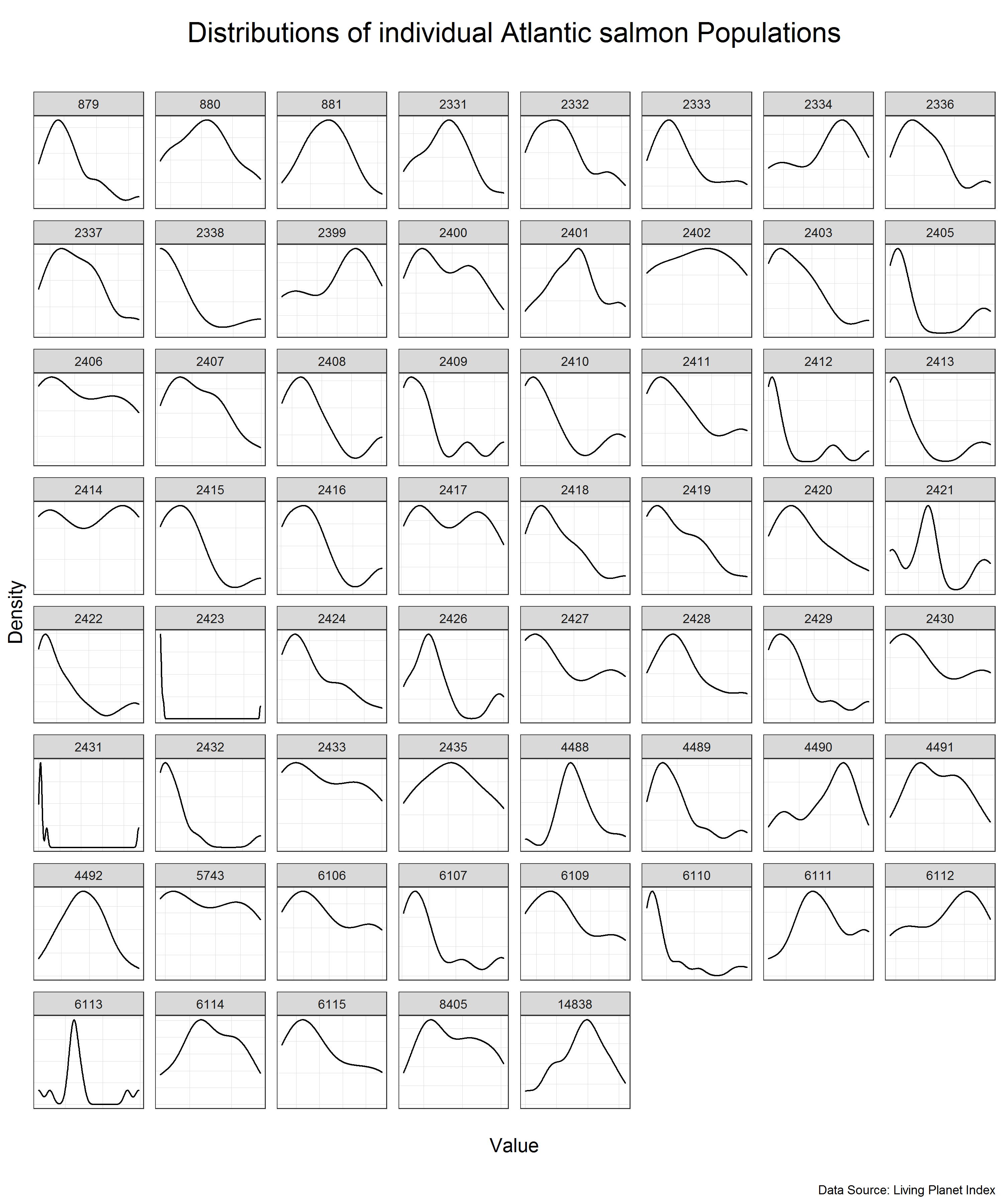
We can see that the individual populations have different distributions but many of them are close to normal distribution on their own scale. This means that we can use standardization to scale the data.
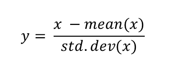
Standardization is a scaling procedure defined as subtracting the mean from the original data and dividing them by standard deviation. This shifts the centre of the distribution to 0 and scales standard deviation to 1. It is especially useful for data which are already normally distributed, in fact, the name of the procedure derives from the term standard normal. Normal distribution is defined by its mean and standard deviation which means that given these two parameters you can draw the exact curve describing the distribution (this fact alone is one of the main reasons why normal distribution is so popular, it is really easy to measure mean and standard deviation). Standard normal refers to a normal distribution with mean = 0 and standard deviation = 1.
You might ask why this procedure would not work for other distributions? Well, the main issue here is that other distributions such as Poisson, binomial or exponential are not well described by their mean and standard deviation. This is due to the asymmetry of these distributions. Look at the animations below to see what happens when we apply standardization to normally distributed data and exponential data.
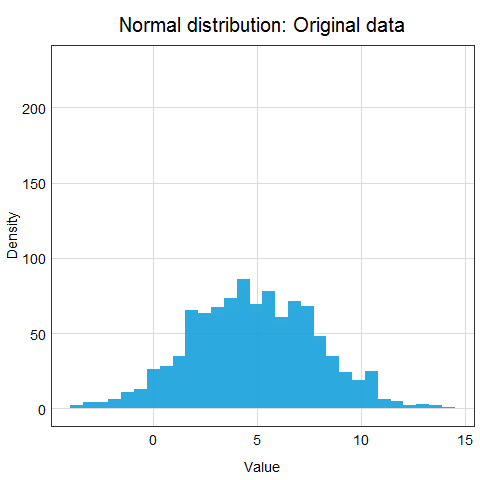
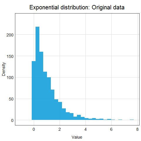
You can clearly see that the standardized normal distribution is centered at 0 and has normal looking tails (standard deviation = 1). Formally, the same is true for the exponential distribution, however, it is not clear at all from looking at the distribution and neither mean nor standard deviation would be useful in describing its shape or values.
Since we have verified that many of our studies have normally distributed population variable, let’s move on to apply standardization to our data. We will use a combination of group_by() and mutate() to standardize data from each of the studies individually.
# Standardize the data
salmon <- salmon %>%
  group_by(id) %>%  # group the data by the study id
  mutate(scalepop_standard = (pop-mean(pop))/(sd(pop))) %>%  # apply standardization
  ungroup()  # ungroup the data to avoid issue with grouping later on
Now let’s have a look at how our overall data distribution has changed by plotting histogram of the original data and the standardized data.
# Histogram of the original, unscaled data
salmon_hist <- ggplot(data = salmon) +
    geom_histogram(aes(x = pop),
                   alpha = 0.9,
                   fill = '#319450') +
    labs(x = 'Value',
         y = 'Density') +
    plot_theme()

# Look at the distribution of the scaled data
salmon_hist_scaled <- ggplot(data = salmon) +
    geom_histogram(aes(x = scalepop_standard),
                       alpha = 0.9,
                       fill = '#319450') +
    labs(x = 'Value',
         y = 'Density') +
    plot_theme()

# Panel of the histograms
(salmon_dist <- plot_grid(salmon_hist + labs(title = 'Original data'),  # original data
                          salmon_hist_scaled + labs(title = 'Standardized data'),  # standardized data
                          nrow = 1,  # number of row in the panel
                          ncol = 2))  # number of columns in the panel
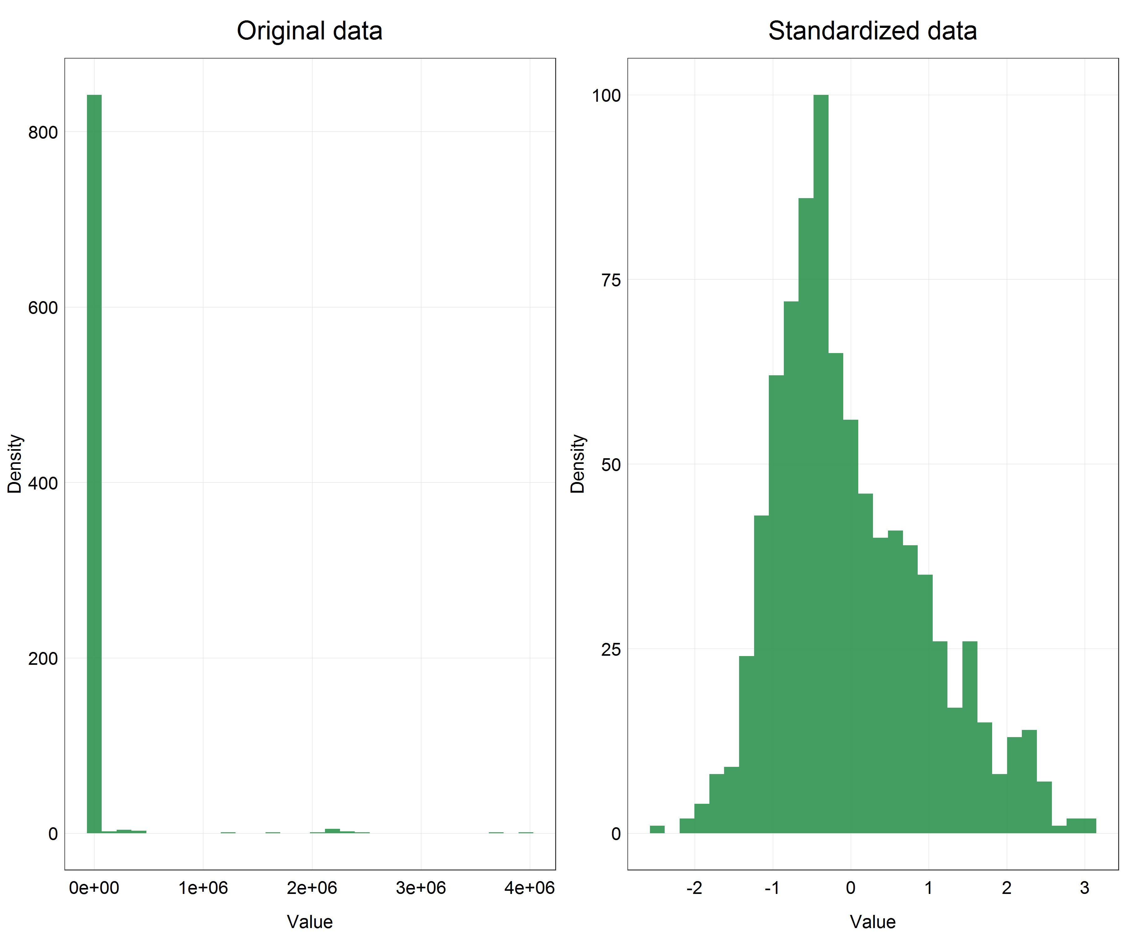
This is a huge difference! We can clearly see that our data are now centered on 0 and the distribution looks very close to normal, even if slightly skewed, but compared to the original data this is an incredible improvement.
We would now proceed with modelling the data using the scaled variable but since the procedure would be essentially the same as in the transformation example above, we will not fully repeat the process here.
The only difference would be back-scaling the data after modelling to show in the final predictions plot. Essentially, the procedure is the same as for other transformations - apply reverse mathematical operations. Since for standardization we subtracted the mean and divided by standard deviation of the original data, to reverse the transformation we need to multiply the scaled data by the standard deviation of the original data and add the mean of the original data. Another thing to pay attention to is that we used this procedure on each individual study separately and thus the reversing has to do the same. This is demonstrated in the code below.
# Reverse transformation test of the salmon data
salmon <- salmon %>%
  group_by(id) %>%  # we group by id again
  mutate(pop_scaled_rev = (scalepop_standard * sd(pop) + mean(pop))) %>%  # apply the reverse transformation
  ungroup() %>%
  glimpse()  # look at the result
The data in the pop_scaled_rev column should match the data in the pop column which they do and so we applied the reverse transformation correctly.
There is one imporatant issue to consider when working with scaled data but presenting the unscaled version. We can notice in our histograms above that in the original data we have most of the data with a very small value and then some outliers which have very large values. This can create a major issue when presenting the data, in particular it will make y-axis scale very large and squish all the small value data points on the x-axis. While this is technically correct, the visualization would not correctly convey the message which is the trend that we have detected. In situations like this it is safe to simply present the scaled data instead of reversing the scaling and explain in the text of your report the reason why you did this. It might be more difficult to understand the meaning of the effect size/slope since it will not have any meaningful units but the prediction plot will be much more clear and interpretable.
Normalization
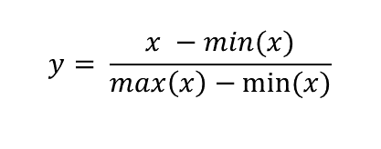
Normalization is another scaling procedure but unlike standaridzation it is suitable for use with any distribution. In fact, it’s purpose is quite different from standardization. Standardization aims to convert any normal distribution into a standard normal but the goal of normalization is to rescale the data into a set range of values. It is defined as subtracting minimum value and dividing by the range of the original variable. Using this procedure on a set of data which contains only non-negative values will result in a range of [0, 1] and if there are negative values the range will be [-1, 1]. The most important property of this scaling procedure is that it does not change the relative distances between individual data points and so does not alter the data distribution.
Now you might ask why you would want to scale data this way if it only changes the range but not the shape of the data distribution? There are several reasons why you might want to do this.
- Using several variables with different ranges and units - this is essentially the same reason as the one we had for standardization with the difference that normalization can be applied to any set of data to make them unitless, not just normally distributed data, with an equal effect (i.e. there is no ‘preferred’ distribution as in the case of standardization).
- Distance-based algorithms and dimensionality reduction - building on the first point, if we want to use an algorithm for exploring our data which relies on calculating and comparing distances between points we need to have the variables in the same range, otherwise variables with the larger range will have disproportionate influence on the algorithm results. Such algorithms include mostly machine learning algorithms such as k-nearest neihbours and k-means clustering algorithm, and dimensionality reduction techniques such as principal component analysis (PCA). If you would like to learn more about these topics Coding Club has very useful tutorials on introductory machine learning and ordination available.
- Convergence issues and improving model performance - when we use more complicated models such as hierarchical models and Bayesian models whose underlying calculations are much more complicated than for a regular linear model we can encounter issues with convergence. Convergence essentially means that the model has successfully finished calculating the result. Non-scaled data often cause complicated models to diverge (i.e. not converge) as the distances and relationships between the points become too complicated for the model to handle. This is where normalization becomes very useful as it normalizes the absolute distances between data points and therefore makes the likelihood of model divergence lower.
As you can see there are plenty of reasons why we would want to use normalization rather than another type of scaling or transformation. Since showing all of these options is beyond the scope of this tutorial, we will only learn how to apply the normalization procedure in R and show its effects through histograms.
For this part we will work with a different but a very well known dataset called Palmer Penguins. It is available through a package in R so you just need to install it and you can access the data at any point hereafter by loading the library.

Source: Palmer Penguins R package vignette. Artwork by Allison Horst.
# Install the penguins package
install.packages("palmerpenguins")

# Load the library
library(palmerpenguins)

# Import the data
penguins <- palmerpenguins::penguins

# Look at the variables in the dataset
str(penguins)
summary(penguins)
As you can see, the dataset contains data for three different species of penguins and measurements of bill length and depth (in mm), flipper length (in mm) and body mass (in g) and some other variables such as sex but we will focus on the four ‘measurement’ variables. Each of these variables has a different range of values, i.e. flipper length in mm will be a much larger value than the beak depth in mm. In addition, the body mass is in completely different units - grams.
If we wanted to use this dataset for, let’s say, classifying the penguin species based on these 4 measurements we would need to scale them. That is what we are going to do now. Let’s therefore apply the normalization to the 4 variables. Before we do that we need to remove observations with missing (NA) values so that we do not get any unexpected errors.
# Remove observations with NA for the variables we are considering
penguins <- penguins[complete.cases(penguins[ , 3:6]),]  # filter out only observations which have values in columns 3:6

# Scale the penguin data using normalization
penguins <- penguins %>%
  mutate(bill_length_mm_norm = (bill_length_mm - min(bill_length_mm))/(max(bill_length_mm)-min(bill_length_mm)),
         bill_depth_mm_norm = (bill_depth_mm - min(bill_depth_mm))/(max(bill_depth_mm)-min(bill_depth_mm)),
         flipper_length_mm_norm = (flipper_length_mm - min(flipper_length_mm))/(max(flipper_length_mm)-min(flipper_length_mm)),
         body_mass_g_norm = (body_mass_g - min(body_mass_g))/(max(body_mass_g)-min(body_mass_g)))
Ugh, this is a quite repetetive code. There surely has to be a better way to apply the same procedure to 4 variables at once? Indeed, there is a much more effective way.
caret package contains a function preProcess() which we can use to apply many different scaling and transformation procedures including normalization, standardization and even Box-Cox transformation. I kept this function a secret up until this point of the tutorial since it is important to understand how the individual scaling procedures and transformations work which is best done through manually implementing them. Furthermore, with preProcess() we cannot do back-transformations - we need to write the functions manually as we have done so far.
However, at this point we can make our lives easier by utilizing preProcess() for applying scaling as shown below (NOTE preProcess() will overwrite the existing columns instead of creating new ones).
# Load the library
library(caret)

# Using preProcess to scale the data
penguins_mapping <- preProcess(penguins[, 3:6], method = c('range'))  # preProcess creates a mapping for the chosen variables
penguins_norm <- predict(penguins_mapping, penguins)  # we transform the data using predict() and the mapping
This is much neater than the previous procedure. You can explore the other transformations available in preProcess() in the documentation by using the command help(preProcess) in your console.
The code for histograms has also got quite repetetive at this point so we will not write the full code here. This is what the histograms would look like for each of the variables with original, unscaled data and normalized data. If you are up for a coding challenge you can try reproducing the plot below.
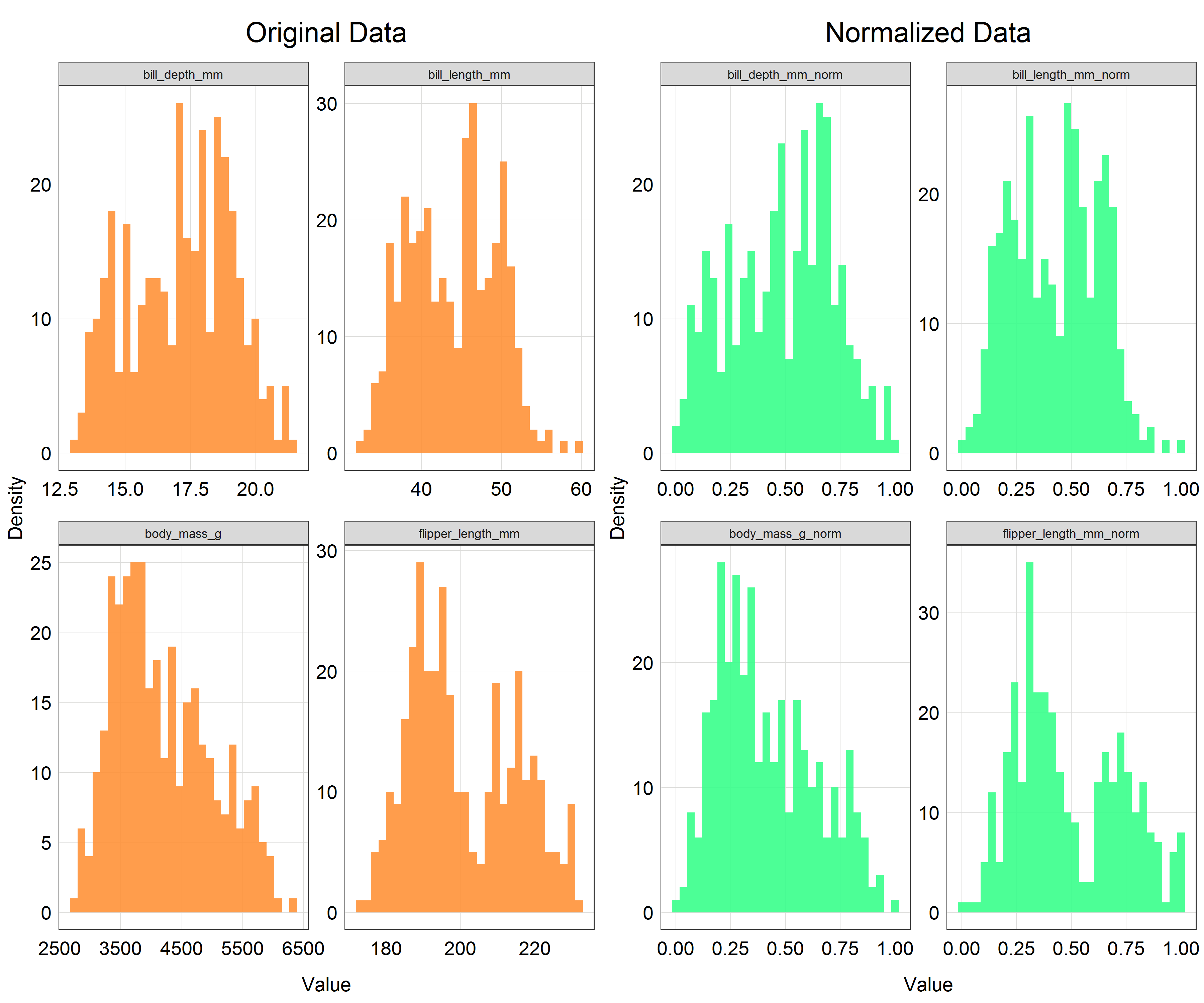
As you can see the shapes of the histograms have not changed which is what we would expect. However, if you look at the x-axis there is a clear change in the scale. All the variables are now scaled on the range from 0 to 1 which is exactly what we wanted to achieve.
After this your data would be ready to be crunched through an algorithm of your choice. We will not follow through with that in this tutorial as it would require explaining a lot of concepts not directly related to scaling and transformation.
This is the end of the second part of the tutorial. At this stage you should be comfortable with explaining what scaling aims to achieve, what the differences are between standardization and normalization and when you would use each, and finally be able to apply the procedures in R. After completing the parts on transformations and scaling you are now equipped with several tools to tackle issues with normality, and different scales and units in your data.
There are many other scaling procedures which can be useful in different situations. You can explore scaling on this very good Wikipedia page or in this article at Towards Data Science which both mention many other different procedures such as the robust scaler and unit vector scaler.
Another important thing to point out is that the terminology used in scaling and transformations can get very confusing and unclear, with each article refering to a single procedure with a different name and sometimes even using one name for two different concepts. Unfortunately, there is no way to avoid this issue. Probably the best strategy to avoid confusion around scaling is to remember the concepts and formulas instead of names and present those in your reports to be as clear as possible.
We will now move on to the last part of the tutorial which will explain how to effectively change the scale on your plots without the need to change the variables themselves.
4. Part III: Scaling for Data Visualization
Credits: NOAA Fisheries
Modelling data is not always our end goal. Sometimes we only want to present the dataset we have through creating beautiful and effective data visualizations. In that case, it can be impractical to go through the process of converting the variables into different scales or transforming them. Instead, we can simply change the scale on the final plot.
This functionality is implemented within ggplot2 and extended by the scales package. It offers a series of functions for effectively modifying the labels and breaks to fit the scale used and even lets us define our own axis scale transformation which is not part of ggplot2. Let’s try out this functionality.
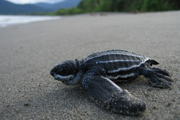
We will work with yet another species from the Living Planet Index database - the leatherback turtle (Dermochelys coriacea).
# Import packages
library(scales)

# Extract the data for the leatherback turtle from the LPI dataset
turtle <- LPI_species %>%
  filter(Common.Name == 'Leatherback turtle') %>%
  mutate(year = parse_number(as.character(year)))

# Look at the dataset
str(turtle)
summary(turtle)
Inspecting the dataset we find out that the units used to describe the population of the turtles are essentially either nesting female counts or nest counts. We will assume that these represent the same phenomenon and therefore can be combined to be a good proxy for population abundance. In this part our goal is just to create a nice visualization showing the population counts, not fully model the trend.
# Plot a scatter plot of the turtle data
(turtle_scatter <- ggplot(data = turtle) +
    geom_point(aes(x = year, y = pop),  # change to geom_point() for scatter plot
                   alpha = 0.9,
                   color = '#ff4040') +
    labs(x = 'Year',
         y = 'Population Abundance',
         title = 'Population abundance of the leatherback turtle') +
    plot_theme())  # apply the custom theme
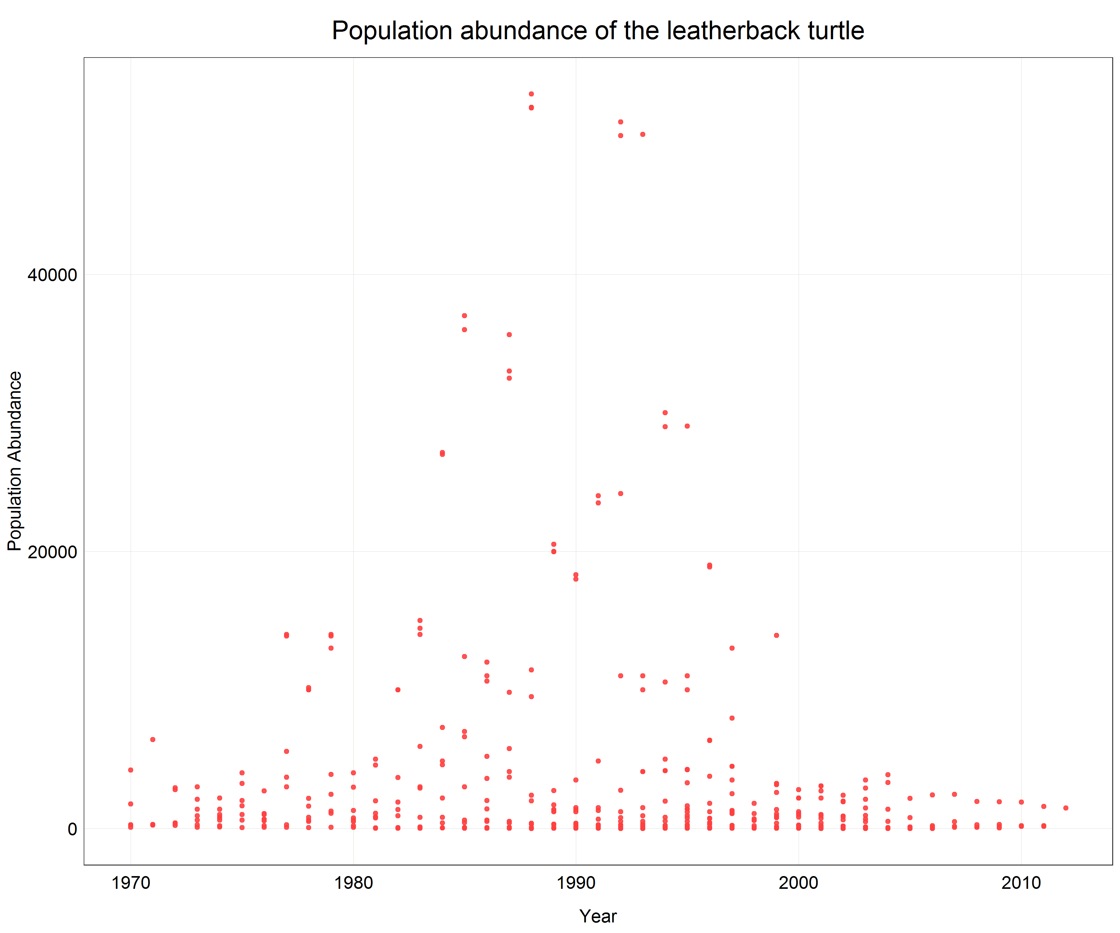
We see that a lot of data is pushed to the x-axis as there are big differences between individual data points. From the previous parts of the tutorial we know that in this case a logarithmic transformation may help. Since we only want to change the axis scale we will add scale_y_log10() with the argument scales::label_number() to the plot call which will create labels with the actual non-logarithmic values on the logarithmic scale.
# Change the scale
(turtle_scatter_log <- ggplot(data = turtle) +
    geom_point(aes(x = year, y = pop),  # change to geom_point() for scatter plot
                   alpha = 0.9,
                   color = '#ff4040') +
    labs(x = 'Year',
         y = 'Population Abundance',
         title = 'Population abundance of the leatherback turtle') +
    scale_y_log10(labels = scales::label_number()) +  # line changes the scale on the y-axis and creates nice labels
    plot_theme())  # apply the custom theme
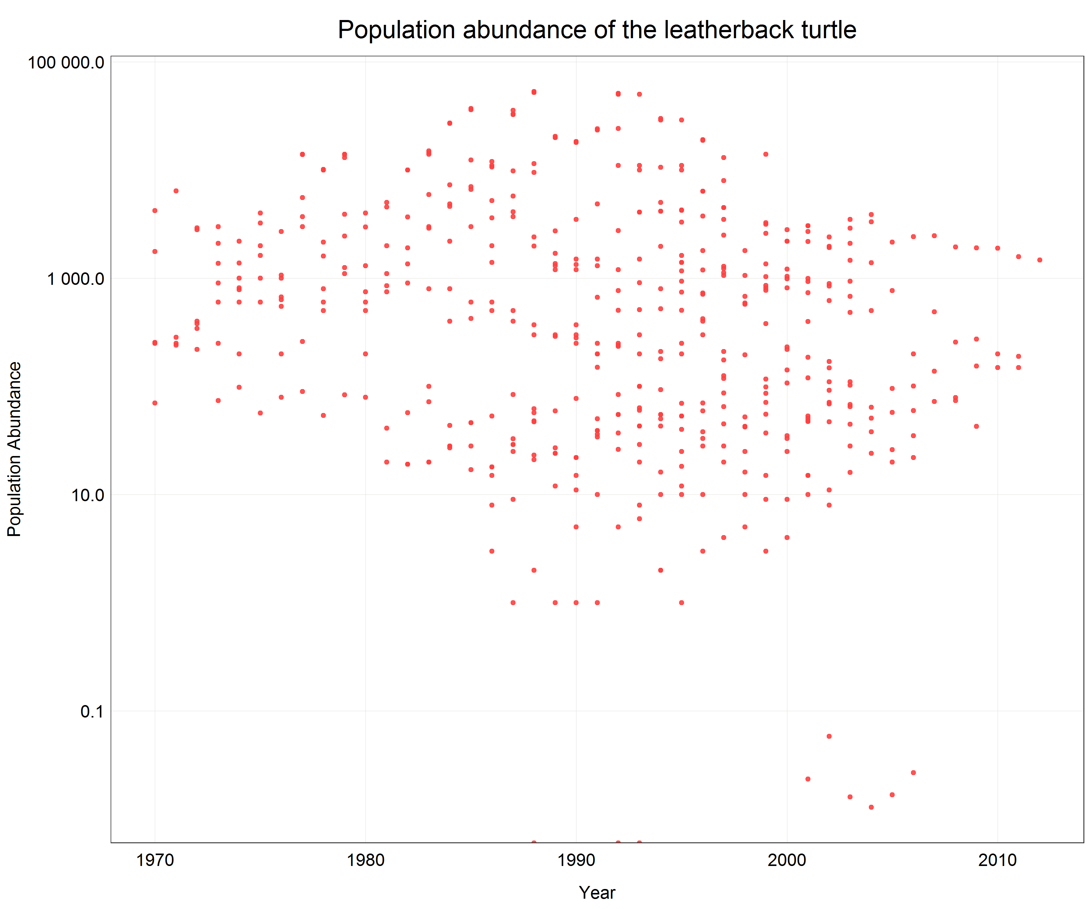
Now we can see all the data points with correct y-axis labels for the log transformed scale and we did all this in one line of extra code.
5. Summary
Congratulations, you made it to the end of the tutorial. Working with data can often be a daunting and complicated task, particularly when your data does not fit into any of the common data distribution types. However, now you are equipped with a range of tools which allow you to visualize and model all sorts of messy datasets. We started with non-linear transformations and learned how to use log, sqrt and Box-Cox transformations, and then reverse these transformations. Afterwards, we explored how scaling can be used by learning about standardization and normalization and finally we introduced a simple way to change scales of plot axes and easily adjust labels to correctly describe the given scale.
6. Challenge
If you would like to practice your newly acquired skills, try to pick one of the animals from the dataset with which we did not work in the tutorial and model how its population changed over time. In your script, try to address the following points and provide a reason for your decisions.
- What data distribution do my data represent?
- Do I need to use a non-linear transformation or scale my data to fit a linear model?
- Do I need to transform or scale my data at all?
- When presenting my results, is it better to back-transform the data or leave them in the transformed scale?
Good luck with the challenge and your future exploration of the field of data science!